Any customizations applied to the web SDK widget UI beyond those documented here are unsupported and might result in unexpected behavior. Google recommends using the Headless SDK if you require more advanced customizations.
To make sure that your theme customizations appears as expected, Google recommends that you test your changes in a test environment before deploying them to production.
Launcher design
The icon, size, position, and color of the launcher can be customized.

Launcher
Open Icon
Close Icon
Icons
If the default launcher's UI doesn't match your branding, you can customize the launcher's icons with your own SVG file. You cannot add a URL to the SVG file, it must be the SVG file itself.
ccaas.config({ launcherOpenIcon: '<svg ....>', launcherCloseIcon: '<svg ....>',})
Size
The default width and height of the launcher is 80px. You can change it to a
different size:
#ccaas-widget {
  --launcher-size: 60px;
}
Border customization
You can customize the following options for the launcher border:
- Border color
- Border width
- Drop shadow (increase or decrease)
--launcher-border-color
--launcher-border-width
--launcher-shadow
Launcher colors
By default, the launcher uses the accent color.
{
  --launcher-border-color: var(--accent-10);
  --launcher-background-color: var(--accent-10);
  --launcher-color: var(--accent-9-contrast);
}
You can customize the launcher to use a different color. For example:
#ccaas-widget {
  --launcher-border-color: var(--green-10);
  --launcher-background-color: var(--blue-10);
  --launcher-color: white;
}
Disable launcher
For aesthetic reasons, you might want to hide the web SDK launcher, opting to
instead use a proactive chat trigger or to start the chat programmatically. You
can hide or disable the launcher's UI using disableLauncher:
ccaas.config({
  disableLauncher: true
})
When the launcher is disabled, you can open the widget with:
ccaas.show()
Widget design

Widget
Logo
Fonts
Select different fonts for your user interface.
--font-en: Roboto, Verdana, Helvetica Neue
--font-zh: PingFang SC, Hiragino Sans GB, Droid Sans Fallback, Microsoft YaHei
--font-ja: Hiragino Sans, Meiryo
Accent color
You can customize the accent color by selecting a predefined color option
using the following configuration:
ccaas.config({
  accent: 'green',
})
Predefined colors include blue, green, purple, orange, yellow, gold,
red.

Accent customization
If the predefined choices don't suit your business needs, you can customize the style with the CSS variables.
#ccaas-widget {
  --accent-1: #fbfdff;
  --accent-2: #f4faff;
  --accent-3: #e6f4fe;
  --accent-4: #d5efff;
  --accent-5: #c2e5ff;
  --accent-6: #acd8fc;
  --accent-7: #8ec8f6;
  --accent-8: #5eb1ef;
  --accent-9: #0090ff;
  --accent-10: #0588f0;
  --accent-11: #0d74ce;
  --accent-12: #113264;
  --accent-contrast: white;
  --chat-input-selection-color: var(--accent-11);
}
Position
If the mount point is #ccaas-widget, you can update the widget position using:
#ccaas-widget {
  --ujet-right: 20px;
  --ujet-bottom: 10px;
}
Logo
Choose a custom logo to appear in the widget.
ccaas.config({
  logo: 'https://example.com/logo.png'
})
Hide the agent logo border
If the mount point is #ccaas-widget, you can hide the Agent Logo Border using
the following code sample:
#ccaas-widget {
--head-logo-shadow: none;
}
Miscellaneous components
Besides accent colors and the position, the Web SDK widget has provided more CSS variables to configure some of the other components used in the widget.
If the mount point is #ccaas-widget, you can customize them using the following
code sample:
#ccaas-widget {
  --variable-name: value;
}
General CSS variables
--text-font: Default text font family.
--text-color: Default text color.
--end-color: Default color of end buttons (end chat, exit chat, end cobrowse)
Confirmation icon
The confirmation icon that appears on various pages throughout the SDK can be customized. You can replace the default icon with a custom icon, and control the size and color.
--confirmation-icon-size
--confirmation-icon-color
Buttons
You can granularly control the customization of different button types. The following table explains the expected behavior when customizing different types of buttons in combination.
| Button Customizations Applied | Result |
| None | Default behavior (all button styles appear according to the primary theme). |
| General Button Customizations | All buttons (excluding Dialogs/Chat screens) appear according to the customizations as set by the customer. This includes Menu Buttons.
If any general button customization variable is NOT specified, the default behavior is applied. |
| Menu Button Customizations
Dialog Button Customizations |
Menu Buttons appear according to the --menu-button variable.
Dialog Buttons appear according to the
If any menu / dialog button customization variable is NOT specified, the default behavior is applied. |
| General Button Customizations
Menu Button Customization Dialog Button Customizations |
Menu Buttons appear according to the --menu-button variable
Dialog Buttons appear according to the Buttons that are NOT Menu Buttons or Dialog Buttons appear according to the general customizations. If any general / menu / dialog button customization variable is NOT specified, the default behavior is applied for that button. |
General buttons
All other buttons SDK-wide that don't have their own CSS variables use the General Button configuration and customization.
--general-button-default-background
--general-button-default-border
--general-button-default-color
--general-button-default-outline

--general-button-hover-background
--general-button-hover-border
--general-button-hover-color
--general-button-hover-outline

--general-button-active-background
--general-button-active-border
--general-button-active-color
--general-button-active-outline

--general-button-focus-background
--general-button-focus-border
--general-button-focus-color
--general-button-focus-outline
Primary buttons
--primary-button-default-background<
--primary-button-default-color

--primary-button-focus-background
--primary-button-focus-color

--primary-button-hover-background
--primary-button-hover-color

--primary-button-active-background
--primary-button-active-color

--primary-button-disabled-background
--primary-button-disabled-color
Secondary buttons
--secondary-button-default-background
--secondary-button-default-border
--secondary-button-default-outline
--secondary-button-default-color

--secondary-button-hover-background
--secondary-button-hover-border
--secondary-button-hover-outline
--secondary-button-hover-color

--secondary-button-active-background
--secondary-button-active-border
--secondary-button-active-outline
--secondary-button-active-color

--secondary-button-disabled-background
--secondary-button-disabled-border
--secondary-button-disabled-outline
--secondary-button-disabled-color

--secondary-button-focus-background
--secondary-button-focus-border
--secondary-button-focus-outline
--secondary-button-focus-color
Secondary buttons (inverse)
--secondary-button-inverse-default-background
--secondary-button-inverse-default-border
--secondary-button-inverse-default-outline
--secondary-button-inverse-default-color

--secondary-button-inverse-hover-background
--secondary-button-inverse-hover-border
--secondary-button-inverse-hover-outline
--secondary-button-inverse-hover-color

--secondary-button-inverse-active-background
--secondary-button-inverse-active-border
--secondary-button-inverse-active-outline
--secondary-button-inverse-active-color

--secondary-button-inverse-disabled-background
--secondary-button-inverse-disabled-border
--secondary-button-inverse-disabled-outline
--secondary-button-inverse-disabled-color

--secondary-button-inverse-focus-background
--secondary-button-inverse-focus-border
--secondary-button-inverse-focus-outline
--secondary-button-inverse-focus-color
Menu buttons
Menu button customization.
--menu-button-default-background
--menu-button-default-border
--menu-button-default-text
--menu-button-default-outline

--menu-button-hover-background
--menu-button-hover-border
--menu-button-hover-text

--menu-button-active-background
--menu-button-active-border
--menu-button-active-text
--menu-button-active-outline

--menu-button-focus-background
--menu-button-focus-border
--menu-button-focus-text
--menu-button-focus-outline

Menu button customization
Dialog Buttons
For example, modals or pop-ups.
--dialog-background
--dialog-text

--dialog-primary-button-default-background
--dialog-primary-button-default-border
--dialog-primary-button-default-text
--dialog-primary-button-default-outline

--dialog-primary-button-hover-background
--dialog-primary-button-hover-border
--dialog-primary-button-hover-text
--dialog-primary-button-hover-outline

--dialog-primary-button-focus-background
--dialog-primary-button-focus-border
--dialog-primary-button-focus-text
--dialog-primary-button-focus-outline

--dialog-primary-button-active-background
--dialog-primary-button-active-border
--dialog-primary-button-active-text
--dialog-primary-button-active-outline

--dialog-secondary-button-default-background
--dialog-secondary-button-default-border
--dialog-secondary-button-default-text
--dialog-secondary-button-default-outline

--dialog-secondary-button-hover-background
--dialog-secondary-button-hover-border
--dialog-secondary-button-hover-text
--dialog-secondary-button-hover-outline

--dialog-secondary-button-focus-background
--dialog-secondary-button-focus-border
--dialog-secondary-button-focus-text
--dialog-secondary-button-focus-outline

--dialog-secondary-button-active-background
--dialog-secondary-button-active-border
--dialog-secondary-button-active-text
--dialog-secondary-button-active-outline

Chat Header
--options-menu-icon-color-default
--options-menu-icon-color-hover
--options-menu-icon-color-active
--options-menu-icon-color-focus

--options-menu-icon-background-default
--options-menu-icon-background-hover
--options-menu-icon-background-active
--options-menu-icon-background-focus

Mute Chat
ccaas.config({
  enableMuteChat: true,
})
Chat Bubble
--chat-bubble-background
--chat-bubble-border
--chat-bubble-text
--chat-bubble-line-height

--chat-bubble-agent-background
--chat-bubble-agent-text
--chat-bubble-agent-border-top-left
--chat-bubble-agent-border-top-right
--chat-bubble-agent-border-bottom-right
--chat-bubble-agent-border-bottom-left

--chat-bubble-user-background
--chat-bubble-user-text
--chat-bubble-user-border-top-left
--chat-bubble-user-border-top-right
--chat-bubble-user-border-bottom-right
--chat-bubble-user-border-bottom-left

### Chat bubble customization
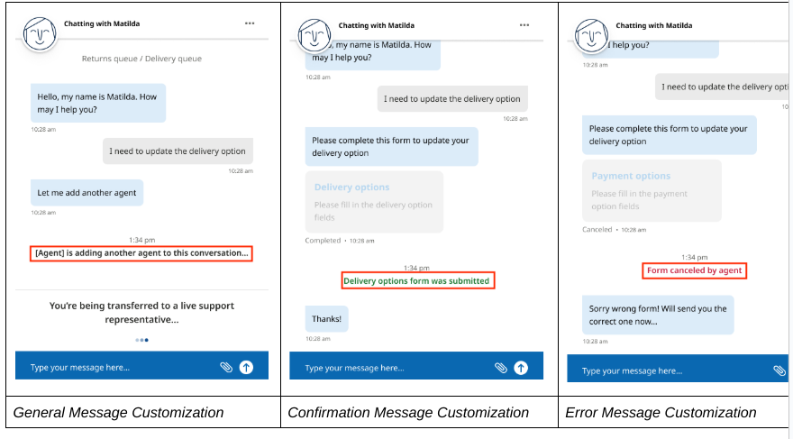
Message
--message-event-general-font
--message-event-general-font-size
--message-event-general-font-weight
--message-event-general-color

--message-event-error-font
--message-event-error-font-size
--message-event-error-font-weight
--message-event-error-color

--message-event-confirmation-font
--message-event-confirmation-font-size
--message-event-confirmation-font-weight
--message-event-confirmation-color

--message-progress-color

--message-button-font
--message-button-text-size
--message-button-text-color
--message-button-font-style

--message-button-default-background
--message-button-default-border
--message-button-hover-background
--message-button-focus-background
--message-button-focus-text

--message-button-disabled-background
--message-button-disabled-border
--message-button-disabled-color
--message-button-disabled-font-style
Post-Session Virtual Agent
--post-session-background
--post-session-padding
