Analyze with BigQuery data canvas
This document describes how to use data canvas for data analysis. You can also manage data canvas metadata by using Dataplex Universal Catalog.
BigQuery data canvas, which is a Gemini in BigQuery feature, lets you find, transform, query, and visualize data by using natural language prompts and a graphic interface for analysis workflows.
For analysis workflows, BigQuery data canvas uses a directed acyclic graph (DAG), which provides a graphical view of your workflow. In BigQuery data canvas, you can iterate on query results and work with multiple branches of inquiry in a single place.
BigQuery data canvas is designed to accelerate analytics tasks and help data professionals such as data analysts, data engineers, and others with their data-to-insights journey. It doesn't require that you have technical knowledge of specific tools, only basic familiarity with reading and writing SQL. BigQuery data canvas works with Dataplex Universal Catalog metadata to identify appropriate tables based on natural language.
BigQuery data canvas isn't intended for direct use by business users.
BigQuery data canvas uses Gemini in BigQuery to find your data, create SQL, generate charts, and create data summaries.
Learn how and when Gemini for Google Cloud uses your data.
Capabilities
BigQuery data canvas lets you do the following:
Use natural language queries or keyword search syntax with Dataplex Universal Catalog metadata to find assets such as tables, views, or materialized views.
Use natural language for basic SQL queries such as the following:
- Queries that contain
FROMclauses, math functions, arrays, and structs. JOINoperations for two tables.
- Queries that contain
Create custom visualizations by using natural language to describe what you want.
Automate data insights.
Limitations
Natural language commands might not work well with the following:
- BigQuery ML
- Apache Spark
- Object tables
- BigLake
INFORMATION_SCHEMAviews- JSON
- Nested and repeated fields
- Complex functions and data types such as
DATETIMEandTIMEZONE
Data visualizations don't work with geomap charts.
Prompting best practices
With the right prompting techniques, you can generate complex SQL queries. The following suggestions help BigQuery data canvas refine your natural language prompts to increase the accuracy of your queries:
Write with clarity. State your request clearly and avoid being vague.
Ask direct questions. For the most precise answer, ask one question at a time, and keep your prompts concise. If you initially gave a prompt with more than one question, itemize each distinct part of the question so that it's clear to Gemini.
Give focused and explicit instructions. Emphasize key terms in your prompts.
Specify the order of operations. Provide instructions in a clear and ordered manner. Divide tasks into small, focused steps.
Refine and iterate. Try different phrases and approaches to see what yields the best results.
For more information, see Prompting best practices for BigQuery data canvas.
Before you begin
- Ensure that Gemini in BigQuery is enabled for your Google Cloud project. An administrator typically performs this step.
- Ensure that you have the necessary Identity and Access Management (IAM) permissions to use BigQuery data canvas.
- To manage data canvas metadata in Dataplex Universal Catalog, ensure that the Dataplex API is enabled in your Google Cloud project.
Required roles
To get the permissions that you need to use BigQuery data canvas, ask your administrator to grant you the following IAM roles on the project:
-
BigQuery Studio User (
roles/bigquery.studioUser) -
Gemini for Google Cloud User (
roles/cloudaicompanion.user)
For more information about granting roles, see Manage access to projects, folders, and organizations.
You might also be able to get the required permissions through custom roles or other predefined roles.
For more information about IAM roles and permissions in BigQuery, see Introduction to IAM.
To manage data canvas metadata in Dataplex Universal Catalog,
ensure that you have the required
Dataplex Universal Catalog roles and the
dataform.repositories.get permission.
Node types
A canvas is a collection of one or more nodes. Nodes can be connected in any order. BigQuery data canvas has the following node types:
- Text
- Search
- Table
- SQL
- Destination node
- Visualization
- Insights
Text node
In BigQuery data canvas, a text node lets you add rich text content to your canvas. It's useful for adding explanations, notes, or instructions to your canvas, making it easier for you and others to understand the context and purpose of your analysis. You can enter any text content you want into the text node editor, including Markdown for formatting. This ability lets you create visually appealing and informative text blocks.
From the text node, you can do the following:
- Delete the node.
- Debug the node.
- Duplicate the node.
Search node
In BigQuery data canvas, a search node lets you find and incorporate data assets into your canvas. It acts as a bridge between your natural language queries or keyword searches and the actual data you want to work with.
You provide a search query, either with natural language or using keywords. The search node searches through your data assets. It leverages Dataplex Universal Catalog metadata for enhanced context awareness. BigQuery data canvas also suggests recently used tables, queries, and saved queries.
The search node returns a list of relevant data assets that match your query. It factors in column names and table descriptions. You can then select the assets you want to add to your data canvas as table nodes, where you can further analyze and visualize the data.
From the search node, you can do the following:
- Delete the node.
- Debug the node.
- Duplicate the node.
Table node
In BigQuery data canvas, a table node represents a specific table that you've incorporated into your analysis workflow. It represents the data you're working with and lets you interact with it directly.
A table node displays information about the table, such as its name, schema, and a preview of the data. You can interact with the table by viewing details such as the table schema, table details, and a table preview.
From the table node, you can do the following:
- Delete the node.
- Debug the node.
- Duplicate the node.
- Run the node.
- Run the node and the following node.
Within the data canvas, you can do the following:
- Query the results in a new SQL node.
- Join the results to another table.
SQL node
In BigQuery data canvas, a SQL node lets you execute custom SQL queries directly within your canvas. You can either write SQL code directly in the SQL node editor or use a natural language prompt to generate the SQL.
The SQL node executes the provided SQL query against the specified data sources. The SQL node produces a result table, which can then be connected to other nodes in the canvas for further analysis or visualization. The outputs from the execution of a SQL node, known as the query result, can also be persisted to their own table through a destination node.
After the query has run, you can export it as a scheduled query, export the query results, or share the canvas, similar to running an interactive query.
From the SQL node, you can do the following:
- Export the SQL statement as a scheduled query.
- Delete the node.
- Debug the node.
- Duplicate the node.
- Run the node.
- Run the node and the following node.
Within the data canvas, you can do the following:
- Query the results in a new SQL node.
- Save the results to a table.
- Visualize the results in a visualization node.
- Generate insights on the results in an insights node.
- Join the results to another table.
Destination node
In BigQuery data canvas, a destination node is a child of a SQL node that persists the result of a SQL execution to a dedicated table. You can save the table in a new or existing dataset, or as a new or existing table in a dataset. After a destination table is created, use the SQL toggle button to keep the table updated in real time when the parent SQL node is re-executed.
A destination node can become a table node when it's detached from its parent and the content of the table isn't affected by any upstream changes at the parent SQL node.
From the destination node, you can do the following:
- Detach the node from the parent to make it a standalone table node.
- Query the table in a new SQL node.
- Join the results to another table.
Visualization node
In BigQuery data canvas, a visualization node lets you display data visually, making it easier to understand trends, patterns, and insights. It provides a variety of chart types to choose from, letting you select and customize the best visualization for your data.
A visualization node takes a table as input, which can be the result of a SQL query or a table node. Based on the selected chart type and the data in the input table, the visualization node generates a chart. You can select Auto-Chart to let BigQuery select the best chart type for your data. The visualization node then displays the generated chart.
The visualization node lets you customize your chart, including changing the colors, labels, and data sources. You can also export the chart as a PNG file.
Visualize data by using the following graphic types:
- Bar chart
- Heat map
- Line graph
- Pie chart
- Scatter chart
From the visualization node, you can do the following:
- Export the chart as a PNG file.
- Debug the node.
- Duplicate the node.
- Run the node.
- Run the node and the following node.
Within the data canvas, you can do the following:
- Generate insights on the results in an insights node.
- Edit the visualization.
Insights node
In BigQuery data canvas, an insights node lets you generate insights and summaries from the data within your data canvas. This helps you uncover patterns, assess data quality, and perform statistical analysis on your canvas. It identifies trends, patterns, anomalies, and correlations within your data, as well as generates concise and clear summaries of the data analysis results.
For more information about data insights, see Generate data insights in BigQuery.
From the insights node, you can do the following:
- Delete the node.
- Duplicate the node.
- Run the node.
Use BigQuery data canvas
You can use BigQuery data canvas in the Google Cloud console, a query, or a table.
Go to the BigQuery page.
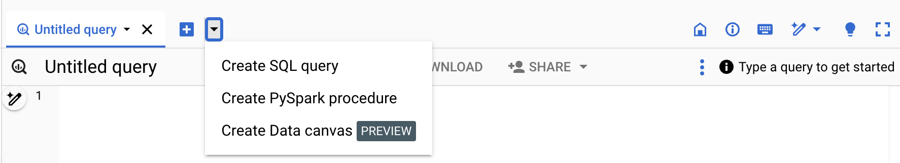
In the query editor, next to SQL query, click Create new, and then click Data canvas.
In the Natural language prompt field, enter a natural language prompt.
For example, if you enter
Find me tables related to trees, BigQuery data canvas returns a list of possible tables, including public datasets likebigquery-public-data.usfs_fia.plot_treeorbigquery-public-data.new_york_trees.tree_species.Select a table.
A table node for the selected table is added to BigQuery data canvas. To view schema information, view table details, or preview the data, select the various tabs in the table node.
Optional: After you save the data canvas, use the following toolbar to view data canvas details or the version history, add new comments, or reply to or get a link to an existing comment:
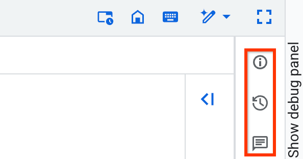
The Details, Version history, and Comments toolbar features are in Preview. To provide feedback or request support for these features, send an email to bqui-workspace-pod@google.com.
The following examples demonstrate different ways to use BigQuery data canvas in analysis workflows.
Example workflow: Find, query, and visualize data
In this example, you use natural language prompts in BigQuery data canvas to find data, generate a query, and edit the query. Then, you create a chart.
Prompt 1: Find data
In the Google Cloud console, go the BigQuery page.
In the query editor, next to SQL query, click Create new, and then click Data canvas.
Click Search for data.
Click filter_list Edit search filters, and then, in the Filter search pane, click the BigQuery public datasets toggle to the on position.
In the Natural language prompt field, enter the following natural language prompt:
Chicago taxi tripsBigQuery data canvas generates a list of potential tables based on Dataplex Universal Catalog metadata. You can select multiple tables.
Select
bigquery-public-data.chicago_taxi_trips.taxi_tripstable, and then click Add to canvas.A table node for
taxi_tripsis added to BigQuery data canvas. To view schema information, view table details, or preview the data, select the various tabs in the table node.
Prompt 2: Generate a SQL query in the selected table
To generate a SQL query for the
bigquery-public-data.chicago_taxi_trips.taxi_trips table, do the following:
In the data canvas, click Query.
In the Natural language prompt field, enter the following:
Get me the 100 longest tripsBigQuery data canvas generates a SQL query similar to the following:
SELECT
  taxi_id,
  trip_start_timestamp,
  trip_end_timestamp,
  trip_miles
FROM
  `bigquery-public-data.chicago_taxi_trips.taxi_trips`
ORDER BY
  trip_miles DESC
LIMIT
  100;
Prompt 3: Edit the query
To edit the query that you generated, you can manually edit the query, or you can change the natural language prompt and regenerate the query. In this example, you use a natural language prompt to edit the query to select only trips where the customer paid with cash.
In the Natural language prompt field, enter the following:
Get me the 100 longest trips where the payment type is cashBigQuery data canvas generates a SQL query similar to the following:
SELECT
  taxi_id,
  trip_start_timestamp,
  trip_end_timestamp,
  trip_miles
FROM
  `PROJECT_ID.chicago_taxi_trips_123123.taxi_trips`
WHERE
  payment_type = 'Cash'
ORDER BY
  trip_miles DESC
LIMIT
  100;
In the preceding example,
PROJECT_IDis the ID of your Google Cloud project.To view the results of the query, click Run.
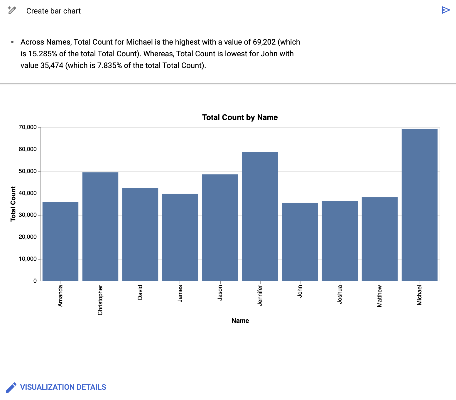
Create a chart
- In the data canvas, click Visualize.
Click Create bar chart.
BigQuery data canvas creates a bar chart showing the most trip miles by trip ID. Along with providing a chart, BigQuery data canvas summarizes some of the key details of the data backing the visualization.
Optional: Do one or more of the following:
- To modify the chart, click Edit, and then edit the chart in the Edit visualization pane.
- To share the data canvas, click Share, then click Share Link to copy BigQuery data canvas link.
- To clean up the data canvas, select More actions, and then select Clear canvas. This step results in a blank canvas.
Example workflow: Join tables
In this example, you use natural language prompts in BigQuery data canvas to find data and join tables. Then, you export a query as a notebook.
Prompt 1: Find data
In the Natural language prompt field, enter the following prompt:
Information about treesBigQuery data canvas suggests several tables that have information about trees.
For this example, select the
bigquery-public-data.new_york_trees.tree_census_1995table, and then click Add to canvas.The table is displayed on the canvas.
Prompt 2: Join the tables on their address
On the data canvas, click Join.
BigQuery data canvas suggests tables to join.
To open a new Natural language prompt field, click Search for tables.
In the Natural language prompt field, enter the following prompt:
Information about treesSelect the
bigquery-public-data.new_york_trees.tree_census_2005table, and then click Add to canvas.The table is displayed on the canvas.
On the data canvas, click Join.
In the On this canvas section, select the Table cell checkbox, and then click OK.
In the Natural language prompt field, enter the following prompt:
Join on addressBigQuery data canvas suggests the SQL query to join these two tables on their address:
SELECT
  *
FROM
  `bigquery-public-data.new_york_trees.tree_census_2015` AS t2015
JOIN
  `bigquery-public-data.new_york_trees.tree_census_1995` AS t1995
ON
  t2015.address = t1995.address;
To run the query and view the results, click Run.
Export query as a notebook
BigQuery data canvas lets you export your queries as a notebook.
- In the data canvas, click Export as notebook.
- In the Save Notebook pane, enter the name for the notebook and the region where you want to save it.
- Click Save. The notebook is created successfully.
- Optional: To view the created notebook, click Open.
Example workflow: Edit a chart by using a prompt
In this example, you use natural language prompts in BigQuery data canvas to find, query, and filter data, and then edit visualization details.
Prompt 1: Find data
To find data about US names, enter the following prompt:
Find data about USA namesBigQuery data canvas generates a list of tables.
For this example, select the
bigquery-public-data.usa_names.usa_1910_currenttable, and then click Add to canvas.
Prompt 2: Query the data
To query the data, in the data canvas, click Query, and then enter the following prompt:
Summarize this dataBigQuery data canvas generates a query similar to the following:
SELECT
  state,
  gender,
  year,
  name,
  number
FROM
  `bigquery-public-data.usa_names.usa_1910_current`
Click Run. The query results are displayed.
Prompt 3: Filter the data
- In the data canvas, click Query these results.
To filter the data, in the SQL prompt field, enter the following prompt:
Get me the top 10 most popular names in 1980BigQuery data canvas generates a query similar to the following:
SELECT
  name,
  SUM(number) AS total_count
FROM
  `bigquery-public-data`.usa_names.usa_1910_current
WHERE
  year = 1980
GROUP BY
  name
ORDER BY
  total_count DESC
LIMIT
  10;
When you run the query, you get a table with the ten most common names of children born in 1980.
Create and edit a chart
In the data canvas, click Visualize.
BigQuery data canvas suggests several visualization options, including a bar chart, pie chart, line graph, and custom visualization.
For this example, click Create bar chart.
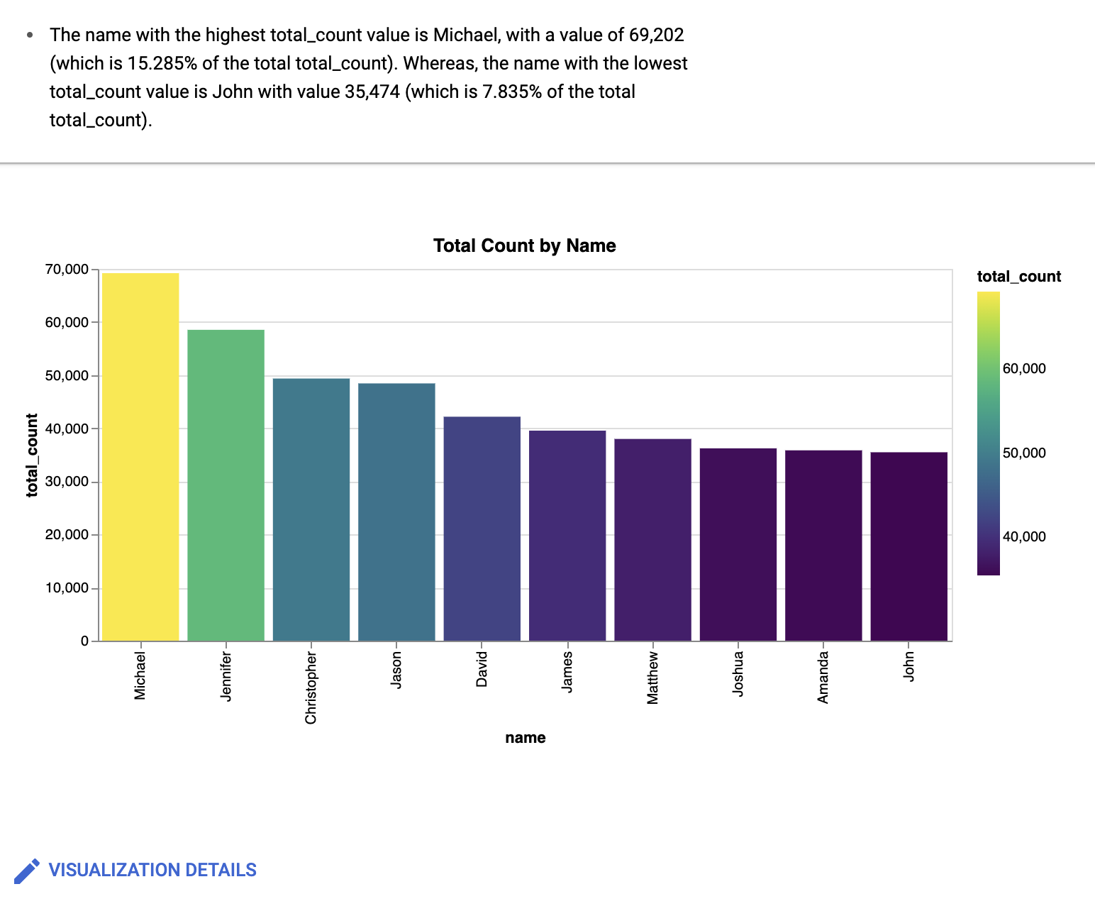
BigQuery data canvas creates a bar chart similar to the following:
Along with providing a chart, BigQuery data canvas summarizes some of the key details of the data backing the visualization. You can modify the chart by clicking Visualization details and editing your chart in the side panel.
Prompt 4: Edit visualization details
In the Visualization prompt field, enter the following:
Create a bar chart sorted high to low, with a gradientBigQuery data canvas creates a bar chart similar to the following:
Optional: To make further changes, click Edit.
The Edit visualization pane is displayed. You can edit details such as the chart title, x-axis name, and y-axis name. Also, if you click the JSON Editor tab, you can directly edit the chart based on the JSON values.
Work with a Gemini assistant
You can use a Gemini-powered chat experience to work with BigQuery data canvas. The chat assistant can create nodes based on your requests, run queries, and create visualizations. You can choose tables for the assistant to work with, and you can add instructions to the assistant to direct its behavior. The assistant works with new or existing data canvases.
To work with the Gemini assistant, do the following:
- To open the assistant, on the data canvas, click spark Open Data Canvas Assistant.
In the Ask a data question field, enter a natural language prompt—for example, one of the following:
Show me interesting statistics of my data.Make a chart based on my data, sorted high to low.I want to see sample data from my table.
The response includes a node or nodes based on the request. For example, if you ask the assistant to create a chart of your data, it creates a visualization node on the data canvas.
When you click the Ask a data question field, you can also do the following:
- To add data, click Settings.
- To add instructions, click Settings.
To continue working with the assistant, add additional natural language prompts.
You can continue to make natural language prompts as you work with your data canvas.
Add data
When you work with the Gemini chat interface, you can add data so that the assistant knows which dataset to reference. The assistant asks you to select a table before you run any prompts. When you search for data within the assistant, you can limit the scope of the searchable data to all projects, starred projects, or your current project. You can also decide whether to include public datasets in your search.
To add data to the Gemini assistant, do the following:
- To open the assistant, on the data canvas, click spark Open Data Canvas Assistant.
- Click Settings, and then click Add Data.
- Optional: To expand the search results to include public datasets, click the Public datasets toggle to the on position.
- Optional: To change the scope of the search results to different projects, select the appropriate project option from the Scope menu.
- Select the checkbox for each of the tables that you want to add to the assistant.
- To search for tables that aren't suggested by the assistant, click Search for tables.
- In the Natural language prompt field, enter a prompt describing what table you are looking for, and then press Enter.
- Select the checkbox for each of the tables you want to add to the assistant, and then click Ok.
- Close the Canvas assistant settings pane.
The assistant bases its analysis on the data you choose.
Add instructions
When you work with the Gemini chat interface, you can add instructions so that the assistant knows how to behave. These instructions are applied to all prompts within the data canvas. Examples of potential instructions include the following:
Visualize trends over time.Chart colors: Red (negative), Green (positive)Domain: USA
To add instructions to the assistant, do the following:
- To open the assistant, on the data canvas, click spark Open Data Canvas Assistant.
- Click Settings.
- In the Instructions field, add a list of your instructions for the assistant, and then close the Canvas assistant settings pane.
The assistant remembers the instructions and applies them to future prompts.
Gemini assistant best practices
To get the best results when working with the BigQuery data canvas assistant, follow these best practices:
Be specific and unambiguous. Clearly state what you want to calculate, analyze, or visualize. For example, instead of
Analyze trip data, sayCalculate the average trip duration for trips starting in council district eight.Ensure accurate data context. The assistant can only work with the data you provide. Ensure all relevant tables and columns have been added to the canvas.
Start simply, then iterate. Begin with a straightforward question to ensure the assistant understands the basic structure and data. For example, first say
Show total trips by, and then saysubscriber_typeShow total trips by.subscriber_typeand break down the result bycouncil_districtBreak down complex questions. For multi-step processes, consider phrasing your prompt clearly with distinct parts, or using separate prompts for each major step. For example, say
First, find the top five busiest stations by trip count. Second, calculate the average trip duration for trips starting from only those top five stations.Clearly state calculations. Specify the chosen calculation, such as
SUM,MAX, orAVERAGE. For example, sayFind the.MAXtrip duration perbike_idUse system instructions for persistent context and preferences. Use system instructions to state information rules, and preferences that apply across all prompts.
Review the canvas. Always review the generated nodes to verify that the logic aligns with your request and the results are accurate.
Experiment. Try different phrasing, levels of detail, and prompt structures to learn how the assistant responds to your specific data and analytical needs.
Reference column names. Whenever possible, use the actual column names from your selected data. For example, instead of
Show trips by
subscriber type
, sayShow the count of trips grouped by.subscriber_typeandstart_station_name
Example workflow: Work with a Gemini assistant
In this example, you use natural language prompts with the Gemini assistant to find, query, and visualize data.
In the Google Cloud console, go the BigQuery page.
In the query editor, next to SQL query, click Create new, and then click Data canvas.
Click Search for data.
Click filter_list Edit search filters, and then, in the Filter search pane, click the BigQuery public datasets toggle to the on position.
In the Natural language prompt field, enter the following natural language prompt:
bikeshareBigQuery data canvas generates a list of potential tables based on Dataplex Universal Catalog metadata. You can select multiple tables.
Select
bigquery-public-data.austin_bikeshare.bikeshare_stationstable andbigquery-public-data.austin_bikeshare.bikeshare_trips, and then click Add to canvas.A table node for each of the selected tables is added to BigQuery data canvas. To view schema information, view table details, or preview the data, select the various tabs in the table node.
To open the assistant, on the data canvas, click spark Open Data Canvas Assistant.
Click Settings.
In the Instructions field, add the following instructions for the assistant:
Tasks:
  - Visualize findings with charts
  - Show many charts per question
  - Make sure to cover each part via a separate line of reasoning
Close the Canvas assistant settings pane.
In the Ask a data question field, enter the following natural language prompt:
Show the number of trips by council district and subscriber typeYou can continue to enter prompts in the Ask a data question field. Enter the following natural language prompt:
What are most popular stations among the top 5 subscriber typesEnter the final prompt:
What station is least used to start and end a tripOnce you've asked all of the relevant prompts, your canvas is populated with the relevant query and visualization nodes according to the prompts and instructions you gave the assistant. Continue to enter prompts or modify existing prompts to get the results you are looking for.
View all data canvases
To view a list of all data canvases in your project, do the following:
In the Google Cloud console, go to the BigQuery page.
In the left pane, click Explorer:

If you don't see the left pane, click Expand left pane to open the pane.
In the Explorer pane, click View actions next to Data canvases, and then do one of the following:
- To open the list in the current tab, click Show all.
- To open the list in a new tab, click Show all in > New tab.
- To open the list in a split tab, click Show all in > Split tab.
View data canvas metadata
To view data canvas metadata, do the following:
In the Google Cloud console, go to the BigQuery page.
In the left pane, click Explorer:
In the Explorer pane, expand your project and click Data canvases.
Click the name of the data canvas you want to view metadata for.
Click
 Details
to see information about the data canvas such as the
region
it uses and the date it was last modified.
Details
to see information about the data canvas such as the
region
it uses and the date it was last modified.
Work with data canvas versions
You can choose to create a data canvas either inside of or outside of a repository. Data canvas versioning is handled differently based on where the data canvas is located.
Data canvas versioning in repositories
Repositories are Git repositories that reside either in BigQuery or with a third-party provider. You can use workspaces in repositories to perform version control on data canvases. For more information, see Use version control with a file.
Data canvas versioning outside of repositories
You can view, compare, and restore versions of a data canvas.
View and compare data canvas versions
To view different versions of a data canvas and compare them with the current version, do the following:
In the Google Cloud console, go to the BigQuery page.
In the left pane, click Explorer:
In the Explorer pane, expand your project and click Data canvases.
Click the name of the data canvas that you want to view version history for.
Click Version history to see a list of the data canvas versions in descending order by date.
Click View actions next to a data canvas version and then click Compare. The comparison pane opens, comparing the data canvas version that you selected with the current data canvas version.
Optional: To compare the versions inline instead of in separate panes, click Compare and then click Inline.
Restore a data canvas version
Restoring from the comparison pane lets you compare the previous version of the data canvas to the current version before choosing whether to restore it.
In the left pane, click Explorer:
In the Explorer pane, expand your project and click Data canvases.
Click the name of the data canvas that you want to restore a previous version of.
Click Version history.
Click View actions next to the version of the data canvas that you want to restore, and then click Compare.
The comparison pane opens, comparing the data canvas version that you selected with the most recent data canvas version.
To restore the previous data canvas version after comparison, click Restore.
Click Confirm.
Manage metadata in Dataplex Universal Catalog
Dataplex Universal Catalog lets you view and manage metadata for data canvases. Data canvases are available in Dataplex Universal Catalog by default, without additional configuration.
You can use Dataplex Universal Catalog to manage data canvases in all BigQuery locations. Managing data canvases in Dataplex Universal Catalog is subject to Dataplex Universal Catalog quotas and limits and Dataplex Universal Catalog pricing.
Dataplex Universal Catalog automatically retrieves the following metadata from data canvases:
- Data asset name
- Data asset parent
- Data asset location
- Data asset type
- Corresponding Google Cloud project
Dataplex Universal Catalog logs data canvases as entries with the following entry values:
- System entry group
- The system entry group
for data canvases is
@dataform. To view details of data canvas entries in Dataplex Universal Catalog, you need to view thedataformsystem entry group. For instructions about how to view a list of all entries in an entry group, see View details of an entry group in the Dataplex Universal Catalog documentation. - System entry type
- The system entry type
for data canvases is
dataform-code-asset. To view details of data canvases, you need to view thedataform-code-assetsystem entry type, filter the results with an aspect-based filter, and set thetypefield insidedataform-code-assetaspect toDATA_CANVAS. Then, select an entry of the selected data canvas. For instructions about how to view details of a selected entry type, see View details of an entry type in the Dataplex Universal Catalog documentation. For instructions about how to view details of a selected entry, see View details of an entry in the Dataplex Universal Catalog documentation. - System aspect type
- The system aspect type
for data canvases is
dataform-code-asset. To provide additional context to data canvases in Dataplex Universal Catalog by annotating data canvas entries with aspects, view thedataform-code-assetaspect type, filter the results with an aspect-based filter, and set thetypefield insidedataform-code-assetaspect toDATA_CANVAS. For instructions about how to annotate entries with aspects, see Manage aspects and enrich metadata in the Dataplex Universal Catalog documentation. - Type
- The type for data canvases is
DATA_CANVAS. This type lets you filter data canvases in thedataform-code-assetsystem entry type and thedataform-code-assetaspect type by using theaspect:dataplex-types.global.dataform-code-asset.type=DATA_CANVASquery in an aspect-based filter.
For instructions about how to search for assets in Dataplex Universal Catalog, see Search for data assets in Dataplex Universal Catalog in the Dataplex Universal Catalog documentation.
Pricing
For details about pricing for this feature, see Gemini in BigQuery pricing overview.
Quotas and limits
For information about quotas and limits for this feature, see Quotas for Gemini in BigQuery.
Locations
You can use BigQuery data canvas in all BigQuery locations. Gemini in BigQuery operates globally, so you can't restrict data processing to a specific region. To learn more about locations where Gemini in BigQuery processes data, see Gemini serving locations.
Provide feedback
You can help improve BigQuery data canvas suggestions by submitting feedback to Google. To provide feedback, do the following:
In the Google Cloud console toolbar, click Submit feedback.
Optional: To copy the DAG JSON information to provide additional context to your feedback, click Copy.
To fill out the form and provide feedback, click form.
Data sharing settings apply to the entire project and can only be set by a
project administrator who has the serviceusage.services.enable and
serviceusage.services.list IAM permissions. For more
information about data use in the Trusted Tester Program, see
Gemini in Google Cloud Trusted Tester
Program.
To provide direct feedback about this feature, you can also contact datacanvas-feedback@google.com.
What's next
Learn how to write queries with Gemini assistance.
Learn how to create notebooks.
Learn how to generate natural language queries about your data with data insights.