Informationen dazu, wie Sie Berichten Diagramme und Steuerelemente hinzufügen
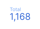 Kurzübersicht
Kurzübersichten enthalten eine Zusammenfassung einzelner Messwerte. Weitere Informationen
Diagrammvarianten:Kurzübersicht mit kompakten Zahlen
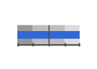
Tabelle „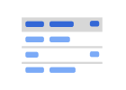 “
“
Sie können Tabellen verwenden, um Ihre Daten in einem Diagramm darzustellen, das sich sortieren und mit Seitenumbrüchen versehen lässt. Weitere Informationen zu Tabellen
Diagrammvarianten:Tabelle mit Balken, Tabelle mit Heatmap
Pivot-Tabelle
In Pivot-Tabellen können Sie Ihre Daten neu organisieren und zusammenfassen. Weitere Informationen zu Pivot-Tabellen
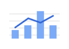
 Zeitreihe
Mithilfe von Zeitreihendiagrammen können Sie nachvollziehen, wie sich Ihre Daten im Zeitverlauf ändern. Weitere Informationen zu Zeitreihendiagrammen
Diagrammvarianten:Sparkline-Diagramm, geglättetes Zeitreihendiagramm
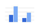 Balken- und Säulendiagramm
Mit Balken- und Säulendiagrammen lassen sich eine oder mehrere Datenkategorien oder ‑gruppen darstellen, insbesondere Kategorien mit Unterkategorien. Weitere Informationen zu Balken- und Säulendiagrammen
Diagrammvarianten:Balkendiagramm, Säulendiagramm, gestapeltes Säulendiagramm, gestapeltes Säulendiagramm (100 %), gestapeltes Balkendiagramm, gestapeltes Balkendiagramm (100 %)
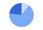 Kreisdiagramm
Mit einem Kreisdiagramm lassen sich Daten als Kreissegmente bzw. Teile eines Ganzen darstellen. Weitere Informationen zu Kreisdiagrammen
Diagrammvarianten:Ringdiagramm
 Kombinationsdiagramm
In Kombinationsdiagrammen können Sie die einzelnen Datenreihen unterschiedlich darstellen, z. B. als Spalte oder Linie. Weitere Informationen zu Kombinationsdiagrammen
Diagrammvarianten:gestapeltes Kombinationsdiagramm, Liniendiagramm, geglättetes Liniendiagramm
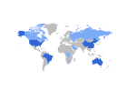 Region
In Geo-Diagrammen wird die Karte eines Landes, eines Kontinents oder einer Region angezeigt. Die Werte für einzelne Orte werden farblich dargestellt. Weitere Informationen zu geografischen Diagrammen
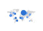 Google Maps
Mit einer Google-Karte können Sie geografische Daten visualisieren. Weitere Informationen zu Google Maps
Diagrammvarianten:Karte mit Blasen, Karte mit ausgefüllten Bereichen, Heatmap, Karte mit Linien
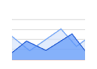 Region
In Flächendiagrammen können Sie unterschiedliche Werte in verschiedenen Datenkategorien grafisch darstellen. Weitere Informationen
Diagrammvarianten:gestapeltes Flächendiagramm, gestapeltes Flächendiagramm (100 %)
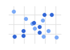 Streudiagramm
In Streudiagrammen können Sie numerische Koordinaten entlang der horizontalen (X) und vertikalen (Y) Achsen darstellen. So werden Trends und Muster zwischen zwei Variablen sichtbar. Weitere Informationen
Diagrammvarianten:Blasendiagramm
 Aufzählungszeichen
Mithilfe eines Bullet-Diagramm können Sie den Fortschritt eines bestimmten Messwerts in Bezug auf mehrere Ziele nachvollziehen. Weitere Informationen
Siehe auch:Tachometerdiagramm
Anzeige 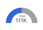
Mit einem Tachometerdiagramm können Sie die Leistung eines Messwerts in Bezug auf ein Ziel nachvollziehen. Weitere Informationen
Diagrammvarianten:Tachometerdiagramm mit Bereichen
Siehe auch:Bullet-Diagramm
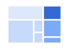 Strukturkarte
Mit Strukturkarten können Sie sich einzelne Objekte in einer Hierarchie mit Über- und Unterordnungen anzeigen lassen. Weitere Informationen
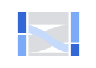 Sankey
In Sankey-Diagrammen wird der Fluss von einer Gruppe von Werten zu einer anderen dargestellt. Weitere Informationen
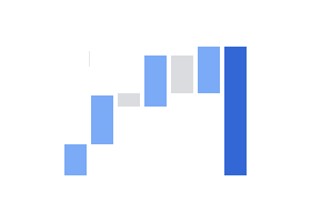 Wasserfalldiagramm
Mit Wasserfalldiagrammen lässt sich visualisieren, wie eine Folge von positiven und negativen Werten eine Gesamtsumme ergibt. Weitere Informationen
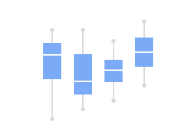 Boxplot
Mit Boxplot-Diagrammen können Sie Verteilung und Streuung von Werten in Ihrem Dataset visualisieren. Sie sind besonders nützlich, um Werte kategorienübergreifend zu vergleichen. Weitere Informationen
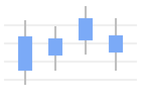 Kerzendiagramm
Mit Kerzendiagrammen lassen sich Bereiche in Ihren Daten visualisieren, darunter Anfangs- und Schlusswerte sowie die Höchst- und Tiefstwerte der einzelnen Bereiche. Weitere Informationen
Zeitachse
Mit Zeitachsendiagrammen können Sie die Beziehungen zwischen Ereignisgruppen visualisieren und die Zeiträume vergleichen, über die diese Ereignisse stattgefunden haben. Weitere Informationen
Trichter
Mit Trichterdiagrammen können Sie visualisieren, wie sich ein Messwert im Laufe der Ereignisse in einem sequenziellen Prozess ändert. Weitere Informationen
 Community-Visualisierungen
Sie können Diagramme von Drittentwicklern verwenden, um Ihre Daten auf verschiedene Arten darzustellen. Weitere Informationen zu Community-Visualisierungen