Bullet charts give you a way to quickly see how well a given metric is performing against target benchmarks. Bullet charts have the following three components:
- A center bar showing the actual value of the metric you are graphing
- A vertical line showing a target value
- Colored bands that represent threshold ranges, such as poor, average, and good
Bullet charts are often used in dashboards to provide meter or gauge-like widgets that monitor various "health" or performance KPIs (key performance indicators).
Bullet charts in Looker Studio
Bullet charts in Looker Studio visualize a single metric. You can optionally display a target value, and set up to three ranges. You can also change the chart colors, and apply data filters.
Example
The following bullet chart is based on the average grade metric for a fictional online course. At a glance, you can see that the average grade exceeds the target:
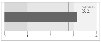
- The center bar shows the metric value (3.2, in this example)
- The vertical bar shows the target average grade (set at 2.8 in the chart configuration)
- The colored bands in the graph show the ranges for poor, average, and good grade averages.
The Avg Grade metric is shown by adding a scorecard on top of the bullet chart.
Add the chart
Add a new chart or select an existing chart. Then, use the Properties panel to configure the chart's Setup tab and Style tab properties to set up the chart data and style the chart, respectively.
Set up the chart data
The options in the Setup tab of the Properties panel determine how the chart's data is organized and displayed.
Data source
A data source provides the connection between the component and the underlying dataset.
- To change the chart's data source, click the current data source name.
- To view or edit the data source, click the
 Edit data source icon. (You must have at least Viewer permission to see this icon.)
 - Click Blend data to see data from multiple data sources in the same chart. Learn more about data blending.
Metric
Metrics measure the things that are contained in dimensions and provide the numeric scale and data series for the chart.
Metrics are aggregations that come from the underlying dataset or that are the result of implicitly or explicitly applying an aggregation function, such as COUNT(), SUM(), or AVG(). The metric itself has no defined set of values, so you can't group by a metric as you can with a dimension.
Bullet charts can have one metric.
Optional metrics
You can add optional metrics by turning on the Optional metrics switch and selecting metrics from the Add metric field selector. You can also click metrics from the fields list on the Data panel and place them in the Optional metrics selector.
Filter
Filters restrict the data that is displayed in the component by including or excluding the values that you specify. Learn more about the filter property.
Filter options include the following:
- Filter name: Click an existing filter to edit it. Mouse over the filter name and click X to delete it.
- Add filter: Click this option to create a new filter for the chart.
Range limits
Range limits specify the threshold values for the chart. Ranges often indicate "poor," "average," and "good" thresholds. By default, bullet charts set the range values to 1, 2, and 3. You should adjust these to better fit your actual data. You can remove a range from the chart by setting it to 0. If you don't want ranges at all, set all 3 ranges to the same value (use a value large enough to display the metric value).
- Range 1: Set the threshold for the "poor" range.
- Range 2: Set the threshold for the "average" range.
- Range 3: Set the threshold for the "good" range.
Target
The Target setting lets you specify a target value for the chart, and displays a vertical line to mark the target value on the chart. Turn on the Show target switch to enable the setting and set a Target value.
Date range dimension
This option appears if your data source has a valid date dimension.
The date range dimension is used as the basis for limiting the date range of the chart and provides a time-based X-axis for your chart. For example, this is the dimension that is used if you set a date range property for the chart or if a viewer of the report uses a date range control to limit the timeframe.
The data type of this dimension determines the granularity of the time series. For example, to visualize daily data, use the Date data type with full year, month, and day. To group the data by calendar quarter, change the data type to Year Quarter.
Learn more about working with dates and time.
Default date range filter
The default date range filter lets you set a timeframe for an individual chart.
Default date range filter options include the following:
- Auto: Uses the default date range, which is determined by the chart's data source.
- Custom: Lets you use the calendar widget to select a custom date range for the chart.
- Comparison date range: Displays comparison data for the selected time period.
Learn more about working with dates and time.
Style the chart
The options in the Style tab control the overall presentation and appearance of the chart.
Chart title
Turn on the Show title switch to add a title to your chart. Looker Studio can automatically generate a title, or you can create a custom title for the chart. You can also customize the title's styling and placement.
Autogenerate
This option is enabled by default. When Autogenerate is enabled, Looker Studio generates a title that is based on the chart type and the fields that are used in the chart. The autogenerated title will be updated if you change the chart type or make changes to the fields that are used in the chart.
To add a custom title to your chart, enter it into the Title field. This will turn off the Autogenerate setting.
Title options
When the Show title setting is enabled, you can use the following title options:
- Title: Provides a text field where report editors can enter a custom title for the chart.
- Font family: Sets the font type for the title text.
- Font size: Sets the font size for the title text.
- Font color: Sets the font color for the title text.
- Font styling options: Applies bold, italic, or underline styling to the title text.
- Top: Positions the chart title at the top of the chart.
- Bottom: Positions the chart title at the bottom of the chart.
- Left: Aligns the chart title to the left side of the chart.
- Center: Centers the chart title horizontally.
- Right: Aligns the chart title to the right side of the chart.
Bar colors
These options control the appearance of the center value bar and the ranges:
- Bar color: Sets the color of the value bar.
- Range color: Sets the color of the ranges.
Axis
These options control the appearance of the chart axis:
- Show Axis: Shows or hides the chart axis.
- Font color: Sets the color of the axis labels. This option is only available when the Show Axis setting is enabled.
- Font family: Sets the font type of the axis labels.
- Compact numbers: Rounds numbers and displays the unit indicator. For example, 553,939 becomes 553.9K. This option is only available when the Show Axis setting is enabled.
- Decimal precision: Sets the number of decimal places that are displayed in metric values. This option is only available when the Show Axis setting is enabled.
Background and border
These options control the appearance of the chart background container:
- Background: Sets the chart background color.
- Opacity: Sets the chart opacity. 100% opacity completely hides objects behind the chart. 0% opacity makes the chart invisible.
- Border color: Sets the chart border color.
- Border radius: Adds rounded borders to the chart background. When the radius is 0, the background shape has 90° corners. A border radius of 100° produces a circular shape.
- Border weight: Sets the chart border line thickness.
- Border style: Sets the chart border line style.
- Add border shadow: Adds a shadow to the chart's lower and right borders.
Chart header
The chart header lets viewers perform various actions on the chart, such as exporting the data, drilling up or down, or sorting the chart. Chart header options include the following:
- Chart header: Controls where the chart header appears on the chart. The Chart header options include the following:
- Do not show: The header options never appear. Note that report viewers can always access the options by right-clicking the chart.
- Always show: The header options always appear.
- Show on hover (default): Three vertical dots appear when you hold the pointer over the chart header. Click these to access the header options.
- Header font color: Sets the color of the chart header options.
Reset to report theme
Click Reset to report theme to reset the chart settings to the report theme settings.