Sankey charts display a flow from one set of values to another and are effective for analyzing movements of information over time. This page provides an overview of Sankey charts and configuration options in Looker Studio.
Sankey charts in Looker Studio
Sankey charts are best used for depicting a many-to-many mapping between two domains or multiple paths through a set of stages. For example, a Sankey chart can effectively visualize the relationship between universities and majors or display how web traffic flows through the different pages on a website. This visualization is best used when a dataset includes multiple dimensions that are related to each other in a hierarchical and sequential way.
A Sankey chart connects data through nodes. The connections between the nodes are called links.
The nodes that links flow from are called source nodes. The nodes that links flow to are called target nodes.
The thickness of the links is also referred to as weight, which is commonly a representation of an aggregation or a metric. The higher the metric value, the thicker the link or higher the weight.
Sankey chart example
The following Sankey chart displays the count of trips between countries using the default style settings.
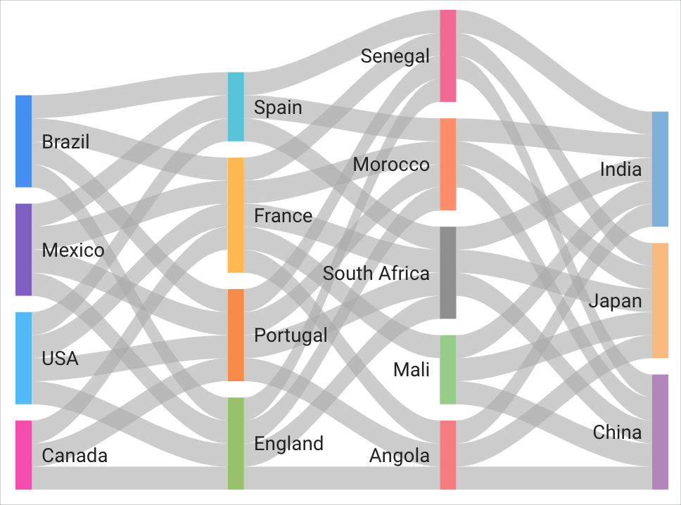
The nodes are countries based on two dimensions, Arrivals and Departures. The links flowing between the nodes display the Record Count metric as the Weight metric. The data renders as a multi-stage Sankey chart because of the way the Arrivals and Departures values correspond in the dataset.
You can interact with Sankey charts in a couple of ways:
- You can highlight the relationship between specific links and nodes by selecting them in a Sankey chart.
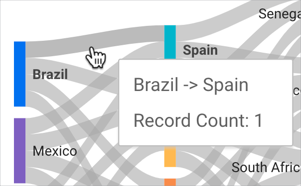
- You can hold your cursor over a link to access a tooltip that displays more details about the link.
Requirements
A Sankey chart requires the following elements:
- Two dimensions:
- A dimension that represents nodes where data flows to (also known as the target)
- A dimension that represents nodes where data flows from (also known as the source)
- One metric to indicate the weight (thickness of the links) between the nodes
Add the chart
Add a new chart or select an existing chart. Then, use the Properties panel to configure the chart's Setup tab and Style tab properties to set up the chart data and style the chart, respectively.
Set up the chart data
The options in the Setup tab of the Properties panel determine how the chart's data is organized and displayed.
Data source
A data source provides the connection between the component and the underlying dataset.
- To change the chart's data source, click the current data source name.
- To view or edit the data source, click the
 Edit data source icon. (You must have at least Viewer permission to see this icon.)
 - Click Blend data to see data from multiple data sources in the same chart. Learn more about data blending.
Dimension
Dimensions are data categories. Dimension values (the data that is contained by the dimension) are names, descriptions, or other characteristics of a category.
Sankey charts require at least two dimensions.
Weight metric
Metrics measure the things that are contained in dimensions and provide the numeric scale and data series for the chart.
Metrics are aggregations that come from the underlying dataset or that are the result of implicitly or explicitly applying an aggregation function, such as COUNT(), SUM(), or AVG(). The metric itself has no defined set of values, so you can't group by a metric as you can with a dimension.
The value of the weight metric indicates the thickness of the links between nodes: The higher the value, the thicker the link. Sankey charts require at least a single metric.
Filter
Filters restrict the data that is displayed in the component by including or excluding the values that you specify. Learn more about the filter property.
Filter options include the following:
- Filter name: Click an existing filter to edit it. Mouse over the filter name and click X to delete it.
- Add filter: Click this option to create a new filter for the chart.
Date range dimension
This option appears if your data source has a valid date dimension.
The date range dimension is used as the basis for limiting the date range of the chart. For example, this is the dimension that is used if you set a date range property for the chart or if a viewer of the report uses a date range control to limit the timeframe.
Default date range filter
The default date range filter lets you set a timeframe for an individual chart.
Default date range filter options include the following:
- Auto: Uses the default date range, which is determined by the chart's data source.
- Custom: Lets you use the calendar widget to select a custom date range for the chart.
Learn more about working with dates and time.
Row limit
The Row limit controls the number of records that are included in a visualization's query. Select a row limit of up to 5,000 from the drop-down menu.
Chart interactions
When the Cross-filtering option is enabled on a chart, that chart acts like a filter control. You can filter the report by clicking or brushing your mouse across the chart. Learn more about cross-filtering.
Cross filter options
When Cross-filtering in the Chart interactions section is enabled, you can select an option from the Cross filter by drop-down menu to filter other charts in the report by a node or link that a user selects in the visualization.
Style the chart
The options in the Style tab control the overall presentation and appearance of the chart.
Chart title
Turn on the Show title switch to add a title to your chart. Looker Studio can automatically generate a title, or you can create a custom title for the chart. You can also customize the title's styling and placement.
Autogenerate
This option is enabled by default. When Autogenerate is enabled, Looker Studio generates a title that is based on the chart type and the fields that are used in the chart. The autogenerated title will be updated if you change the chart type or make changes to the fields that are used in the chart.
To add a custom title to your chart, enter it into the Title field. This will turn off the Autogenerate setting.
Title options
When the Show title setting is enabled, you can use the following title options:
- Title: Provides a text field where report editors can enter a custom title for the chart.
- Font family: Sets the font type for the title text.
- Font size: Sets the font size for the title text.
- Font color: Sets the font color for the title text.
- Font styling options: Applies bold, italic, or underline styling to the title text.
- Top: Positions the chart title at the top of the chart.
- Bottom: Positions the chart title at the bottom of the chart.
- Left: Aligns the chart title to the left side of the chart.
- Center: Centers the chart title horizontally.
- Right: Aligns the chart title to the right side of the chart.
Color by
These options control the color of the Sankey visualization:
- Single color: When this option is selected, the data series is displayed in shades of a single color. Otherwise, the chart is displayed in multiple colors, according to your report theme. You can set specific colors by using each data series' color picker.
- Node order: Displays values in order of the node size, which reflects the value of the Weight metric.
- Dimension values: This option colors each dimension value in the chart with the color that is specified in the dimension value color map. This option ensures that your data uses color consistently, regardless of the position of that data in the chart.
Text
These options control the appearance of the value labels that appear in a Sankey chart. Each option lets you specify the following:
- Font family: Specifies the font family of value labels from a series of drop-down menu options.
- Font size: Specifies the size of value labels in pixels from a series of drop-down menu options.
- Font color: Specifies the color of value labels from a color palette menu.
- Bold: When the Bold setting is enabled, value labels appear in bold font.
Link
The Link color mode and Iterations drop-down menus control the appearance of the links that flow between nodes in a Sankey chart.
The Link color mode drop-down menu contains several options that let you choose the way links appear in Sankey charts. The options include the following:
- Default: Displays links in gray and nodes by the option specified in the Color by section.
- Source color: Displays links in the same color as the source node.
- Target color: Displays links in the same color as the target node.
- Gradient: Displays links in a color gradient between a source node's color and target node's color.
The Iterations drop-down menu lets you select a number that specifies the placement of nodes for optimal readability. The larger the selected number, the more organized the layout of complex Sankeys.
Node
The Node thickness and Node padding options control the appearance of nodes in a Sankey chart:
- The Node thickness drop-down lets you specify the thickness for each node. The higher the number, the thicker the node.
- The Node padding drop-down lets you specify the padding around each node and control the spacing between links. The higher the number, the more compact the node and the more spacing between links.
Missing data
This option appears when your time dimension is missing data. When Looker Studio determines that your time dimension is missing data, you can select one of the following options to indicate that there is no data:
- Line to zero: When you select this option, a line series will drop to zero for the missing dates. This is the default option.
- Line breaks: When this option is selected, missing data appears as breaks in the data series.
- Linear interpolation: When this option is selected, Looker Studio will continue the series by connecting the data points on either side of the missing data.
Background and border
These options control the appearance of the chart background container:
- Background: Sets the chart background color.
- Opacity: Sets the chart opacity. 100% opacity completely hides objects behind the chart. 0% opacity makes the chart invisible.
- Border color: Sets the chart border color.
- Border radius: Adds rounded borders to the chart background. When the radius is 0, the background shape has 90° corners. A border radius of 100° produces a circular shape.
- Border weight: Sets the chart border line thickness.
- Border style: Sets the chart border line style.
- Add border shadow: Adds a shadow to the chart's lower and right borders.
Chart header
The chart header lets viewers perform various actions on the chart, such as exporting the data, drilling up or down, or sorting the chart. Chart header options include the following:
- Chart header: Controls where the chart header appears on the chart. The Chart header options include the following:
- Do not show: The header options never appear. Note that report viewers can always access the options by right-clicking the chart.
- Always show: The header options always appear.
- Show on hover (default): Three vertical dots appear when you hold the pointer over the chart header. Click these to access the header options.
- Header font color: Sets the color of the chart header options.
Reset to report theme
Click Reset to report theme to reset the chart settings to the report theme settings.