This page presents a typical way you might work with Looker Studio. This scenario covers 6 steps:
- Create a report
- Connect to your data
- Visualize the data
- Transform the data
- Share your insights
- Update and refine the report
Scenario
 Aqsa is a data analyst for a travel company. She wants to explore and visualize data on flight arrival and departure delays in order to see if there are valuable insights her company can provide to their customers to improve their travel experience. The data is stored in BigQuery.
Create
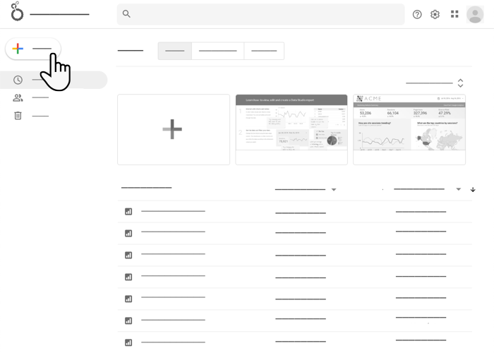
Aqsa signs into Looker Studio, then clicks Create > Report. The Looker Studio report editor opens and the Add data panel appears.
Connect
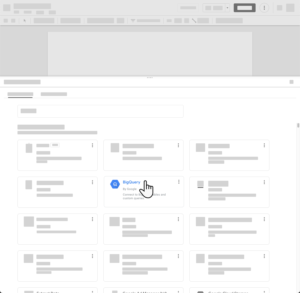
The Add data panel lets Aqsa create a new data source or select an existing one. She doesn't yet have a data source for the flight data she wants to visualize, so she clicks the BigQuery connector to create a new data source.
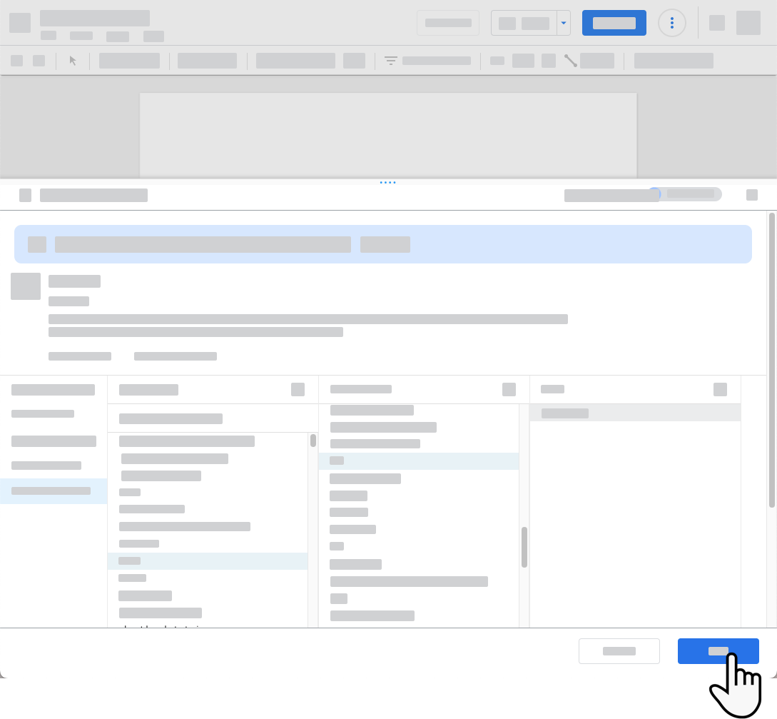
Aqsa enters the information needed to connect to the BigQuery table containing the flight data, and then adds the new data source to her report.
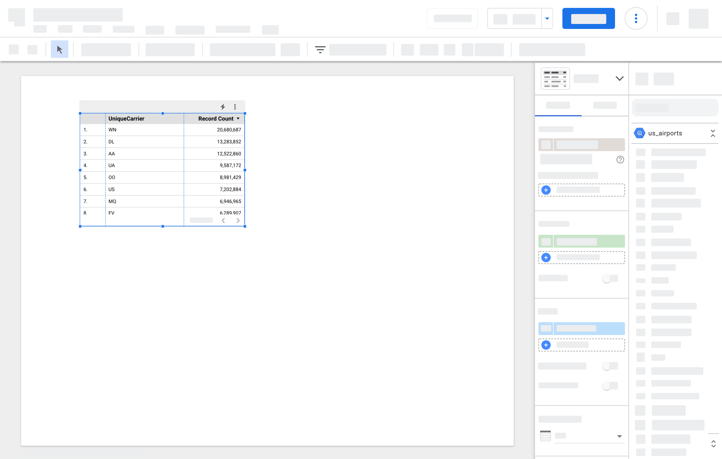
The Add data panel closes and a table appears on the editor canvas, with the airline carrier field and the record count for each unique carrier.
Visualize
Aqsa adds more fields to the table by dragging them from the properties panel to the table. She adds an Arrival Delay metric, which contains the number of minutes each flight was delayed past its scheduled arrival time.
Aqsa knows that tables are great for seeing the details in data, but she wants to get a higher level overview, so she adds a horizontal bar chart and a pie chart to the report. Now she can immediately see which airlines had the most delays of their arriving flights and their relationship to the other airlines' performances.
Transform
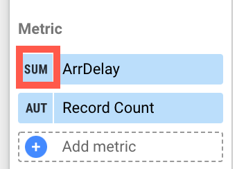 Aqsa notices that the arrival delay field is summing the data but it should instead be averaging it. She could fix this by changing the aggregation for the field as it appears in each chart, but it's more efficient to edit the data source.
When you want to modify a field that appears in a report, you have the following options:
Modify the field In a chart. When you do this, you're just changing that specific instance of the field. The change only applies to the field in that chart. Other charts that use the field will have the field's default configuration, as set in the data source.
Modify the field In the data source. When you do this, the change will appear the next time you use that field. For example, new charts you create will use the changed field, as will existing chart to which you add another instance of the field. Components that used the field before you made the change won't be affected.
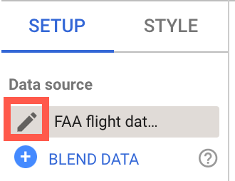
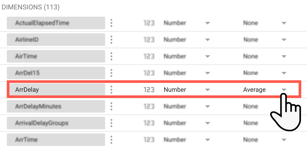
To edit the data source, at the top of the properties panel, Aqsa clicks the pencil next to the data source name. She locates the ArrDelay field and changes its Default aggregation to Average. Aqsa clicks DONE to save her change and return to the report editor.
Now when anyone with access to edit the report uses this field, it will have the desired aggregation by default.
Share and collaborate
 Aqsa asks her colleague Lauren to help apply their design skills to the report. Aqsa shares the report with Lauren's email address, giving them Can edit permission. Lauren sets to work, adding text and images, and crafting the report appearance to match their company's style guidelines. Lauren suggests they add a page that provides more context by embedding the current marketing plan, which is stored as a Google Doc. Together, Aqsa and Lauren create an attractive, compelling report that highlights the insights they've found in the flight data.
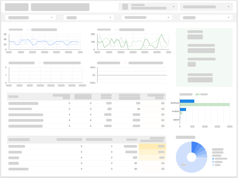
When the report is finished, Asqa shares it with the senior management team's group email address, giving them Can view permission. Because the data source has Owner's data credentials, the management team can see the data in the report, even if they don't have direct access to the underlying BigQuery dataset.
Update and refine

The company CEO loves the report, and asks Aqsa if she can add their marketing analytics data to get even deeper insights. Aqsa edits the report and adds data sources for their Google Ads and Google Analytics accounts. She uses community connectors to access data from Facebook and other social media channels as well. Aqsa uses some of Looker Studio's more advanced features, such as data blending and calculated fields, to reveal opportunities and challenges she'd never have discovered without being able to see all the available data in one place.
