Boxplot charts help you visualize the distribution and spread of values in your dataset. Boxplot charts can be especially useful for comparing values across categories.
Boxplot charts in Looker Studio
Boxplot charts display the distribution of your data, including the upper and lower bounds that exclude outliers, the median, and the first and third quartile marks. Boxplot charts can be used to display statistical variations in a dataset, and help you identify outliers. To create a boxplot chart, you need your data to be separated into quartiles, or quarters.
The box portion of the chart represents the values between the first and third quartiles, where 50% of your data is contained. The "whisker" portions of the chart, which are the lines that extend vertically from the top and bottom of the box and end at the maximum and minimum values in your data, represent the remaining 50% of values. A horizontal line through the box represents the median value.
Boxplot chart example
The following boxplot chart displays yearly trends in the number of mobile subscription users for the years 2005 through 2014.
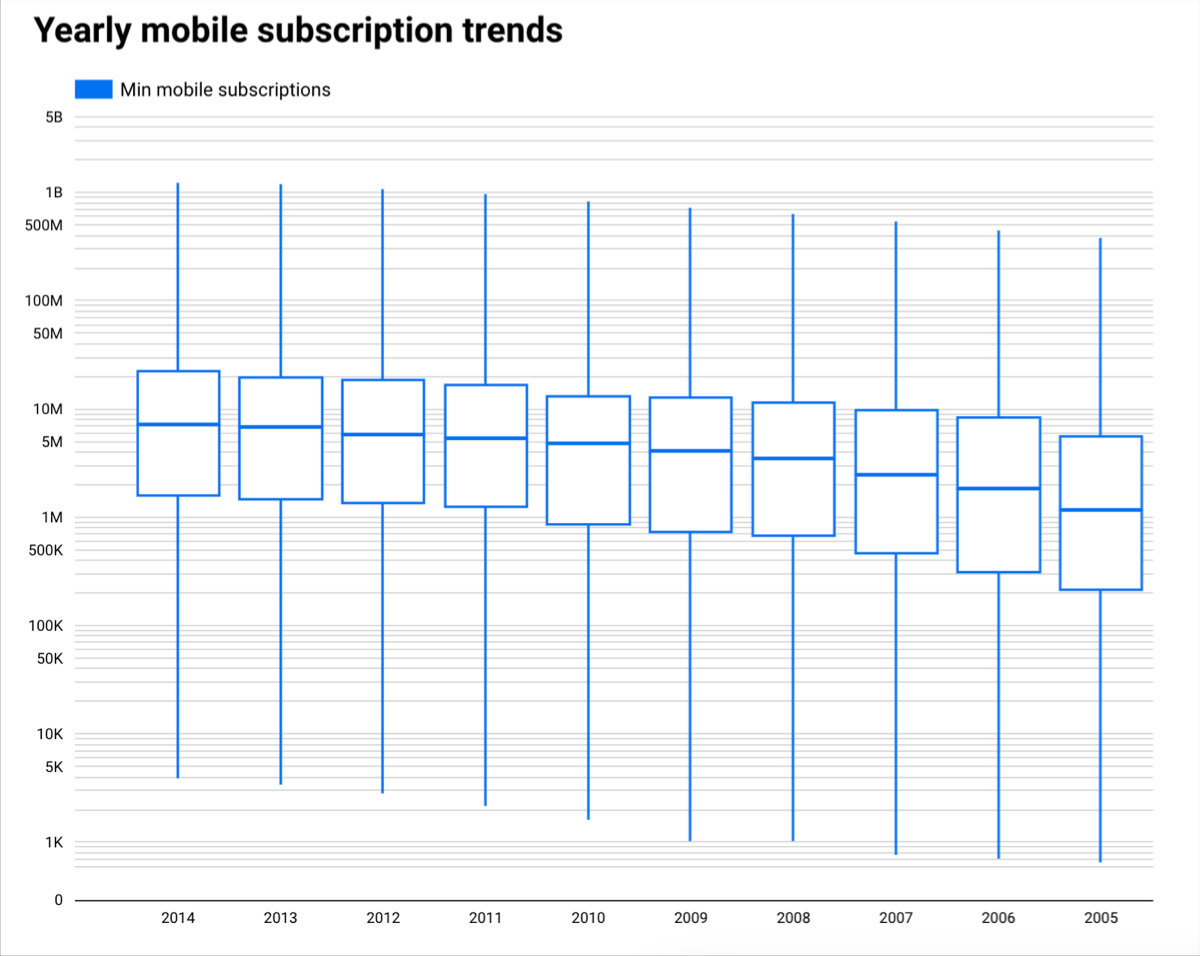
You can put your cursor over the elements in a boxplot chart to access a tooltip that displays more details about the data.
Requirements
Boxplot charts require five metrics:
- A minimum value — This value is represented as the lowest tip of the bottom whisker.
- A 25th percentile value — This value is represented as the bottom of the box.
- A median value — This value is represented as the horizontal line inside the box.
- A 75th percentile value — This value is represented as the top of the box.
- A maximum value — This value is represented as the highest tip of the top whisker.
If your data is not already naturally divided into quartiles, or quarters, you can create calculated fields that use the MIN, MAX, MEDIAN, and PERCENTILE functions. See the Function list page for more information regarding how to use these functions in an expression.
Add the chart
Add a new chart or select an existing chart. Then, use the Properties panel to configure the chart's Setup tab and Style tab properties to set up the chart data and style the chart, respectively.
Set up the chart data
The options in the Setup tab of the Properties panel determine how the chart's data is organized and displayed.
Data source
A data source provides the connection between the component and the underlying dataset.
- To change the chart's data source, click the current data source name.
- To view or edit the data source, click the
 Edit data source icon. (You must have at least Viewer permission to see this icon.)
 - Click Blend data to see data from multiple data sources in the same chart. Learn more about data blending.
Dimension
Dimensions are data categories. Dimension values (the data that is contained by the dimension) are names, descriptions, or other characteristics of a category.
At least one dimension is required. The first dimension you specify serves as the primary data series in the chart. If you specify a breakdown dimension, the chart is limited to a single metric.
Drill down
This option appears on charts that support it.
Drilling down gives viewers a way to reveal additional levels of detail within a chart. When you turn on the Drill down switch, each dimension that you add becomes another level of detail that you can drill into. Learn more about chart drill down.
Metric
Metrics measure the things that are contained in dimensions and provide the numeric scale and data series for the chart.
Metrics are aggregations that come from the underlying dataset or that are the result of implicitly or explicitly applying an aggregation function, such as COUNT(), SUM(), or AVG(). The metric itself has no defined set of values, so you can't group by a metric as you can with a dimension.
Five metrics are required for a boxplot chart. See the Requirements section on this page for more details.
Metric sliders
Turn on the Metric sliders switch to add a metric slider to your chart.
Filter
Filters restrict the data that is displayed in the component by including or excluding the values that you specify. Learn more about the filter property.
Filter options include the following:
- Filter name: Click an existing filter to edit it. Mouse over the filter name and click X to delete it.
- Add filter: Click this option to create a new filter for the chart.
Date range dimension
This option appears if your data source has a valid date dimension.
The date range dimension is used as the basis for limiting the date range of the chart. For example, this is the dimension that is used if you set a date range property for the chart or if a viewer of the report uses a date range control to limit the timeframe.
Default date range filter
The default date range filter lets you set a timeframe for an individual chart.
Default date range filter options include the following:
- Auto: Uses the default date range, which is determined by the chart's data source.
- Custom: Lets you use the calendar widget to select a custom date range for the chart.
Sort
Select a field that will sort your boxplot chart results. The default sort order will be by the first dimension unless otherwise specified.
Select either the Ascending or the Descending option.
Chart interactions
When the Cross-filtering option is enabled on a chart, that chart acts like a filter control. You can filter the report by clicking or brushing your mouse across the chart. Learn more about cross-filtering.
The Change sorting option lets report viewers change how a chart is sorted.
The Zoom option lets you zoom into a chart and pan on that chart to view all the data that is present. Learn more about zooming and panning on Cartesian charts.
Style the chart
The options in the Style tab control the overall presentation and appearance of the chart.
Chart title
Turn on the Show title switch to add a title to your chart. Looker Studio can automatically generate a title, or you can create a custom title for the chart. You can also customize the title's styling and placement.
Autogenerate
This option is enabled by default. When Autogenerate is enabled, Looker Studio generates a title that is based on the chart type and the fields that are used in the chart. The autogenerated title will be updated if you change the chart type or make changes to the fields that are used in the chart.
To add a custom title to your chart, enter it into the Title field. This will turn off the Autogenerate setting.
Title options
When the Show title setting is enabled, you can use the following title options:
- Title: Provides a text field where report editors can enter a custom title for the chart.
- Font family: Sets the font type for the title text.
- Font size: Sets the font size for the title text.
- Font color: Sets the font color for the title text.
- Font styling options: Applies bold, italic, or underline styling to the title text.
- Top: Positions the chart title at the top of the chart.
- Bottom: Positions the chart title at the bottom of the chart.
- Left: Aligns the chart title to the left side of the chart.
- Center: Centers the chart title horizontally.
- Right: Aligns the chart title to the right side of the chart.
Series
This section repeats for each metric that is displayed in the chart. The order of sections matches the order of the metrics that are listed in the Setup tab.
These settings control the appearance of the boxes:
- Line color: Sets an outline color for the box portion and whiskers of the chart.
- Fill color: Sets a fill color for the box portion of the chart.
Reference lines
Add a reference line or a reference band to your chart by selecting the Add a reference line or Add a reference band option, respectively.
For more information about reference lines and reference bands, visit the Add reference lines and reference bands to charts page. Reference lines are not available for 100% stacked area charts.
Number of points
This option lets you limit the number of data points displayed on the boxplot chart. Input a number into the field to limit the number of data points displayed.
For example, if you input the number 3, only three boxes will appear on a chart.
Zoom
When you enable the Zoom option for a chart on the Setup tab of the Properties panel, you can select one of the following options:
- Click and drag to zoom: Zoom by clicking and dragging to select a portion of the visualization to magnify.
- Scroll to zoom: Zoom by scrolling with your mouse.
Optionally, turn on the Pan/Zoom X-axis only switch to allow zooming and panning only along the X-axis.
Axes
These options control the display of the chart axes titles and scales:
- Show axes: Shows or hides the chart axes.
- Axis color: Sets the color of the axes.
- Axis text color: Sets the text color for the axis text.
- Font family: Sets the font type for the axis text.
- Axis font size: Sets the font size for the axis text.
- Reverse Y-axis direction: Controls the vertical display of the Y-axis.
- Reverse X-axis direction: Controls the horizontal display of the X-axis.
- Align both axes to 0: Makes both left and right axes start at 0. Available for Cartesian line, bar, and combo charts that have left and right Y-axes.
Left Y-Axis
These options appear when you enable Show axes in the Axes section. A Right Y-Axis section with the same options appears when you have more than one metric in your chart.
These options control the display of the Y-axis:
- Show axis title: Shows or hides the axis title.
- Show axis labels: Shows or hides the axis labels.
- Rotation (0° to 90°): Sets the rotation of the axis labels for ease of readability. This option appears when you enable Show axis labels.
- Show axis line: Shows or hides the axis line.
- Axis min: Sets the minimum value for the axis.
- Axis max: Sets the maximum value for the axis.
- Custom tick interval: Controls the interval between axis ticks.
- Log scale: Makes the axis scale logarithmic.
X-Axis
These options control the display of the chart's X-axis. These options appear when you enable Show axes in the Axes section:
- Show axis title: Shows or hides the axis title.
- Show axis labels: Shows or hides the axis labels.
- Rotation (0° to 90°): Sets the rotation of the axis labels for ease of readability. This option appears when you enable Show axis labels.
- Show axis line: Shows or hides the axis line.
Grid
These options control the look of the chart grid:
- Grid background: Sets the color of the chart background.
- Grid border color: Sets the color of the inner chart border.
- Show X-axis grid lines: Displays the X-axis grid line.
- Grid line style: Sets the line style of the X-axis grid. This option is only available when Show X-axis grid lines is enabled.
- Grid line color: Sets the color of the X-axis grid line. This option is only available when Show X-axis grid lines is enabled.
- Show Y-axis grid lines: Displays the Y-axis grid line.
- Grid line style: Sets the line style of the Y-axis grid. This option is only available when Show Y-axis grid lines is enabled.
- Grid line color: Sets the color of the Y-axis grid line. This option is only available when Show Y-axis grid lines is enabled.
Legend
These options determine the placement and appearance of the chart legend:
- Display legend: When enabled, displays the chart legend.
- Position: Sets the position of the legend.
- Alignment: Sets the alignment of the legend relative to the selected position.
Align legend with grid: Sets the alignment of the legend with the position of the grid, instead of aligning with the title.
Max lines: Sets the number of lines that are used by the legend. If the number of series requires more lines, overflow items can be displayed by clicking the < and > arrows.
Font family: Sets the font type of the legend font.
Font size: Sets the size of the legend font.
Font color: Sets the color of the legend font.
Background and border
These options control the appearance of the chart background container:
- Background: Sets the chart background color.
- Opacity: Sets the chart opacity. 100% opacity completely hides objects behind the chart. 0% opacity makes the chart invisible.
- Border color: Sets the chart border color.
- Border radius: Adds rounded borders to the chart background. When the radius is 0, the background shape has 90° corners. A border radius of 100° produces a circular shape.
- Border weight: Sets the chart border line thickness.
- Border style: Sets the chart border line style.
- Add border shadow: Adds a shadow to the chart's lower and right borders.
Chart header
The chart header lets viewers perform various actions on the chart, such as exporting the data, drilling up or down, or sorting the chart. Chart header options include the following:
- Chart header: Controls where the chart header appears on the chart. The Chart header options include the following:
- Do not show: The header options never appear. Note that report viewers can always access the options by right-clicking the chart.
- Always show: The header options always appear.
- Show on hover (default): Three vertical dots appear when you hold the pointer over the chart header. Click these to access the header options.
- Header font color: Sets the color of the chart header options.
Reset to report theme
Click Reset to report theme to reset the chart settings to the report theme settings.