Line charts are useful when you want to see how your data changes or fluctuates over time, or in comparison with another dimension. Line charts can display your data series as a line chart, a bar chart, or a combo chart, which contains both lines and bars.
Line charts can plot a single dimension with up to five metrics or two dimensions with a single metric.
Line charts in Looker Studio
Line charts and time series are similar in appearance but differ from each other in the following ways:
- You can use any type of dimension as the X-axis in a line chart. Time series only allow a
DateorDate & Timedimension as the X-axis. - Line charts based on
DateorDate & Timedimensions will display gaps in the X-axis if those fields are missing data for the selected date range. By comparison, time series provide a continuous X-axis of dates and give you options on how to handle missing data. - You can limit the number of data points that are displayed by the line chart. Time series show all the data for the specified date range.
- Line charts don't display trendlines. Time series do.
Line chart examples
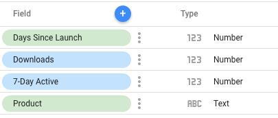
You are launching a series of mobile apps and want to visualize the Downloads and 7-Day Active metrics for the different product versions. Your data might look something like the following table:
| Product | Days Since Launch | Downloads | 7-Day Active |
|---|---|---|---|
| MyApp 2.0 | 1 | 1000 | 0 |
| MyApp 2.0 | 2 | 1330 | 0 |
| MyApp 2.0 | 3 | 1800 | 0 |
| MyApp 2.0 | 4 | 3600 | 0 |
| MyApp 2.0 | 5 | 3501 | 0 |
| MyApp 2.0 | 6 | 3700 | 898 |
| MyApp 2.0 | 7 | 3333 | 1194 |
| MyApp 2.1 | 8 | 3000 | 1381 |
| MyApp 2.1 | 9 | 3200 | 1515 |
The following illustration shows a data source that is based on this data:
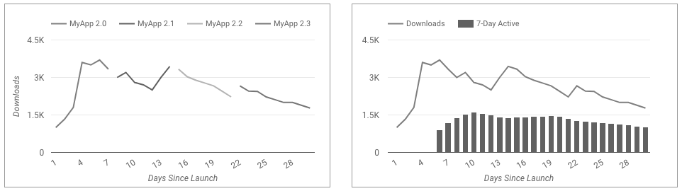
The following line charts show two ways you could visualize this data. Both charts use Days Since Launch as the primary X-axis dimension. The first chart shows the Downloads metric broken down by the Product dimension. The second chart shows both the Downloads and the 7-Day Active metrics. The second chart variation could plot up to five metrics.
Add the chart
Add a new chart or select an existing chart. Then, use the Properties panel to configure the chart's Setup tab and Style tab properties to set up the chart data and style the chart, respectively.
Set up the chart data
The options in the Setup tab of the Properties panel determine how the chart's data is organized and displayed.
Data source
A data source provides the connection between the component and the underlying dataset.
- To change the chart's data source, click the current data source name.
- To view or edit the data source, click the
 Edit data source icon. (You must have at least Viewer permission to see this icon.)
 - Click Blend data to see data from multiple data sources in the same chart. Learn more about data blending.
Dimension
Dimensions are data categories. Dimension values (the data that is contained by the dimension) are names, descriptions, or other characteristics of a category.
At least one dimension is required. The first dimension that you specify serves as the primary data series in the chart. If you specify a breakdown dimension, the chart is limited to a single metric.
Drill down
This option appears on charts that support it.
Drilling down gives viewers a way to reveal additional levels of detail within a chart. When you turn on the Drill down switch, each dimension that you add becomes another level of detail that you can drill into. Learn more about chart drill down.
Breakdown dimension
This option displays the metric data broken down according to the selected dimension. For example, a chart that shows annual sales data could be broken down by a Sales Region dimension to show sales by region or by an Employee ID dimension to show sales by sales associate.
Metric
Metrics measure the things that are contained in dimensions and provide the numeric scale and data series for the chart.
Metrics are aggregations that come from the underlying dataset or that are the result of implicitly or explicitly applying an aggregation function, such as COUNT(), SUM(), or AVG(). The metric itself has no defined set of values, so you can't group by a metric as you can with a dimension.
At least one metric is required. For charts with a single dimension, you can have up to 20 metrics. For charts with two dimensions, you can have one metric.
Optional metrics
You can add optional metrics by turning on the Optional metrics switch and selecting metrics from the Add metric field selector. You can also click metrics from the fields list on the Data panel and place them in the Optional metrics selector.
Metric sliders
Turn on the Metric sliders switch to add a metric slider to your chart.
Filter
Filters restrict the data that is displayed in the component by including or excluding the values that you specify. Learn more about the filter property.
Filter options include the following:
- Filter name: Click an existing filter to edit it. Mouse over the filter name and click X to delete it.
- Add filter: Click this option to create a new filter for the chart.
Date range dimension
This option appears if your data source has a valid date dimension.
The date range dimension is used as the basis for limiting the date range of the chart. For example, this is the dimension that is used if you set a date range property for the chart or if a viewer of the report uses a date range control to limit the timeframe.
Default date range filter
The default date range filter lets you set a timeframe for an individual chart.
Default date range filter options include the following:
- Auto: Uses the default date range, which is determined by the chart's data source.
- Custom: Lets you use the calendar widget to select a custom date range for the chart.
- Comparison date range: Displays comparison data for the selected time period.
Learn more about working with dates and time.
Sort
The Sort and Secondary sort options in the chart's setup panel control the default sorting behavior. You can select any metric in the chart's data source, or any dimension that is displayed in the chart, to use as the primary or secondary sorting field.
Chart interactions
When the Cross-filtering option is enabled on a chart, that chart acts like a filter control. You can filter the report by clicking or brushing your mouse across the chart. Learn more about cross-filtering.
The Change sorting option lets report viewers change how a chart is sorted.
The Zoom option lets you zoom into a chart and pan on that chart to view all the data that is present. Learn more about zooming and panning on Cartesian charts.
Style the chart
The options in the Style tab control the overall presentation and appearance of the chart.
Chart title
Turn on the Show title switch to add a title to your chart. Looker Studio can automatically generate a title, or you can create a custom title for the chart. You can also customize the title's styling and placement.
Autogenerate
This option is enabled by default. When Autogenerate is enabled, Looker Studio generates a title that is based on the chart type and the fields that are used in the chart. The autogenerated title will be updated if you change the chart type or make changes to the fields that are used in the chart.
To add a custom title to your chart, enter it into the Title field. This will turn off the Autogenerate setting.
Title options
When the Show title setting is enabled, you can use the following title options:
- Title: Provides a text field where report editors can enter a custom title for the chart.
- Font family: Sets the font type for the title text.
- Font size: Sets the font size for the title text.
- Font color: Sets the font color for the title text.
- Font styling options: Applies bold, italic, or underline styling to the title text.
- Top: Positions the chart title at the top of the chart.
- Bottom: Positions the chart title at the bottom of the chart.
- Left: Aligns the chart title to the left side of the chart.
- Center: Centers the chart title horizontally.
- Right: Aligns the chart title to the right side of the chart.
Color by
These options appear when you have a secondary (breakdown) dimension in your line chart:
- Series order: Use the current theme to color the data according to its position in the chart. This option emphasizes the ranking of the data over the identity of the data. You can set specific colors by using each data series' color picker.
- Dimension values: This option colors each dimension value in the chart with the color that is specified in the dimension value color map. This option ensures that your data uses color consistently, regardless of the position of that data in the chart.
- Bar border color: This option lets you change the outline color for the bars, when one or more series in a line chart is set to Bars. You can also specify a bar border color for all the bar charts in your report from the Layout tab of the Themes menu.
Learn more about coloring your data.
Bar border color
This option appears for combo charts.
This option lets you change the outline color for the bars in a combo chart. You can also specify a bar border color for all the bar charts in your report from the Layout tab of the Themes menu.
Series
This section repeats for each metric that is displayed in the chart. The order of sections matches the order of the metrics that are listed in the Setup tab.
These options control the appearance of each series:
- Series type: Displays the data points for this series in Line or Bars.
- Line color: Determines the color of the series line. This option appears when you select Line.
- Line weight: Determines the thickness of the series line. This option appears when you select Line.
- Line style: Determines the style and appearance of the series line. This option appears when you select Line.
- Gradient: Highlights the series line with a color gradient shadow. This option appears when you select Line.
- Cumulative: When this option is selected, data for this series is summed over time. Otherwise, the data is shown with no additional aggregation.
- Show points: Displays individual data points on a line series. Viewers can put their cursor over a data point to display its value. This option appears when you select Line.
- Stepped lines: Displays a line with a series of steps between data points instead of a smooth line that connects the data points. This option appears when you select Line.
- Show data labels: Displays individual values on the data points in the series. Enabling this option also reveals the Data label section, where you can control the presentation of the labels on the chart.
Data label
If you enable the Show data labels setting in the Series section, you can configure the following options.
- Compact numbers: Rounds numbers and displays the unit indicator. For example, 553,939 becomes 553.9K.
- Decimal precision: Sets the number of decimal places in metric values.
- Font family: Sets the font type of the label text.
- Font color: Sets the font color for the label text.
- Font size: Sets the font size for the label text.
- Font styling options: Applies bold or italic styling to the label text.
- Background color: Sets a background color for the label text.
- Labels opacity: For labels with a custom background color, this setting adjusts the opacity of the background for the label text. 100% opacity makes the background solid, and 0% opacity makes the background fully transparent.
- Labels border radius: For labels with a custom background color, this setting adds rounded borders to the chart background. Choose a value from 0px (90° corners) to 20px (maximum rounding).
General
- Smooth: Display series lines as curves. This option appears for line charts, or when at least one series in a combo chart is a Line.
- Stacked Bars: Display bars as stacked bars. This option appears when at least one series in a combo is set to Bars.
- Axis: Determines the axis for the series. This option only appears on combo charts.
Data label
This section controls the presentation of data labels for bars. This option appears when at least one series in a combo or a line chart is set to Bars.
Turn on Show data labels for a series to see these options:
- Bar label type: This option is available only for stacked bars. The Bar label type drop-down menu includes the following options:
- Metric value (default): Shows a metric value for each segment of the bar.
- Stacked: Shows the total stack value for each bar, along with the running SUM from the values for each segment of the bar.
- Bar label position: Sets the position of labels relative to the bar or column.
Chart spacing
This option lets you customize the spacing between bars in a chart.
For stacked bar charts, use the Group bar width slider to specify a custom bar width for between 0% and 100%.
For unstacked multiple bar charts, use the Bar width slider to specify a custom width for each individual bar, and use the Group bar with slider to specify a custom bar width for each group of bars.
Reference lines
Add a reference line or a reference band to your chart by selecting the Add a reference line or Add a reference band option, respectively.
For more information about reference lines and reference bands, visit the Add reference lines and reference bands to charts page. Reference lines are not available for 100% stacked area charts.
Number of points
This option appears for line charts.
This option lets you limit the number of data points that are displayed on a line chart. Enter a number into the text field to limit the number of data points that will be displayed.
For example, if you enter the number 3, only three boxes will appear on a chart.
Number of series
This option appears for line charts.
This setting is available when you have set a value for Breakdown Dimension. The Number of Series setting lets you limit the number of breakdown dimension series that are displayed on the chart. Select a number of series to display from the drop-down menu. The series that are displayed are based on the Secondary sort specifications.
Group others
Turn on the Group others switch to aggregate the results that are outside of the specified Number of series limit into a series that will have the label Others. When enabled, Group others lets you compare other series against the context of the remaining results.
Zoom
When you enable the Zoom chart interaction option on the Setup tab of the Properties panel, you can select one of the following options:
- Click and drag to zoom: Zoom by clicking and dragging to select a portion of the visualization to magnify.
- Scroll to zoom: Zoom by scrolling with your mouse.
Axes
These options control the display of the chart axes titles and scales. A right Y-axis section appears when you have more than one metric in your chart.
These options control the display of the chart axes titles and scales:
- Show axes: Shows or hides the chart axes.
- Axis color: Sets the color of the axes.
- Axis text color: Sets the text color for the axis text.
- Font family: Sets the font type for the axis text.
- Axis font size: Sets the font size for the axis text.
- Reverse Y-axis direction: Controls the vertical display of the Y-axis.
- Reverse X-axis direction: Controls the horizontal display of the X-axis.
- Align both axes to 0: Makes both left and right axes start at 0. Available for Cartesian line, bar, and combo charts that have left and right Y-axes.
Left Y-Axis
These options appear when you enable Show axes in the Axes section. A Right Y-Axis section with the same options appears when you have more than one metric in your chart.
These options control the display of the Y-axis:
- Show axis title: Shows or hides the axis title.
- Show axis labels: Shows or hides the axis labels.
- Rotation (0° to 90°): Sets the rotation of the axis labels for ease of readability. This option appears when you enable Show axis labels.
- Show axis line: Shows or hides the axis line.
- Axis min: Sets the minimum value for the axis.
- Axis max: Sets the maximum value for the axis.
- Custom tick interval: Controls the interval between axis ticks.
- Log scale: Makes the axis scale logarithmic.
X-Axis
These options control the display of the chart's X-axis. These options appear when you enable Show axes in the Axes section:
- Show axis title: Shows or hides the axis title.
- Show axis labels: Shows or hides the axis labels.
- Rotation (0° to 90°): Sets the rotation of the axis labels for ease of readability. This option appears when you enable Show axis labels.
- Show axis line: Shows or hides the axis line.
Grid
These options control the look of the chart grid:
- Grid background: Sets the color of the chart background.
- Grid border color: Sets the color of the inner chart border.
- Show X-axis grid lines: Displays the X-axis grid line.
- Grid line style: Sets the line style of the X-axis grid. This option is only available when Show X-axis grid lines is enabled.
- Grid line color: Sets the color of the X-axis grid line. This option is only available when Show X-axis grid lines is enabled.
- Show Y-axis grid lines: Displays the Y-axis grid line.
- Grid line style: Sets the line style of the Y-axis grid. This option is only available when Show Y-axis grid lines is enabled.
- Grid line color: Sets the color of the Y-axis grid line. This option is only available when Show Y-axis grid lines is enabled.
Legend
These options determine the placement and appearance of the chart legend:
- Display legend: When enabled, displays the chart legend.
- Position: Sets the position of the legend.
- Alignment: Sets the alignment of the legend relative to the selected position.
Align legend with grid: Sets the alignment of the legend with the position of the grid, instead of aligning with the title.
Max lines: Sets the number of lines that are used by the legend. If the number of series requires more lines, overflow items can be displayed by clicking the < and > arrows.
Font family: Sets the font type of the legend font.
Font size: Sets the size of the legend font.
Font color: Sets the color of the legend font.
Background and border
These options control the appearance of the chart background container:
- Background: Sets the chart background color.
- Opacity: Sets the chart opacity. 100% opacity completely hides objects behind the chart. 0% opacity makes the chart invisible.
- Border color: Sets the chart border color.
- Border radius: Adds rounded borders to the chart background. When the radius is 0, the background shape has 90° corners. A border radius of 100° produces a circular shape.
- Border weight: Sets the chart border line thickness.
- Border style: Sets the chart border line style.
- Add border shadow: Adds a shadow to the chart's lower and right borders.
Chart header
The chart header lets viewers perform various actions on the chart, such as exporting the data, drilling up or down, or sorting the chart. Chart header options include the following:
- Chart header: Controls where the chart header appears on the chart. The Chart header options include the following:
- Do not show: The header options never appear. Note that report viewers can always access the options by right-clicking the chart.
- Always show: The header options always appear.
- Show on hover (default): Three vertical dots appear when you hold the pointer over the chart header. Click these to access the header options.
- Header font color: Sets the color of the chart header options.
Reset to report theme
Click Reset to report theme to reset the chart settings to the report theme settings.