Pivot tables let you narrow down a large data set or analyze relationships between data points. Pivot tables reorganize your dimensions and metrics to help you quickly summarize your data and see relationships that might otherwise be hard to spot.
Pivot tables in Looker Studio
Pivot tables in Looker Studio take the rows in a standard table and pivot them so they become columns. This lets you group and summarize the data in ways a standard table can't provide.
Pivot table examples
The following is a standard table listing the Revenue Per User metric by Country, Quarter, and Year:
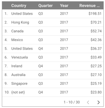
While this table is useful for showing which country received the most revenue per user and in which quarter, it isn't useful for summarizing this data in a meaningful way.
A pivot table, however, quickly shows the relationship of this data.
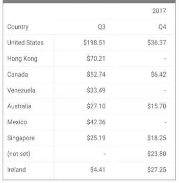
Pivot tables also let you spot outliers or anomalies in your data. In the previous example, a pivot table displays that several countries had no revenue in Q4.
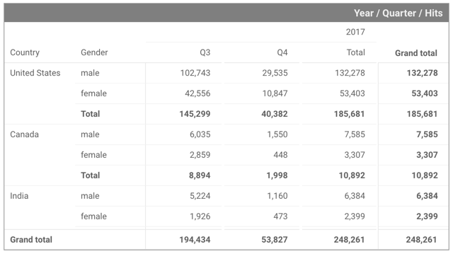
Show totals
Pivot tables support totals and subtotals for both rows and columns:
Expand-collapse
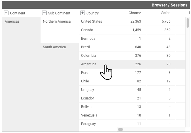
Pivot tables in Looker Studio support adding multiple row and column dimensions. Expand-collapse lets report viewers show or hide different levels of information in the pivot table by clicking the plus sign + and minus sign – icons in the column header.
Viewers can then explore the data at the level of detail that interests them most. Expand-collapse also provides a way for a single pivot table to show both summary and detailed information, reducing the number of charts needed in your reports.
Limits of pivot tables
The following limitations apply when using pivot tables:
- Pivot tables can render up to 500,000 cells of data. However, depending on the dataset and dimensions and metrics involved in the table, performance may degrade. You can apply a filter to the pivot table to reduce the amount of data being rendered.
- You may have up to 5 pivot tables per page in a report.
- The number of row dimensions available depends on the type of data that you're connecting to:
- Fixed-schema data sources, such as Google Ads and Google Analytics, can have up to 5 row dimensions.
- Flexible-schema data sources, such as Google Sheets and BigQuery, can have up to 10 row dimensions.
- Pivot tables can have up to 2 column dimensions.
- Pivot tables can have up to 20 metrics.
- Pivot tables don't paginate as standard tables do.
- You can't apply metric filters to pivot tables; doing so displays an error message.
Add the chart
Add a new chart or select an existing chart. Then, use the Properties panel to configure the chart's Setup tab and Style tab properties to set up the chart data and style the chart, respectively.
Set up the chart data
The options in the Setup tab of the Properties panel determine how the chart's data is organized and displayed.
Data source
A data source provides the connection between the component and the underlying dataset.
- To change the chart's data source, click the current data source name.
- To view or edit the data source, click the
 Edit data source icon. (You must have at least Viewer permission to see this icon.)
 - Click Blend data to see data from multiple data sources in the same chart. Learn more about data blending.
Row dimension
Dimensions are data categories. Dimension values (the data that is contained by the dimension) are names, descriptions, or other characteristics of a category.
The row dimensions provide the breakdown of rows in the pivot table. Reorder the dimensions listed to change the order of the rows in your table.
Expand-collapse
Turn on Expand-collapse to treat the row dimensions as an expandable hierarchy.
Default expand level
Set the level of detail to show by default. For example, in a geographic hierarchy consisting of Continent > Sub Continent > Country, setting the default expand level to Country would show Continent and Sub Continent details. This option appears when you turn on Expand-collapse.
Column dimension
The column dimensions provide the breakdown of columns in the pivot table. Reorder the dimensions listed to change the order of the columns in your table.
Metric
Metrics measure the things that are contained in dimensions and provide the numeric scale and data series for the chart.
Metrics are aggregations that come from the underlying dataset or that are the result of implicitly or explicitly applying an aggregation function, such as COUNT(), SUM(), or AVG(). The metric itself has no defined set of values, so you can't group by a metric as you can with a dimension.
Optional metrics
You can add optional metrics by turning on the Optional metrics switch and selecting metrics from the Add metric field selector. You can also click metrics from the fields list on the Data panel and place them in the Optional metrics selector.
Filter
Filters restrict the data that is displayed in the component by including or excluding the values that you specify. Learn more about the filter property.
Filter options include the following:
- Filter name: Click an existing filter to edit it. Mouse over the filter name and click X to delete it.
- Add filter: Click this option to create a new filter for the chart.
Date range dimension
This option appears if your data source has a valid date dimension.
The date range dimension is used as the basis for limiting the date range of the chart. For example, this is the dimension that is used if you set a date range property for the chart or if a viewer of the report uses a date range control to limit the timeframe.
Default date range filter
The default date range filter lets you set a timeframe for an individual chart.
Default date range filter options include the following:
- Auto: Uses the default date range, which is determined by the chart's data source.
- Custom: Lets you use the calendar widget to select a custom date range for the chart.
Learn more about working with dates and time.
Totals
Display totals for each row and column by clicking the switches in the Rows and Columns sections. If you have only one dimension in a row or column, the option is to display a grand total. If you have two or more dimensions, the options include subtotals and grand totals.
Sorting
The sorting options let you control the order of the data displayed in the pivot table.
Number of rows and number of columns
You can specify a number in the Number of rows field and within the Number of columns field for each row and column series to limit the number of rows and columns in the pivot table.
Group others
When a column or row limit is set in the Number of rows field or the Number of columns field for the first row dimension or the first column dimension, the Group others switch will become available.
Turn on the Group others switch for Row #1, Column #1, or both, to aggregate the results that are outside of the specified row or column limit into a row or into a column that will have the label Others. When enabled, this setting lets you compare other series against the context of the remaining results.
Chart interactions
When the Cross-filtering option is enabled on a chart, that chart acts like a filter control. You can filter the report by clicking or brushing your mouse across the chart. Learn more about cross-filtering.
When the Open links in new tab option is enabled on a chart, hyperlinks that are included in the data will open in a new tab. When the Open links in new tab option is not enabled, hyperlinks that are included in the data will open in the same tab.
Style the chart
The options in the Style tab control the overall presentation and appearance of the chart.
Chart title
Turn on the Show title switch to add a title to your chart. Looker Studio can automatically generate a title, or you can create a custom title for the chart. You can also customize the title's styling and placement.
Autogenerate
This option is enabled by default. When Autogenerate is enabled, Looker Studio generates a title that is based on the chart type and the fields that are used in the chart. The autogenerated title will be updated if you change the chart type or make changes to the fields that are used in the chart.
To add a custom title to your chart, enter it into the Title field. This will turn off the Autogenerate setting.
Title options
When the Show title setting is enabled, you can use the following title options:
- Title: Provides a text field where report editors can enter a custom title for the chart.
- Font family: Sets the font type for the title text.
- Font size: Sets the font size for the title text.
- Font color: Sets the font color for the title text.
- Font styling options: Applies bold, italic, or underline styling to the title text.
- Top: Positions the chart title at the top of the chart.
- Bottom: Positions the chart title at the bottom of the chart.
- Left: Aligns the chart title to the left side of the chart.
- Center: Centers the chart title horizontally.
- Right: Aligns the chart title to the right side of the chart.
Conditional formatting
Click Add conditional formatting to apply conditional formatting rules to the chart. Learn more about conditional formatting in Looker Studio charts.
Table header
These options control the appearance of the table headers:
- Font family: Changes the font family of the table header.
- Font size: Changes the font size of the table header.
- Font color: Changes the font color of the table header.
Column header
Turn on the Wrap text switch to wrap the text for column headers.
This setting is disabled by default.
Row header
Turn on the Wrap text switch to wrap the text for row headers.
This setting is disabled by default.
You can adjust the column width to accommodate more text by clicking and dragging a column divider. To resize multiple columns at once, hold the Shift key while dragging a column divider.
Table colors
These options control the colors of the table borders and cells:
- Header background: Sets the color of the table header background.
- Cell border color: Sets the color of the border between rows.
- Highlight color: Sets the color of the highlight bars.
- Odd row color: Sets the color of odd-numbered rows in the table.
- Even row color: Sets the color of the even-numbered rows in the table.
Table labels
These options control the appearance of the table data:
- Font family: Sets the font family of the data.
- Font size: Sets the font size of the data.
- Font color: Sets the font color of the data.
- Heatmap text contrast: Sets the font color automatically when a metric is displayed as a heatmap. Choose from four levels of contrast: None, Low, Medium, or High.
Totals labels
If you have enabled row or column totals, additional Totals labels options will appear. Totals labels options include the following:
- Subtotal label: Sets the label for the subtotal.
- Grand total label: Sets the label for the grand total.
Missing data
When your pivot table is missing data, you can choose from the following options to indicate that there is no data:
- Show "No data": Displays the text "No data" on the gauge chart.
- Show "0": Displays the number "0" on the gauge chart.
- Show "-": Displays the text "-" on the gauge chart.
- Show "null": Displays the text "null" on the gauge chart.
- Show " " (blank): Displays no text on the gauge chart.
Metrics
These options control the appearance of the metrics:
Drop-down menu options:
- Number: Displays the metric value "as is."
Heatmap: Displays the metric value with a colored background, the intensity of which shows how that value compares to the other values in that column. You can set the color with the corresponding Metric color drop-down.
Use the Heatmap text contrast option in the Table labels section to set the font color automatically to provide better readability of your data labels. Choose from four levels of contrast: None, Low, Medium, or High.
Bar: displays the metric value as a horizontal bar. You can change the bar color with the Metric color drop-down and include the numeric value by clicking the Show number switch.
Compact numbers: Rounds numbers and displays the unit indicator. For example, 553,939 becomes 553.9K.
Decimal precision: Sets the number of decimal places in metric values.
Bar scaling: Sets the scale for the bar length. This setting appears when the column type is set to Bar.
Background and border
These options control the appearance of the chart background container:
- Background: Sets the chart background color.
- Opacity: Sets the chart opacity. 100% opacity completely hides objects behind the chart. 0% opacity makes the chart invisible.
- Border color: Sets the chart border color.
- Border radius: Adds rounded borders to the chart background. When the radius is 0, the background shape has 90° corners. A border radius of 100° produces a circular shape.
- Border weight: Sets the chart border line thickness.
- Border style: Sets the chart border line style.
- Add border shadow: Adds a shadow to the chart's lower and right borders.
Chart header
The chart header lets viewers perform various actions on the chart, such as exporting the data, drilling up or down, or sorting the chart. Chart header options include the following:
- Chart header: Controls where the chart header appears on the chart. The Chart header options include the following:
- Do not show: The header options never appear. Note that report viewers can always access the options by right-clicking the chart.
- Always show: The header options always appear.
- Show on hover (default): Three vertical dots appear when you hold the pointer over the chart header. Click these to access the header options.
- Header font color: Sets the color of the chart header options.
Reset to report theme
Click Reset to report theme to reset the chart settings to the report theme settings.