Scorecards display a summary of a single metric. Scorecards are commonly used to visualize key performance indicators or some other variable that measures the relative health or performance of your business or area of activity. For example, a scorecard can summarize total sales, average bounce rate, count of ad impressions, maximum hold time, minimum failure rate, etc.
Scorecards in Looker Studio
Scorecards in Looker Studio appear as numbers and, optionally, with the name of the metric that is being summarized. The format of the displayed number depends on how the metric is configured in your data source.
Example:
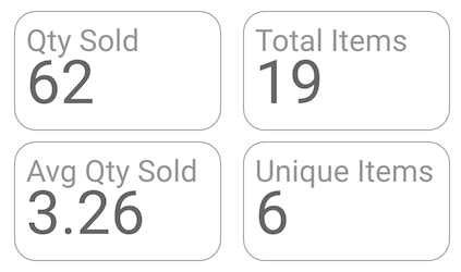
The data source for a fictional pet store contains the metrics Qty Sold, Avg Qty Sold, Total Items, and Unique Items. The Qty Sold metric is a number from the dataset. The Avg Qty Sold metric is a duplicate of the Qty Sold field, with the Average aggregation type. Total Items and Unique Items are calculated fields.
| Name | Calculation | Aggregation Type |
|---|---|---|
| Qty Sold | none | Sum |
| Avg Qty Sold | none | Average |
| Total Items | COUNT(Items) | Auto |
| Unique Items | COUNT_DISTINCT(Items) | Auto |
Scorecards for these metrics might look like this:
Other types of scorecards
In addition to the basic scorecard, you can also add a preset scorecard from the toolbar that displays compact numbers.
Add the chart
Add a new chart or select an existing chart. Then, use the Properties panel to configure the chart's Setup tab and Style tab properties to set up the chart data and style the chart, respectively.
Set up the chart data
The options in the Setup tab of the Properties panel determine how the chart's data is organized and displayed.
Data source
A data source provides the connection between the component and the underlying dataset.
- To change the chart's data source, click the current data source name.
- To view or edit the data source, click the
 Edit data source icon. (You must have at least Viewer permission to see this icon.)
 - Click Blend data to see data from multiple data sources in the same chart. Learn more about data blending.
Primary field
This option lets you choose whether to display a Dimension or a Metric value in your scorecard chart.
Dimensions are categories of information. The values contained in those categories are typically names, descriptions or other characteristics of that data. See the Dimension page for more information about dimensions.
Metrics are aggregations that come from the underlying dataset or that are the result of implicitly or explicitly applying an aggregation function, such as COUNT(), SUM(), or AVG(). The metric itself has no defined set of values, so you can't group by a metric as you can with a dimension.
After you click either the Dimension or the Metric option, you can choose a field from your data source.
Optional metrics
If you choose Metric as your primary field, you can set optional metrics.
You can add optional metrics by turning on the Optional metrics switch and selecting metrics from the Add metric field selector. You can also click metrics from the fields list on the Data panel and place them in the Optional metrics selector.
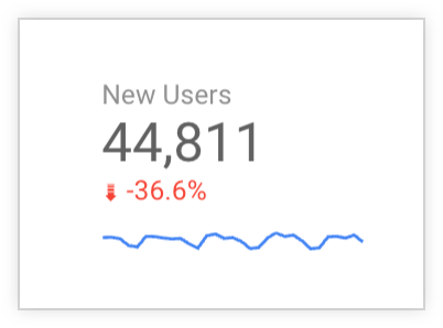
Sparkline
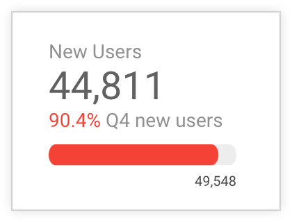
When Metric is selected as Primary field, you can add a sparkline to a scorecard chart to visualize your primary metric's trends over time. For example, in the following scorecard chart, a blue sparkline shows the trend over time for the primary metric, New Users. The sparkline is displayed after both the value for the primary metric and the percentage for the optional comparison metric:
To add a sparkline to a scorecard chart, follow these steps:
- In the Sparkline section of the Setup tab, click Add dimension.
- From the drop-down menu, select a date dimension.
- To customize the appearance of the sparkline, use the options in the Sparkline section of the Style tab of the Properties panel.
Filter
Filters restrict the data that is displayed in the component by including or excluding the values that you specify. Learn more about the filter property.
Filter options include the following:
- Filter name: Click an existing filter to edit it. Mouse over the filter name and click X to delete it.
- Add filter: Click this option to create a new filter for the chart.
Date range dimension
This option appears if your data source has a valid date dimension.
The date range dimension is used as the basis for limiting the date range of the chart. For example, this is the dimension that is used if you set a date range property for the chart or if a viewer of the report uses a date range control to limit the timeframe.
Default date range filter
The default date range filter lets you set a timeframe for an individual chart.
Default date range filter options include the following:
- Auto: Uses the default date range, which is determined by the chart's data source.
- Custom: Lets you use the calendar widget to select a custom date range for the chart.
Comparison date range: Displays comparison data for the selected time period.
Sort
This option appears when you set Dimension as your primary field. You can choose to sort the Primary field values in either Ascending or Descending order in the scorecard chart.
When Dimension is selected as Primary field, you can select a different field for sorting the dimension values. For example, if a user chooses to display the values for a dimension called Country name in the scorecard chart, they can choose a Total first clicks metric to display the Country name with the most or the least Total first clicks in the scorecard chart. This field is optional.
Other comparison options
When Metric is selected as Primary field, the Other comparison options property lets you specify a period of time, a specific metric, or a specific value against which to compare the primary metric for your scorecard chart.
You can configure the visual format of the comparison value in the Comparison fields section of the Style tab of the Properties panel.
Comparison type
In the Comparison type drop-down menu, set whether the primary metric will be compared against a period of time that you specify, a specific metric, or a specific value.
The comparison types include the following:
- Period: Specify a date range for comparison with the primary metric. This option is the default. When this option is selected, configure a time period for comparison against the primary metric by using the Comparison date range selector in the Default date range section of the Setup tab.
- Value: Enter a numerical value or use the upward or downward arrows to select a number to use for comparison with the primary metric. When you select this option, enter a numeric value against which to compare the primary metric's value in the Target value field.
- Metric: Select another metric to compare with the primary metric. When you select this option, specify another metric against which to compare the primary metric by selecting a field from the Add metric drop-down in the Target metric field.
- None: Select None to remove the comparison from the scorecard chart.
Show as progress
Turn on the Show as progress switch to treat the comparison data as a target against which to measure the percentage of progress of the primary metric.
When Show as progress is not enabled, the calculation is displayed as the percent change for the primary metric's value in relation to the comparison data. This setting is the default.
When Show as progress is enabled, the calculation is depicted as the percentage of change for the primary metric's value in relation to the comparison data. This is the default setting.
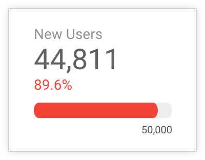
When Show as progress is enabled, progress is depicted with a progress bar by default. You can configure how progress will be presented in the Progress Visual section of the Style tab.
Starting value
When Metric is selected as Primary field, and the Show as progress setting is enabled, you can specify a custom numeric value as the starting value for comparison with the primary metric.
Style the chart
The options in the Style tab control the overall presentation and appearance of the chart.
Chart title
Turn on the Show title switch to add a title to your chart. Looker Studio can automatically generate a title, or you can create a custom title for the chart. You can also customize the title's styling and placement.
Autogenerate
This option is enabled by default. When Autogenerate is enabled, Looker Studio generates a title that is based on the chart type and the fields that are used in the chart. The autogenerated title will be updated if you change the chart type or make changes to the fields that are used in the chart.
To add a custom title to your chart, enter it into the Title field. This will turn off the Autogenerate setting.
Title options
When the Show title setting is enabled, you can use the following title options:
- Title: Provides a text field where report editors can enter a custom title for the chart.
- Font family: Sets the font type for the title text.
- Font size: Sets the font size for the title text.
- Font color: Sets the font color for the title text.
- Font styling options: Applies bold, italic, or underline styling to the title text.
- Top: Positions the chart title at the top of the chart.
- Bottom: Positions the chart title at the bottom of the chart.
- Left: Aligns the chart title to the left side of the chart.
- Center: Centers the chart title horizontally.
- Right: Aligns the chart title to the right side of the chart.
Conditional formatting
Click Add conditional formatting to apply conditional formatting rules to the chart. Learn more about conditional formatting in Looker Studio charts.
Primary metric
These options control the appearance of the scorecard's current data:
- Compact numbers: Rounds numbers and displays the unit indicator. For example, 553,939 becomes 553.9K.
- Decimal precision: Sets the number of decimal places in metric values.
Comparison fields
Thes Comparison fields options control the appearance of the scorecard's comparison data, which you can add to the chart from the Other comparison options section of the Setup tab. The Comparison fields style options include the following:
- Positive change color: Changes the font color that is used to indicate positively changing (upward trending) data.
- Negative change color: Changes the font color that is used to indicate negatively changing (downward trending) data.
- Compact numbers: Rounds numbers and displays the unit indicator. For example, 553,939 becomes 553.9K.
- Decimal precision: Sets the number of decimal places in metric values.
- Show absolute change: Changes the comparison display from percentage of change to absolute numeric difference.
- Hide comparison label: Hides the label that shows the comparison period.
Comparison label
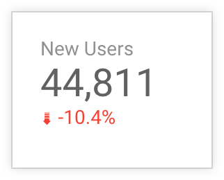
When the Hide comparison label setting is not enabled, you can edit the label for the comparison. For example, you can add the label "Q4 new users" to a scorecard chart with a primary metric of New Users that compares the number of new users in Q1 to the number of users in a past time period, Q4 of the previous year.
Sparkline
This section controls the appearance of sparkline visualizations for comparison metrics. These options appear when a sparkline is set on the Setup tab:
- Sparkline color: Changes the color of the sparkline.
- Fill: Fills the sparkline with a lighter shade of the sparkline color.
- Smooth: Displays series lines as curves.
- Missing data: Sets how the sparkline will display missing data.
Missing data for sparkline
When your sparkline is missing data, you can choose one of the following options to indicate that there is no data:
- Line to zero: When this option is selected, a line series will drop to zero for the missing dates.
- Line breaks: When this option is selected, missing data appears as breaks in the data series.
- Linear interpolation: When this option is selected, Looker Studio will continue the series by connecting the data points on either side of the missing data. This option is the default.
Progress Visual
When the Show as progress setting is enabled on the Setup tab, you can specify how the progress visualization will be displayed by selecting one of the following options:
- Bar: Displays the progress of the primary metric toward the target as a bar. This setting is the default.
- Circle: Displays the progress of the primary metric toward the target as a circle.
- None: Removes the progress bar or progress circle from the scorecard chart.
Missing data
When your scorecard chart is missing data, you can choose from the following options to indicate that there is no data:
- Show "No data": Displays the text "No data" on the scorecard chart.
- Show "0": Displays the number "0" on the scorecard chart.
- Show "-": Displays the text "-" on the scorecard chart.
- Show "null": Displays the text "null" on the scorecard chart.
- Show " " (blank): Displays no text on the scorecard chart.
Labels
These options control the appearance of the chart labels:
- Font family: Changes the font family of the scorecard label.
- Font size: Changes the font size of the scorecard label.
- Font color: Changes the font color of the scorecard label.
- Hide field Name: Hides the default field name (which comes from the data source).
- Alignment: Aligns the field name, field value, and comparison value.
Padding
Use these options to control the line height, and the padding for the left, right, and top of the chart.
Background and border
These options control the appearance of the chart background container:
- Background: Sets the chart background color.
- Opacity: Sets the chart opacity. 100% opacity completely hides objects behind the chart. 0% opacity makes the chart invisible.
- Border color: Sets the chart border color.
- Border radius: Adds rounded borders to the chart background. When the radius is 0, the background shape has 90° corners. A border radius of 100° produces a circular shape.
- Border weight: Sets the chart border line thickness.
- Border style: Sets the chart border line style.
- Add border shadow: Adds a shadow to the chart's lower and right borders.
Chart header
The chart header lets viewers perform various actions on the chart, such as exporting the data, drilling up or down, or sorting the chart. Chart header options include the following:
- Chart header: Controls where the chart header appears on the chart. The Chart header options include the following:
- Do not show: The header options never appear. Note that report viewers can always access the options by right-clicking the chart.
- Always show: The header options always appear.
- Show on hover (default): Three vertical dots appear when you hold the pointer over the chart header. Click these to access the header options.
- Header font color: Sets the color of the chart header options.
Reset to report theme
Click Reset to report theme to reset the chart settings to the report theme settings.