Use scatter charts to look for relationships between variables. Scatter charts are particularly useful in highlighting trends and patterns that emerge in data. You can also use scatter plots to identify outliers in your data.
If your data contains two variables that correlate, a scatterplot can be an ideal visualization method to find and explore different types of correlations: * Positive correlation: While the x variable increases, the y variable increases. * Negative correlation: While the x variable increases, the y variable decreases. * Null correlation: There is no correlation between the two chosen variables.
Awareness of potential data correlation can lead to greater insight about your data and can even guide predictions of future data behavior.
Scatter charts in Looker Studio
To configure a scatter chart in Looker Studio, select metrics for the horizontal (X) and vertical (Y) axes of the chart. You can group the data by adding up to three dimensions to the chart.
For example, you could use a scatter chart to see if there's a correlation between ad spend and conversion rate for each country, broken down by region and ad campaign. This chart could help you answer questions such as "Do more expensive ads result in better conversions in all locales?"
To find trends and patterns, and to identify outliers in your data, you can include a trend line. The general direction of slope of the trend line shows the type of relationship (correlation) between the variables:
- A slope upwards from left to right can indicate a positive correlation. In other words, the more X, the more Y.
- A slope downwards from upper left to lower right can indicate a negative correlation: the more X, the less Y.
- Lack of slope can indicate that there is little or no correlation between the variables.
Data points nearer the trend line are more closely correlated than those farther away from the line.
Scatter chart example
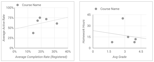
The following scatter charts give you two different views of the performance for a fictional online university.
The left-hand chart compares the average course completion rate with the average activity rate (a measurement of how engaged the students were, in terms of forum posts, class activities completed, and so on). The linear trend line in this chart slopes upwards from left to right, indicating that there is a positive relationship between activity rate and completion rate. The more engaged the student, the more likely they are to complete the course.
The chart on the right compares the average student grade with the number of hours of homework for each course. The trend line in this chart slopes downwards from left to right, indicating there is a negative correlation between the metrics: the less homework assigned, the better the average grade.
The right hand chart also shows the presence of two outliers: the course in the bottom left had few hours of homework but also had a low average grade, while the course at the top of the graph had the highest amount of homework, yet still had close to a 3.0 grade average. (You might want to investigate your own chart outliers to see if you can discover why they don't fit the norm.)
Other types of scatter charts
In addition to the basic scatter chart, you can also add a preset bubble chart from the toolbar.
Bubble chart
Bubble charts include a bubble size metric. This can be the same metric as the X or Y axis metric, or it can be a different metric. The larger the metric value, the larger the bubble.
Bubble chart example
This bubble chart visualizes visits to a national park (Pinnacles National Park in California, USA) in 2021. Each bubble represents a month. The position of each bubble in the chart represents the number of visitors and the amount of time spent by those visitors for each month. This chart uses the recreation_visitors metric to determine the size of the bubble.
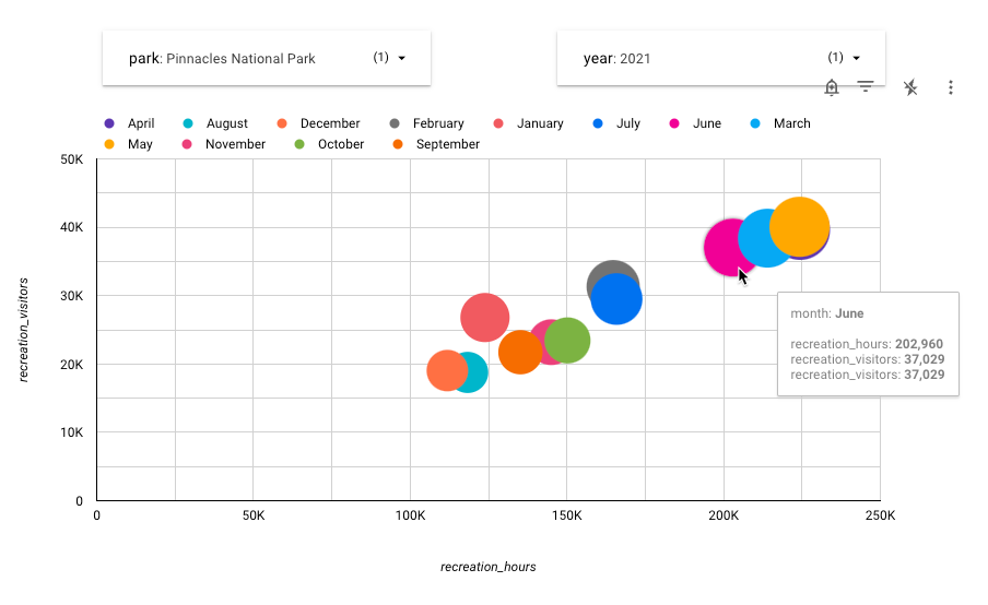
Examining this chart shows that the fewest number of people visit the park in December and August, while the park is most crowded in the Spring and early Summer. July and February appear to be intermediate in terms of park visitation.
Add the chart
Add a new chart or select an existing chart. Then, use the Properties panel to configure the chart's Setup tab and Style tab properties to set up the chart data and style the chart, respectively.
Set up the chart data
The options in the Setup tab of the Properties panel determine how the chart's data is organized and displayed.
Data source
A data source provides the connection between the component and the underlying dataset.
- To change the chart's data source, click the current data source name.
- To view or edit the data source, click the
 Edit data source icon. (You must have at least Viewer permission to see this icon.)
 - Click Blend data to see data from multiple data sources in the same chart. Learn more about data blending.
Dimension
Dimensions are data categories. Dimension values (the data that is contained by the dimension) are names, descriptions, or other characteristics of a category.
Drill down
This option appears on charts that support it.
Drilling down gives viewers a way to reveal additional levels of detail within a chart. When you turn on the Drill down switch, each dimension that you add becomes another level of detail that you can drill into. Learn more about chart drill down.
Metric
Metrics measure the things that are contained in dimensions and provide the numeric scale and data series for the chart.
Metrics are aggregations that come from the underlying dataset or that are the result of implicitly or explicitly applying an aggregation function, such as COUNT(), SUM(), or AVG(). The metric itself has no defined set of values, so you can't group by a metric as you can with a dimension.
You can set the following metrics in scatter charts:
- Metric X: The X (horizontal) axis metric (for example, Avg Grade in the second chart in the scatter chart example).
- Metric Y: The Y (vertical) axis metric (for example, Homework Hours in the second chart in the scatter chart example).
- Bubble size metric: Setting this causes the chart to be displayed as a bubble chart. This metric determines the size of the data points.
Metric sliders
Turn on the Metric sliders switch to add a metric slider to your chart.
Filter
Filters restrict the data that is displayed in the component by including or excluding the values that you specify. Learn more about the filter property.
Filter options include the following:
- Filter name: Click an existing filter to edit it. Mouse over the filter name and click X to delete it.
- Add filter: Click this option to create a new filter for the chart.
Date range dimension
This option appears if your data source has a valid date dimension.
The date range dimension is used as the basis for limiting the date range of the chart. For example, this is the dimension that is used if you set a date range property for the chart or if a viewer of the report uses a date range control to limit the timeframe.
Default date range filter
The default date range filter lets you set a timeframe for an individual chart.
Default date range filter options include the following:
- Auto: Uses the default date range, which is determined by the chart's data source.
- Custom: Lets you use the calendar widget to select a custom date range for the chart.
- Comparison date range: Displays comparison data for the selected time period.
Learn more about working with dates and time.
Sort
The Sort and Secondary sort options in the chart's setup panel control the default sorting behavior. You can select any metric in the chart's data source, or any dimension that is displayed in the chart, to use as the primary or secondary sorting field.
When you specify a metric as a sort field, you can edit the field's aggregation. For example, you could include a numeric field in the chart as a SUM, but sort on that same field's AVERAGE value.
Chart interactions
When the Cross-filtering option is enabled on a chart, that chart acts like a filter control. You can filter the report by clicking or brushing your mouse across the chart. Learn more about cross-filtering.
The Zoom option lets you zoom into a chart and pan on that chart to view all the data that is present. Learn more about zooming and panning on Cartesian charts.
Style the chart
The options in the Style tab control the overall presentation and appearance of the chart.
Chart title
Turn on the Show title switch to add a title to your chart. Looker Studio can automatically generate a title, or you can create a custom title for the chart. You can also customize the title's styling and placement.
Autogenerate
This option is enabled by default. When Autogenerate is enabled, Looker Studio generates a title that is based on the chart type and the fields that are used in the chart. The autogenerated title will be updated if you change the chart type or make changes to the fields that are used in the chart.
To add a custom title to your chart, enter it into the Title field. This will turn off the Autogenerate setting.
Title options
When the Show title setting is enabled, you can use the following title options:
- Title: Provides a text field where report editors can enter a custom title for the chart.
- Font family: Sets the font type for the title text.
- Font size: Sets the font size for the title text.
- Font color: Sets the font color for the title text.
- Font styling options: Applies bold, italic, or underline styling to the title text.
- Top: Positions the chart title at the top of the chart.
- Bottom: Positions the chart title at the bottom of the chart.
- Left: Aligns the chart title to the left side of the chart.
- Center: Centers the chart title horizontally.
- Right: Aligns the chart title to the right side of the chart.
Scatter chart
These options control the overall appearance and layout of your chart:
- Show data labels: Displays individual values for the data points in the series.
- Bubble opacity: Sets the opacity of the bubbles. The lower the percentage, the more transparent the bubbles.
- Number of bubbles: Determines the number of data points to display. If the number of dimension values exceeds this number, only the top N values are shown.
- Bubble Color: Sets the dimension to use for coloring the data points in your chart. When set to None, the bubbles display in a single color. Selecting a dimension causes the chart to display multiple colors.
Color by
This section controls how your data is colored. Learn more about coloring your data. Click a color swatch to change the color.
Reference lines
Add a reference line or a reference band to your chart by selecting the Add a reference line or Add a reference band option, respectively.
For more information about reference lines and reference bands, visit the Add reference lines and reference bands to charts page. Reference lines are not available for 100% stacked area charts.
Trendline
A trendline is a line that is superimposed on a chart to reveal the overall direction of the data. Looker Studio supports several types of trendlines, which are available in the Trendline drop-down menu:
- Linear: Displays a straight line that most closely approximates the data in the chart. (To be precise, it's the line that minimizes the sum of squared distances from every point to it.)
- Polynomial: Displays data directionality as a curved line. It can be useful for analyzing large, highly variable data series.
- Exponential: Displays the direction of data that is best represented as an exponential of the form
eax+b.
Trendlines are available only for time series charts and scatter charts.
Options for setting the trendline Weight, Style, and Color appear when an option is selected from the Trendline drop-down menu.
Zoom
After you enable the Zoom option for a chart on the Setup tab of the Properties panel, you can select one of the following options:
- Click and drag to zoom: Zoom by clicking and dragging to select a portion of the visualization to magnify.
- Scroll to zoom: Zoom by scrolling with your mouse.
Optionally, click the Pan/Zoom X-axis only switch to allow zooming and panning only along the X-axis.
Axes
These options control the display of the chart axes titles and scales:
- Show axes: Shows or hides the chart axes.
- Font family: Sets the font type for the axis text.
- Axis font size: Sets the font size for the axis text.
- Axis color: Sets the color of the axes.
- Axis text color: Sets the text color for the axis text.
- Reverse Y-axis direction: Controls the vertical display of the Y-axis.
- Reverse X-axis direction: Controls the horizontal display of the X-axis.
Left Y-Axis
These options appear when you enable Show axes in the Axes section. A Right Y-Axis section with the same options appears when you have more than one metric in your chart.
These options control the display of the Y-axis:
- Show axis title: Shows or hides the axis title.
- Show axis labels: Shows or hides the axis labels.
- Rotation (0° to 90°): Sets the rotation of the axis labels for ease of readability. This option appears when you enable Show axis labels.
- Show axis line: Shows or hides the axis line.
- Axis min: Sets the minimum value for the axis.
- Axis max: Sets the maximum value for the axis.
- Custom tick interval: Controls the interval between axis ticks.
- Log scale: Makes the axis scale logarithmic.
X-Axis
These options control the display of the chart's X-axis. These options appear when you enable Show axes in the Axes section:
- Show axis title: Shows or hides the axis title.
- Show axis labels: Shows or hides the axis labels.
- Rotation (0° to 90°): Sets the rotation of the axis labels for ease of readability. This option appears when you enable Show axis labels.
- Show axis line: Shows or hides the axis line.
- Axis min: Sets the minimum value for the axis.
- Axis max: Sets the maximum value for the axis.
- Custom tick interval: Controls the interval between axis ticks.
- Log scale: Makes the axis scale logarithmic.
Grid
These options control the look of the chart grid:
- Grid background: Sets the color of the chart background.
- Grid border color: Sets the color of the inner chart border.
- Show X-axis grid lines: Displays the X-axis grid line.
- Grid line style: Sets the line style of the X-axis grid. This option is only available when Show X-axis grid lines is enabled.
- Grid line color: Sets the color of the X-axis grid line. This option is only available when Show X-axis grid lines is enabled.
- Show Y-axis grid lines: Displays the Y-axis grid line.
- Grid line style: Sets the line style of the Y-axis grid. This option is only available when Show Y-axis grid lines is enabled.
- Grid line color: Sets the color of the Y-axis grid line. This option is only available when Show Y-axis grid lines is enabled.
Legend
These options determine the placement and appearance of the chart legend:
- Display legend: When enabled, displays the chart legend.
- Position: Sets the position of the legend.
- Alignment: Sets the alignment of the legend relative to the selected position.
Align legend with grid: Sets the alignment of the legend with the position of the grid, instead of aligning with the title.
Max lines: Sets the number of lines that are used by the legend. If the number of series requires more lines, overflow items can be displayed by clicking the < and > arrows.
Font family: Sets the font type of the legend font.
Font size: Sets the size of the legend font.
Font color: Sets the color of the legend font.
Background and border
These options control the appearance of the chart background container:
- Background: Sets the chart background color.
- Opacity: Sets the chart opacity. 100% opacity completely hides objects behind the chart. 0% opacity makes the chart invisible.
- Border color: Sets the chart border color.
- Border radius: Adds rounded borders to the chart background. When the radius is 0, the background shape has 90° corners. A border radius of 100° produces a circular shape.
- Border weight: Sets the chart border line thickness.
- Border style: Sets the chart border line style.
- Add border shadow: Adds a shadow to the chart's lower and right borders.
Chart header
The chart header lets viewers perform various actions on the chart, such as exporting the data, drilling up or down, or sorting the chart. Chart header options include the following:
- Chart header: Controls where the chart header appears on the chart. The Chart header options include the following:
- Do not show: The header options never appear. Note that report viewers can always access the options by right-clicking the chart.
- Always show: The header options always appear.
- Show on hover (default): Three vertical dots appear when you hold the pointer over the chart header. Click these to access the header options.
- Header font color: Sets the color of the chart header options.
Reset to report theme
Click Reset to report theme to reset the chart settings to the report theme settings.
Limitations
A scatter chart in Looker Studio can display a maximum of 1,000 bubbles.