Timeline charts let you visualize the relationships between groups of events and compare the timespans over which these events took place. This page provides an overview of timeline charts and configuration options in Looker Studio.
Requirements
Timeline charts require the following fields in the Setup tab of the Properties panel:
- Row label: A
stringtype dimension that provides the label for each row - Start time: A
datetype dimension that specifies the beginning of the timeline End time: A
datetype dimension that specifies the end of the timelineIf you don't use an End time field, you need a Duration field: A
numbertype dimension that specifies the length of a timeline chart in seconds, minutes, hours, days, months, or years.
There are other optional fields that you can configure to add additional context to a timeline chart. See the following Timeline chart examples and Set up the chart data sections for more details.
Things to know
There are several things to know about timeline charts in Looker Studio:
- If a value does not have a corresponding Row label or Start time, the value won't show up in the timeline chart.
- If the Start time, End time, or Duration is invalid (or if the specified Duration calculates a date that is too far into the future), the timeline chart will end up in an error state.
- If the End time and Duration fields are both specified, the timeline chart will use the End time field and ignore the Duration field.
Timeline chart examples
You can configure timeline charts to display data in several different ways. This section includes examples for the following use cases:
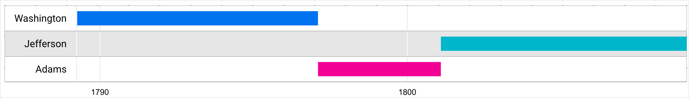
Simple timeline
A timeline chart that contains the minimum required fields can help report viewers contextualize and compare the timespan of events.
In this example, you have a timeline chart with the following dimensions:
- Row label field: Name (the name of US presidents)
- Start time field: Start (a
datetype field, in years) - End time field: End (a
datetype field, in years)
With this minimal configuration, the timeline helps report viewers compare the term lengths of US presidents.
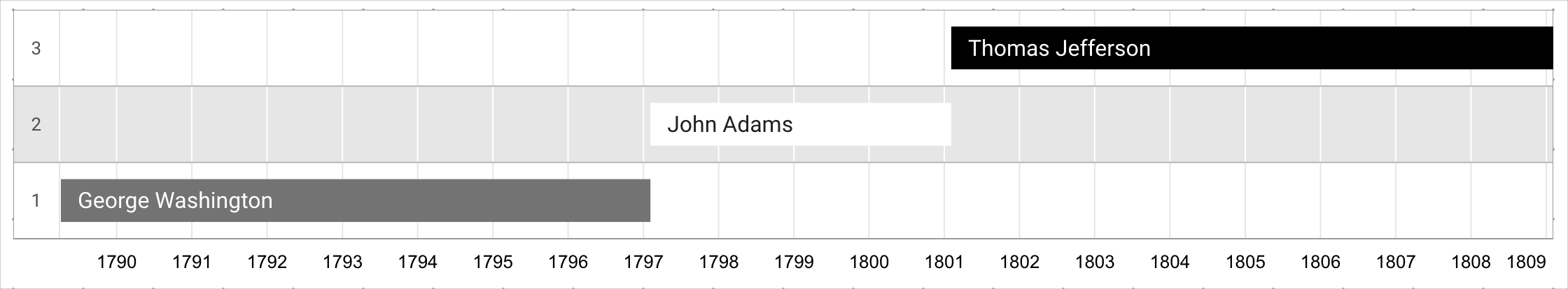
Timeline with bar labels
If you want timeline bars to represent a different value than the Row label field, you can specify a Bar label dimension and enable the Show bar label style setting.
Using these settings helps report viewers differentiate the bar value from the row label value, since the Bar label is a different dimension than the Row label.
In this example, you have a timeline chart with the following dimensions:
- Row label field: Term (a
numbertype field that represents a US presidential term) - Bar label field: Name (the name of US presidents)
- Start time field: Start (a
datetype field, in years) - End time field: End (a
datetype field, in years)
In this example, the Show bar label setting helps report viewers see the presidential term for each president along with the length of each presidential term.
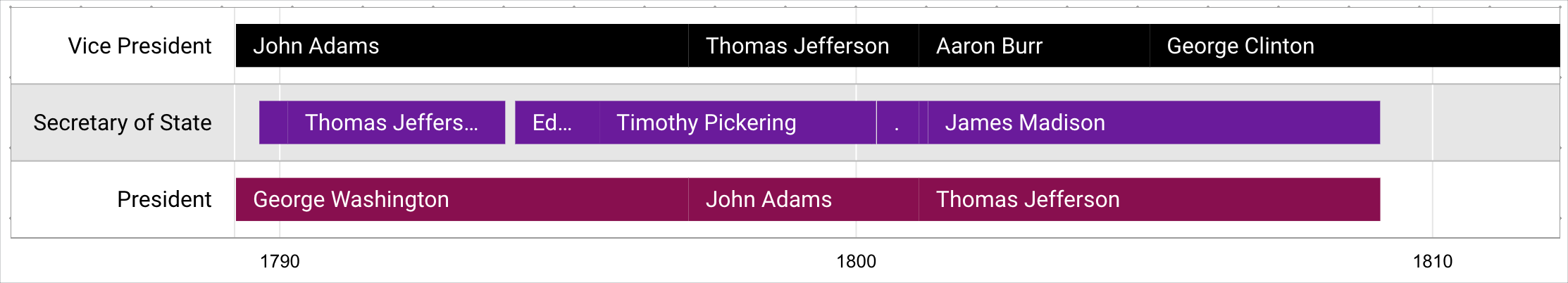
Timeline with individual or multiple bars per row
You can use the Row label field in conjunction with the Group by row label style setting to group bars into individual or multiple bars per row.
In this example, you have a timeline chart with the following dimensions:
- Row label field: Position (the name of positions, such as Vice President, Secretary of State, and President)
- Bar label field: Name (the name of the individual that held a specific position)
- Start time field: Start (a
datetype field, in years) - End time field: End (a
datetype field, in years)
The chart displays the values grouped by the labels Vice President, Secretary of State, and President.
When Group by row label is not enabled, each value appears on an individual row, organized according to the row label that the value corresponds to. The bars will be assigned a color according to the specified Color by options.
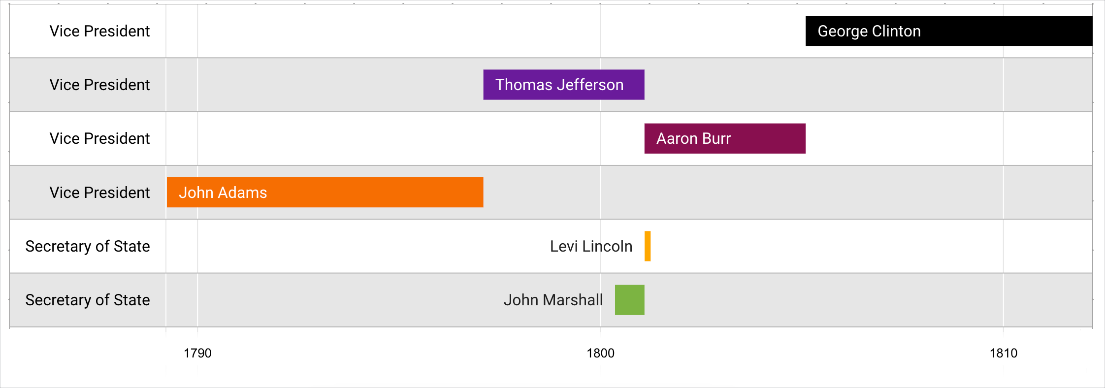
When Group by row label is enabled, each value is displayed together in one row per each row label.
This format can make each row look distinct from other groups. You can also select the Color by row label style option to make each row look more cohesive.
Add the chart
Add a new chart or select an existing chart. Then, use the Properties panel to configure the chart's Setup tab and Style tab properties to set up the chart data and style the chart, respectively.
Set up the chart data
The options in the Setup tab of the Properties panel determine how the chart's data is organized and displayed.
Data source
A data source provides the connection between the component and the underlying dataset.
- To change the chart's data source, click the current data source name.
- To view or edit the data source, click the
 Edit data source icon. (You must have at least Viewer permission to see this icon.)
 - Click Blend data to see data from multiple data sources in the same chart. Learn more about data blending.
Fields
Configure the options in the Fields section to set up the timeline chart data.
Row label
The Row label field is the primary grouping dimension, and it provides the label for each row. The Row label dimension must be a string type dimension.
This field is required.
Bar label
The Bar label field is the secondary grouping dimension, and it provides the label for each bar. The Bar label field must be a string type dimension.
This field is optional.
Start time
The Start time field specifies when the time chart begins. The Start time field must be a date type dimension.
This field is required.
End time
The End time field specifies when the time chart ends. The End time field must be a date type dimension.
Timeline charts require either an End time field or a Duration field. (A timeline chart can't use both an End time field and a Duration field at the same time.)
Duration
The Duration field determines the length of a time chart in seconds, minutes, hours, days, months, or years. The Duration field must be a number type dimension.
If you use a Duration field, you must specify the Duration units.
Timeline charts require either an End time field or a Duration field. (A timeline chart can't use both an End time field and a Duration field at the same time.)
Duration units
The Duration units field indicates the unit of time that are represented by the Duration field. If you're including a Duration field, you must select a Duration units option.
You can select one of the following options from the Duration units drop-down menu:
- Seconds
- Minutes
- Hours
- Days
- Months
- Years
Tooltip
Report viewers can hold the pointer over a bar in a timeline chart to access a tooltip that displays more details about the data.
Tooltips in timeline charts display the dimension values from the Row label, Bar label, Start time, and End time (or Duration ) fields for each bar.
The Tooltip field lets you specify a dimension that provides an additional data point in tooltips.
The tooltip field must be a dimension.
Filter
Filters restrict the data that is displayed in the component by including or excluding the values that you specify. Learn more about the filter property.
Filter options include the following:
- Filter name: Click an existing filter to edit it. Mouse over the filter name and click X to delete it.
- Add filter: Click this option to create a new filter for the chart.
Date range dimension
This option appears if your data source has a valid date dimension.
The date range dimension is used as the basis for limiting the date range of the chart. For example, this is the dimension that is used if you set a date range property for the chart or if a viewer of the report uses a date range control to limit the timeframe.
Default date range filter
The default date range filter lets you set a timeframe for an individual chart.
Default date range filter options include the following:
- Auto: Uses the default date range, which is determined by the chart's data source.
- Custom: Lets you use the calendar widget to select a custom date range for the chart.
Sort
The Sort field lets you choose a dimension by which to sort the bars on the timeline chart, in either Ascending or Descending order.
This field is optional.
Total records
The Total records drop-down lets you specify the number of rows that appear in a timeline chart.
- If Group by row label is not enabled, Total records corresponds to the number of rows that are displayed.
- If Group by row label is enabled, Total records corresponds to the number of bars that are displayed.
Chart interactions
Cross-filtering lets report viewers interact with one chart and apply that interaction as a filter to other charts in the report. When cross-filtering is turned on for a chart, you can filter the report by clicking one or more dimension values in the chart. Learn more about cross-filtering.
Style the chart
The options in the Style tab control the overall presentation and appearance of the chart.
Chart title
Turn on the Show title switch to add a title to your chart. Looker Studio can automatically generate a title, or you can create a custom title for the chart. You can also customize the title's styling and placement.
Autogenerate
This option is enabled by default. When Autogenerate is enabled, Looker Studio generates a title that is based on the chart type and the fields that are used in the chart. The autogenerated title will be updated if you change the chart type or make changes to the fields that are used in the chart.
To add a custom title to your chart, enter it into the Title field. This will turn off the Autogenerate setting.
Title options
When the Show title setting is enabled, you can use the following title options:
- Title: Provides a text field where report editors can enter a custom title for the chart.
- Font family: Sets the font type for the title text.
- Font size: Sets the font size for the title text.
- Font color: Sets the font color for the title text.
- Font styling options: Applies bold, italic, or underline styling to the title text.
- Top: Positions the chart title at the top of the chart.
- Bottom: Positions the chart title at the bottom of the chart.
- Left: Aligns the chart title to the left side of the chart.
- Center: Centers the chart title horizontally.
- Right: Aligns the chart title to the right side of the chart.
Color by
These options control the colors of the timeline visualization:
- Single color: When this option is selected, the data series is displayed in shades of a single color. Otherwise, the chart is displayed in multiple colors, according to your report theme. You can set specific colors by using the color picker.
- Series order: Use the current theme to color the data according to its position in the chart. This option emphasizes the ranking of the data over the identity of the data. You can set specific colors by using each data series' color picker.
- Dimension values: This option colors each dimension value in the chart with the color that is specified in the dimension value color map. This option ensures that your data uses color consistently, regardless of the position of that data in the chart.
Color by bar label: Displays bars in colors as a group. You can choose either Color by row label, Color by bar label, or Color by tooltip label.
The Color by row label option displays each bar in a color that corresponds to the row label value. Color by row label can be helpful if you want to display bar values that correspond to row labels.
The Color by bar label option displays each bar in a color that corresponds to the bar label value. Color by bar label can be helpful if you want to group bars by a row label and still distinguish between individual values for each row.
The Color by tooltip option displays each bar in a color that corresponds to the tooltip dimension value. Color by tooltip can be helpful if you want to distinguish bars by a value other than the row label or bar label. This option is available only if a value is set for the Tooltip field.
Missing data
When your timeline chart is missing data, you can choose from the following options to indicate that there is no data:
- Show "No data": Displays the text "No data" on the scorecard chart.
- Show "0": Displays the number "0" on the scorecard chart.
- Show "-": Displays the text "-" on the scorecard chart.
- Show "null": Displays the text "null" on the scorecard chart.
- Show " " (blank): Displays no text on the scorecard chart.
Bar options
Bar label values come from the dimension that is selected as the Bar label) field. When enabled, the Show bar label option displays the dimension value for each bar in a row.
You can use the Font family and Font size menu options to customize the appearance of bar labels.
Row options
Row label values come from the dimension that is selected as the Row label field. The following options control the appearance of rows in timeline charts:
- Group by row label: When enabled, displays bars that have the same row label value together on one single row.
- Font family: Sets the font style of the row label.
- Font size: Sets the font size of the row label.
- Font color: Sets the font color of the row label.
- Chart background: Sets the background for the data section of the chart.
- Alternating row colors: When enabled, displays alternating rows with a background color.
Background and border
These options control the appearance of the chart background container:
- Background: Sets the chart background color.
- Opacity: Sets the chart opacity. 100% opacity completely hides objects behind the chart. 0% opacity makes the chart invisible.
- Border color: Sets the chart border color.
- Border radius: Adds rounded borders to the chart background. When the radius is 0, the background shape has 90° corners. A border radius of 100° produces a circular shape.
- Border weight: Sets the chart border line thickness.
- Border style: Sets the chart border line style.
- Add border shadow: Adds a shadow to the chart's lower and right borders.
Chart header
The chart header lets viewers perform various actions on the chart, such as exporting the data, drilling up or down, or sorting the chart. Chart header options include the following:
- Chart header: Controls where the chart header appears on the chart. The Chart header options include the following:
- Do not show: The header options never appear. Note that report viewers can always access the options by right-clicking the chart.
- Always show: The header options always appear.
- Show on hover (default): Three vertical dots appear when you hold the pointer over the chart header. Click these to access the header options.
- Header font color: Sets the color of the chart header options.
Reset to report theme
Click Reset to report theme to reset the chart settings to the report theme settings.