Waterfall charts help you visualize how a sequence of positive and negative values adds up to a total. These charts are often used for financial data to show how various profits and losses make up a total. Waterfall charts can also be used more generally to illustrate how different categories contribute to a total, especially if the data contains positive and negative values.
Waterfall charts in Looker Studio
Waterfall charts are helpful for tracking and displaying progress of metrics over time and for understanding what drives the change. For example, you can use a waterfall chart to display the progress of a product launch or to display different tasks that need to be completed along with their current status
Waterfall chart example
The following waterfall chart displays revenue gains and losses by year, with a Total column that shows the sum of all the values.
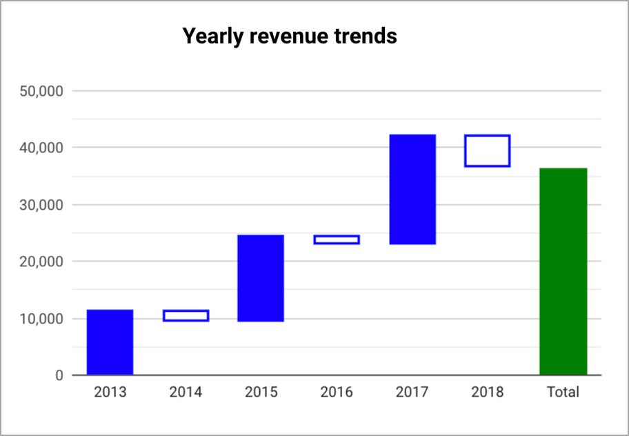
You can hold your cursor over the columns in a waterfall chart to access a tooltip that displays more details.
Requirements
A waterfall chart requires the following elements:
- One dimension
- One metric
Add the chart
Add a new chart or select an existing chart. Then, use the Properties panel to configure the chart's Setup tab and Style tab properties to set up the chart data and style the chart, respectively.
Set up the chart data
The options in the Setup tab determine how the chart's data is organized and displayed.
Data source
A data source provides the connection between the component and the underlying dataset.
- To change the chart's data source, click the current data source name.
- To view or edit the data source, click the
 Edit data source icon. (You must have at least Viewer permission to see this icon.)
 - Click Blend data to see data from multiple data sources in the same chart. Learn more about data blending.
Dimension
Dimensions are data categories. Dimension values (the data that is contained by the dimension) are names, descriptions, or other characteristics of a category.
Waterfall charts require one dimension.
Drill down
This option appears on charts that support it.
Drilling down gives viewers a way to reveal additional levels of detail within a chart. When you turn on the Drill down switch, each dimension that you add becomes another level of detail that you can drill into. Learn more about chart drill down.
Metrics
Metrics measure the things that are contained in dimensions and provide the numeric scale and data series for the chart.
Metrics are aggregations that come from the underlying dataset or that are the result of implicitly or explicitly applying an aggregation function, such as COUNT(), SUM(), or AVG(). The metric itself has no defined set of values, so you can't group by a metric as you can with a dimension.
Optional metrics
You can add optional metrics by turning on the Optional metrics switch and selecting metrics from the Add metric field selector. You can also click metrics from the fields list on the Data panel and place them in the Optional metrics selector.
Metric sliders
Turn on the Metric sliders switch to add a metric slider to your chart.
Filters
Filters restrict the data that is displayed in the component by including or excluding the values that you specify. Learn more about the filter property.
Filter options include the following:
- Filter name: Click an existing filter to edit it. Mouse over the filter name and click X to delete it.
- Add filter: Click this option to create a new filter for the chart.
Date range dimension
This option appears if your data source has a valid date dimension.
The date range dimension is used as the basis for limiting the date range of the chart. For example, this is the dimension that is used if you set a date range property for the chart or if a viewer of the report uses a date range control to limit the timeframe.
Default date range filter
The default date range filter lets you set a timeframe for an individual chart.
Default date range filter options include the following:
- Auto: Uses the default date range, which is determined by the chart's data source.
- Custom: Lets you use the calendar widget to select a custom date range for the chart.
Learn more about working with dates and time.
Totals
The Totals option lets you display totals or subtotals of values in your waterfall chart. You can specify the timeframe by which to total or subtotal the values from the Total calculation drop-down menu.
The options include the following:
- None: Select this option if you don't want to display total calculation bars in your waterfall chart.
- At End: Select this option to display a sum of all the values in your waterfall chart.
- Annually: Select this option to display subtotals for every year.
- Quarterly: Select this option to display subtotals for every quarter.
- Monthly: Select this option to display a subtotal of values for every month.
Custom aggregation
Custom aggregation is an optional configuration and lets you specify a value as the starting baseline of the waterfall chart. Enter a value into the text field to specify a custom aggregation.
Sort
Select a field that will sort your waterfall chart results. The default sort order will be by the first dimension, unless otherwise specified. Select either the Ascending or the Descending option.
Chart interactions
When the Cross-filtering option is enabled on a chart, that chart acts like a filter control. You can filter the report by clicking or brushing your mouse across the chart. Learn more about cross-filtering.
Style the chart
The options in the Style tab control the overall presentation and appearance of the chart.
Chart title
Turn on the Show title switch to add a title to your chart. Looker Studio can automatically generate a title, or you can create a custom title for the chart. You can also customize the title's styling and placement.
Autogenerate
This option is enabled by default. When Autogenerate is enabled, Looker Studio generates a title that is based on the chart type and the fields that are used in the chart. The autogenerated title will be updated if you change the chart type or make changes to the fields that are used in the chart.
To add a custom title to your chart, enter it into the Title field. This will turn off the Autogenerate setting.
Title options
When the Show title setting is enabled, you can use the following title options:
- Title: Provides a text field where report editors can enter a custom title for the chart.
- Font family: Sets the font type for the title text.
- Font size: Sets the font size for the title text.
- Font color: Sets the font color for the title text.
- Font styling options: Applies bold, italic, or underline styling to the title text.
- Top: Positions the chart title at the top of the chart.
- Bottom: Positions the chart title at the bottom of the chart.
- Left: Aligns the chart title to the left side of the chart.
- Center: Centers the chart title horizontally.
- Right: Aligns the chart title to the right side of the chart.
Waterfall
These options let you control the axis orientation and number of bars that appear in your waterfall chart.
The options include the following:
- Vertical: Click the
 Vertical icon to display the Y-axis values vertically on the Y-axis. This option is selected by default.
 - Horizontal: Click the
 Horizontal icon to display the Y-axis values horizontally on the X-axis.
 - Bars: Optionally, input a value to limit the number of bars that are displayed in addition to the totals and subtotals that appear on the chart.
- Show data labels: Displays values for each bar. Enabling this option also reveals the Data label section, where you can control the presentation of the labels on the chart.
Data label
If you enable the Show data labels setting in the Waterfall section, you can configure the following options:
- Compact numbers: Rounds numbers and displays the unit indicator, when enabled. For example, 553,939 becomes 553.9K.
- Decimal precision: Sets the number of decimal places in metric values.
- Font family: Sets the font type of the label text.
- Font size: Sets the font size for the label text.
- Font color: Sets the font color for the label text.
- Text contrast: Sets the contrast of the label text. Options include None, Low, Medium, or High.
- Font styling options: Applies bold or italic styling to the label text.
- Labels position: Sets the position of the data label in relation to the bar (inside or outside).
Rising bar styling
These options let you control the appearance of positive value rising bars that appear in your waterfall chart.
The options include the following:
- Color for positive values: Sets the fill color for displaying positive value bars.
- Stroke color for positive values: Sets the outline color for positive value bars.
- Stroke weight for positive values: Sets the thickness of positive value bar outlines. The higher the number selected, the thicker that bar outlines will appear.
Falling bar styling
These options let you control the appearance of negative value falling bars that appear in your waterfall chart.
The options include the following:
- Color for negative values: Sets the fill color for displaying negative value bars.
- Stroke color for negative values: Sets the outline color for negative value bars.
- Stroke Weight for negative values: Sets the thickness of negative value bar outlines. The higher the number selected, the thicker that bar outlines will appear.
Axes
The Show axes setting is automatically enabled. Turn off the Show axes switch to hide all the waterfall chart axis labels and values.
These options control the appearance of the axes:
- Show axes: Shows or hides the chart axes.
- Axis color: Sets the color of the axes.
- Axis text color: Sets the text color for the axis text.
- Font family: Sets the font type for the axis text.
- Axis font size: Sets the font size for the axis text.
Y-Axis
These options appear when you enable Show axes in the Axes section. A Right Y-Axis section with the same options appears when you have more than one metric in your chart.
These options control the display of the Y-axis:
- Show axis title: Shows or hides the axis title.
- Show axis labels: Shows or hides the axis labels.
- Rotation (0° to 90°): Sets the rotation of the axis labels for ease of readability. This option appears when you enable Show axis labels.
- Show axis line: Shows or hides the axis line.
- Axis min: Sets the minimum value for the axis.
- Axis max: Sets the maximum value for the axis.
- Custom tick interval: Controls the interval between axis ticks.
- Log scale: Makes the axis scale logarithmic.
X-Axis
These options control the display of the chart's X-axis. These options appear when you enable Show axes in the Axes section:
- Show axis title: Shows or hides the axis title.
- Show axis labels: Shows or hides the axis labels.
- Rotation (0° to 90°): Sets the rotation of the axis labels for ease of readability. This option appears when you enable Show axis labels.
- Show axis line: Shows or hides the axis line.
Grid
The options in the Grid section of the Style tab let you control the appearance of the waterfall chart grid.
Grid options include the following:
- Axis color: Select the Axis color icon to choose a color for displaying X and Y axis values and titles.
- Grid color: Select the Grid color icon to choose a color for displaying grid lines in the chart.
- Font family: Select the Font family drop-down menu to choose a font for displaying chart values and labels.
- Axis font size: Select the Axis font size drop-down menu to choose a size in pixels for displaying chart values and labels.
Background and border
These options control the appearance of the chart background container:
- Background: Sets the chart background color.
- Opacity: Sets the chart opacity. 100% opacity completely hides objects behind the chart. 0% opacity makes the chart invisible.
- Border color: Sets the chart border color.
- Border radius: Adds rounded borders to the chart background. When the radius is 0, the background shape has 90° corners. A border radius of 100° produces a circular shape.
- Border weight: Sets the chart border line thickness.
- Border style: Sets the chart border line style.
- Add border shadow: Adds a shadow to the chart's lower and right borders.
Chart header
The chart header lets viewers perform various actions on the chart, such as exporting the data, drilling up or down, or sorting the chart. Chart header options include the following:
- Chart header: Controls where the chart header appears on the chart. The Chart header options include the following:
- Do not show: The header options never appear. Note that report viewers can always access the options by right-clicking the chart.
- Always show: The header options always appear.
- Show on hover (default): Three vertical dots appear when you hold the pointer over the chart header. Click these to access the header options.
- Header font color: Sets the color of the chart header options.
Reset to report theme
Click Reset to report theme to reset the chart settings to the report theme settings.