Mit Sammlungen den Überblick behalten
Sie können Inhalte basierend auf Ihren Einstellungen speichern und kategorisieren.
Mit Diagrammen können Sie Daten visualisieren und analysieren. In dieser Lektion fügen Sie dem Bericht ein Kreisdiagramm, ein Balkendiagramm und ein Geo-Diagramm hinzu.
Diagramm hinzufügen
So fügen Sie der aktuellen Seite ein Diagramm hinzu:
Öffnen Sie den Bericht zum Bearbeiten.
Rufen Sie die Seite auf, auf der das Diagramm eingeblendet werden soll.
Klicken Sie in der Symbolleiste auf Diagramm hinzufügen.
Wählen Sie das Diagramm aus, das Sie hinzufügen möchten.
Klicken Sie auf den Canvas, um das Diagramm dem Bericht hinzuzufügen.
Wählen Sie ein oder mehrere Diagramme aus, um sie bei Bedarf zu verschieben oder ihre Größe anzupassen.
Schritt 1: Kreisdiagramm hinzufügen
Mit einem Kreisdiagramm können Sie eine kleine Anzahl von Messwerten oder Variablen vergleichen.
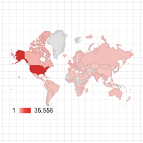
Führen Sie die Schritte unter So fügen Sie ein Diagramm hinzu aus, um dem Bericht eine Google Maps-Karte hinzuzufügen. Wählen Sie die Option „Karte mit Blasen“ aus.
Wählen Sie im Eigenschaftenbereich den Tab EINRICHTUNG aus.
Klicken Sie auf das Standardfeld Standort und ersetzen Sie es durch die Dimension Ort.
Fügen Sie Messwerte für Farbe und Größe der Blasen hinzu. Für Größe können Sie z. B. Sitzungen und für Farbe die Option Durchschnittliche Zeit auf der Seite auswählen.
Wählen Sie den Tab Stil aus.
Über die Schieberegler können Sie die Hintergrunddetails der Karte anpassen, etwa die Straßen, Sehenswürdigkeiten und Labels.
Wählen Sie unter Farben die Farben für den Messwertbereich aus.
Unter Kartensteuerelemente können Sie die Steuerelemente für Nutzer aktivieren oder deaktivieren.
Rufen Sie den Bericht auf. Schwenken, zoomen und scrollen. Sie können auch Street View verwenden.
Nächster Schritt
Glückwunsch! Sie haben Ihren ersten Looker Studio-Bericht erstellt.
Nun können Sie noch Titel hinzufügen, Farben und Stile ändern oder weitere Visualisierungen hinzufügen. Wenn Sie bereit sind, fahren Sie mit der nächsten Lektion fort: Bericht aufrufen und freigeben.
[[["Leicht verständlich","easyToUnderstand","thumb-up"],["Mein Problem wurde gelöst","solvedMyProblem","thumb-up"],["Sonstiges","otherUp","thumb-up"]],[["Schwer verständlich","hardToUnderstand","thumb-down"],["Informationen oder Beispielcode falsch","incorrectInformationOrSampleCode","thumb-down"],["Benötigte Informationen/Beispiele nicht gefunden","missingTheInformationSamplesINeed","thumb-down"],["Problem mit der Übersetzung","translationIssue","thumb-down"],["Sonstiges","otherDown","thumb-down"]],["Zuletzt aktualisiert: 2025-09-03 (UTC)."],[],[],null,["# Tutorial: Add charts to your report\n\nUse charts to visualize and explore your data. In this lesson, you'll add a pie chart, a bar chart and a Geo chart to this report.\n| **Important:** This page assumes you are using the `[Sample] Google Analytics Data` [data source](/looker/docs/studio/data-source), as described in the [Create a new report](/looker/docs/studio/tutorial-create-a-new-report) tutorial. If you are using a different data source, you may need to select the appropriate dimensions and metrics for each chart.\n\nHow to add a chart\n------------------\n\nTo add a chart to the current page:\n\n1. Edit your report.\n2. Navigate to the page that will contain the chart.\n3. In the toolbar, click **Add a chart**.\n4. Select the chart you want to add.\n5. Click the canvas to add the chart to the report.\n6. Select one or more charts to move or resize them as needed.\n\nStep 1: Add a pie chart\n-----------------------\n\nUse a pie chart to give a general comparison of a small number of metrics or variables.\n\n[Learn more about pie charts](/looker/docs/studio/pie-chart-reference).\n\n1. Following the steps in \\[How to add a chart\\](#how-to-add-a-chart), add a **Pie Chart** to the report.\n2. In the **Properties** panel, select the **SETUP** tab.\n3. Click the **Source** dimension chip to access the **Dimension Picker**.\n4. Click the **User Type** dimension.\n5. Click the **STYLE** tab.\n6. Use the donut slider to change the solid shape to a ring shape.\n7. Use the **Legend** property to position the metric labels under the pie:\n\n| **Tip:** Use the **Dimension Picker's** search box to find dimensions and metrics quickly:\n\nStep 2: Add a bar chart\n-----------------------\n\nBar charts are great for showing and comparing the magnitude of multiple variables.\n\n[Learn more about bar charts](/looker/docs/studio/bar-chart-and-column-chart-reference).\n\n1. Following the steps in [How to add a chart](#how-to-add-a-chart), add a **Bar Chart** to the report.\n2. In the **Properties** panel, select the **SETUP** tab.\n3. Click the **Source** dimension and change it to **Browser**.\n4. Click the return arrow:\n5. Click the **Sessions** metric and change it to **Users**.\n6. Click the **STYLE** tab.\n7. Change the orientation to **Horizontal** :\n8. Scroll to the **Background and Border** section of the **STYLE** tab.\n9. Set the **Border color** to gray:\n\nStep 3: Add a Google Map\n------------------------\n\nUse a Google Map to see the distribution of sessions (or other metrics) across the world.\n| **Note:** For Google Analyticss data, Looker Studio automatically selects the geographic dimension. If you are using a different data source, be sure it contains a valid geo dimension.\n\n[Learn more about Google Maps](/looker/docs/studio/google-maps-reference).\n\n1. Following the steps in [How to add a chart](#how-to-add-a-chart), add a **Google Map** to the report. Choose the bubble map style.\n2. In the **Properties** panel, select the **SETUP** tab.\n3. Click the default **Location** field and replace it with the **City** dimension.\n4. Add metrics for bubble color and bubble size. For example, select **Sessions** for **Size** , and **Average time on Page** for **Color**.\n5. Select the **Style** tab.\n6. Use the sliders to adjust the background details, such as roads, landmarks, and labels.\n7. In the **Colors** section, select colors for the range of metric values.\n8. In the **Map Controls** section, turn on or off the map controls you want to let your viewers use.\n9. View your report. Pan, zoom, and scroll. You can also use [Street View](https://www.google.com/streetview/)!\n\nNext step\n---------\n\nCongratulations! You've created your first Looker Studio report!\n\nIf you'd like, add titles, change colors and styles, add more visualizations. When you're ready to move on, begin the next lesson: [View and share your report](/looker/docs/studio/tutorial-view-and-share-your-report).\n\nRelated resources\n-----------------\n\n[Types of charts in Looker Studio](/looker/docs/studio/types-of-charts-in-looker-studio)"]]
 Mit einem Kreisdiagramm können Sie eine kleine Anzahl von Messwerten oder Variablen vergleichen.
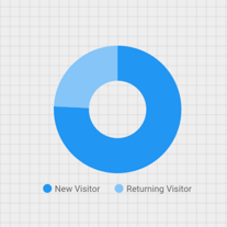


 .
.