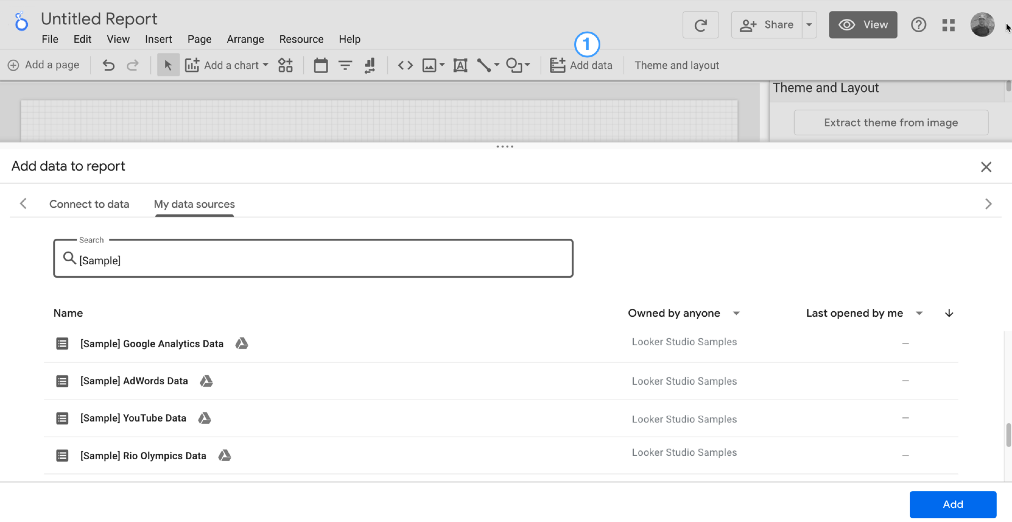
Anda akan melihat alat editor laporan, dengan panel Tambahkan data ke laporan terbuka. Panel ini memiliki dua tab: Hubungkan ke data dan Sumber data saya.
Anda akan mempelajari konektor dan sumber data lebih lanjut dalam topik Menghubungkan ke data.
Di tab Menghubungkan ke data, pilih konektor, buat sumber data baru, lalu tambahkan sumber data itu ke laporan Anda:
Pilih jenis data yang ingin divisualisasikan.
Berikan detail akun Anda atau detail lainnya.
Di kanan bawah, klik Tambahkan.
Gunakan tab Sumber data saya untuk menambahkan sumber data yang sudah ada ke laporan Anda:
Tab Sumber data saya menyertakan sejumlah contoh sumber data.
Untuk mengikuti tutorial ini, pilih sumber data [Sample] GA4 - Google Merchandise Store. Jika Anda menambahkan sumber data yang berbeda, hasil Anda dapat bervariasi dari langkah-langkah yang dijelaskan dalam tutorial ini.
Temukan sumber data yang Anda inginkan.
Di kanan bawah, klik Tambahkan.
Sumber data ditambahkan ke laporan Anda.
Tabel berisi kolom dari sumber data tersebut akan muncul.
Gunakan panel properti di sebelah kanan untuk mengubah data dan gaya tabel.
Secara default, jenis tata letak ditetapkan ke Tata letak bentuk bebas. Untuk menggunakan laporan responsif, pilih jenis Tata letak responsif. Anda dapat mengubah setelan tata letak nanti.
Laporan format bebas disesuaikan untuk layar desktop. Pilih jenis laporan ini jika Anda menginginkan kontrol yang sempurna atas penempatan dan ukuran setiap komponen laporan.
Laporan responsif dapat diskalakan dengan baik di berbagai ukuran layar. Pilih jenis laporan ini jika Anda memperkirakan pengguna akan melihat laporan secara rutin di tablet atau perangkat seluler lainnya.
Di kiri atas, beri nama laporan Anda dengan mengklik Laporan Tanpa Judul, lalu masukkan nama baru.
(Opsional) Tambahkan deskripsi ke laporan dengan mengklik menu tiga titik dan memilih Detail. Kemudian, tambahkan deskripsi ke kolom Deskripsi.
Menambahkan lebih banyak data
Untuk menambahkan sumber data lainnya ke laporan, di toolbar, klik Tambahkan data.
Langkah 2: Menambahkan diagram lain ke laporan
Diagram deret waktu memetakan data selama berjalannya waktu.
Di toolbar, klik Tambahkan diagram.
Pilih diagram Deret waktu.
Klik kanvas tempat diagram ingin ditampilkan.
Looker Studio secara otomatis menambahkan dimensi Tanggal dan metrik Tampilan (dengan asumsi Anda menggunakan sumber data Analytics).
Untuk menyesuaikan posisinya, tarik diagram, atau pilih diagram lalu pindahkan dengan menggunakan tombol panah di keyboard Anda.
Untuk menyesuaikan ukurannya, pilih diagram, lalu tarik salah satu sudut atau titik garis tengahnya.
Uraikan diagram menurut Kategori Perangkat:
Pastikan diagram deret waktu dipilih.
Di sebelah kanan, di panel Data, gunakan alat penelusuran untuk menemukan dimensi Kategori Perangkat.
Tarik kolom dan lepaskan di target Dimensi Perincian.
Diagram Anda sekarang seharusnya menampilkan rangkaian data untuk kategori perangkat yang berbeda-beda (Seluler, Desktop, dan Tablet).
Langkah 3: Menentukan gaya laporan
Tema preset memungkinkan Anda menerapkan opsi warna dan gaya ke seluruh laporan.
Edit laporan.
Di toolbar, klik Tema dan tata letak.
Pada tab TEMA, klik tema yang ingin Anda terapkan.
Anda dapat menyesuaikan salah satu tema preset. Misalnya, Anda dapat memilih warna latar belakang lain yang lebih cocok dengan merek Anda:
Di panel Tema dan Tata Letak, klik Sesuaikan.
Scroll ke bawah ke bagian Latar Belakang dan Batas.
Gunakan pemilih warna untuk menetapkan warna Latar Belakang ke warna favorit Anda. Mungkin seperti warna ungu-jingga?
Langkah 4: Tambahkan banner
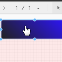
Gunakan persegi panjang berwarna sebagai banner latar belakang untuk header laporan Anda.
Pilih komponen Halaman dengan mengklik di mana saja dalam area petak.
Pilih alat Kotak dari toolbar.
Gambar persegi panjang di bagian atas halaman.
Di sebelah kanan, di panel Properti Kotak, tetapkan warna latar belakang persegi panjang menjadi biru.
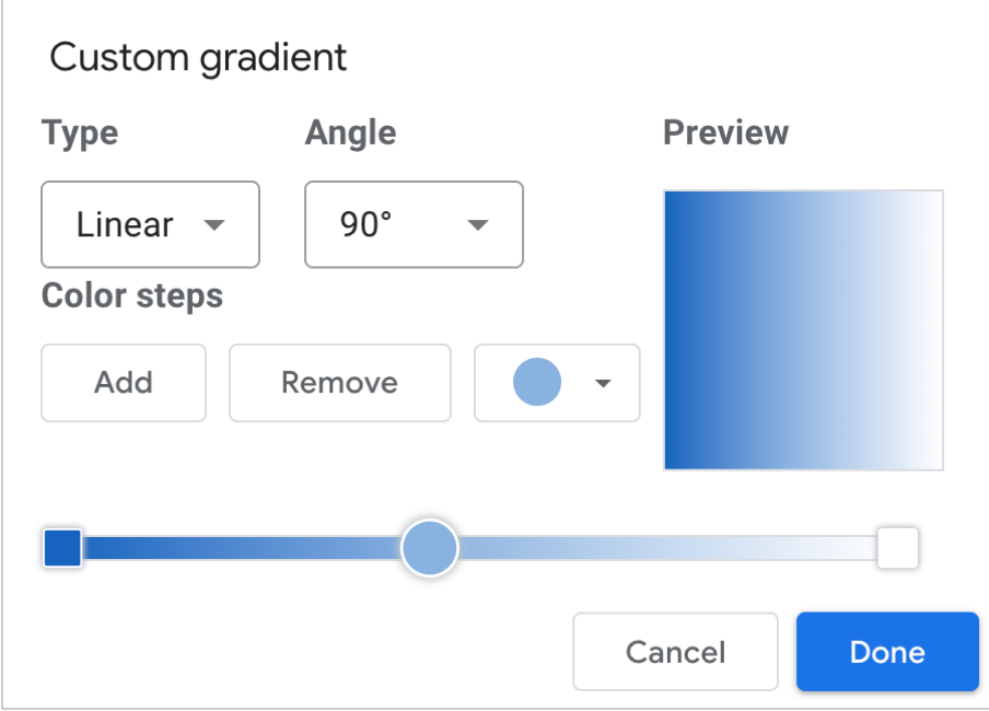
Kredit ekstra! Tambahkan gradien ke banner.
Ketika satu warna memudar menjadi warna lain, efek tersebut dinamakan gradien. Gradien adalah opsi properti warna latar belakang.
Klik kontrol warna latar belakang:
Klik Gradien.
Contoh warna di kanan dan kiri menentukan hasil awal dan akhir warna. Masukkan nilai heksadesimal warna tertentu, pilih dari palet, atau gunakan penggeser vertikal untuk memilih warna.
Panah orientasi mengontrol aliran gradien.
Langkah 5: Tambahkan judul ke laporan
Alat teks memungkinkan Anda menganotasi laporan dan diagram.
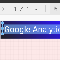
Pilih alat Teks dari toolbar.
Gambar kotak teks di dalam persegi panjang banner.
Ketik Google Analytics Demo Dashboard di kolom.
Tandai teks. Gunakan panel Properti Teks di sebelah kanan untuk mengubah warna font dan ukuran font sesuai keinginan Anda.
Halo, Di mana tombol SIMPAN?
Looker Studio akan otomatis menyimpan setiap perubahan yang Anda buat, sehingga Anda tidak perlu mengklik Simpan saat mengedit laporan. Cukup keren!
[[["Mudah dipahami","easyToUnderstand","thumb-up"],["Memecahkan masalah saya","solvedMyProblem","thumb-up"],["Lainnya","otherUp","thumb-up"]],[["Sulit dipahami","hardToUnderstand","thumb-down"],["Informasi atau kode contoh salah","incorrectInformationOrSampleCode","thumb-down"],["Informasi/contoh yang saya butuhkan tidak ada","missingTheInformationSamplesINeed","thumb-down"],["Masalah terjemahan","translationIssue","thumb-down"],["Lainnya","otherDown","thumb-down"]],["Terakhir diperbarui pada 2025-09-04 UTC."],[],[],null,["# Tutorial: Create a new report\n\nIn this tutorial, you'll learn how to create a new report in Looker Studio.\n\nStep 1: Create a new blank report\n---------------------------------\n\n1. [Sign in to Looker Studio.](https://lookerstudio.google.com)\n\n2. Click **Create** and then select **Report**.\n\n3. You'll see the report editor tool, with the *Add data to report* panel open. This panel has two tabs: *Connect to data* and *My data sources*.\n\n \u003e You'll learn more about connectors and data sources in the [Connect to your data](/looker/docs/studio/about-connectors-data-sources-and-credentials) topic.\n 1. In the *Connect to data* tab, select a [connector](/looker/docs/studio/connector), create a new data source, and add that to your report:\n\n 1. Select the type of data that you want to visualize.\n 2. Provide your account or other details.\n 3. In the bottom right, click **Add**.\n 2. Use *My data sources* to add an existing [data source](/looker/docs/studio/data-source) to your report:\n\n \u003e \u003cbr /\u003e\n \u003e\n \u003e The **My data sources** tab includes a number of sample data sources.\n \u003e\n \u003e To follow along with this tutorial, select the `[Sample] GA4 - Google Merchandise Store` data source. If you add a different data source, your results may vary from the steps described in this tutorial.\n \u003e\n \u003e \u003cbr /\u003e\n \u003e\n \u003e | **Tip:** If you have a lot of data sources, use the search bar to locate the data source that you want.\n \u003e |\n \u003e | \u003cbr /\u003e\n \u003e |\n \u003e \u003cbr /\u003e\n \u003e\n 1. Locate the data source that you want.\n 2. In the bottom right, click **Add**.\n 3. The data source is added to your report.\n4. A table appears with fields from that data source.\n\n Use the [properties panel](/looker/docs/studio/properties-panel) on the right to change the data and style of the table.\n5. By default, the layout type is set to **Freeform layout** . To use a [responsive report](/looker/docs/studio/create-a-responsive-report) instead, select the **Responsive layout** type. You can change the layout setting later.\n\n - A freeform report is tailored for desktop screens. Choose this report type if you want pixel-perfect control over the placement and sizing of each report component.\n - A responsive report scales well across many different screen sizes. Choose this report type if you expect your users to regularly view the report on a tablet or other mobile device.\n6. In the top left, name your report by clicking *Untitled Report* and then entering a new name.\n\n7. (Optional) Add a description to your report by clicking the three-dot menu and selecting **Details** . Then add a description to the **Description** field.\n\n### Add more data\n\nTo add more data sources to a report, in the toolbar, click **Add data**.\n\nStep 2: Add another chart to the report\n---------------------------------------\n\nThe time series chart plots data over the course of time.\n\n1. In the toolbar, click **Add a chart**.\n\n2. Select a **Time series** chart .\n\n3. Click the canvas where you want the chart to appear.\n\n4. Looker Studio automatically adds the *Date* dimension and the *Views* metric (assuming you're using an Analytics data source).\n\n5. To adjust the chart's position, drag it, or select the chart and move it by using your keyboard arrow keys.\n\n | **Tip:** Each press of the arrow key moves the chart one full column or row (10 px) on the grid. Hold the Shift key down while using your arrow keys to nudge the selected components into place one pixel at a time.\n6. To adjust the chart's size, select it, and then drag a corner or mid-line point.\n\n7. Break down the chart by *Device Category*:\n\n 1. Make sure that the time series chart is selected.\n 2. On the right, in the **Data** panel, use the search tool to find the *Device Category* dimension.\n 3. Drag the field and drop it on the **Breakdown Dimension** target.\n\nYour chart should now display data series for the different device categories (Mobile, Desktop, and Tablet).\n\nStep 3: Style the report\n------------------------\n\nPreset themes let you apply color and style options to your entire report.\n\n1. Edit the report.\n2. In the toolbar, click **Theme and layout**.\n3. In the THEME tab, click the theme that you want to apply.\n\nYou can customize any of the preset themes. For example, you can select a different background color that better matches your brand:\n\n1. In the *Theme and Layout* panel, click **Customize**.\n2. Scroll down to the *Background and Border* section.\n3. Use the color picker to set the **Background** color to your favorite color. Something in a mauvy-peach, perhaps?\n\nStep 4: Add a banner\n--------------------\n\nUse a colored rectangle as a background banner for your report header.\n\n1. Select the [Page](/looker/docs/studio/page) component by clicking anywhere in the grid area.\n2. Select the **Rectangle** tool from the toolbar.\n3. Draw a rectangle across the top of the page.\n4. On the right, in the *Rectangle Properties* panel, set the rectangle background color to blue.\n\n#### Extra credit! Add a gradient to the banner.\n\nWhen one color fades into another, the effect is called a gradient. Gradients are an option of the background color property.\n\n1. Click the background color control:\n2. Click **Gradient**.\n\nThe left and right color swatches determine the starting and ending colors. Enter the specific color hex values, choose from the palette, or use the vertical sliders to select the color.\n\nThe orientation arrow controls the flow of the gradient.\n\nStep 5: Add a title to the report\n---------------------------------\n\nThe text tool lets you annotate your reports and charts.\n\n1. Select the **Text** tool from the toolbar.\n2. Draw a textbox inside the banner rectangle.\n3. Type `Google Analytics Demo Dashboard` in the field.\n4. Highlight the text. Use the *Text Properties* panel on the right to change the font color and the font size to something that looks nice to you.\n\n\u003e #### Hey! Where's the SAVE button?\n\u003e\n\u003e Looker Studio automatically saves every change you make, so there's no need to click **Save** when editing a report. Pretty sweet!\n\nNext steps\n----------\n\n[Add more charts to your report.](/looker/docs/studio/tutorial-add-charts-to-your-report)"]]