Gunakan diagram untuk memvisualisasikan dan mempelajari data Anda. Dalam pelajaran ini, Anda akan menambahkan diagram lingkaran, diagram batang, dan diagram Geografis ke laporan ini.
Cara menambahkan diagram
Untuk menambahkan diagram ke halaman saat ini:
- Edit laporan.
- Buka halaman yang akan berisi diagram.
- Di toolbar, klik Tambahkan diagram.
- Pilih chart yang ingin Anda tambahkan.
- Klik kanvas untuk menambahkan chart ke laporan.
- Pilih satu atau beberapa diagram untuk dipindahkan atau diubah ukurannya sesuai kebutuhan.
Langkah 1: Tambahkan diagram lingkaran
 Gunakan diagram lingkaran untuk membuat perbandingan umum terkait sejumlah kecil metrik atau variabel.
Pelajari diagram lingkaran lebih lanjut.
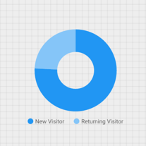
- Dengan mengikuti langkah-langkah dalam [Cara menambahkan diagram](#how-to-add-a-chart), tambahkan Diagram Lingkaran ke laporan.
- Di panel Properti, pilih tab PENYIAPAN.
- Klik chip dimensi Sumber untuk mengakses Pemilih Dimensi.
- Klik dimensi Jenis Pengguna.
- Klik tab GAYA.
- Gunakan penggeser donat untuk mengubah bentuk solid menjadi bentuk cincin.

- Gunakan properti Legenda untuk menempatkan label metrik di bawah lingkaran:

Langkah 2: Tambahkan diagram batang
Diagram batang sangat baik untuk menampilkan dan membandingkan besaran beberapa variabel.
Pelajari diagram batang lebih lanjut.
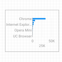
- Dengan mengikuti langkah-langkah dalam Cara menambahkan diagram, tambahkan Diagram Batang ke laporan.
- Di panel Properti, pilih tab PENYIAPAN.
- Klik dimensi Sumber dan ubah menjadi Browser.
- Klik panah arah kembali:

- Klik metrik Sesi lalu ubah menjadi Pengguna.
- Klik tab GAYA.
- Ubah orientasi menjadi Horizontal :

- Scroll ke bagian Latar Belakang dan Batas di tab GAYA.
- Tetapkan Warna batas ke abu-abu:

Langkah 3: Tambahkan Peta Google
Gunakan Peta Google Maps untuk melihat distribusi sesi (atau metrik lainnya) di seluruh dunia.
Pelajari Google Maps lebih lanjut.
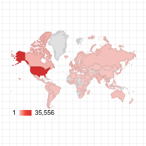
- Dengan mengikuti langkah-langkah dalam Cara menambahkan diagram, tambahkan Peta Google Maps ke laporan. Pilih gaya peta balon.
- Di panel Properti, pilih tab PENYIAPAN.
- Klik kolom Lokasi default lalu ganti dengan dimensi Kota.
- Tambahkan metrik untuk warna dan ukuran balon. Misalnya, pilih Sesi untuk Ukuran, dan Waktu rata-rata di Halaman untuk Warna.
- Pilih tab Gaya.
- Gunakan penggeser untuk menyesuaikan detail latar belakang, seperti jalan, tempat terkenal, dan label.
- Di bagian Warna, pilih warna untuk rentang nilai metrik.
- Di bagian Kontrol Peta, aktifkan atau nonaktifkan kontrol peta yang Anda inginkan untuk digunakan oleh pelihat.
- Lihat laporan Anda. Geser, zoom, dan scroll. Anda juga dapat menggunakan Street View.
Langkah berikutnya
Selamat! Anda telah membuat laporan Looker Studio pertama Anda.
Jika Anda suka, tambahkan judul, ubah warna dan gaya, tambahkan lebih banyak visualisasi. Jika Anda sudah siap melanjutkan, mulai pelajaran berikutnya: Melihat dan membagikan laporan.
Referensi terkait
Jenis diagram di Looker Studio