This page applies to Apigee and Apigee hybrid.
This page describes the dashboards available in API insights and provides an overview of the metrics available in each dashboard.
The following dashboards are available in API insights:
Before you begin
Assign the required IAM roles and permissions to your principal account. See IAM roles and permissions for more details.
Gateway performance
The Gateway performance dashboard helps you monitor the health of your entire API ecosystem, allowing you to prioritize efforts by identifying active gateways and managing inactive or underperforming ones. You can filter the dashboard by gateway type and gateway name.
To view this dashboard, go to the API hub > API insights page in the Google Cloud console and select the Gateway performance tab.
The following metrics are available in this dashboard:
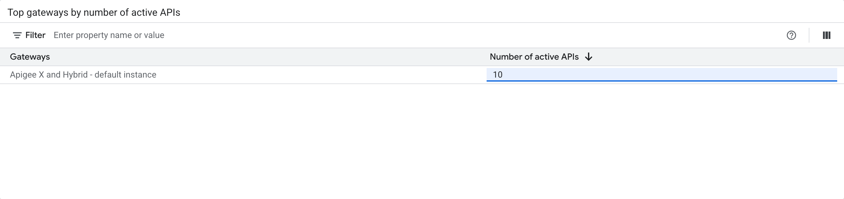
- Top gateways by number of active APIs: displays the top gateways ranked by the number of active APIs in the selected time period.
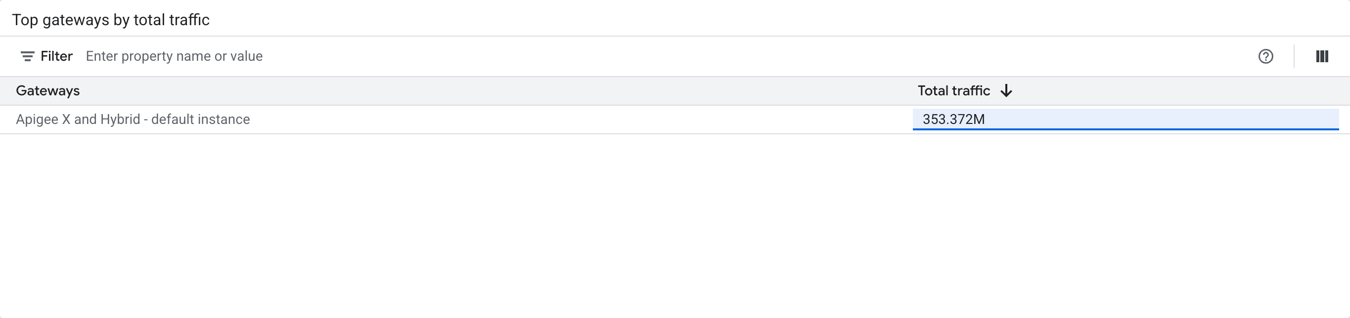
- Top gateways by total traffic: displays the top gateways ranked by the total traffic in the selected time period.
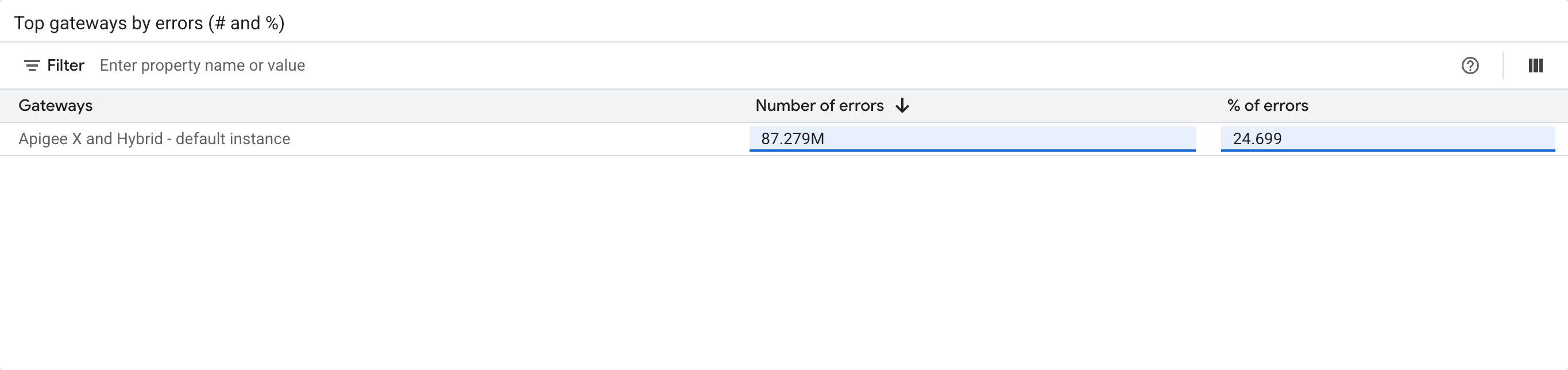
- Top gateways by errors (# and %): displays the top gateways ranked by the number of errors and percentage of errors in the selected time period.
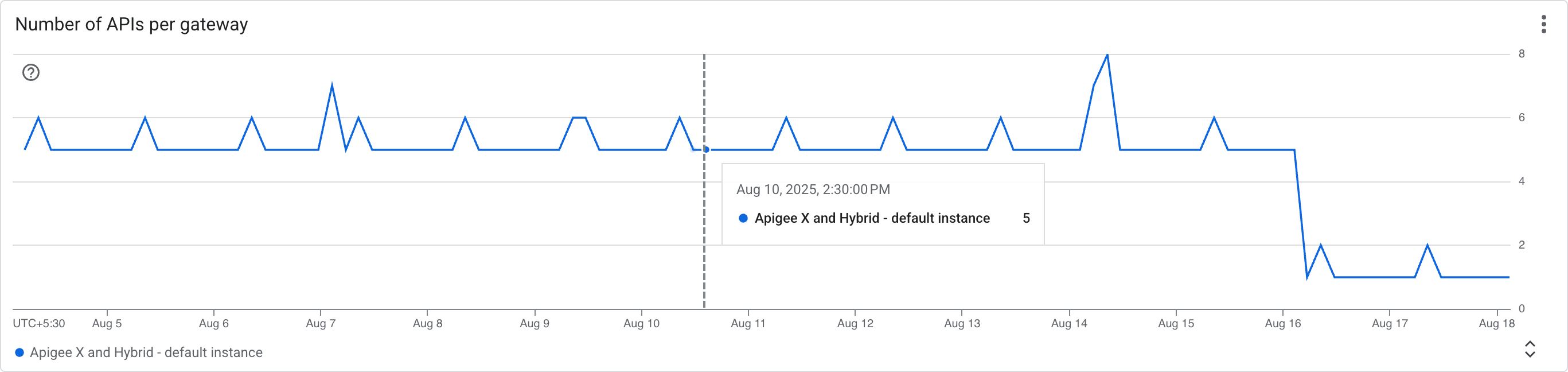
- Number of APIs per gateway: displays a time-series graph of the number of APIs present for each gateway in the selected time period.
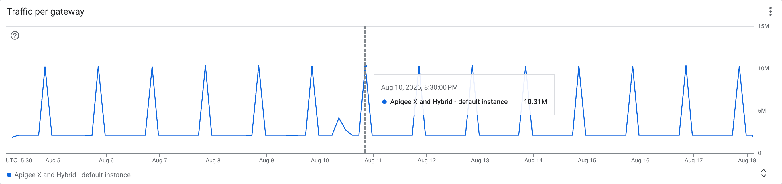
- Traffic per gateway: displays a time-series graph of the traffic volume for each gateway in the selected time period.
API performance
The API performance dashboard provides insights into the traffic and performance of your APIs, with filters for gateway type, gateway name, API name, and deployment name. You can click on the names of the APIs to view detailed information about that API.
To view this dashboard, go to the API hub > API insights page in the Google Cloud console and select the API performance tab.
The following metrics are available in this dashboard:
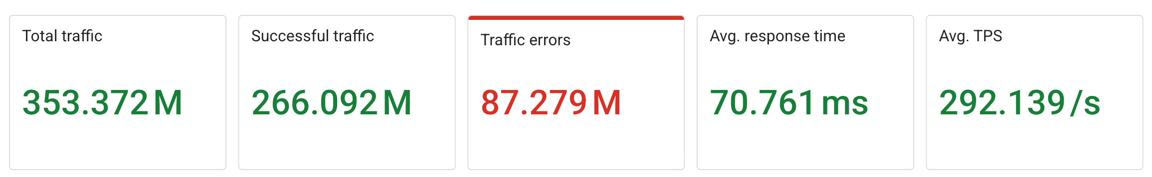
- Summary scorecards: the following metric scorecards are displayed to provide a quick overview of the API traffic and performance data:
- Total traffic: the overall volume of API traffic in the selected time period.
- Successful traffic: the total count of successful API calls in the selected time period.
- Traffic errors: the total count of errors encountered in the selected time period.
- Avg response time: the average time taken for a request to be processed by the gateway in the selected time period.
- Avg TPS: the average number of transactions processed per second in the selected time period.
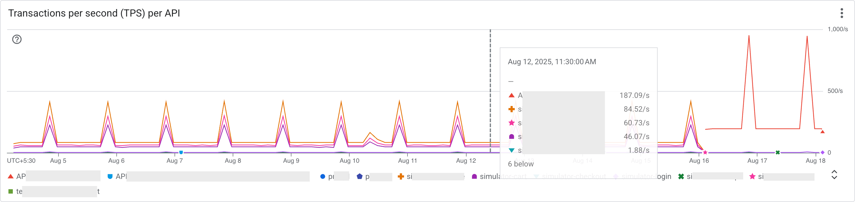
- Transactions per second (TPS) per API: displays a time-series graph of the number of transactions processed per second for individual APIs in the selected time period. One request and its response count as one transaction.
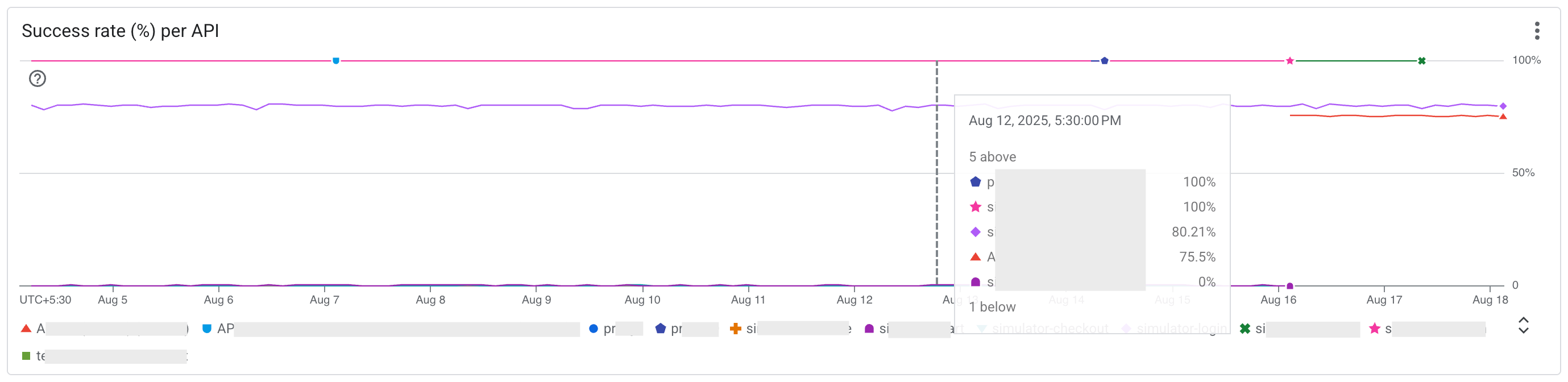
- Success rate (%) per API: displays a time-series graph of the success rate percentage for APIs in the selected time period.
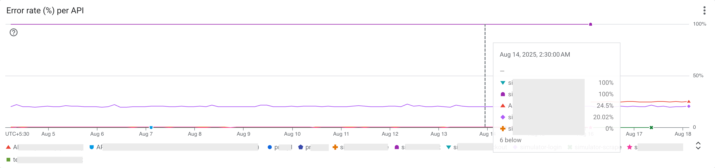
- Error rate (%) per API: displays a time-series graph of the error rate percentage for APIs in the selected time period.
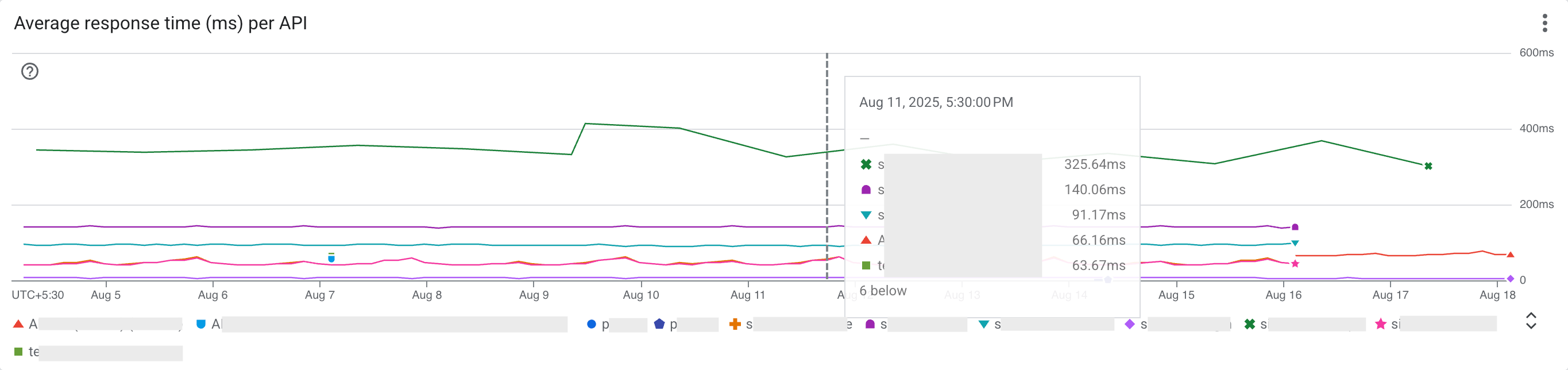
- Average response time (ms) per API: displays a time-series graph of the average latency (total response time) in milliseconds for APIs in the selected time period.
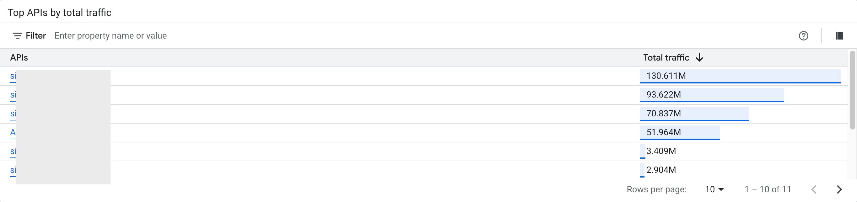
- Top APIs by total traffic: displays the top APIs ranked by the total traffic in the selected time period.
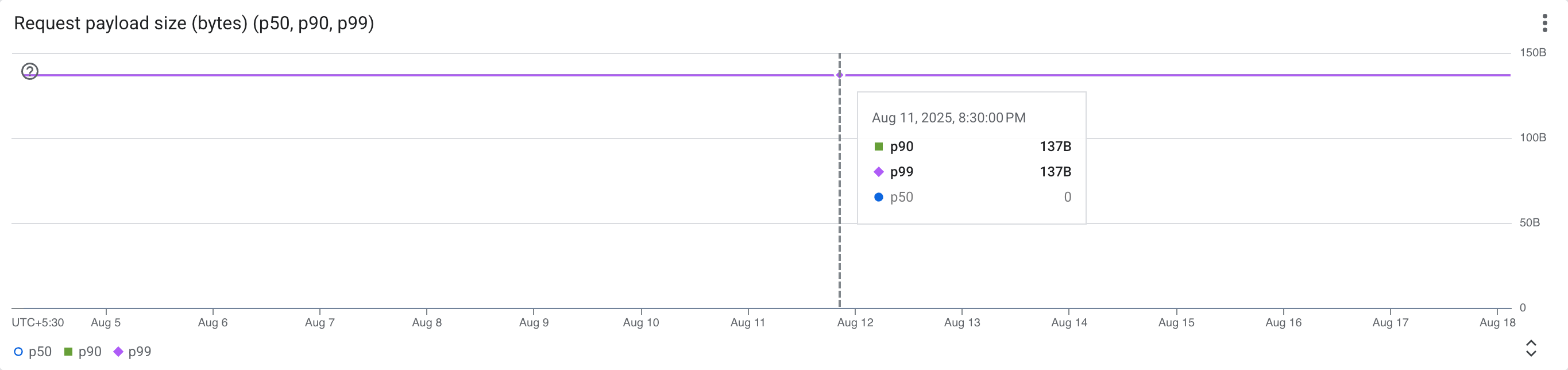
- Request payload size (bytes) (p50, p90, p99): displays percentiles (p50, p90, p99) of request payload sizes of APIs in the selected time period.
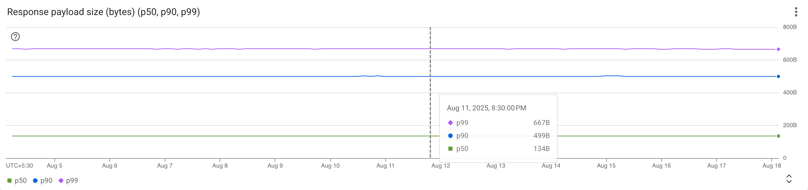
- Response payload size (bytes) (p50, p90, p99): displays percentiles (p50, p90, p99) of response payload sizes of APIs in the selected time period.
API error analysis
The API error analysis dashboard provides insights into the number of errors and the error type of your APIs, with filters for gateway type, gateway name, API name, and deployment name. API errors are based on HTTP error code categories.
To view this dashboard, go to the API hub > API insights page in the Google Cloud console and select the API error analysis tab.
The following metrics are available in this dashboard:
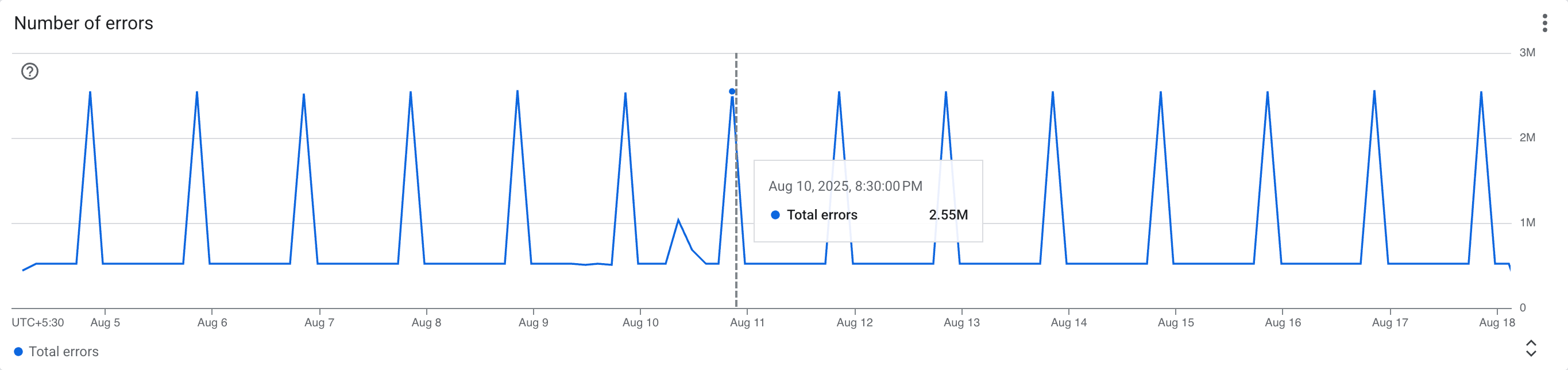
- Number of errors: displays a time-series graph of the total number of errors for APIs in the selected time period.
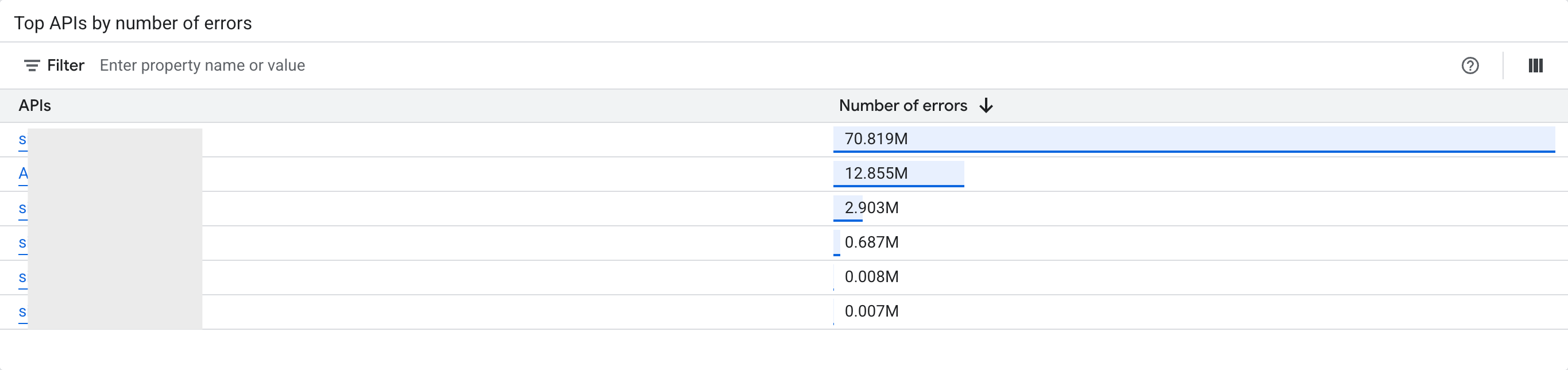
- Top APIs by number of errors: displays the top APIs ranked by the number of errors in the selected time period.
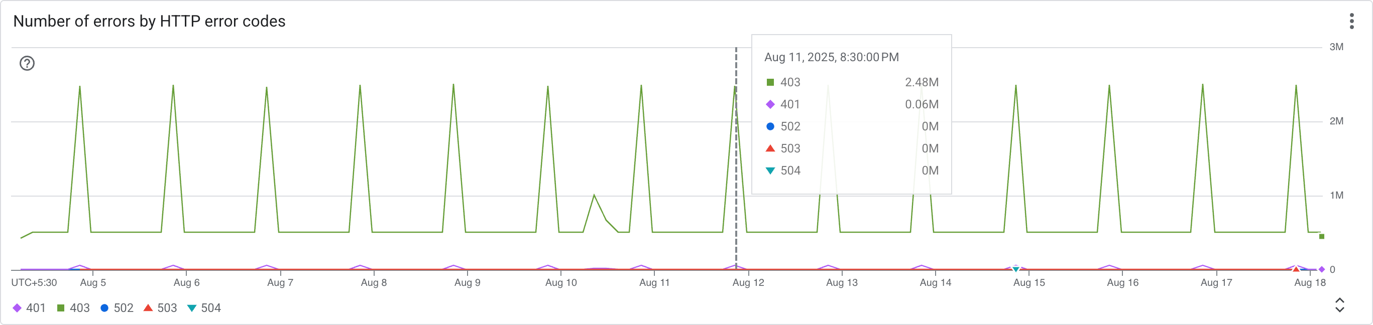
- Number of errors based on HTTP error codes: displays the number of API calls for each HTTP error code category.
Latency analysis
The Latency analysis dashboard provides insights into the latency of your APIs across multiple percentiles, with filters for gateway type, gateway name, API name, and deployment name. You can analyze latency by 50th, 95th, and 99th percentiles for all metrics.
To view this dashboard, go to the API hub > API insights page in the Google Cloud console and select the Latency analysis tab.
The following metrics are available in this dashboard:
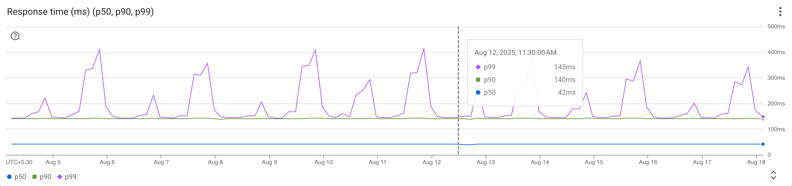
- Response time (ms) (p50, p90, p99): displays percentiles (p50, p90, p99) of the overall response time in milliseconds for APIs in the selected time period.
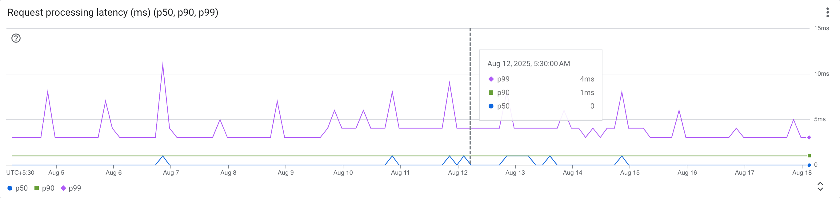
- Request processing latency (ms) (p50, p90, p99): displays percentiles (p50, p90, p99) of the latency specifically during the request processing phase in milliseconds for APIs in the selected time period.
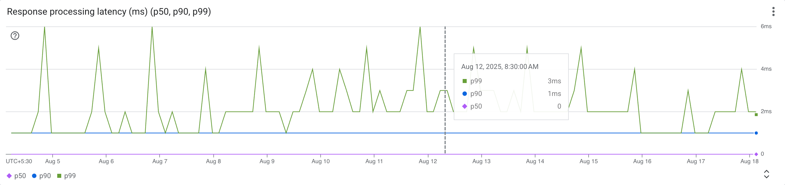
- Response processing latency (ms) (p50, p90, p99): displays percentiles (p50, p90, p99) of the latency specifically during the response processing phase in milliseconds for APIs in the selected time period.
Target performance
The Target performance dashboard provides insights into the traffic and performance of your targets, with filters for gateway type, gateway name, target IP, and target name.
To view this dashboard, go to the API hub > API insights page in the Google Cloud console and select the Target performance tab.
The following metrics are available in this dashboard:
- Summary scorecards: the following metric scorecards are displayed to provide a quick overview of the target traffic and performance data:
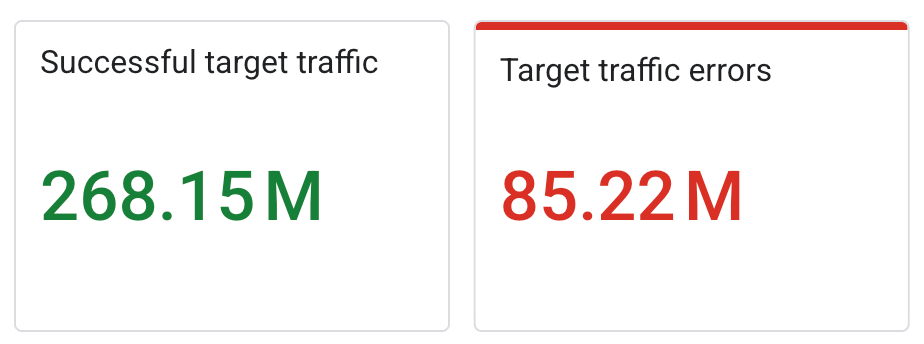
- Successful target traffic: the overall successful traffic to targets in the selected time period.
- Target traffic errors: the overall traffic errors to targets in the selected time period.
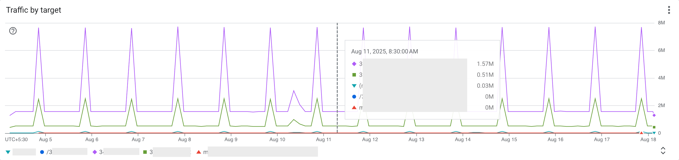
- Traffic by target: displays a time-series graph of the traffic volume for each target in the selected time period.
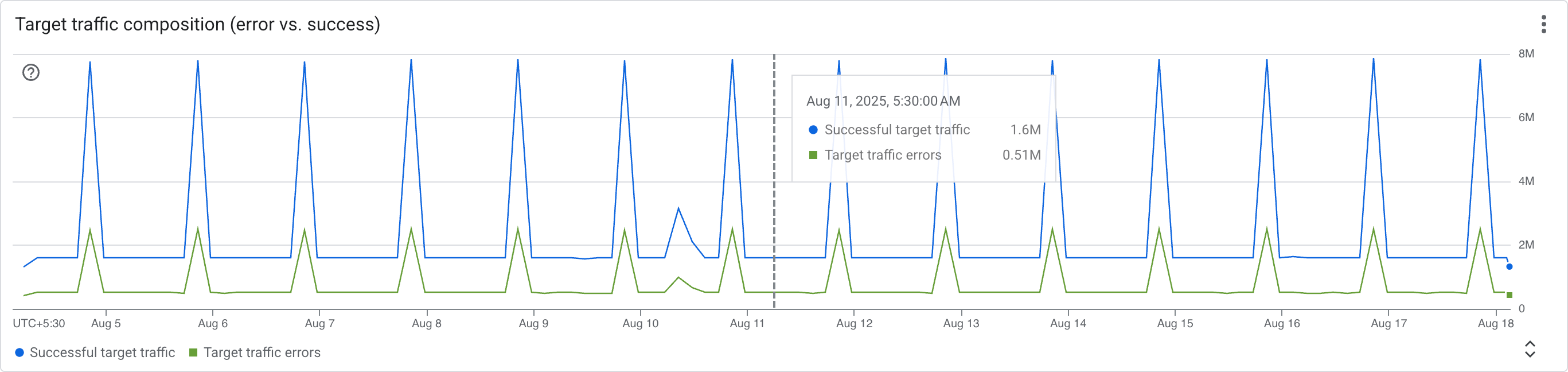
- Target traffic composition (error vs. success): displays a time-series graph of the successful traffic versus error traffic to targets in the selected time period.
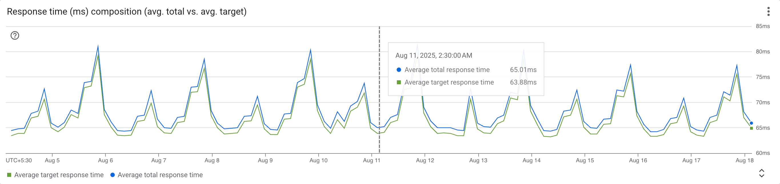
- Response time (ms) composition (avg. total vs. avg. target): displays a time-series graph of the average total response time versus the average target response time in the selected time period.
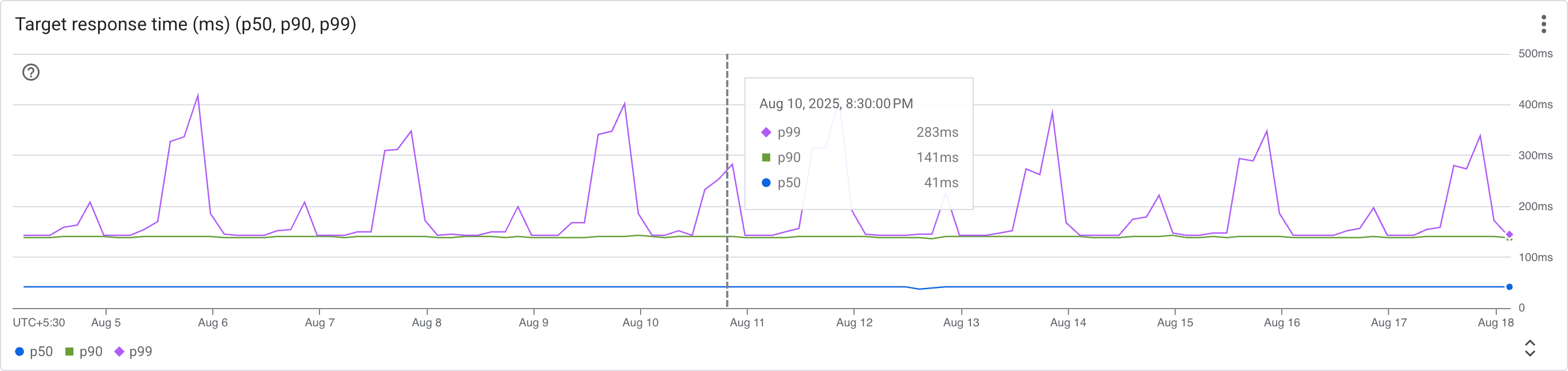
- Target response time (ms) (p50, p90, p99): displays percentiles (p50, p90, p99) of the target response time in milliseconds for targets in the selected time period.
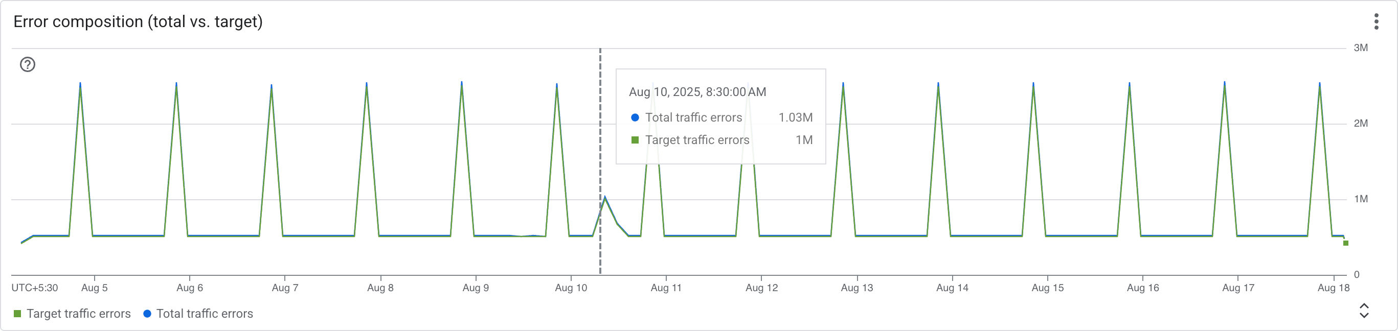
- Error composition (total vs. target): displays a time-series graph of the total error count versus the target error count in the selected time period.
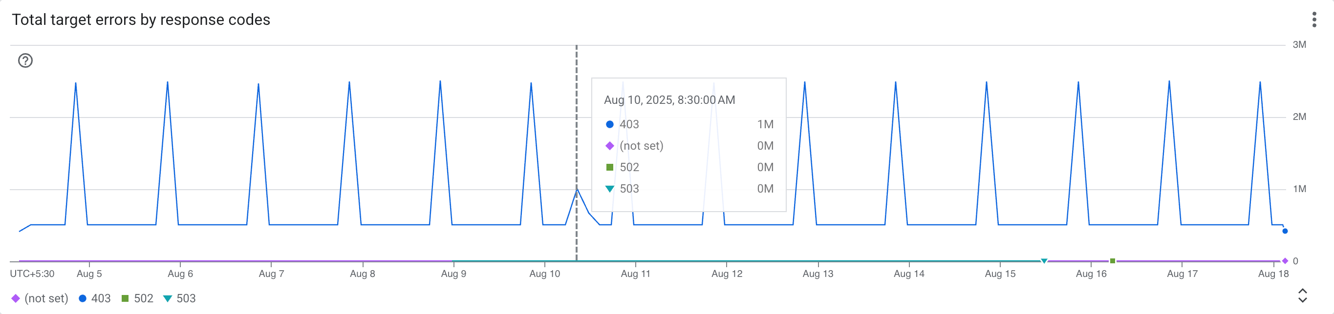
- Total target errors by response codes: displays the total target errors categorized by HTTP response codes.
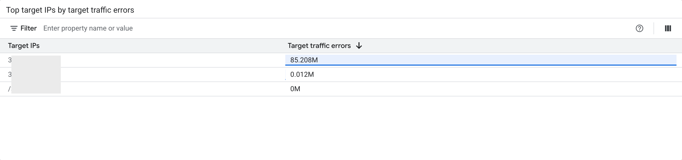
- Top target IPs by target traffic errors: displays the top target IPs based on the number of target traffic errors.
Limitations
- Time-series charts and tables are limited to displaying the top 50 resources.
Considerations
- Time-series charting discrepancy with API analytics
When comparing time-series charts between API insights and API analytics, you may notice a time shift in how data points are plotted. While the overall shape of the graph for a given metric is identical, the timestamps on the x-axis will be different.
This discrepancy is due to a fundamental difference in how the two systems anchor data points in time:
- API insights plots a metric value at the end time of its collection interval. For example, a data point for traffic aggregated from 8:00 AM to 9:00 AM will be displayed at the 9:00 AM timestamp.
- API analytics plots the same value at the start time of the interval, meaning it would be displayed at the 8:00 AM timestamp.
The duration of this time shift is determined by the data aggregation interval (granularity), which varies based on the time range you select in the UI.
-
API insights presents empty API data values as
Not set. - If the data volume is too large for a selected time range, or if you have a high number of resources (such as APIs, deployments, plugin instances, or target IPs), the UI might not be able to display the data. Consider selecting smaller time ranges for better results and keeping your resources below 1000.
What's next
- Learn more about API insights overview.
- Learn about the available insights for each API resource. See View API resource insights.