This page applies to Apigee and Apigee hybrid.
View
Apigee Edge documentation.

Using the page editor, you define your portal content using Markdown or HTML.
Exploring the page editor
Access the page editor by clicking the name of a page when viewing the list of pages, as described in Managing the pages in your portal.
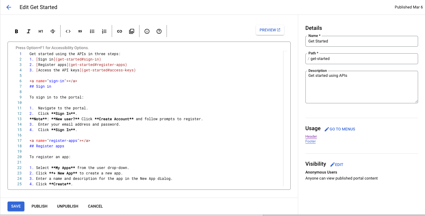
The page editor opens:
Cloud Console UI
Classic UI
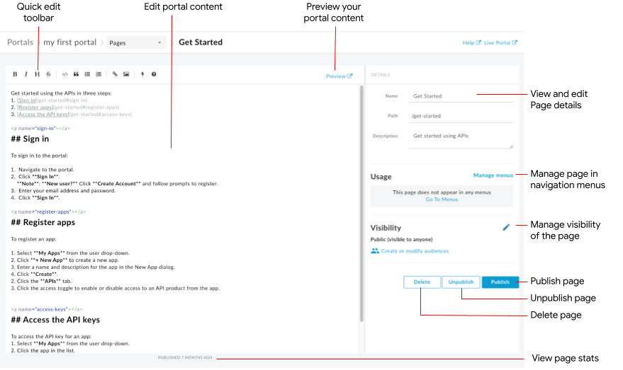
The page editor lets you:
- Edit portal content and add Angular Material components in the left pane
- Use the quick edit toolbar to apply formats or insert Markdown tags quickly
- Edit page details, such as name, path, and description, in the right pane
- Manage the visibility for a page in the right pane
- Preview the portal content
- Publish or unpublish a page (see Publish your portal content)
- Manage the page in your navigation menus (see Set up navigation)
- View the amount of time since the page was last published
- Delete a page
Editing content in the page editor
Markdown is a simple formatting language that uses plain text markup that is both easy to read and write. Its syntax is specified using punctuation characters. Markdown is converted to HTML before rendering in your browser.
The quick edit toolbar at the top of the page editor provides shortcuts for applying formats (such as bold, italic, and so on) or inserting Markdown tags (such as lists, images, links, and so on).
For a quick summary of Markdown syntax, in the quick edit toolbar:
Cloud Console UI
Click the Information icon.
Classic UI
Click the icon.
The Markdown syntax quick reference is displayed.
To undo or redo the last edit, press Command+z or Command+Shift+z, respectively.
Markdown is recommended if you want to keep your formatting workflow simple. However, it is not intended to replace HTML. There is a wide range of formatting you can do in HTML that you cannot do in Markdown. For example, you can specify a CSS class for an element in HTML; you cannot do this in Markdown:
<p class="class1">
You can insert HTML anywhere within the content body by simply entering the HTML tags.
For information about HTML tags, see the HTML5 specification.
Adding Angular Material components
Angular Material provides a state-of-the-art UI component library. Angular Material components enable you to quickly and easily construct consistent, responsive, and accessible user interfaces utilizing modern design principles.
Available components
The portal experience is built using Angular Material, and a limited set of Angular Material components may be used in pages, summarized in the following table.
| Component | Example |
|---|---|
| Buttons | The following code creates a rectangular button with elevation.The following code creates a circular button with a transparent background that includes the warning icon. The color of the button is defined using the warn color palette. |
| Card | The following code creates a card. The card includes button and icon components, as well as heading and body text. The color of the button is defined using the primary color palette. |
| Icon | The following code creates a checkmark icon. For a complete list of icons that are supported, see Material Design - Icons. |
| Toolbar | The following code creates a simple toolbar with text and a shopping cart icon.
|
Managing the visibility for a page in your portal
Managing the visibility of a page in your portal is described in Managing the visibility of a page in your portal.
Previewing portal content
To preview the portal content:
- Access the page editor as described in Managing the pages in your portal.
Preview the page.
Cloud Console UI
- Click Save.
- Click Preview.
Classic UI
- Click Preview in the page editor toolbar.
- Navigate through other pages in your portal to preview the content, as desired.
Publishing portal content
Publishing and unpublishing portal content is described in Publishing your portal content.
Deleting a page
Deleting pages from the portal is described in Deleting pages from your portal.