Die Zeitachsenansicht von API-Monitoring zeigt die Zeitachsen des letzten API-Traffics an, um Sie bei der Diagnose und Untersuchung von Problemen zu unterstützen.
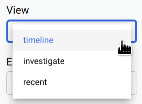
Für den Zugriff auf die Zeitachsenansicht führen Sie die Schritte unter Auf API-Monitoring zugreifen aus und wählen Zeitachse aus.
Die Abbildung unten zeigt die Benutzeroberfläche, in der Zeitachse ausgewählt ist.
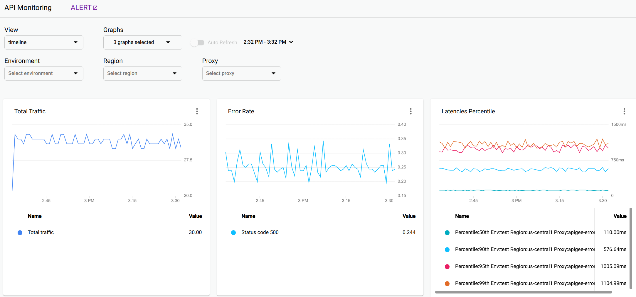
In der Zeitachsenansicht werden die folgenden Grafiken angezeigt:
Gesamter Proxy-Traffic: Die Anzahl der Anfragen in 1-Minuten-Intervallen des Zeitraums.
Proxy-Fehlerrate: Gesamtanzahl der Fehler (4xx und 5xx) geteilt durch den gesamten Traffic in jedem Intervall.
Proxy-Latenzperzentil: Perzentile für die API-Latenz.
Im Diagramm werden die folgenden Perzentile angezeigt: 50. (Median) 90., 95. und 99. Perzentil.
Gesamter Ziel-Traffic
Zielfehlerrate
Latenzperzentil des Ziels
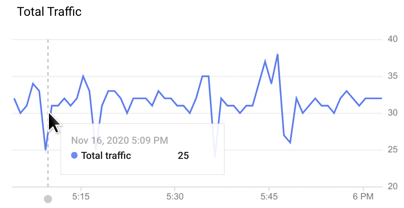
Bewegen Sie den Mauszeiger auf einen beliebigen Punkt in einer Grafik, um die Werte für diesen Punkt anzuzeigen.
Sie können die gewünschten Diagramme im Drop-down-Menü Grafiken auswählen.
Grafikoptionen für alle Ansichten
Die folgenden Grafikoptionen stehen in allen drei Ansichten zur Verfügung: Zeitachse, Untersuchung und Letzte:
WARNUNG: Klicken Sie auf BENACHRICHTIGUNG, um Benachrichtigungen für Ereignisse wie Traffic- oder Latenzspitzen einzurichten.
Ansicht: Wählen Sie eine der API-Monitoring-Ansichten aus:
Zeitachse (oben angezeigt)
Untersuchung
Letzte
Grafiken: Wählen Sie die anzuzeigenden Grafiken aus der Drop-down-Liste aus.
Wenn Sie die Diagramme auswählen, werden sie in der Reihenfolge ihrer Auswahl angezeigt, beginnend mit den zuletzt ausgewählten.
Zeitraum: Wählen Sie die Länge des Zeitraums für die Grafiken aus.
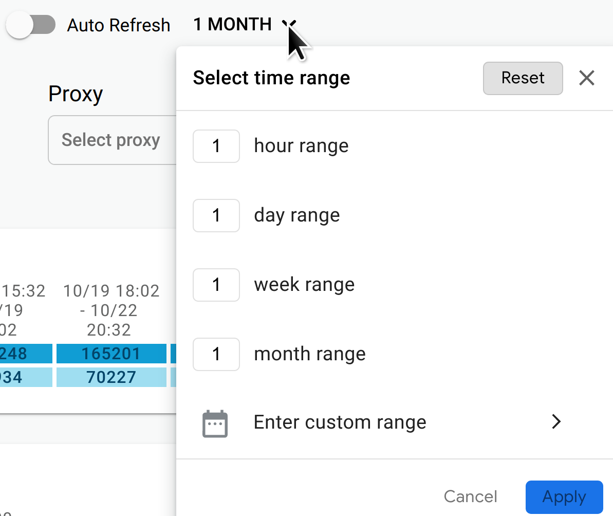
Sie können auch die Automatisch aktualisieren aktivieren, damit die Daten einmal pro Minute aktualisiert werden.
Umgebung: Wählen Sie die Umgebung für die API aus.
Region (nur Ansichten "Zeitachse" und "Untersuchung"): Wählen Sie die API-Region aus.
Proxy (nur Ansichten "Zeitachse" und "Untersuchung"): Wählen Sie den API-Proxy aus.
[[["Leicht verständlich","easyToUnderstand","thumb-up"],["Mein Problem wurde gelöst","solvedMyProblem","thumb-up"],["Sonstiges","otherUp","thumb-up"]],[["Schwer verständlich","hardToUnderstand","thumb-down"],["Informationen oder Beispielcode falsch","incorrectInformationOrSampleCode","thumb-down"],["Benötigte Informationen/Beispiele nicht gefunden","missingTheInformationSamplesINeed","thumb-down"],["Problem mit der Übersetzung","translationIssue","thumb-down"],["Sonstiges","otherDown","thumb-down"]],["Zuletzt aktualisiert: 2025-09-05 (UTC)."],[[["\u003cp\u003eThis page details the API Monitoring Timeline view in Apigee and Apigee hybrid, which offers graphical insights into recent API traffic for diagnostic purposes.\u003c/p\u003e\n"],["\u003cp\u003eThe Timeline view displays several graphs, including Proxy Total Traffic, Proxy Error Rate, Proxy Latencies Percentile, Target Total Traffic, Target Error Rate, and Target Latencies Percentile.\u003c/p\u003e\n"],["\u003cp\u003eUsers can customize the view by selecting specific graphs to display, adjusting the time range, and turning on auto-refresh to update the data every minute.\u003c/p\u003e\n"],["\u003cp\u003eIn addition to viewing data, the tool offers configuration options for alerts, different views (Timeline, Investigate, and Recent), and the ability to filter by environment, region, and proxy.\u003c/p\u003e\n"]]],[],null,["# Using the Timeline view\n\n*This page\napplies to **Apigee** and **Apigee hybrid**.*\n\n\n*View [Apigee Edge](https://docs.apigee.com/api-platform/get-started/what-apigee-edge) documentation.*\n\n\u003cbr /\u003e\n\nThe API Monitoring Timeline view displays timelines of\nrecent API traffic, to help you diagnose and investigate issues.\n\nTo access the Timeline view, follow the steps in\n[Accessing API Monitoring](/apigee/docs/api-monitoring#accessing_api_monitoring) and\nselect **Timeline**. \n\n\u003cbr /\u003e\n\nThe figure below shows the UI with **Timeline** selected. \n\nThe Timeline view displays following graphs:\n\n- **Proxy Total Traffic**: Numbers of requests during 1 minute intervals of the time range.\n- **Proxy Error Rate**: Total errors (4xx and 5xx) divided by the total traffic in each interval.\n- **Proxy Latencies Percentile** : Percentiles for API [latency](/apigee/docs/api-platform/analytics/latency-analysis-dashboard). The graph shows the following percentiles: 50th (median) 90th, 95th, and 99th percentile.\n- **Target Total Traffic**\n- **Target Error Rate**\n- **Target Latencies Percentile**\n\nHover the mouse over any point in a graph to display the values at that point.\n\nYou can choose which graphs to display in the **Graphs** drop-down menu.\n\nGraph options for all views\n---------------------------\n\nThe following graph options are available in all three views: Timeline,\nInvestigate, and Recent:\n\n- **ALERT** : Click **ALERT** to set up [alerts and notifications](https://cloud.google.com/monitoring/alerts) for events, such as spikes in traffic or latencies.\n- **View**: Select one of the API Monitoring views:\n\n - Timeline (shown above)\n - Investigate\n - Recent\n- **Graphs**: Select the graphs to display from the drop-down list.\n\n When you select the graphs, they are displayed in the order in which you\n selected them, starting with the most recently selected.\n- **Time range**: Select the length of the time range for the graphs.\n\n You can also turn on **Auto Refresh** to automatically refresh the data\n once every minute.\n- **Environment** : Select the\n [environment](/apigee/docs/api-platform/fundamentals/environments-overview)\n for the API.\n\n- **Region** (Timeline and Investigate views only): Select the API\n [region](https://cloud.google.com/compute/docs/regions-zones).\n\n- **Proxy** (Timeline and Investigate views only): Select the API\n [proxy](/apigee/docs/api-platform/fundamentals/understanding-apis-and-api-proxies)."]]