Menjelajahi dan memvisualisasikan data di BigQuery dari dalam JupyterLab
Halaman ini menunjukkan beberapa contoh cara menjelajahi dan memvisualisasikan data yang disimpan di BigQuery dari dalam antarmuka JupyterLab dari instance notebook terkelola Vertex AI Workbench Anda.
Buka JupyterLab
Di konsol Google Cloud , buka halaman Managed notebooks.
Di samping nama instance notebook terkelola, klik Open JupyterLab.
Instance notebook terkelola Anda akan membuka JupyterLab.
Membaca data dari BigQuery
Di dua bagian berikutnya, Anda akan membaca data dari BigQuery yang akan digunakan untuk divisualisasikan nanti. Langkah-langkah ini identik dengan langkah di Data kueri di BigQuery dari dalam JupyterLab, jadi jika sudah menyelesaikannya, Anda dapat langsung ke Dapatkan ringkasan data dalam tabel BigQuery.
Membuat kueri data menggunakan perintah magic %%bigquery
Di bagian ini, Anda akan menulis SQL langsung di sel notebook dan membaca data dari BigQuery ke dalam notebook Python.
Perintah magic yang menggunakan karakter persentase tunggal atau ganda (% atau %%) memungkinkan Anda menggunakan sintaksis minimal untuk berinteraksi dengan BigQuery dalam notebook. Library klien BigQuery untuk Python otomatis diinstal di instance notebook terkelola. Di balik layar, perintah magic %%bigquery menggunakan library klien BigQuery agar Python dapat menjalankan kueri yang diberikan, mengonversi hasilnya menjadi DataFrame pandas, menyimpan hasil ke variabel secara opsional, dan kemudian menampilkan hasil tersebut.
Catatan: Mulai versi 1.26.0 paket Python google-cloud-bigquery, BigQuery Storage API digunakan secara default untuk mendownload hasil dari perintah magic %%bigquery.
Untuk membuka file notebook, pilih File > New > Notebook.
Dalam dialog Select Kernel, pilih Python (Local), lalu klik Select.
File IPYNB baru Anda akan terbuka.
Untuk mendapatkan jumlah region berdasarkan negara dalam set data
international_top_terms, masukkan pernyataan berikut:%%bigquery SELECT country_code, country_name, COUNT(DISTINCT region_code) AS num_regions FROM `bigquery-public-data.google_trends.international_top_terms` WHERE refresh_date = DATE_SUB(CURRENT_DATE, INTERVAL 1 DAY) GROUP BY country_code, country_name ORDER BY num_regions DESC;
Klik Run cell.
Outputnya mirip dengan hal berikut ini:
Query complete after 0.07s: 100%|██████████| 4/4 [00:00<00:00, 1440.60query/s]
Downloading: 100%|██████████| 41/41 [00:02<00:00, 20.21rows/s]
country_code      country_name    num_regions
0   TR  Turkey         81
1   TH  Thailand       77
2   VN  Vietnam        63
3   JP  Japan          47
4   RO  Romania        42
5   NG  Nigeria        37
6   IN  India          36
7   ID  Indonesia      34
8   CO  Colombia       33
9   MX  Mexico         32
10  BR  Brazil         27
11  EG  Egypt          27
12  UA  Ukraine        27
13  CH  Switzerland    26
14  AR  Argentina      24
15  FR  France         22
16  SE  Sweden         21
17  HU  Hungary        20
18  IT  Italy          20
19  PT  Portugal       20
20  NO  Norway         19
21  FI  Finland        18
22  NZ  New Zealand    17
23  PH  Philippines    17
...
Pada sel berikutnya (di bawah output dari sel sebelumnya), masukkan perintah berikut untuk menjalankan kueri yang sama, tetapi kali ini simpan hasilnya ke DataFrame pandas baru yang bernama
regions_by_country. Anda memberikan nama tersebut menggunakan argumen dengan perintah magic%%bigquery.%%bigquery regions_by_country SELECT country_code, country_name, COUNT(DISTINCT region_code) AS num_regions FROM `bigquery-public-data.google_trends.international_top_terms` WHERE refresh_date = DATE_SUB(CURRENT_DATE, INTERVAL 1 DAY) GROUP BY country_code, country_name ORDER BY num_regions DESC;
Catatan: Untuk informasi selengkapnya tentang argumen yang tersedia untuk perintah
%%bigquery, lihat dokumentasi keajaiban library klien.Klik Run cell.
Di sel berikutnya, masukkan perintah berikut untuk melihat beberapa baris pertama hasil kueri yang baru saja Anda baca:
regions_by_country.head()Klik Run cell.
DataFrame
regions_by_countrypandas siap dipetakan.
Membuat kueri data dengan langsung menggunakan library klien BigQuery
<
Mendapatkan ringkasan data dalam tabel BigQuery
Di bagian ini, Anda akan menggunakan pintasan notebook guna mendapatkan ringkasan statistik dan visualisasi untuk semua kolom tabel BigQuery. Ini bisa menjadi cara cepat untuk membuat profil data Anda sebelum mempelajarinya lebih lanjut.
Library klien BigQuery menyediakan perintah magic,
%bigquery_stats, yang dapat Anda panggil dengan nama tabel tertentu untuk memberikan
ringkasan tabel dan statistik mendetail dari setiap kolom
tabel.
Di sel berikutnya, masukkan kode berikut untuk menjalankan analisis tersebut di tabel
top_termsAS:%bigquery_stats bigquery-public-data.google_trends.top_termsKlik Run cell.
Setelah berjalan selama beberapa waktu, gambar akan muncul dengan berbagai statistik untuk masing-masing dari 7 variabel dalam tabel
top_terms. Gambar berikut menunjukkan bagian dari beberapa contoh output:
Memvisualisasikan data BigQuery
Di bagian ini, Anda akan menggunakan kemampuan plot untuk memvisualisasikan hasil dari kueri yang sebelumnya Anda jalankan di notebook Jupyter.
Di sel berikutnya, masukkan kode berikut untuk menggunakan metode
DataFrame.plot()pandas untuk membuat diagram batang yang memvisualisasikan hasil kueri yang menampilkan jumlah region berdasarkan negara:regions_by_country.plot(kind="bar", x="country_name", y="num_regions", figsize=(15, 10))Klik Run cell.
Outputnya mirip dengan yang berikut ini:

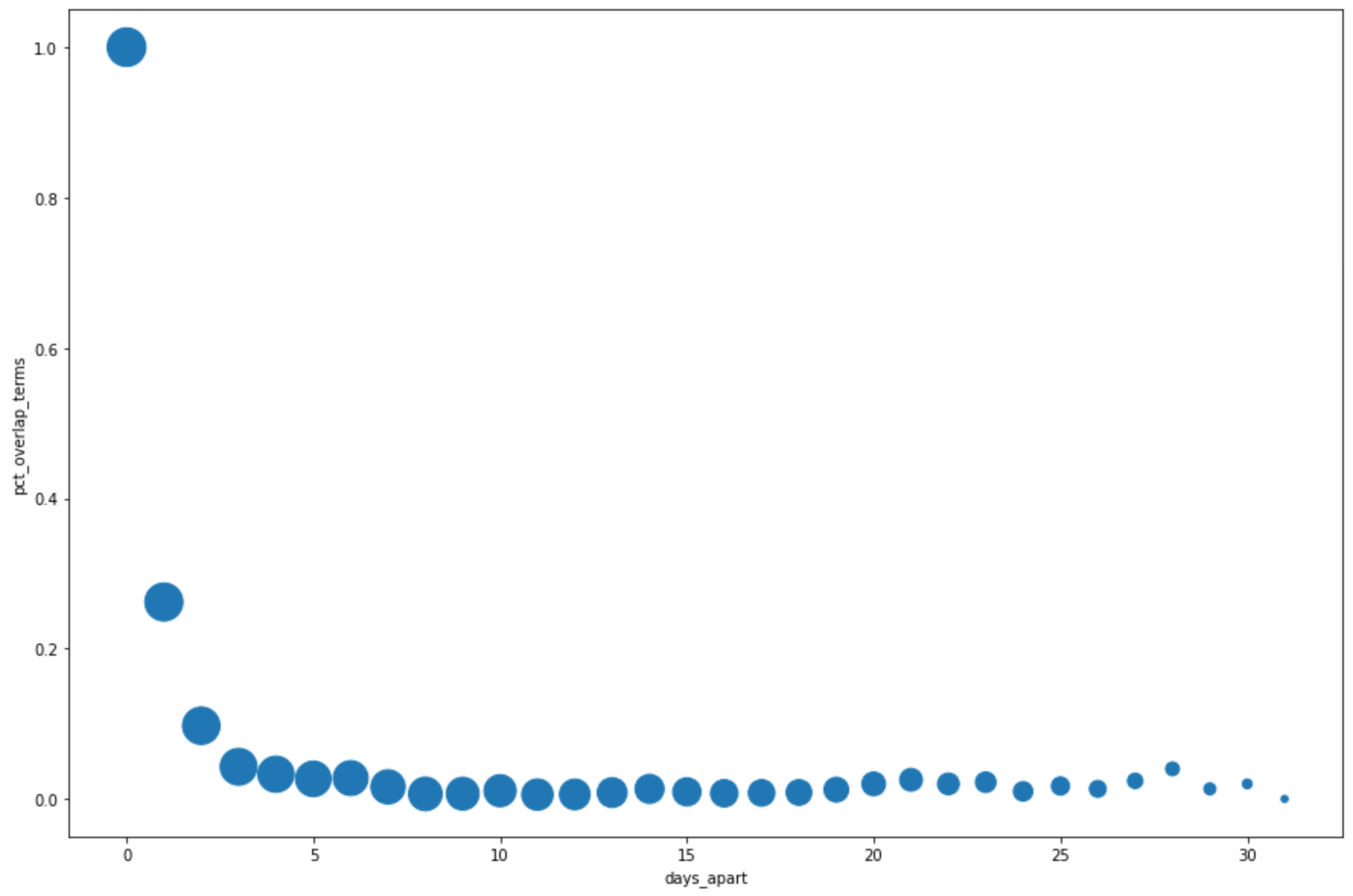
Di sel berikutnya, masukkan kode berikut untuk menggunakan metode
DataFrame.plot()pandas guna membuat diagram sebar yang memvisualisasikan hasil dari kueri untuk persentase tumpang tindih dengan istilah penelusuran teratas dari beberapa hari sebelumnya:pct_overlap_terms_by_days_apart.plot( kind="scatter", x="days_apart", y="pct_overlap_terms", s=len(pct_overlap_terms_by_days_apart["num_date_pairs"]) * 20, figsize=(15, 10) )Klik Run cell.
Outputnya serupa dengan yang berikut ini: Ukuran setiap titik mencerminkan jumlah pasangan tanggal yang berjarak beberapa hari dalam data. Misalnya, ada lebih banyak pasangan yang berjarak 1 hari daripada yang berjarak 30 hari karena istilah penelusuran teratas muncul setiap hari selama sekitar satu bulan.
Untuk mengetahui informasi selengkapnya tentang visualisasi data, lihat dokumentasi pandas.