
Tutorial ini ditujukan untuk orang-orang yang ingin memvisualisasikan data GEOGRAPHY dari BigQuery menggunakan Looker Studio. Untuk menyelesaikan tutorial ini, Anda memerlukan project penagihan BigQuery. Anda tidak perlu mengetahui cara menulis SQL, dan Anda dapat menggunakan set data publik.
Sasaran
Dalam tutorial ini, Anda akan membuat laporan yang menampilkan keterjangkauan harga properti di negara bagian Washington. Anda akan menggunakan Peta Google untuk memvisualisasikan data GEOGRAPHY yang berasal dari set data BigQuery publik.
Dalam tutorial ini, Anda akan menyelesaikan hal berikut:
- Membuat laporan kosong baru
- Menambahkan Google Map ke laporan
- Mengonfigurasi peta
- Menata gaya peta
- Berinteraksi dengan peta
- Mengubah tooltip
- Menambahkan gaya lain ke peta
Sebelum memulai
Jika belum menyiapkan project penagihan BigQuery, Anda dapat mendaftar secara gratis.
Membuat laporan kosong baru
- Login ke Looker Studio.
- Klik
 Buat, lalu pilih Laporan.
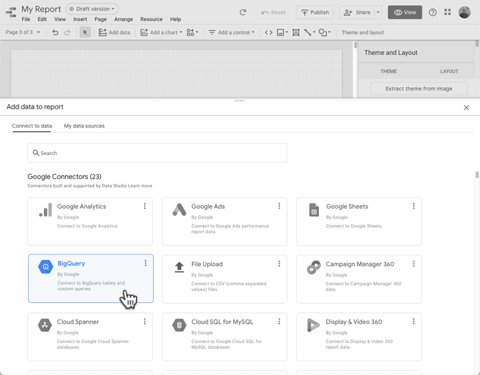
 Di panel Tambahkan data ke laporan, pilih BigQuery.
Di navigasi sebelah kiri, pilih KUERI KUSTOM.
Pilih atau masukkan project ID penagihan Anda.
Di bagian Masukkan Kueri Kustom, tempel kueri SQL berikut:
select ct.state_fips_code, ct.county_fips_code, c.county_name, ct.tract_ce, ct.geo_id, ct.tract_name, ct.lsad_name, ct.internal_point_lat, ct.internal_point_lon, ct.internal_point_geo, ct.tract_geom, acs.total_pop, acs.households, acs.male_pop, acs.female_pop, acs.median_age, acs.median_income, acs.income_per_capita, acs.gini_index, acs.owner_occupied_housing_units_median_value, acs.median_rent, acs.percent_income_spent_on_rent, from `bigquery-public-data.geo_census_tracts.census_tracts_washington` ct left join `bigquery-public-data.geo_us_boundaries.counties` c on (ct.state_fips_code || ct.county_fips_code) = c.geo_id left join `bigquery-public-data.census_bureau_acs.censustract_2018_5yr` acs on ct.geo_id = acs.geo_idKlik Tambahkan untuk menambahkan data ini ke dalam laporan.
Menambahkan Google Map ke dalam laporan
- Hapus tabel di halaman laporan.
- Klik Tambahkan diagram.
- Di bagian Google Maps, klik Peta bidang.
Mengonfigurasi peta
Peta belum akan ditampilkan. Anda harus menambahkan kolom yang secara unik mengidentifikasi setiap lokasi lebih dulu.
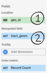
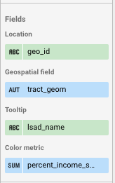
- Di bagian Lokasi, klik Dimensi tidak valid, lalu pilih geo_id.
- Kolom ini mengidentifikasi setiap jalur sensus secara unik.
- Di bagian Kolom Geospasial, klik Tambahkan metrik, lalu pilih tract_geom.
- Kolom ini berisi data
GEOGRAPHYBigQuery yang menentukan poligon yang ingin Anda tampilkan.
- Kolom ini berisi data
Peta akan terlihat seperti ini:
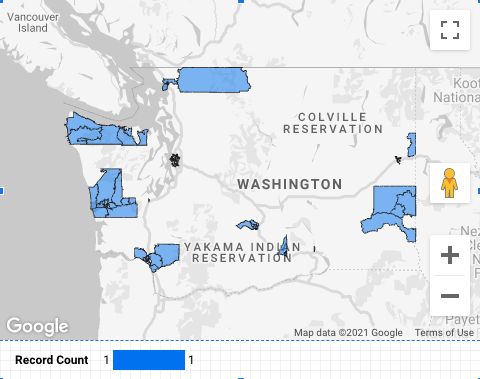
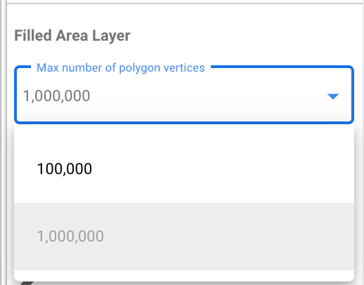
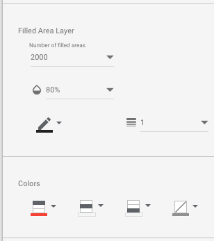
Mengapa peta tidak berisi poligon? Peta Google di Looker Studio memetakan 100 ribu titik (sudut poligon) secara default, tetapi kolom tract_geom berisi 911.364 titik. Anda dapat menambah jumlah titik (hingga maksimum 1 juta) atau, untuk mengurangi jumlah titik, Anda dapat menambahkan filter untuk berfokus pada area tertentu. Di tab GAYA di panel properti diagram, di bagian Lapisan Area Bidang, tetapkan Jumlah maksimum verteks poligon ke 1.000.000.
Menambahkan filter county
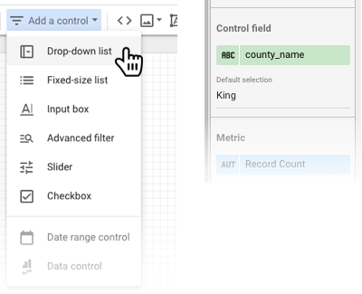
- Di toolbar, klik Tambahkan kontrol.
- Pilih Menu drop-down.
- Setel kolom Kontrol menjadi county_name, dan untuk Pilihan default, masukkan King.
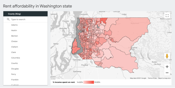
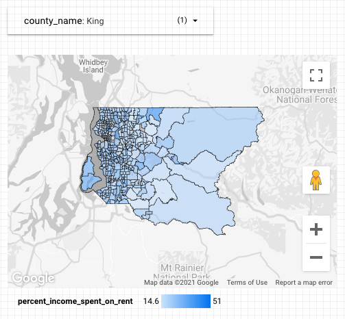
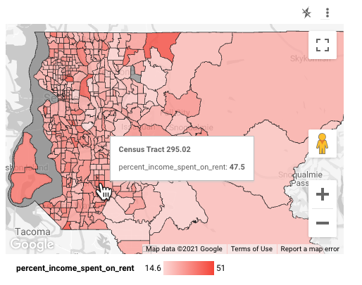
Sekarang Anda akan melihat semua poligon untuk King County, yang berisi Seattle:
Menentukan gaya peta
Metrik warna default peta adalah Jumlah Kumpulan Data. Anda juga dapat memilih metrik yang berbeda.
Di bagian Metrik warna, pilih percent_income_spent_on_rent.
Berinteraksi dengan peta
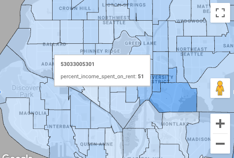
Bergantung pada opsi yang diaktifkan, Anda dapat memperbesar/memperkecil dan menggeser serta melihat jalur sensus tempat orang-orang menghabiskan hampir setengah pendapatan mereka untuk biaya sewa, seperti University District di Seattle:
Mengubah tooltip
Saat mengarahkan mouse ke peta, Anda akan melihat bahwa tooltip menampilkan geo_id, yang tidak terlalu berarti dalam konteks ini:
Anda dapat memberikan tooltip yang lebih berguna kepada pelihat dengan mengubah dimensi Tooltip.
- Di laporan, klik Edit.
- Pilih peta.
- Di bagian Tooltip pada panel properti, pilih lsad_name.
- Kolom ini berisi nama jalur sensus yang mudah dibaca:
Menambahkan gaya lain ke peta
Anda dapat menyesuaikan tampilan peta pada tab GAYA. Misalnya, Anda dapat meningkatkan opasitas bidang ke 80% dan mengubah gradasi warna dari biru ke merah.
Selamat
Anda telah membuat Peta Google di Looker Studio yang memvisualisasikan data GEOGRAPHY BigQuery.
Referensi terkait
- Terhubung ke Google BigQuery
- Set Data Publik BigQuery (beberapa set data dengan data poligon geografis)
- Referensi Google Maps
- Fungsi geografi BigQuery