本页介绍了您可能会使用 Looker Studio 的典型方式。此方案包含 6 个步骤:
- 创建报告
- 连接到您的数据
- 直观呈现数据
- 转换数据
- 分享您的数据分析
- 更新和优化报告
场景
 Aqsa 是一家旅游公司的数据分析师。她想探索和直观呈现航班到达和起飞延误方面的数据,看看公司能否为客户提供有价值的洞见,从而改善客户的旅行体验。数据存储在 BigQuery 中。
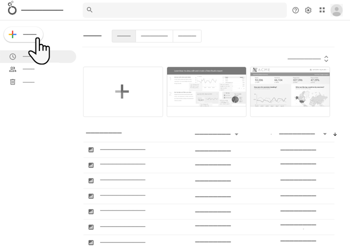
创建
Aqsa 登录 Looker Studio,然后依次点击创建 > 报告。Looker Studio 报告编辑器随即会打开,并显示添加数据面板。
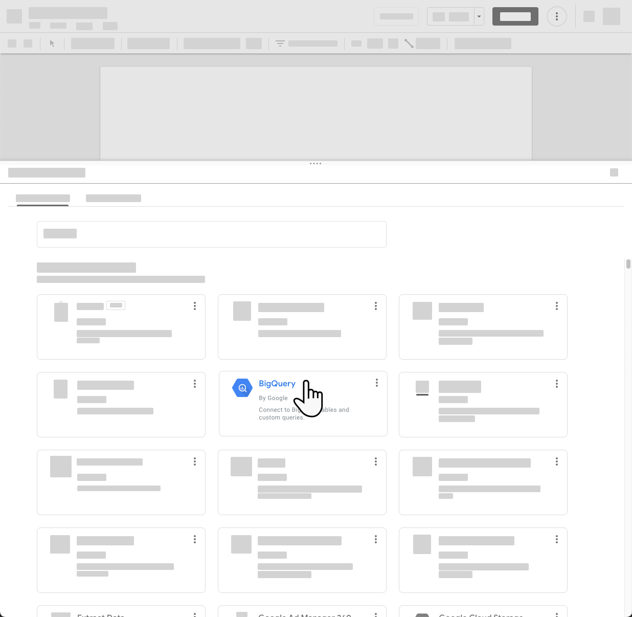
连接
借助添加数据面板,Aqsa 可以创建新的数据源或选择现有数据源。她还没有想要可视化的航班数据的数据源,因此点击 BigQuery 连接器以创建新的数据源。
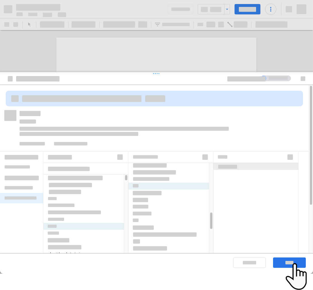
Aqsa 输入了连接到包含航班数据的 BigQuery 表所需的信息,然后将新数据源添加到报告中。
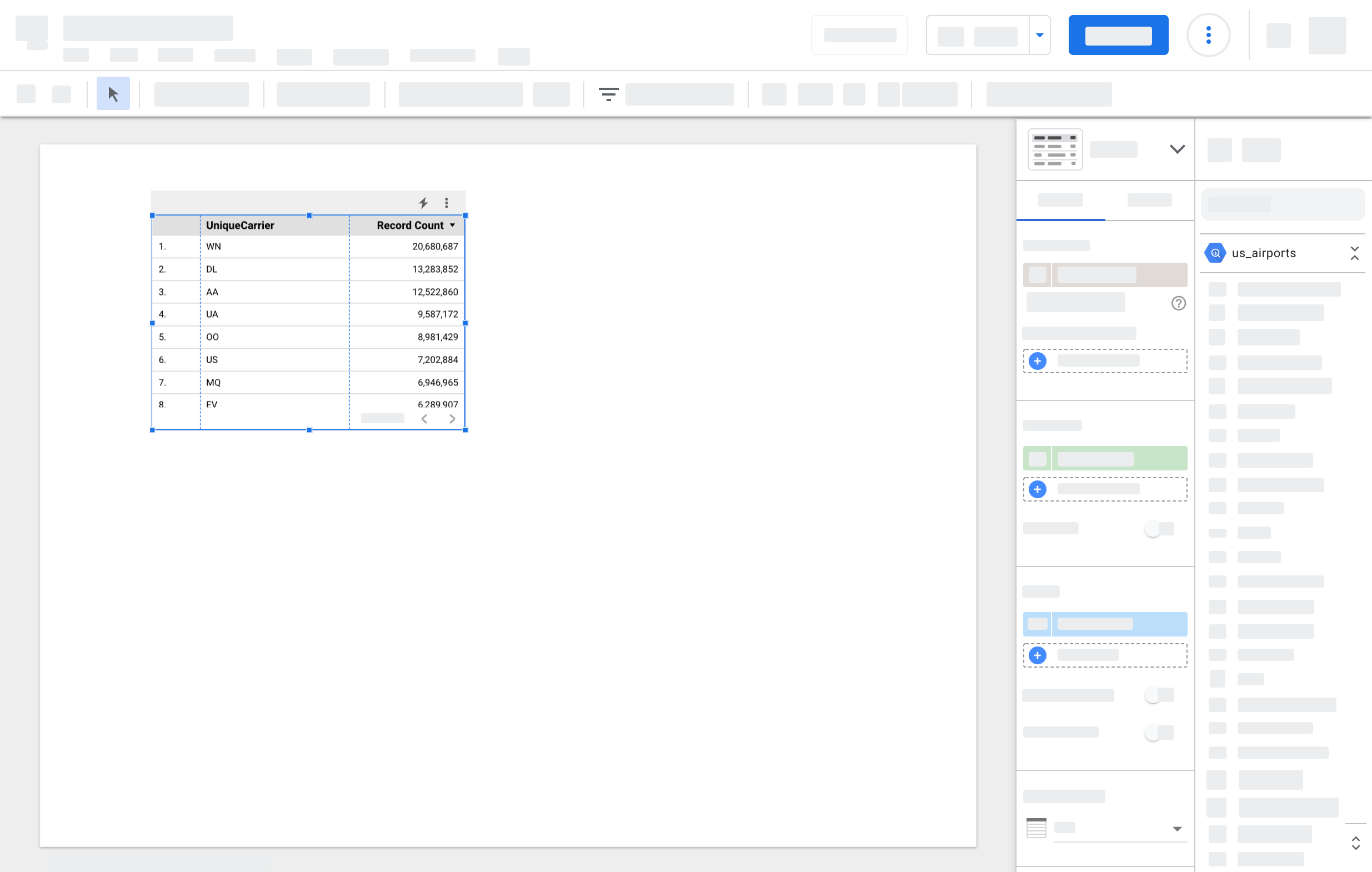
添加数据面板随即关闭,编辑器画布上会显示一个表格,其中包含航空公司字段以及每个唯一航空公司的记录数。
可视化
Aqsa 将更多字段从“属性”面板拖动到表格中,从而向表格添加更多字段。她添加了到达延误指标,其中包含每趟航班延误的时间(以分钟为单位),即超过预定到达时间的时间。
Aqsa 知道表格非常适合查看数据中的详细信息,但她希望获得更高级别的概览,因此在报告中添加了水平条形图和饼图。现在,她可以立即查看哪些航空公司的到达航班延误最多,以及这些延误与其他航空公司的表现有何关系。
转换
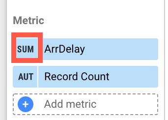 Aqsa 发现到达延迟时间字段正在对数据求和,但实际上应该求平均值。她可以通过更改该字段在每个图表中的汇总方式来解决此问题,但更有效的方法是修改数据源。
如果您想修改报告中显示的字段,可以选择以下方式:
修改图表中的字段。执行此操作时,您只是更改该字段的特定实例。相应更改仅适用于该图表中的相应字段。使用该字段的其他图表将采用数据源中设置的该字段的默认配置。
修改数据源中的字段。完成此操作后,更改将在您下次使用相应字段时显示。例如,您创建的新图表将使用更改后的字段,您向现有图表添加的字段的其他实例也将使用更改后的字段。在您做出更改之前使用该字段的组件不会受到影响。
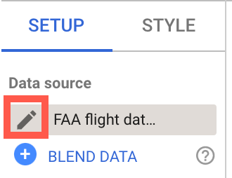
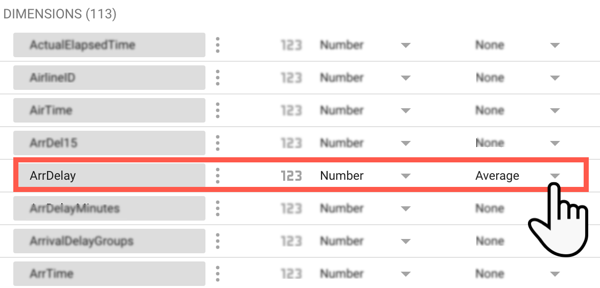
如需修改数据源,Aqsa 点击属性面板顶部数据源名称旁边的铅笔。她找到 ArrDelay 字段,然后将其默认聚合更改为平均值。Aqsa 点击完成以保存更改并返回报告编辑器。
现在,任何有权修改报告的用户使用此字段时,系统都会默认应用所需的汇总方式。
共享和协作
 Aqsa 请同事 Lauren 帮忙将设计技能应用到报告中。Aqsa 使用 Lauren 的电子邮件地址分享了报告,并授予了对方可修改权限。Lauren 开始工作,添加文字和图片,并根据公司的样式指南精心设计报告外观。Lauren 建议他们添加一个页面,通过嵌入当前存储为 Google 文档的营销方案来提供更多背景信息。Aqsa 和 Lauren 共同创建了一份富有吸引力且引人入胜的报告,其中重点介绍了他们从航班数据中发现的数据洞见。
报告完成后,Asqa 会将其共享给高层管理团队的群组电子邮件地址,并授予他们可查看权限。由于数据源具有所有者的数据凭据,因此管理团队可以查看报告中的数据,即使他们无法直接访问底层 BigQuery 数据集也是如此。
更新和优化

公司 CEO 非常喜欢这份报告,并询问 Aqsa 是否可以添加营销分析数据,以便获得更深入的分析洞见。Aqsa 修改了报告,并为其 Google Ads 和 Google Analytics 账号添加了数据源。她还使用社区连接器来访问 Facebook 和其他社交媒体渠道的数据。Aqsa 使用了 Looker Studio 的一些更高级的功能,例如数据混合和计算字段,从而发现了她以前从未发现过的机遇和挑战,而这一切都得益于她能够在一个地方查看所有可用的数据。