Na guia Conectar aos dados, selecione um conector, crie uma fonte de dados e adicione ao seu relatório:
Escolha o tipo de dados que você quer acessar.
Adicione sua conta ou outros detalhes.
No canto inferior direito, clique em Adicionar.
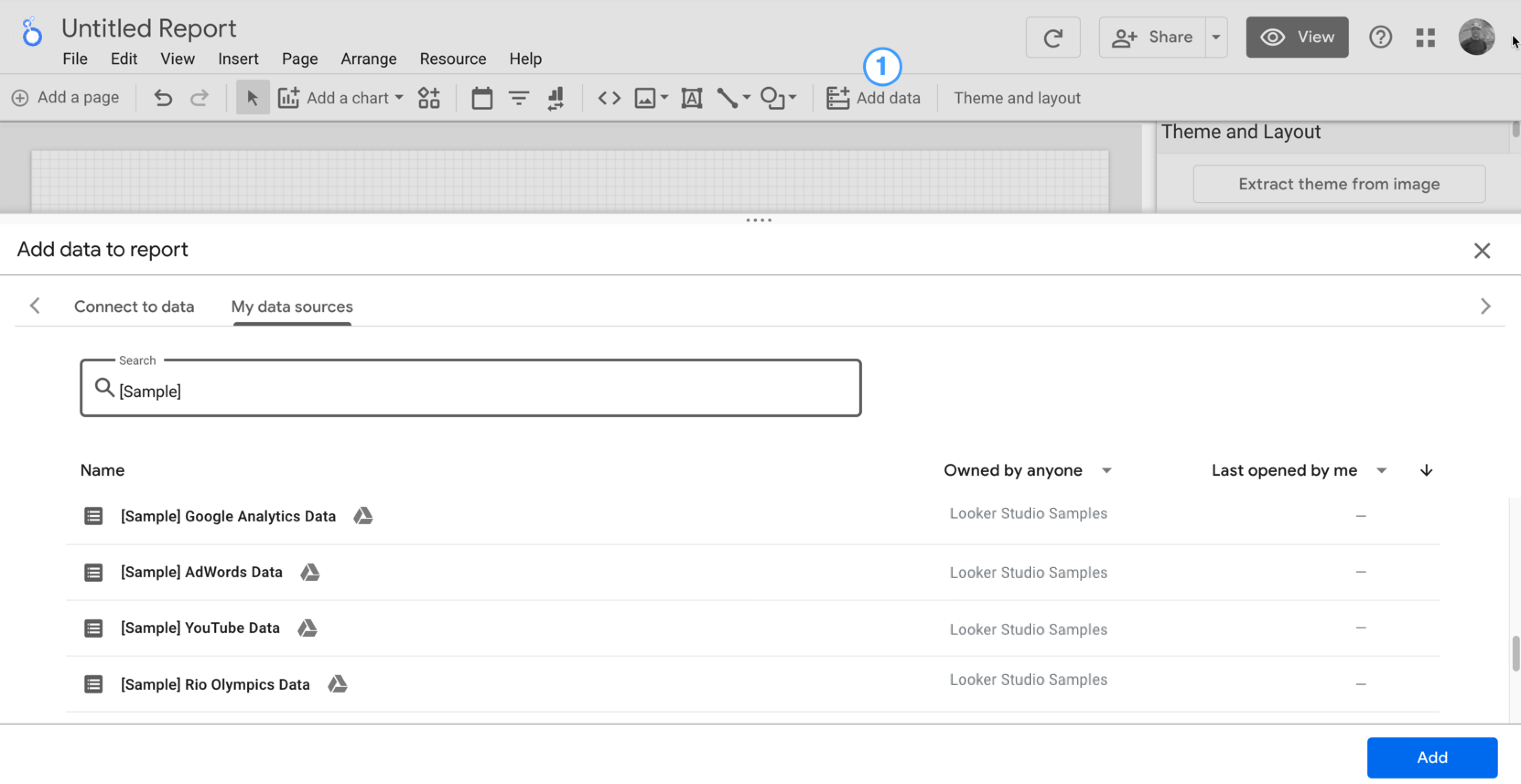
Use Minhas fontes de dados para adicionar uma fonte de dados ao seu relatório:
A guia Minhas fontes de dados tem várias amostras.
Para acompanhar este tutorial, selecione a fonte de dados [Sample] GA4 - Google Merchandise Store. Se você adicionar outra, os resultados poderão ser diferentes das etapas descritas neste tutorial.
Localize a fonte de dados.
No canto inferior direito, clique em Adicionar.
A fonte de dados é adicionada ao seu relatório.
Os campos dessa fonte de dados são apresentados em uma tabela.
Por padrão, o tipo de layout é definido como Layout livre. Para usar um relatório responsivo, selecione o tipo Layout responsivo. É possível mudar essa configuração depois.
Um relatório de estilo livre é adaptado para telas de computadores. Escolha esse tipo de relatório se quiser ter controle perfeito sobre o posicionamento e o dimensionamento de cada componente.
Um relatório responsivo é dimensionado bem em vários tamanhos de tela diferentes. Escolha esse tipo de relatório se você espera que os usuários consultem o relatório regularmente em um tablet ou outro dispositivo móvel.
No canto superior esquerdo, clique em Relatório sem título e insira um novo nome.
(Opcional) Adicione uma descrição ao seu relatório clicando no menu de três pontos e selecionando Detalhes. Em seguida, adicione uma descrição ao campo Descrição.
Adicionar mais dados
Para adicionar mais fontes de dados a um relatório, clique em Adicionar dados na barra de ferramentas.
Etapa 2: adicionar outro gráfico ao relatório
O gráfico de série temporal coleta dados ao longo do tempo.
Na barra de ferramentas, clique em Adicionar um gráfico.
Selecione um gráfico de série temporal.
Clique na tela em que você quer mostrar o gráfico.
O Looker Studio vai adicionar automaticamente a dimensão Data e a métrica Visualizações se você usar uma fonte de dados do Google Analytics.
Para ajustar a posição, arraste o gráfico ou selecione e mova usando as setas do teclado.
Para ajustar o tamanho do gráfico, selecione-o e arraste um ponto na extremidade ou no meio das linhas.
Detalhe o gráfico por Categoria do dispositivo:
Verifique se o gráfico de série temporal está selecionado.
À direita, no painel Dados, use a ferramenta de pesquisa para encontrar a dimensão Categoria do dispositivo.
Arraste o campo e solte-o em Dimensão de detalhamento.
Agora seu gráfico vai mostrar séries de dados para as diferentes categorias de dispositivos (smartphone, computador e tablet).
Etapa 3: personalizar o estilo do relatório
Você pode usar os temas predefinidos para aplicar opções de cor e estilo aos relatórios.
Edite o relatório.
Na barra de ferramentas, clique em Tema e layout.
Na guia TEMA, clique no tema que você quer aplicar.
Você pode personalizar qualquer um dos temas predefinidos. Por exemplo, é possível selecionar uma cor de segundo plano que combine mais com sua marca:
No painel Tema e layout, clique em Personalizar.
Role a tela para baixo até a seção Segundo plano e borda.
Use o seletor para definir a cor do Segundo plano. É a hora de usar sua cor favorita!
Etapa 4: adicionar um banner
Use um retângulo colorido como um banner no segundo plano para o título do relatório.
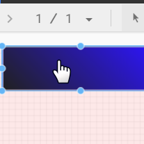
Selecione o componente Página clicando em qualquer lugar da grade.
Selecione a ferramenta Retângulo na barra de ferramentas.
Desenhe um retângulo na parte superior da página.
No painel Propriedades do retângulo à direita, defina a cor do plano de fundo como azul.
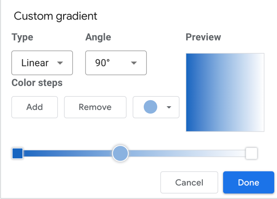
Crédito extra! Adicione um gradiente ao banner.
O efeito de degradê de uma cor para a outra é chamado de gradiente. Os gradientes são uma opção da propriedade da cor de segundo plano.
Clique no controle de cor do plano de fundo:
Clique em Gradiente.
As amostras de cores à esquerda e à direita representam as cores inicial e final. Digite os valores hexadecimais específicos das cores, escolha na paleta ou use os controles deslizantes verticais para selecionar a cor.
A seta de orientação controla o fluxo do gradiente.
Etapa 5: adicionar um título ao relatório
Você pode usar a ferramenta de texto para anotar seus relatórios e gráficos.
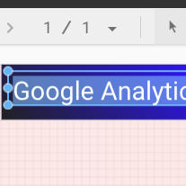
Selecione a ferramenta Texto na barra de ferramentas.
Desenhe uma caixa de texto no retângulo do banner.
Digite Google Analytics Demo Dashboard no campo.
Destaque o texto. Use o painel Propriedades de texto à direita para alterar a cor e o tamanho da fonte de acordo com suas preferências.
Olá! Onde está o botão "SALVAR"?
Como o Looker Studio salva todas as mudanças automaticamente, não é necessário clicar em Salvar após editar um relatório. Isso é muito útil.
[[["Fácil de entender","easyToUnderstand","thumb-up"],["Meu problema foi resolvido","solvedMyProblem","thumb-up"],["Outro","otherUp","thumb-up"]],[["Difícil de entender","hardToUnderstand","thumb-down"],["Informações incorretas ou exemplo de código","incorrectInformationOrSampleCode","thumb-down"],["Não contém as informações/amostras de que eu preciso","missingTheInformationSamplesINeed","thumb-down"],["Problema na tradução","translationIssue","thumb-down"],["Outro","otherDown","thumb-down"]],["Última atualização 2025-08-25 UTC."],[],[],null,["# Tutorial: Create a new report\n\nIn this tutorial, you'll learn how to create a new report in Looker Studio.\n\nStep 1: Create a new blank report\n---------------------------------\n\n1. [Sign in to Looker Studio.](https://lookerstudio.google.com)\n\n2. Click **Create** and then select **Report**.\n\n3. You'll see the report editor tool, with the *Add data to report* panel open. This panel has two tabs: *Connect to data* and *My data sources*.\n\n \u003e You'll learn more about connectors and data sources in the [Connect to your data](/looker/docs/studio/about-connectors-data-sources-and-credentials) topic.\n 1. In the *Connect to data* tab, select a [connector](/looker/docs/studio/connector), create a new data source, and add that to your report:\n\n 1. Select the type of data that you want to visualize.\n 2. Provide your account or other details.\n 3. In the bottom right, click **Add**.\n 2. Use *My data sources* to add an existing [data source](/looker/docs/studio/data-source) to your report:\n\n \u003e \u003cbr /\u003e\n \u003e\n \u003e The **My data sources** tab includes a number of sample data sources.\n \u003e\n \u003e To follow along with this tutorial, select the `[Sample] GA4 - Google Merchandise Store` data source. If you add a different data source, your results may vary from the steps described in this tutorial.\n \u003e\n \u003e \u003cbr /\u003e\n \u003e\n \u003e | **Tip:** If you have a lot of data sources, use the search bar to locate the data source that you want.\n \u003e |\n \u003e | \u003cbr /\u003e\n \u003e |\n \u003e \u003cbr /\u003e\n \u003e\n 1. Locate the data source that you want.\n 2. In the bottom right, click **Add**.\n 3. The data source is added to your report.\n4. A table appears with fields from that data source.\n\n Use the [properties panel](/looker/docs/studio/properties-panel) on the right to change the data and style of the table.\n5. By default, the layout type is set to **Freeform layout** . To use a [responsive report](/looker/docs/studio/create-a-responsive-report) instead, select the **Responsive layout** type. You can change the layout setting later.\n\n - A freeform report is tailored for desktop screens. Choose this report type if you want pixel-perfect control over the placement and sizing of each report component.\n - A responsive report scales well across many different screen sizes. Choose this report type if you expect your users to regularly view the report on a tablet or other mobile device.\n6. In the top left, name your report by clicking *Untitled Report* and then entering a new name.\n\n7. (Optional) Add a description to your report by clicking the three-dot menu and selecting **Details** . Then add a description to the **Description** field.\n\n### Add more data\n\nTo add more data sources to a report, in the toolbar, click **Add data**.\n\nStep 2: Add another chart to the report\n---------------------------------------\n\nThe time series chart plots data over the course of time.\n\n1. In the toolbar, click **Add a chart**.\n\n2. Select a **Time series** chart .\n\n3. Click the canvas where you want the chart to appear.\n\n4. Looker Studio automatically adds the *Date* dimension and the *Views* metric (assuming you're using an Analytics data source).\n\n5. To adjust the chart's position, drag it, or select the chart and move it by using your keyboard arrow keys.\n\n | **Tip:** Each press of the arrow key moves the chart one full column or row (10 px) on the grid. Hold the Shift key down while using your arrow keys to nudge the selected components into place one pixel at a time.\n6. To adjust the chart's size, select it, and then drag a corner or mid-line point.\n\n7. Break down the chart by *Device Category*:\n\n 1. Make sure that the time series chart is selected.\n 2. On the right, in the **Data** panel, use the search tool to find the *Device Category* dimension.\n 3. Drag the field and drop it on the **Breakdown Dimension** target.\n\nYour chart should now display data series for the different device categories (Mobile, Desktop, and Tablet).\n\nStep 3: Style the report\n------------------------\n\nPreset themes let you apply color and style options to your entire report.\n\n1. Edit the report.\n2. In the toolbar, click **Theme and layout**.\n3. In the THEME tab, click the theme that you want to apply.\n\nYou can customize any of the preset themes. For example, you can select a different background color that better matches your brand:\n\n1. In the *Theme and Layout* panel, click **Customize**.\n2. Scroll down to the *Background and Border* section.\n3. Use the color picker to set the **Background** color to your favorite color. Something in a mauvy-peach, perhaps?\n\nStep 4: Add a banner\n--------------------\n\nUse a colored rectangle as a background banner for your report header.\n\n1. Select the [Page](/looker/docs/studio/page) component by clicking anywhere in the grid area.\n2. Select the **Rectangle** tool from the toolbar.\n3. Draw a rectangle across the top of the page.\n4. On the right, in the *Rectangle Properties* panel, set the rectangle background color to blue.\n\n#### Extra credit! Add a gradient to the banner.\n\nWhen one color fades into another, the effect is called a gradient. Gradients are an option of the background color property.\n\n1. Click the background color control:\n2. Click **Gradient**.\n\nThe left and right color swatches determine the starting and ending colors. Enter the specific color hex values, choose from the palette, or use the vertical sliders to select the color.\n\nThe orientation arrow controls the flow of the gradient.\n\nStep 5: Add a title to the report\n---------------------------------\n\nThe text tool lets you annotate your reports and charts.\n\n1. Select the **Text** tool from the toolbar.\n2. Draw a textbox inside the banner rectangle.\n3. Type `Google Analytics Demo Dashboard` in the field.\n4. Highlight the text. Use the *Text Properties* panel on the right to change the font color and the font size to something that looks nice to you.\n\n\u003e #### Hey! Where's the SAVE button?\n\u003e\n\u003e Looker Studio automatically saves every change you make, so there's no need to click **Save** when editing a report. Pretty sweet!\n\nNext steps\n----------\n\n[Add more charts to your report.](/looker/docs/studio/tutorial-add-charts-to-your-report)"]]