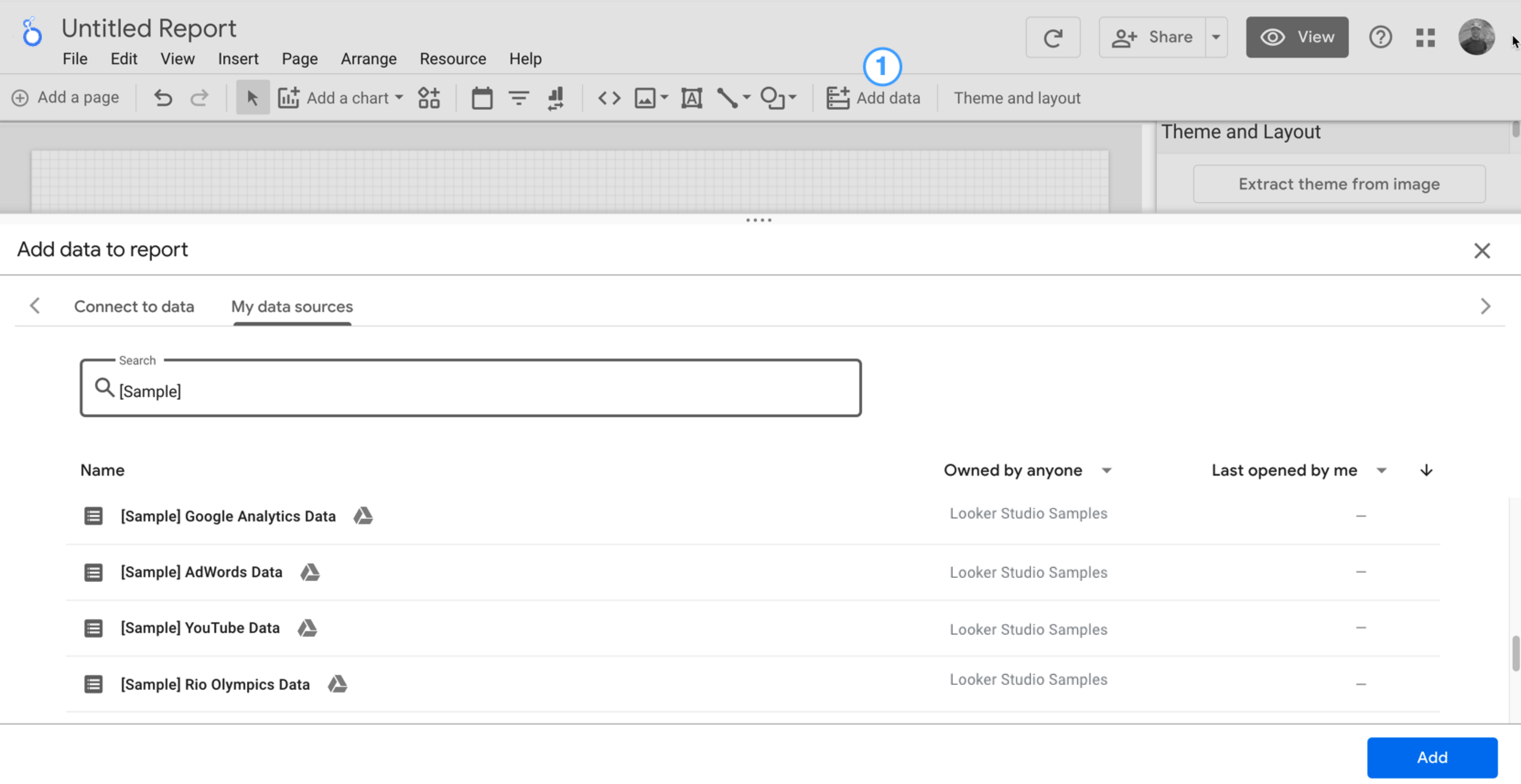
You'll see the report editor tool, with the Add data to report panel open. This panel has two tabs: Connect to data and My data sources.
You'll learn more about connectors and data sources in the Connect to your data topic.
In the Connect to data tab, select a connector, create a new data source, and add that to your report:
Select the type of data that you want to visualize.
Provide your account or other details.
In the bottom right, click Add.
Use My data sources to add an existing data source to your report:
The My data sources tab includes a number of sample data sources.
To follow along with this tutorial, select the [Sample] GA4 - Google Merchandise Store data source. If you add a different data source, your results may vary from the steps described in this tutorial.
Locate the data source that you want.
In the bottom right, click Add.
The data source is added to your report.
A table appears with fields from that data source.
Use the properties panel on the right to change the data and style of the table.
By default, the layout type is set to Freeform layout. To use a responsive report instead, select the Responsive layout type. You can change the layout setting later.
A freeform report is tailored for desktop screens. Choose this report type if you want pixel-perfect control over the placement and sizing of each report component.
A responsive report scales well across many different screen sizes. Choose this report type if you expect your users to regularly view the report on a tablet or other mobile device.
In the top left, name your report by clicking Untitled Report and then entering a new name.
(Optional) Add a description to your report by clicking the three-dot menu and selecting Details. Then add a description to the Description field.
Add more data
To add more data sources to a report, in the toolbar, click Add data.
Step 2: Add another chart to the report
The time series chart plots data over the course of time.
In the toolbar, click Add a chart.
Select a Time series chart .
Click the canvas where you want the chart to appear.
Looker Studio automatically adds the Date dimension and the Views metric (assuming you're using an Analytics data source).
To adjust the chart's position, drag it, or select the chart and move it by using your keyboard arrow keys.
To adjust the chart's size, select it, and then drag a corner or mid-line point.
Break down the chart by Device Category:
Make sure that the time series chart is selected.
On the right, in the Data panel, use the search tool to find the Device Category dimension.
Drag the field and drop it on the Breakdown Dimension target.
Your chart should now display data series for the different device categories (Mobile, Desktop, and Tablet).
Step 3: Style the report
Preset themes let you apply color and style options to your entire report.
Edit the report.
In the toolbar, click Theme and layout.
In the THEME tab, click the theme that you want to apply.
You can customize any of the preset themes. For example, you can select a different background color that better matches your brand:
In the Theme and Layout panel, click Customize.
Scroll down to the Background and Border section.
Use the color picker to set the Background color to your favorite color. Something in a mauvy-peach, perhaps?
Step 4: Add a banner
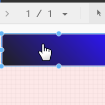
Use a colored rectangle as a background banner for your report header.
Select the Page component by clicking anywhere in the grid area.
Select the Rectangle tool from the toolbar.
Draw a rectangle across the top of the page.
On the right, in the Rectangle Properties panel, set the rectangle background color to blue.
Extra credit! Add a gradient to the banner.
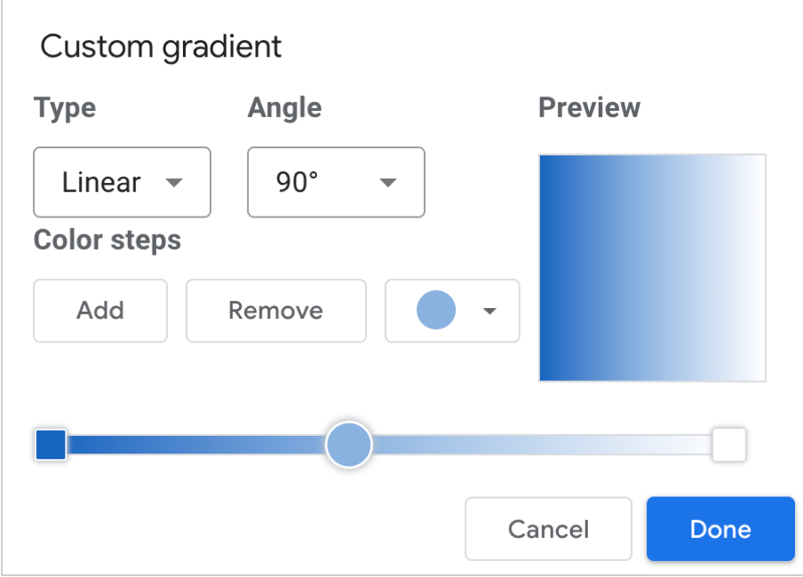
When one color fades into another, the effect is called a gradient. Gradients are an option of the background color property.
Click the background color control:
Click Gradient.
The left and right color swatches determine the starting and ending colors. Enter the specific color hex values, choose from the palette, or use the vertical sliders to select the color.
The orientation arrow controls the flow of the gradient.
Step 5: Add a title to the report
The text tool lets you annotate your reports and charts.
Select the Text tool from the toolbar.
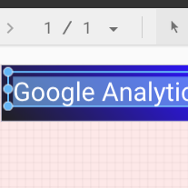
Draw a textbox inside the banner rectangle.
Type Google Analytics Demo Dashboard in the field.
Highlight the text. Use the Text Properties panel on the right to change the font color and the font size to something that looks nice to you.
Hey! Where's the SAVE button?
Looker Studio automatically saves every change you make, so there's no need to click Save when editing a report. Pretty sweet!
[[["Easy to understand","easyToUnderstand","thumb-up"],["Solved my problem","solvedMyProblem","thumb-up"],["Other","otherUp","thumb-up"]],[["Hard to understand","hardToUnderstand","thumb-down"],["Incorrect information or sample code","incorrectInformationOrSampleCode","thumb-down"],["Missing the information/samples I need","missingTheInformationSamplesINeed","thumb-down"],["Other","otherDown","thumb-down"]],["Last updated 2025-08-28 UTC."],[],[],null,["# Tutorial: Create a new report\n\nIn this tutorial, you'll learn how to create a new report in Looker Studio.\n\nStep 1: Create a new blank report\n---------------------------------\n\n1. [Sign in to Looker Studio.](https://lookerstudio.google.com)\n\n2. Click **Create** and then select **Report**.\n\n3. You'll see the report editor tool, with the *Add data to report* panel open. This panel has two tabs: *Connect to data* and *My data sources*.\n\n \u003e You'll learn more about connectors and data sources in the [Connect to your data](/looker/docs/studio/about-connectors-data-sources-and-credentials) topic.\n 1. In the *Connect to data* tab, select a [connector](/looker/docs/studio/connector), create a new data source, and add that to your report:\n\n 1. Select the type of data that you want to visualize.\n 2. Provide your account or other details.\n 3. In the bottom right, click **Add**.\n 2. Use *My data sources* to add an existing [data source](/looker/docs/studio/data-source) to your report:\n\n \u003e \u003cbr /\u003e\n \u003e\n \u003e The **My data sources** tab includes a number of sample data sources.\n \u003e\n \u003e To follow along with this tutorial, select the `[Sample] GA4 - Google Merchandise Store` data source. If you add a different data source, your results may vary from the steps described in this tutorial.\n \u003e\n \u003e \u003cbr /\u003e\n \u003e\n \u003e | **Tip:** If you have a lot of data sources, use the search bar to locate the data source that you want.\n \u003e |\n \u003e | \u003cbr /\u003e\n \u003e |\n \u003e \u003cbr /\u003e\n \u003e\n 1. Locate the data source that you want.\n 2. In the bottom right, click **Add**.\n 3. The data source is added to your report.\n4. A table appears with fields from that data source.\n\n Use the [properties panel](/looker/docs/studio/properties-panel) on the right to change the data and style of the table.\n5. By default, the layout type is set to **Freeform layout** . To use a [responsive report](/looker/docs/studio/create-a-responsive-report) instead, select the **Responsive layout** type. You can change the layout setting later.\n\n - A freeform report is tailored for desktop screens. Choose this report type if you want pixel-perfect control over the placement and sizing of each report component.\n - A responsive report scales well across many different screen sizes. Choose this report type if you expect your users to regularly view the report on a tablet or other mobile device.\n6. In the top left, name your report by clicking *Untitled Report* and then entering a new name.\n\n7. (Optional) Add a description to your report by clicking the three-dot menu and selecting **Details** . Then add a description to the **Description** field.\n\n### Add more data\n\nTo add more data sources to a report, in the toolbar, click **Add data**.\n\nStep 2: Add another chart to the report\n---------------------------------------\n\nThe time series chart plots data over the course of time.\n\n1. In the toolbar, click **Add a chart**.\n\n2. Select a **Time series** chart .\n\n3. Click the canvas where you want the chart to appear.\n\n4. Looker Studio automatically adds the *Date* dimension and the *Views* metric (assuming you're using an Analytics data source).\n\n5. To adjust the chart's position, drag it, or select the chart and move it by using your keyboard arrow keys.\n\n | **Tip:** Each press of the arrow key moves the chart one full column or row (10 px) on the grid. Hold the Shift key down while using your arrow keys to nudge the selected components into place one pixel at a time.\n6. To adjust the chart's size, select it, and then drag a corner or mid-line point.\n\n7. Break down the chart by *Device Category*:\n\n 1. Make sure that the time series chart is selected.\n 2. On the right, in the **Data** panel, use the search tool to find the *Device Category* dimension.\n 3. Drag the field and drop it on the **Breakdown Dimension** target.\n\nYour chart should now display data series for the different device categories (Mobile, Desktop, and Tablet).\n\nStep 3: Style the report\n------------------------\n\nPreset themes let you apply color and style options to your entire report.\n\n1. Edit the report.\n2. In the toolbar, click **Theme and layout**.\n3. In the THEME tab, click the theme that you want to apply.\n\nYou can customize any of the preset themes. For example, you can select a different background color that better matches your brand:\n\n1. In the *Theme and Layout* panel, click **Customize**.\n2. Scroll down to the *Background and Border* section.\n3. Use the color picker to set the **Background** color to your favorite color. Something in a mauvy-peach, perhaps?\n\nStep 4: Add a banner\n--------------------\n\nUse a colored rectangle as a background banner for your report header.\n\n1. Select the [Page](/looker/docs/studio/page) component by clicking anywhere in the grid area.\n2. Select the **Rectangle** tool from the toolbar.\n3. Draw a rectangle across the top of the page.\n4. On the right, in the *Rectangle Properties* panel, set the rectangle background color to blue.\n\n#### Extra credit! Add a gradient to the banner.\n\nWhen one color fades into another, the effect is called a gradient. Gradients are an option of the background color property.\n\n1. Click the background color control:\n2. Click **Gradient**.\n\nThe left and right color swatches determine the starting and ending colors. Enter the specific color hex values, choose from the palette, or use the vertical sliders to select the color.\n\nThe orientation arrow controls the flow of the gradient.\n\nStep 5: Add a title to the report\n---------------------------------\n\nThe text tool lets you annotate your reports and charts.\n\n1. Select the **Text** tool from the toolbar.\n2. Draw a textbox inside the banner rectangle.\n3. Type `Google Analytics Demo Dashboard` in the field.\n4. Highlight the text. Use the *Text Properties* panel on the right to change the font color and the font size to something that looks nice to you.\n\n\u003e #### Hey! Where's the SAVE button?\n\u003e\n\u003e Looker Studio automatically saves every change you make, so there's no need to click **Save** when editing a report. Pretty sweet!\n\nNext steps\n----------\n\n[Add more charts to your report.](/looker/docs/studio/tutorial-add-charts-to-your-report)"]]