Creating a treemap chart with the Chart Config Editor
Stay organized with collections
Save and categorize content based on your preferences.
A treemap chart displays categorical and hierarchical data as a set of rectangles, where the size of each rectangle is determined by a numeric measure.
Using the Chart Config Editor, you can create treemap charts by starting from a column chart in Looker. For best results, use a pivoted dimension, an unpivoted dimension, and a measure to create a treemap chart.
For example, you can create a treemap chart that shows the Order Item Count over several different Category values, pivoted by Seasonal Collection. Each season is represented by a color-coded rectangle, which contains smaller rectangles that represent the category. The size of each rectangle corresponds to the Order Item Count .
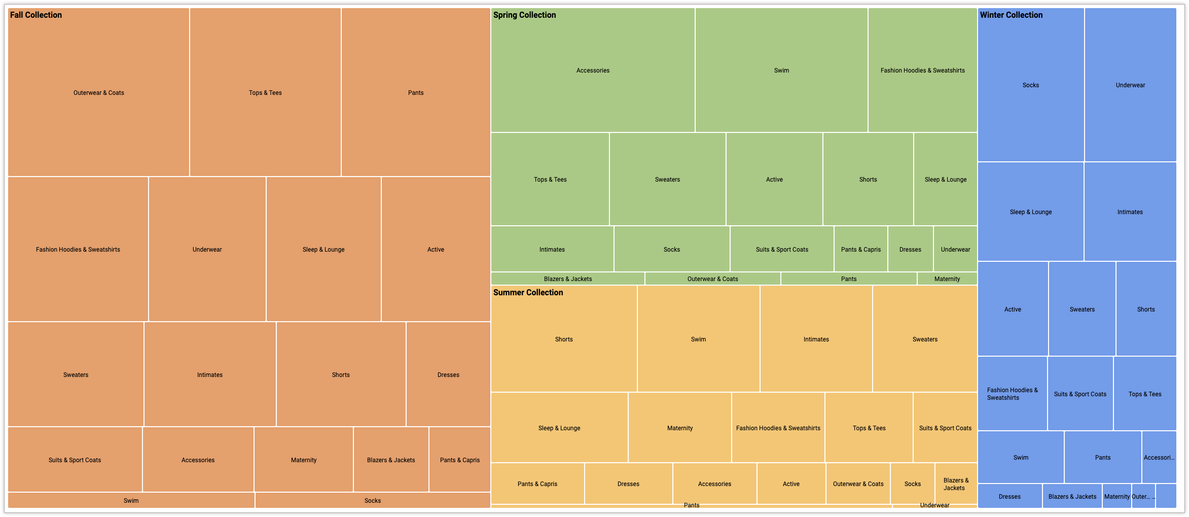
To create a treemap chart, start from the following JSON snippet:
{chart:{type:'treemap',}}
Creating a treemap chart
To create a treemap chart, follow these steps:
View a column chart in an Explore, or edit a column chart in a Look or dashboard.
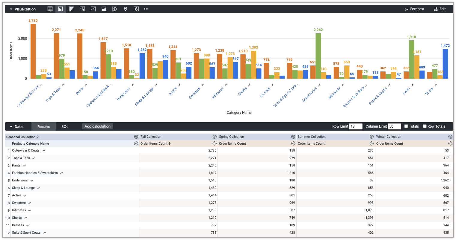
For this example, we recommend starting from a column chart with two dimensions and one measure. One dimension should be pivoted. The pivoted values define the top level categories used to render the treemap. Your starting chart might look something like this example:
Open the Edit menu in the visualization.
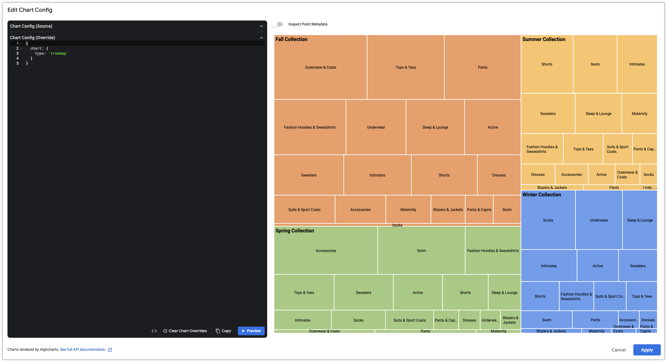
In the Plot tab, click the Edit Chart Config button. Looker displays the Edit Chart Config dialog.
Select the Chart Config (Override) section, and enter the HighCharts JSON from the Writing the JSON snippet section of this page.
To let Looker properly format your JSON, click <> (Format code).
To test your changes, click Preview.
To apply your changes, click Apply. The visualization will be displayed using the custom JSON values.
Once you've customized your visualization, you can save it.
[[["Easy to understand","easyToUnderstand","thumb-up"],["Solved my problem","solvedMyProblem","thumb-up"],["Other","otherUp","thumb-up"]],[["Hard to understand","hardToUnderstand","thumb-down"],["Incorrect information or sample code","incorrectInformationOrSampleCode","thumb-down"],["Missing the information/samples I need","missingTheInformationSamplesINeed","thumb-down"],["Other","otherDown","thumb-down"]],["Last updated 2025-08-25 UTC."],[],[],null,["# Creating a treemap chart with the Chart Config Editor\n\n| **Note:** Starting in Looker 24.10, the Chart Config Editor supports the creation of treemap charts.\n\nA treemap chart displays categorical and hierarchical data as a set of rectangles, where the size of each rectangle is determined by a numeric measure.\n\nUsing the [Chart Config Editor](/looker/docs/2512/chart-config-editor), you can create treemap charts by starting from a [column chart](/looker/docs/2512/column-options) in Looker. For best results, use a pivoted dimension, an unpivoted dimension, and a measure to create a treemap chart.\n\nFor example, you can create a treemap chart that shows the **Order Item Count** over several different **Category** values, pivoted by **Seasonal Collection** . Each season is represented by a color-coded rectangle, which contains smaller rectangles that represent the category. The size of each rectangle corresponds to the **Order Item Count** .\n\nPrerequisites\n-------------\n\nTo access the Chart Config Editor, you must have the [`can_override_vis_config` permission](/looker/docs/2512/admin-panel-users-roles#can_override_vis_config).\n\n### Writing the JSON snippet\n\nTo create a treemap chart, start from the following JSON snippet: \n\n {\n chart: {\n type: 'treemap',\n }\n }\n\n### Creating a treemap chart\n\nTo create a treemap chart, follow these steps:\n\n1. View a [column chart](/looker/docs/2512/column-options) in an Explore, or edit a column chart in a Look or dashboard.\n\n For this example, we recommend starting from a column chart with two dimensions and one measure. One dimension should be pivoted. The pivoted values define the top level categories used to render the treemap. Your starting chart might look something like this example:\n\n2. Open the **Edit** menu in the visualization.\n\n3. In the **Plot** tab, click the **Edit Chart Config** button. Looker displays the **Edit Chart Config** dialog.\n\n4. Select the **Chart Config (Override)** section, and enter the HighCharts JSON from the [Writing the JSON snippet](#json) section of this page.\n\n5. To let Looker properly format your JSON, click **\\\u003c\\\u003e (Format code)**.\n\n6. To test your changes, click **Preview**.\n\n7. To apply your changes, click **Apply**. The visualization will be displayed using the custom JSON values.\n\nOnce you've customized your visualization, you can save it."]]