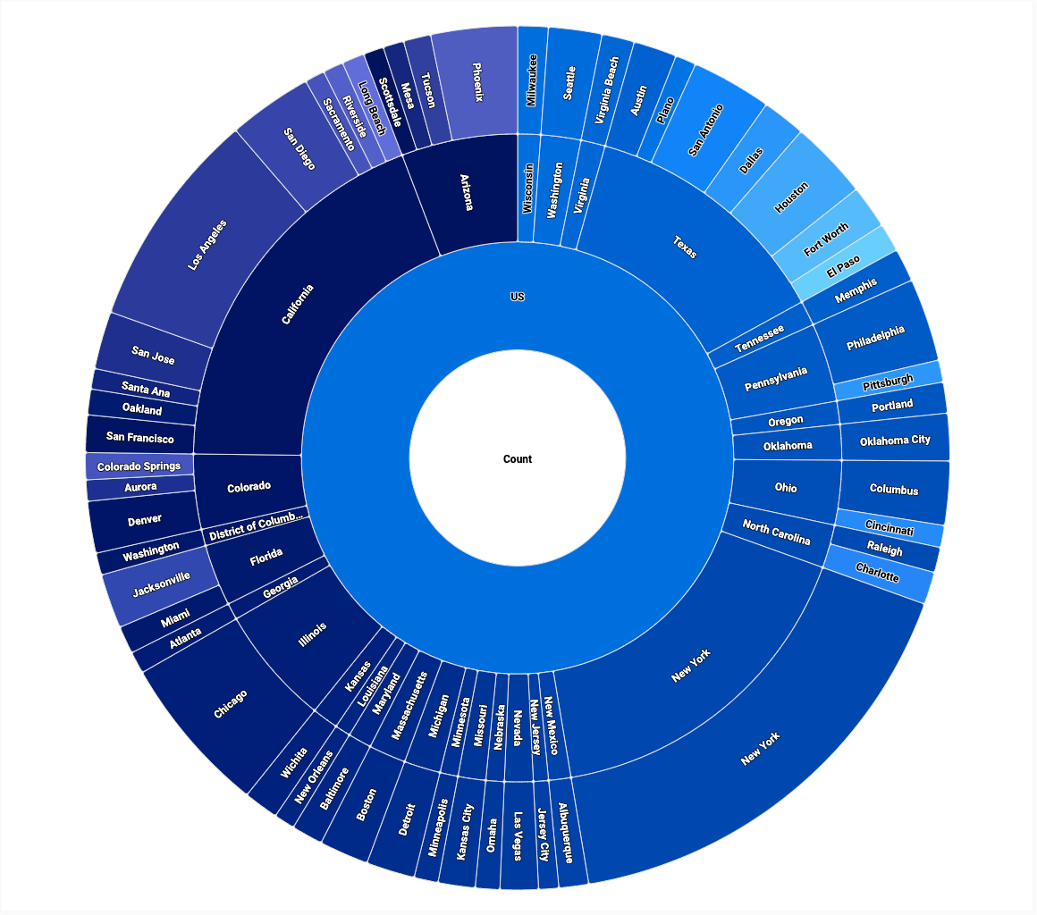
A sunburst chart displays hierarchical data as a set of concentric rings, where the size of each ring slice is determined by a numeric measure.
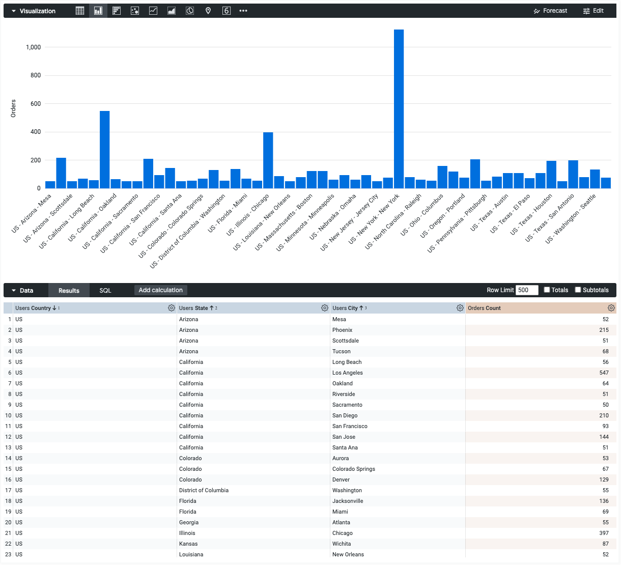
Using the Chart Config Editor, you can create sunburst charts by starting from a column chart in Looker. For best results, use at least two unpivoted dimensions and exactly one numeric measure to create a sunburst chart.
For example, you can create a sunburst chart that shows the Orders Count measure, broken down by the Users Country, Users State, and Users City dimensions. The size of each ring slice corresponds to the Orders Count .
Prerequisites
To access the Chart Config Editor, you must have the can_override_vis_config permission.
Writing the JSON snippet
To create a sunburst chart, start from the following JSON snippet:
{
  chart: {
    type: 'sunburst',
  }
}
Creating a sunburst chart
To create a sunburst chart, follow these steps:
View a column chart in an Explore, or edit a column chart in a Look or dashboard.
Start from a column chart with two or more unpivoted dimensions and exactly one numeric measure. Make sure to order the dimensions from least granular to most granular. Your starting chart might look like a column chart plotting a single measure, with a concatenation of dimension values for each x-axis value.
Open the Edit menu in the visualization.
In the Plot tab, click the Edit Chart Config button. Looker displays the Edit Chart Config dialog.
Select the Chart Config (Override) section, and enter the HighCharts JSON from the Writing the JSON snippet section of this page.
To let Looker properly format your JSON, click <> (Format code).
To test your changes, click Preview.
To apply your changes, click Apply. The visualization will be displayed using the custom JSON values.
Once you've customized your visualization, you can save it.
Drilling into the data
Sunburst charts support the following drill actions:
- To drill into one dimension value, click the corresponding ring slice.
- To go back one level, click the center of the sunburst chart.
- To go back one or more levels, use the breadcrumb navigation at the top left of the chart.