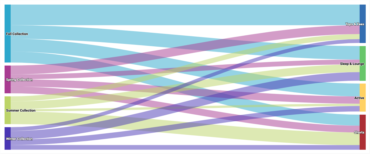
A Sankey chart emphasizes flow from one state to another. In Looker, each dimension value is represented as a state, and the size of the flow is determined by a numeric measure value.
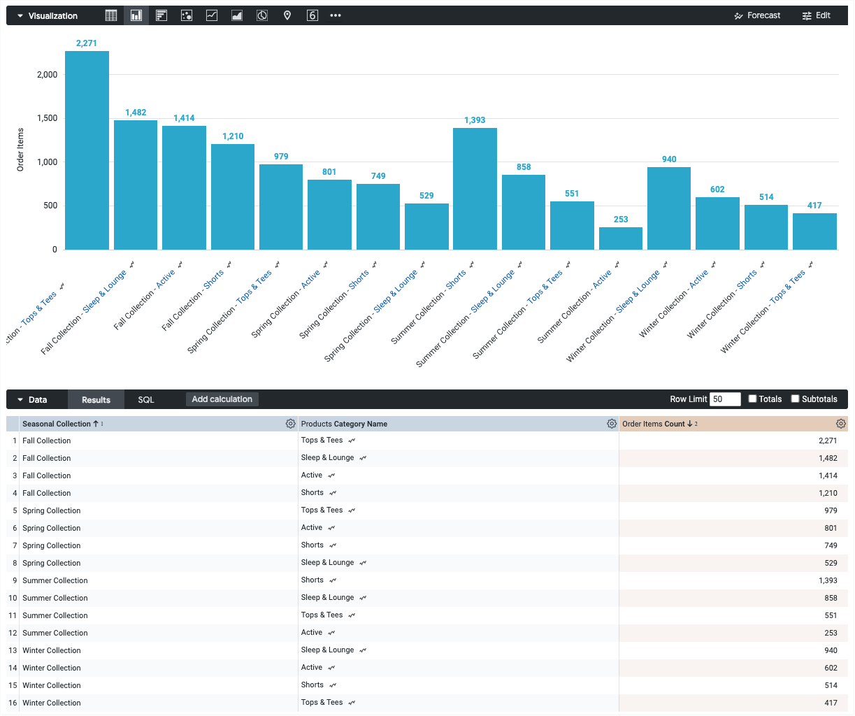
Using the Chart Config Editor, you can create Sankey charts by starting from a column chart in Looker. For best results, use at least two dimensions and exactly one measure to create a Sankey chart.
For example, you can create a Sankey chart that shows the Order Item Count measure values over several Seasonal Collection dimension values, which flow into Category dimension values. Each dimension value is represented by a color-coded rectangle. The width of each line where it meets each rectangle corresponds to the value of the Order Item Count measure for that dimension.
Prerequisites
To access the Chart Config Editor, you must have the can_override_vis_config permission.
Writing the JSON snippet
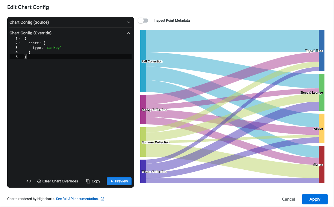
To create a Sankey chart, start from the following JSON snippet:
{
  chart: {
    type: 'sankey'
  }
}
Creating a Sankey chart
To create a Sankey chart, follow these steps:
View a column chart in an Explore, or edit a column chart in a Look or dashboard.
For this example, we recommend starting from a column chart with two dimensions and one measure. Your starting chart might look something like this example:
Open the Edit menu in the visualization.
In the Plot tab, click the Edit Chart Config button. Looker displays the Edit Chart Config dialog.
Select the Chart Config (Override) section, and enter the HighCharts JSON from the Writing the JSON snippet section of this page.
To let Looker properly format your JSON, click <> (Format code).
To test your changes, click Preview.
To apply your changes, click Apply. The visualization will be displayed using the custom JSON values.
Once you've customized your visualization, you can save it.
Limitations and requirements
- Sankey charts require at least two dimensions and exactly one measure.
- Sankey charts can display a maximum of 50 rows of data.