Build a Look with sample data
Learn how to query and visualize data in Looker and to save your query results as a Look that you can share and reuse.
This quickstart guides you through building a Look on your Looker (Google Cloud core) instance. You'll use sample data from the prebuilt Intermediate Ecommerce Explore to create the following table chart, and then you'll save the chart as a Look.
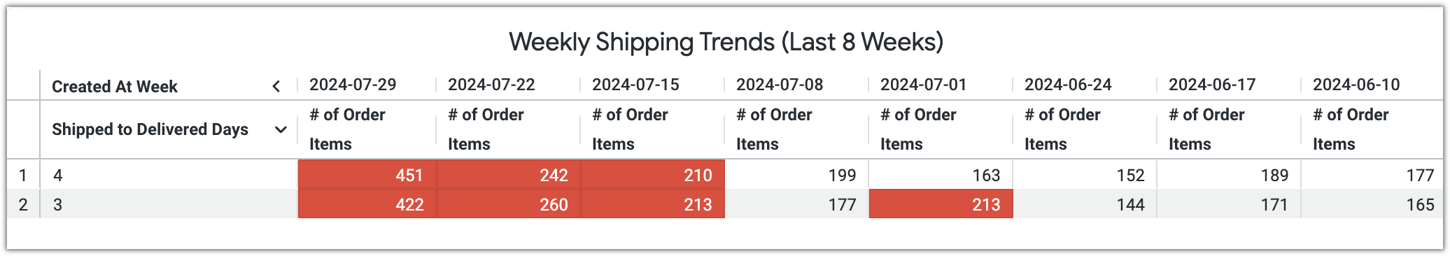
The table chart that you'll create will display weekly shipping trends, using conditional formatting (such as a red background) to highlight potential delays (in this case, weeks where more than 200 order items took over two days to be delivered). The following table is an example of the query results that you'll use to build your Look:
| Created At Week | 2024-07-29 | 2024-07-22 | 2024-07-15 | 2024-07-08 | 2024-07-01 | 2024-06-24 | 2024-06-17 | 2024-06-10 |
|---|---|---|---|---|---|---|---|---|
| Shipped to Delivered Days | # of Order Items | # of Order Items | # of Order Items | # of Order Items | # of Order Items | # of Order Items | # of Order Items | # of Order Items |
| 4 | 451 | 242 | 210 | 199 | 163 | 152 | 189 | 177 |
| 3 | 422 | 260 | 213 | 177 | 213 | 144 | 171 | 165 |
Before you begin
To follow along with this quickstart, you'll need access to a Looker (Google Cloud core) instance that includes the sample LookML project. The sample project includes the prebuilt Intermediate Ecommerce Explore that is used in this quickstart.
You'll also need to have a the following Looker permissions on your Looker (Google Cloud core) instance (or a Looker role that includes these permissions):
access_data: Access the sample data in the Intermediate Ecommerce Explore.explore: Access the Explore page and run queries in the Intermediate Ecommerce Explore.save_looks(and its parent permission,save_content): Save the visualization as a Look.see_looks: View the Look that you'll create in this quickstart.
Navigate to the Explore
To navigate to the Intermediate Ecommerce Explore, follow these steps:
- In Looker, click Main menu to expand the main navigation menu.
- In the main navigation menu, select Explore.
- Expand Z) Sample LookML (or the corresponding model name on your instance) to expand the list of Explores.
- Click 2) Intermediate Ecommerce Explore to open the Explore page.
Select fields and pivot data
To build the query, follow these steps:
- In the field picker, expand the Order Items section.
- In the Dimensions section of the field picker, expand Created At Date, and then hold your cursor over the Week field and select the Pivot data icon
 to display the weeks as columns in the results table.
 - Expand Other Dates, and then select the Shipped to Delivered Days field to show how long it took each order to be delivered after it was shipped.
- In the Measures section of the field picker, select the # of Order Items field to show the total number of order items for each combination of week and shipping duration.
Add filters and run the query
Next, you will add filters on the following fields to refine the query results:
- Created At Week: The filter on this field will have the condition
is in the last 8 weeks, which includes only data from the past 8 weeks. - Shipped to Delivered Days:
- The first filter on this field will have the condition
is not null, which excludes null values. - The second filter on this field will have the condition
is >2, which includes only shipping durations that are longer than 2 days.
- The first filter on this field will have the condition
To apply these filters to your query, follow these steps:
- For each filter, in the Filters section of the Explore page, click + Filter to open the Add Filter window.
- In the Add Filter window, create each filter by selecting the appropriate condition and adding filter values as needed:
- For the first filter, select the Created At Week field and choose the is in the last condition. In the text input field, enter the value
8, and select weeks from the list of timeframes. - For the next filter, select the Shipped to Delivered Days field and choose the is not null condition.
- For the final filter, select the Shipped to Delivered Days field. For the filter condition, select is >. In the text input field, enter the value
2.
- For the first filter, select the Created At Week field and choose the is in the last condition. In the text input field, enter the value
- Click Run to run the query and display the results.
The Data section of the Explore now shows the number of order items for each shipping duration over the past eight weeks.
Customize the visualization
Before saving the visualization as a Look, change the default chart type to a table chart and apply conditional formatting to highlight potential shipping delays. To make these changes, follow these steps:
- In the Visualization section of the Explore page, click the Visualizations bar to open the visualization editor.
- In the Visualization menu, select Table to display the query results as a table chart.
- Click Edit to open the visualization editor.
- In the Series tab, expand Order Items # of Items and disable the Cell Visualization option.
- In the Formatting tab of the visualization editor, confirm that the Enable conditional formatting option is enabled.
In the Rules section of the Formatting tab, if there is an existing conditional formatting rule, replace the default conditions with the following conditions. If there are no rules, click Add a Rule to create a new custom formatting rule and apply the following conditions.
- In the Apply to section, choose Select fields... and enter the Order Items # of Order Items field in the text input field.
- In the Format section, choose the If value is greater than condition and enter the value
200. - In the Styles section, select the existing color swatch in the Background color section, and then select a background color (in this example, select the color red).
Click Add Rule to save the conditional formatting rule.
Now that you've customized the visualization and applied conditional formatting, Looker highlights cells in the table chart where more than 200 order items took more than two days to be delivered.
Save the visualization as a Look
To save the table chart as a Look, follow these steps:
- Click the Explore actions gear icon in the Explore header.
- Select Save..., and then select As a Look.
- In the Save Look window, enter a title for the Look in the Title field.
- In the Folder section, choose a folder to save the Look to.
- Click Save to save the Look to that folder, or click Save & View Look to save and immediately open the Look.
Now that you've saved the visualization as a Look, you can access it again for further analysis, share it with others, or incorporate it into dashboards for broader visibility. You can also use the Look in a dashboard, as described in the Build a dashboard with sample data.