Solid gauge charts are useful for displaying numbers in a known range. Readers can quickly determine whether the current value is relatively high or low based on expected values.
Using the Chart Config Editor, you can create solid gauge charts by starting from a column chart in Looker. Solid gauge charts require one dimension and one measure.
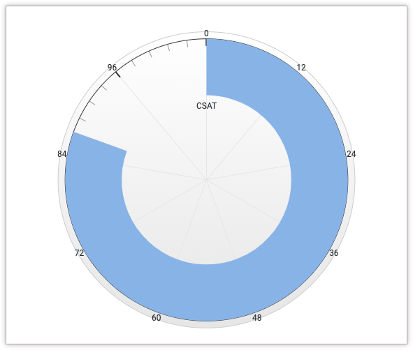
For example, the following solid gauge chart shows the current value of the Customer Satisfaction (CSAT) measure, which is represented by a circular blue progress bar. Since the possible values of CSAT scores can be from 0 to 100, those values are represented on either end of the gauge.
Prerequisites
To access the Chart Config Editor, you must have the can_override_vis_config permission.
Writing the JSON snippet
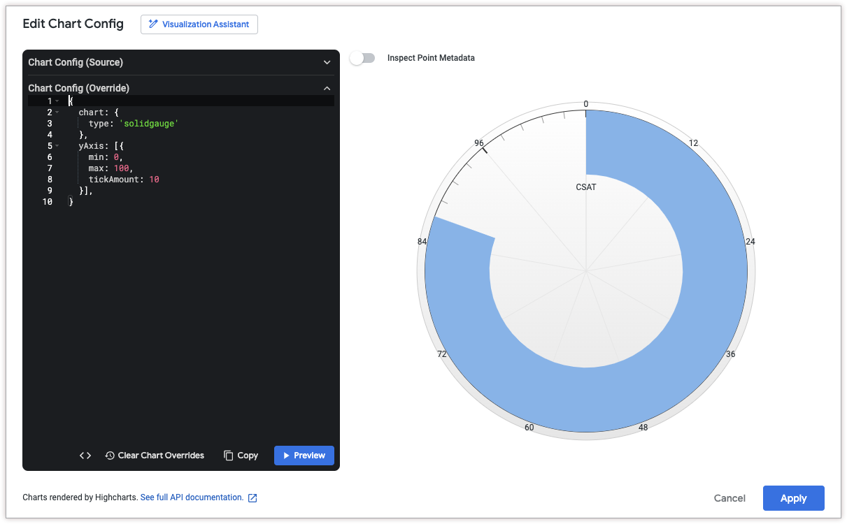
To create a solid gauge chart, start from the following JSON snippet:
{
  chart: {
    type: 'solidgauge'
  },
  yAxis: [{
    min: 0,
    max: 100,
    tickAmount: 10
  }],
}
Change the following values to fit your use case:
- The
yAxis.minattribute defines the minimum value for the solid gauge chart. - The
yAxis.maxattribute defines the maximum value for the solid gauge chart. - The
yAxis.tickAmountattribute specifies the number of labels that should be displayed around the solid gauge chart. The labels will be evenly distributed based on theyAxis.minandyAxis.maxattributes.
Creating a solid gauge chart
To create a solid gauge chart, follow these steps:
View a column chart in an Explore, or edit a column chart in a Look or dashboard.
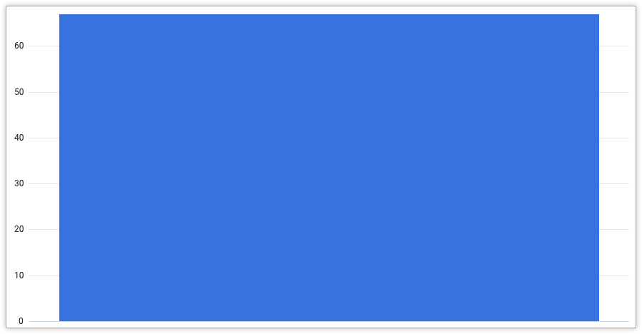
For this example, we recommend starting from a column chart with one dimension and one measure, with a limit of one row. Your starting chart might look something like this example:
Open the Edit menu in the visualization.
In the Plot tab, click the Edit Chart Config button. Looker displays the Edit Chart Config dialog.
Select the Chart Config (Override) section, and enter the HighCharts JSON from the Writing the JSON snippet section of this page.
To let Looker properly format your JSON, click <> (Format code).
To test your changes, click Preview.
To apply your changes, click Apply. The visualization will be displayed using the custom JSON values.
Once you've customized your visualization, you can save it.