Diagram meteran solid berguna untuk menampilkan angka dalam rentang yang diketahui. Pembaca dapat dengan cepat menentukan apakah nilai saat ini relatif tinggi atau rendah berdasarkan nilai yang diharapkan.
Dengan Chart Config Editor, Anda dapat membuat diagram pengukur solid dengan memulai dari diagram kolom di Looker. Diagram indikator solid memerlukan satu dimensi dan satu ukuran.
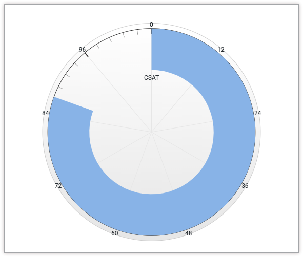
Misalnya, diagram pengukur solid berikut menunjukkan nilai saat ini dari ukuran Kepuasan Pelanggan (CSAT), yang diwakili oleh status progres biru melingkar. Karena nilai skor CSAT yang mungkin berkisar dari 0 hingga 100, nilai tersebut ditampilkan di kedua ujung pengukur.
Prasyarat
Untuk mengakses Editor Konfigurasi Diagram, Anda harus memiliki izin can_override_vis_config.
Menulis cuplikan JSON
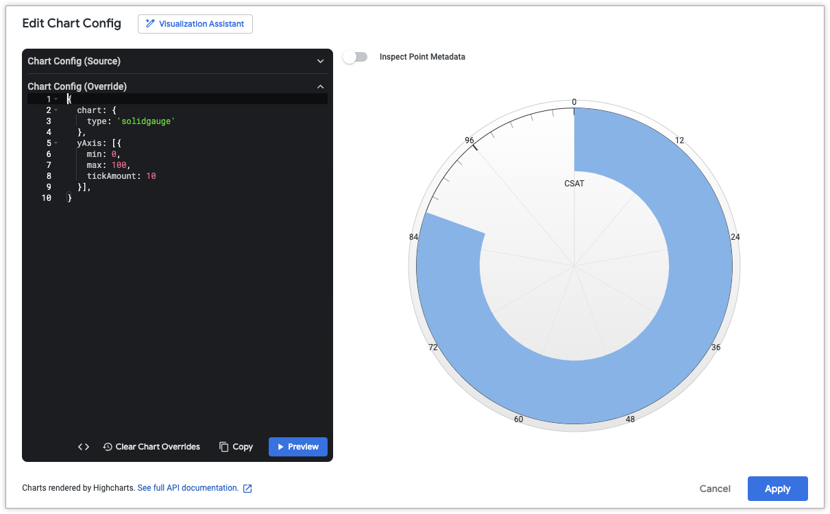
Untuk membuat diagram pengukur solid, mulai dari cuplikan JSON berikut:
{
  chart: {
    type: 'solidgauge'
  },
  yAxis: [{
    min: 0,
    max: 100,
    tickAmount: 10
  }],
}
Ubah nilai berikut agar sesuai dengan kasus penggunaan Anda:
- Atribut
yAxis.minmenentukan nilai minimum untuk diagram pengukur solid. - Atribut
yAxis.maxmenentukan nilai maksimum untuk diagram pengukur solid. - Atribut
yAxis.tickAmountmenentukan jumlah label yang harus ditampilkan di sekitar diagram pengukur solid. Label akan didistribusikan secara merata berdasarkan atributyAxis.mindanyAxis.max.
Membuat diagram pengukur solid
Untuk membuat diagram pengukur solid, ikuti langkah-langkah berikut:
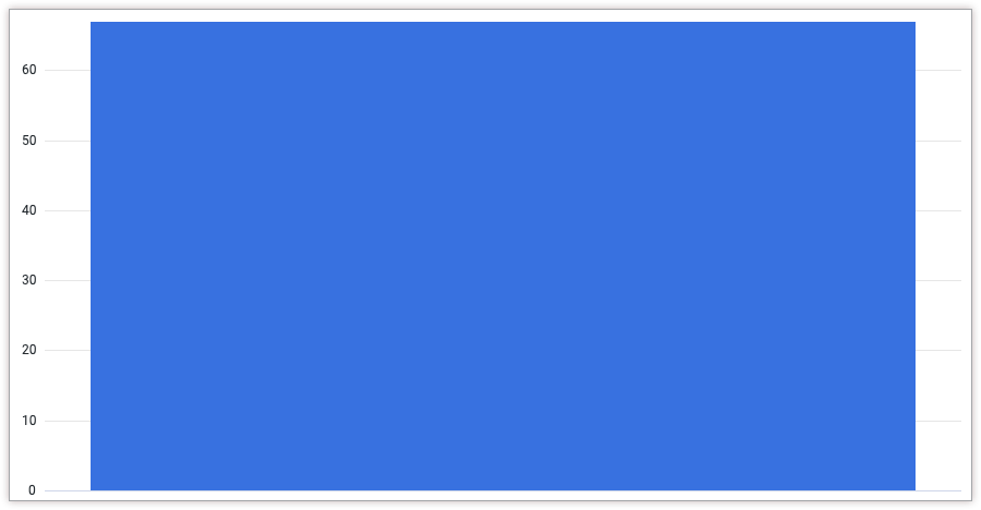
Lihat diagram kolom di Jelajahi, atau edit diagram kolom di Tampilan atau dasbor.
Untuk contoh ini, sebaiknya mulai dari diagram kolom dengan satu dimensi dan satu ukuran, dengan batas satu baris. Diagram awal Anda mungkin terlihat seperti contoh ini:
Buka menu Edit dalam visualisasi.
Di tab Plot, klik tombol Edit Chart Config. Looker akan menampilkan dialog Edit Chart Config.
Pilih bagian Chart Config (Override), lalu masukkan JSON HighCharts dari bagian Menulis cuplikan JSON di halaman ini.
Agar Looker dapat memformat JSON Anda dengan benar, klik <> (Format code).
Untuk menguji perubahan, klik Pratinjau.
Untuk menerapkan perubahan, klik Terapkan. Visualisasi akan ditampilkan menggunakan nilai JSON kustom.
Setelah menyesuaikan visualisasi, Anda dapat menyimpannya.