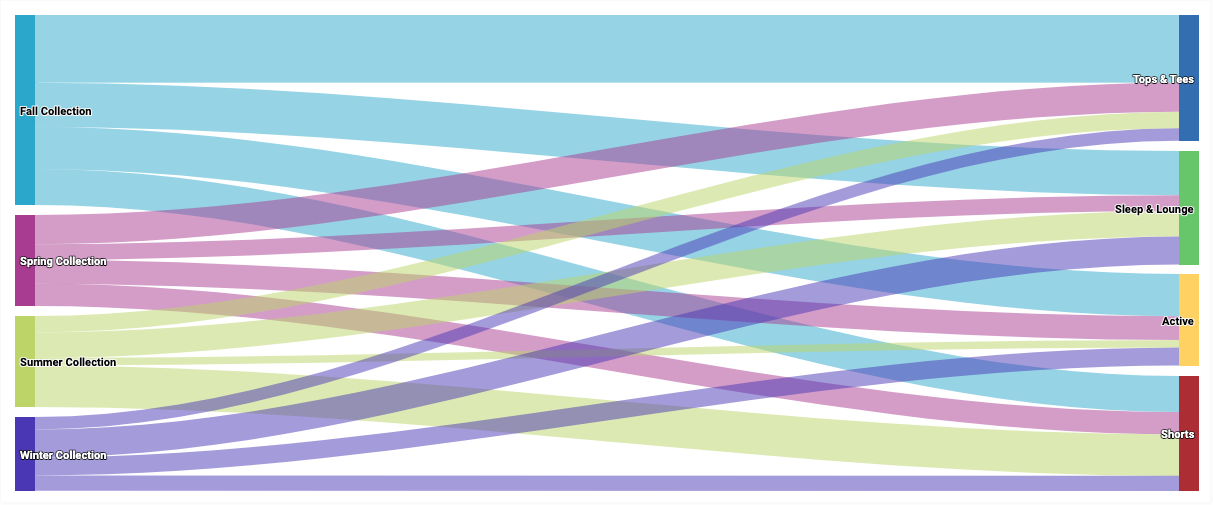
Diagram Sankey menekankan alur dari satu status ke status lainnya. Di Looker, setiap nilai dimensi ditampilkan sebagai status, dan ukuran alur ditentukan oleh nilai ukuran numerik.
Dengan menggunakan Editor Konfigurasi Diagram, Anda dapat membuat diagram Sankey dengan memulai dari diagram kolom di Looker. Untuk hasil terbaik, gunakan minimal dua dimensi dan tepat satu ukuran untuk membuat diagram Sankey.
Misalnya, Anda dapat membuat diagram Sankey yang menampilkan nilai ukuran Jumlah Item Pesanan di beberapa nilai dimensi Koleksi Musiman, yang mengalir ke nilai dimensi Kategori. Setiap nilai dimensi diwakili oleh persegi panjang berkode warna. Lebar setiap garis di tempat garis tersebut bertemu dengan setiap persegi panjang sesuai dengan nilai ukuran Jumlah Item Pesanan untuk dimensi tersebut.
Prasyarat
Untuk mengakses Editor Konfigurasi Diagram, Anda harus memiliki izin can_override_vis_config.
Menulis cuplikan JSON
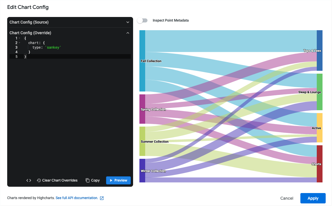
Untuk membuat diagram Sankey, mulailah dari cuplikan JSON berikut:
{
  chart: {
    type: 'sankey'
  }
}
Membuat diagram Sankey
Untuk membuat diagram Sankey, ikuti langkah-langkah berikut:
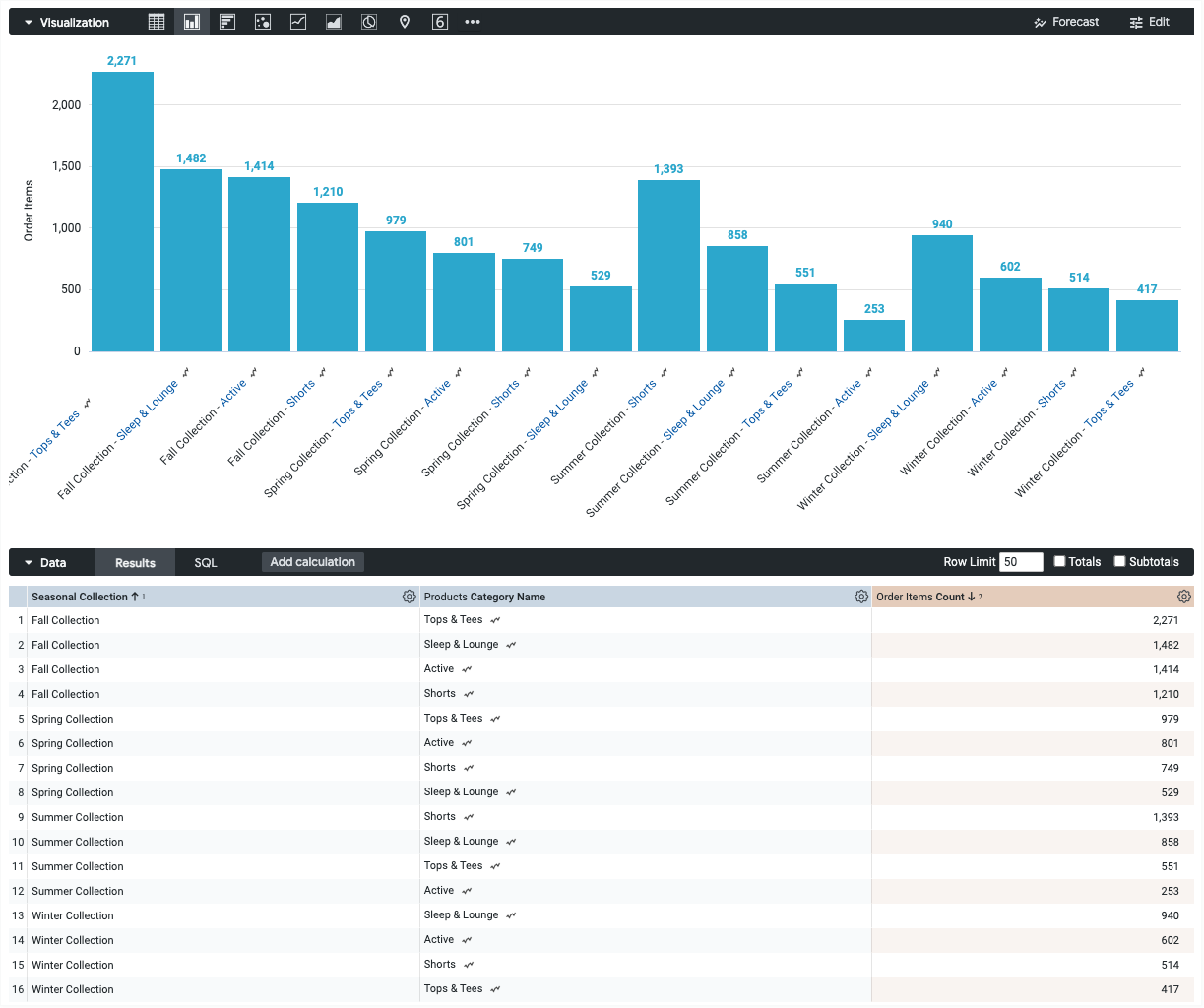
Lihat diagram kolom di Eksplorasi, atau edit diagram kolom di Look atau dasbor.
Untuk contoh ini, sebaiknya mulai dari diagram kolom dengan dua dimensi dan satu ukuran. Diagram awal Anda mungkin terlihat seperti contoh berikut:
Buka menu Edit dalam visualisasi.
Di tab Plot, klik tombol Edit Chart Config. Looker akan menampilkan dialog Edit Chart Config.
Pilih bagian Chart Config (Override), lalu masukkan JSON HighCharts dari bagian Menulis cuplikan JSON di halaman ini.
Agar Looker dapat memformat JSON Anda dengan benar, klik <> (Format kode).
Untuk menguji perubahan, klik Pratinjau.
Untuk menerapkan perubahan, klik Terapkan. Visualisasi akan ditampilkan menggunakan nilai JSON kustom.
Setelah menyesuaikan visualisasi, Anda dapat menyimpannya.
Batasan dan persyaratan
- Diagram sankey memerlukan setidaknya dua dimensi dan tepat satu ukuran.
- Diagram Sankey dapat menampilkan maksimum 50 baris data.