Membuat diagram peluru dengan Editor Konfigurasi Diagram
Tetap teratur dengan koleksi
Simpan dan kategorikan konten berdasarkan preferensi Anda.
Diagram peluru berguna untuk menampilkan performa terhadap target, atau progres terhadap sasaran.
Dengan Editor Konfigurasi Diagram, Anda dapat membuat diagram peluru dengan memulai dari diagram batang di Looker.
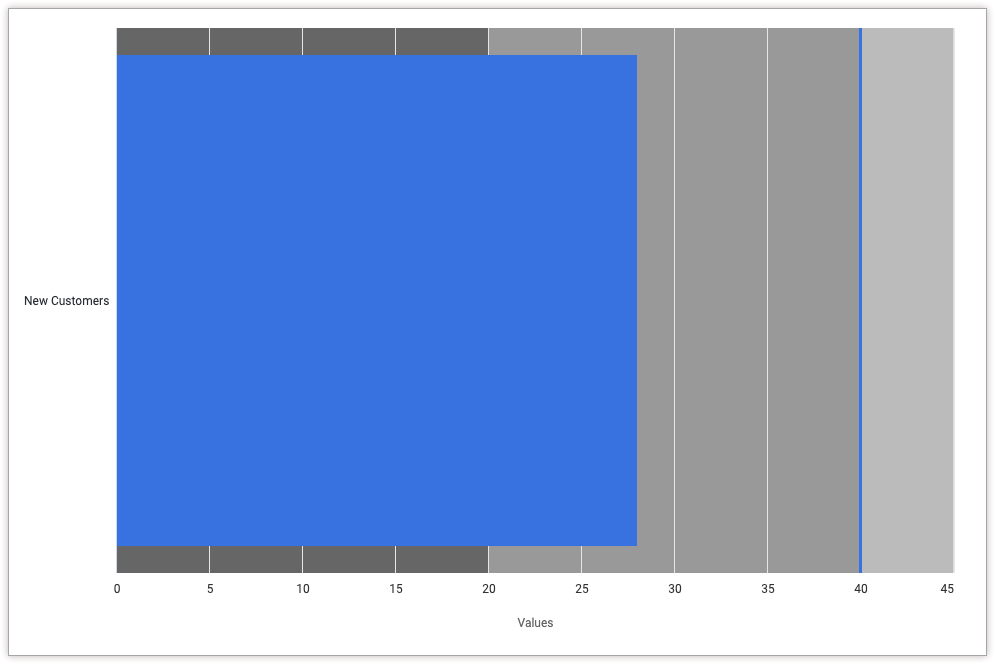
Misalnya, diagram peluru berikut membandingkan ukuran Jumlah Pelanggan Baru, yang diwakili oleh status progres biru, dengan nilai target 40, yang diwakili oleh garis vertikal biru. Diagram juga menunjukkan bucket progres antara 0 dan 20, antara 20 dan 40, serta antara 40 dan 80, yang masing-masing diwakili oleh warna abu-abu yang berbeda.
Ubah nilai berikut agar sesuai dengan kasus penggunaan Anda:
Atribut xAxis.categories menimpa label sumbu X. Dalam contoh ini, label sumbu X harus berupa nama ukuran Pelanggan Baru.
Atribut yAxis.plotBands menentukan warna latar belakang diagram untuk nilai tertentu. Dalam contoh ini, warna latar belakang adalah abu-abu tua (#666666) antara 0 dan 20, abu-abu sedang (#999999) antara 20 dan 40, dan abu-abu muda (#bbbbbb) antara 40 dan 80.
Atribut series.data.target menentukan nilai target untuk diagram peluru, yang akan muncul sebagai garis vertikal. Dalam contoh ini, targetnya adalah 40.
Membuat diagram peluru
Untuk membuat diagram peluru, ikuti langkah-langkah berikut:
Lihat diagram batang di Jelajah, atau edit diagram batang di Look atau dasbor.
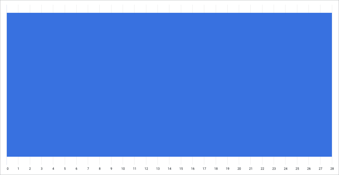
Untuk contoh ini, sebaiknya mulai dari diagram batang dengan satu dimensi dan satu ukuran, dengan batas satu baris. Diagram awal Anda mungkin terlihat seperti contoh ini:
Buka menu Edit dalam visualisasi.
Di tab Plot, klik tombol Edit Chart Config. Looker akan menampilkan dialog Edit Chart Config.
Pilih bagian Chart Config (Override), lalu masukkan JSON HighCharts dari bagian Menulis cuplikan JSON di halaman ini.
Agar Looker dapat memformat JSON Anda dengan benar, klik <> (Format code).
Untuk menguji perubahan, klik Pratinjau.
Untuk menerapkan perubahan, klik Terapkan. Visualisasi akan ditampilkan menggunakan nilai JSON kustom.
Setelah menyesuaikan visualisasi, Anda dapat menyimpannya. Jika Anda melihat visualisasi di Jelajah, simpan Jelajah. Jika Anda mengedit Tampilan atau dasbor, klik Simpan.
[[["Mudah dipahami","easyToUnderstand","thumb-up"],["Memecahkan masalah saya","solvedMyProblem","thumb-up"],["Lainnya","otherUp","thumb-up"]],[["Sulit dipahami","hardToUnderstand","thumb-down"],["Informasi atau kode contoh salah","incorrectInformationOrSampleCode","thumb-down"],["Informasi/contoh yang saya butuhkan tidak ada","missingTheInformationSamplesINeed","thumb-down"],["Masalah terjemahan","translationIssue","thumb-down"],["Lainnya","otherDown","thumb-down"]],["Terakhir diperbarui pada 2025-08-25 UTC."],[],[],null,["# Creating a bullet chart with the Chart Config Editor\n\n| **Note:** Starting in Looker 24.4, the Chart Config Editor supports the creation of bullet charts.\n\nBullet charts are useful for showing performance against a target, or progress on a goal.\n\nUsing the [Chart Config Editor](/looker/docs/chart-config-editor), you can create bullet charts by starting from a bar chart in Looker.\n\nFor example, the following bullet chart compares the **New Customers Count** measure, represented by a blue progress bar, to a target value of 40, represented by a blue vertical line. The chart also indicates progress buckets between 0 and 20, between 20 and 40, and between 40 and 80, each represented by a different shade of grey.\n\nPrerequisites\n-------------\n\nTo access the Chart Config Editor, you must have the [`can_override_vis_config` permission](/looker/docs/admin-panel-users-roles#can_override_vis_config).\n\n### Writing the JSON snippet\n\nTo create a bullet chart, start from the following JSON snippet: \n\n {\n chart: {\n type: 'bullet'\n },\n xAxis: {\n categories: ['New Customers']\n },\n yAxis: {\n plotBands: [{\n from: 0,\n to: 20,\n color: '#666666'\n }, {\n from: 20,\n to: 40,\n color: '#999999'\n }, {\n from: 40,\n to: 80,\n color: '#bbbbbb'\n }],\n },\n series: [{\n data: [{\n target: 40\n }]\n }],\n }\n\nChange the following values to fit your use case:\n\n- The `xAxis.categories` attribute overwrites the label of the X-axis. In this example, the X-axis label should be the measure name **New Customers**.\n- The `yAxis.plotBands` attribute specifies the background color of the chart for certain values. In this example, the background color is dark grey (`#666666`) between 0 and 20, medium grey (`#999999`) between 20 and 40, and light grey (`#bbbbbb`) between 40 and 80.\n- The `series.data.target` attribute specifies the target value for the bullet chart, which will appear as a vertical line. In this example, the target is 40.\n\n### Creating a bullet chart\n\nTo create a bullet chart, follow these steps:\n\n1. View a [bar chart](/looker/docs/bar-options) in an Explore, or edit a bar chart in a Look or dashboard.\n\n For this example, we recommend starting from a bar chart with one dimension and one measure, with a limit of one row. Your starting chart might look something like this example:\n\n2. Open the **Edit** menu in the visualization.\n\n3. In the **Plot** tab, click the **Edit Chart Config** button. Looker displays the **Edit Chart Config** dialog.\n\n4. Select the **Chart Config (Override)** section, and enter the HighCharts JSON from the [Writing the JSON snippet](#json) section of this page.\n\n5. To allow Looker to properly format your JSON, click **\\\u003c\\\u003e (Format code)**.\n\n6. To test your changes, click **Preview**.\n\n7. To apply your changes, click **Apply**. The visualization will be displayed using the custom JSON values.\n\nOnce you've customized your visualization, you can save it. If you viewed the visualization in an Explore, [save the Explore](/looker/docs/viewing-and-interacting-with-explores#the_explore_actions_gear_menu). If you edited a Look or a dashboard, click **Save**."]]