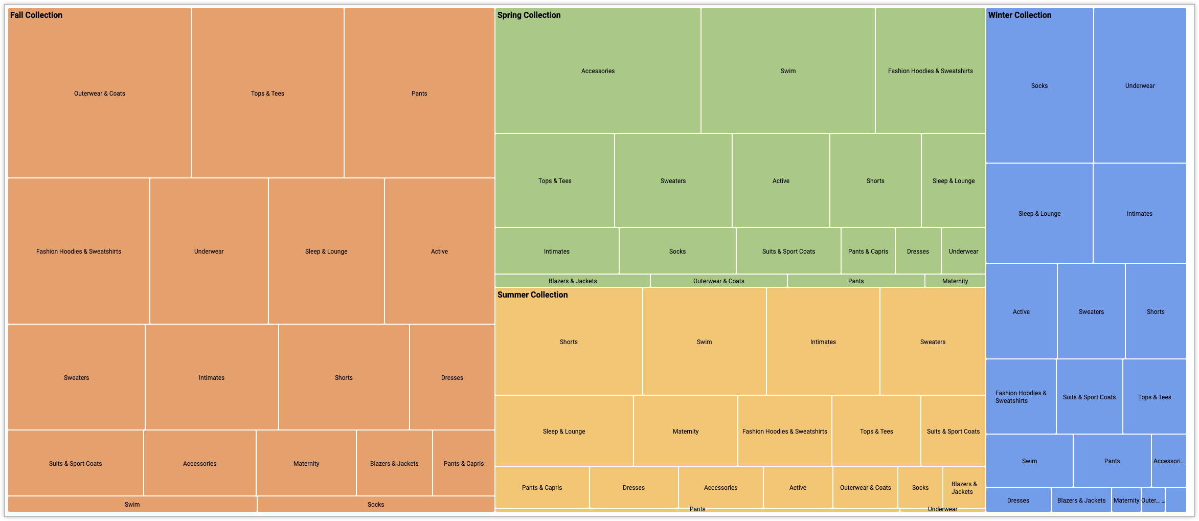
Um mapa de árvore mostra dados categóricos e hierárquicos como um conjunto de retângulos, em que o tamanho de cada um é determinado por uma medida numérica.
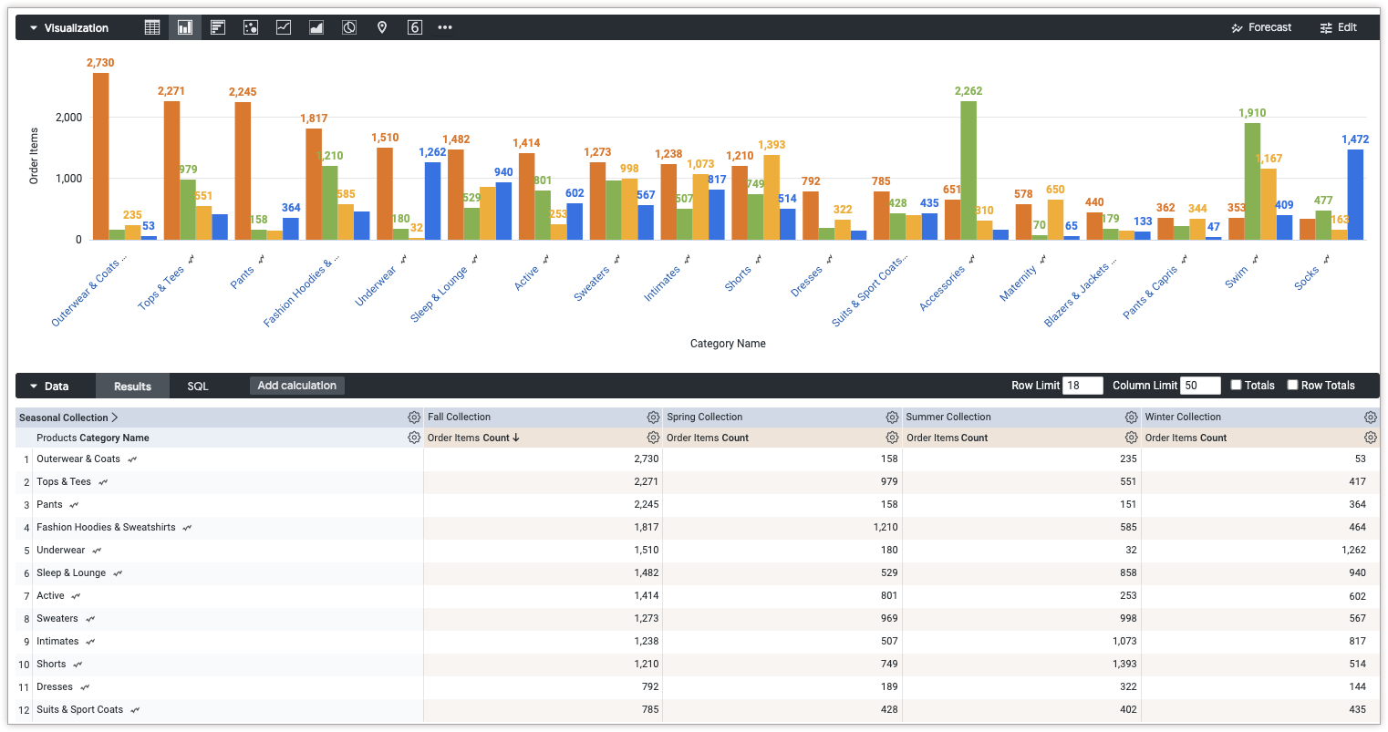
Com o Editor de configuração de gráficos, é possível criar gráficos de mapa de árvore começando com um gráfico de colunas no Looker. Para ter os melhores resultados, use uma dimensão dinamizada, uma dimensão não dinamizada e uma métrica para criar um gráfico de mapa de árvore.
Por exemplo, é possível criar um gráfico treemap que mostra a Contagem de itens do pedido em vários valores diferentes de Categoria, com rotação por Coleção sazonal. Cada temporada é representada por um retângulo codificado por cores, que contém retângulos menores que representam a categoria. O tamanho de cada retângulo corresponde à Contagem de itens do pedido .
Pré-requisitos
Para acessar o Editor de configuração de gráficos, você precisa ter a permissão can_override_vis_config.
Escrever o snippet JSON
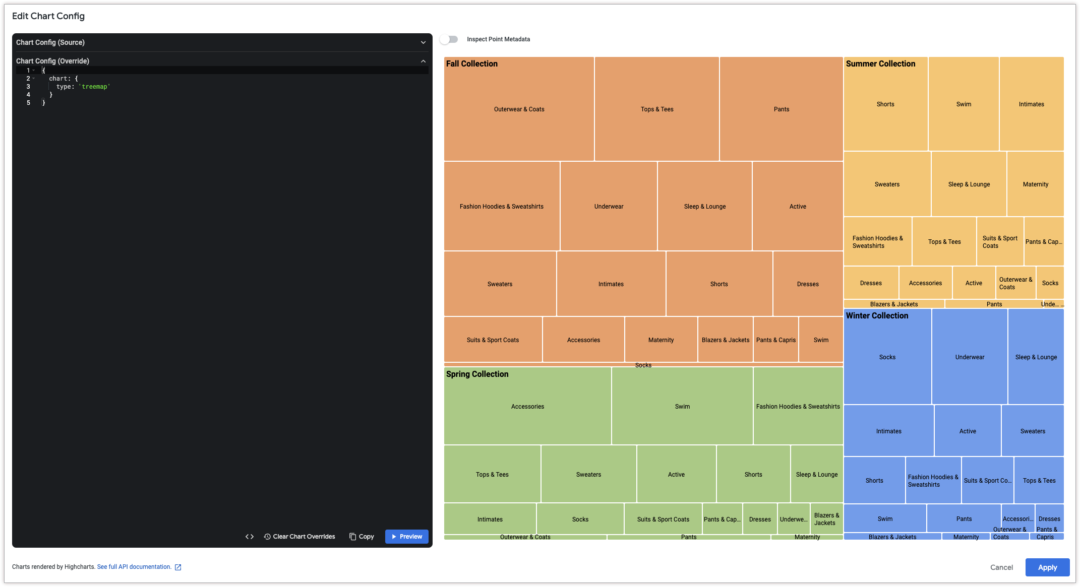
Para criar um gráfico de mapa de árvore, comece com o seguinte snippet JSON:
{
  chart: {
    type: 'treemap',
  }
}
Como criar um gráfico de mapa de árvore
Para criar um gráfico de mapa de árvore, siga estas etapas:
Ver um gráfico de colunas em uma Análise ou editar um gráfico de colunas em um Look ou painel.
Para este exemplo, recomendamos começar com um gráfico de colunas com duas dimensões e uma métrica. Uma dimensão precisa ser dinamizada. Os valores de transposição definem as categorias de nível superior usadas para renderizar o mapa de árvore. Seu gráfico inicial pode ser parecido com este exemplo:
Abra o menu Editar na visualização.
Na guia Gráfico, clique no botão Editar configuração do gráfico. O Looker mostra a caixa de diálogo Editar configuração do gráfico.
Selecione a seção Configuração do gráfico (substituição) e insira o JSON do HighCharts da seção Como escrever o snippet JSON desta página.
Para que o Looker formate corretamente seu JSON, clique em <> (Formatar código).
Para testar as mudanças, clique em Visualizar.
Para aplicar as mudanças, clique em Aplicar. A visualização será mostrada usando os valores JSON personalizados.
Depois de personalizar a visualização, você pode salvá-la.