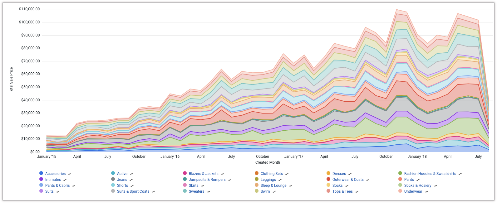
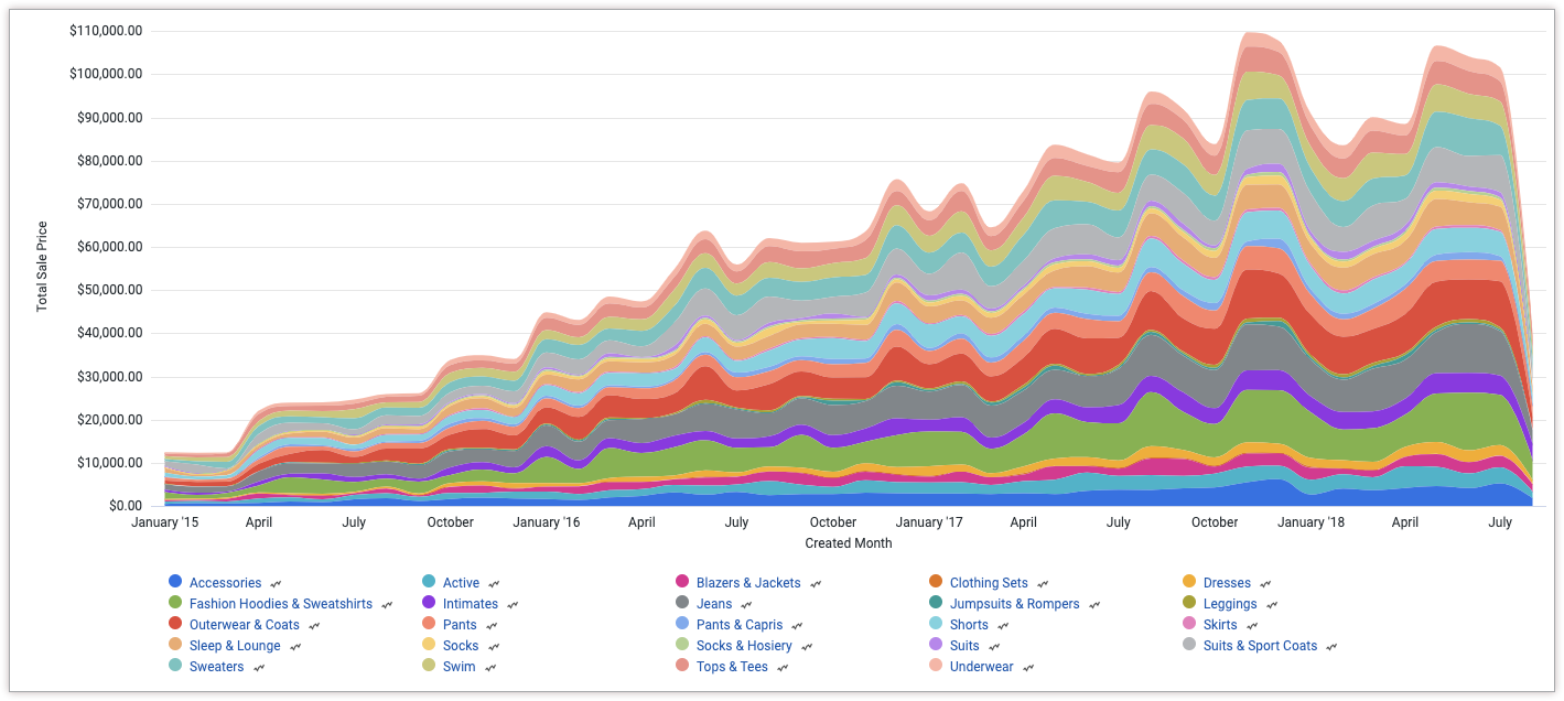
Por exemplo, o gráfico de fluxo a seguir mostra o preço total de venda em vários valores de categoria, plotados no mês de criação do pedido. As categorias são empilhadas para mostrar a contribuição de cada uma para o total e como o total muda ao longo do tempo.
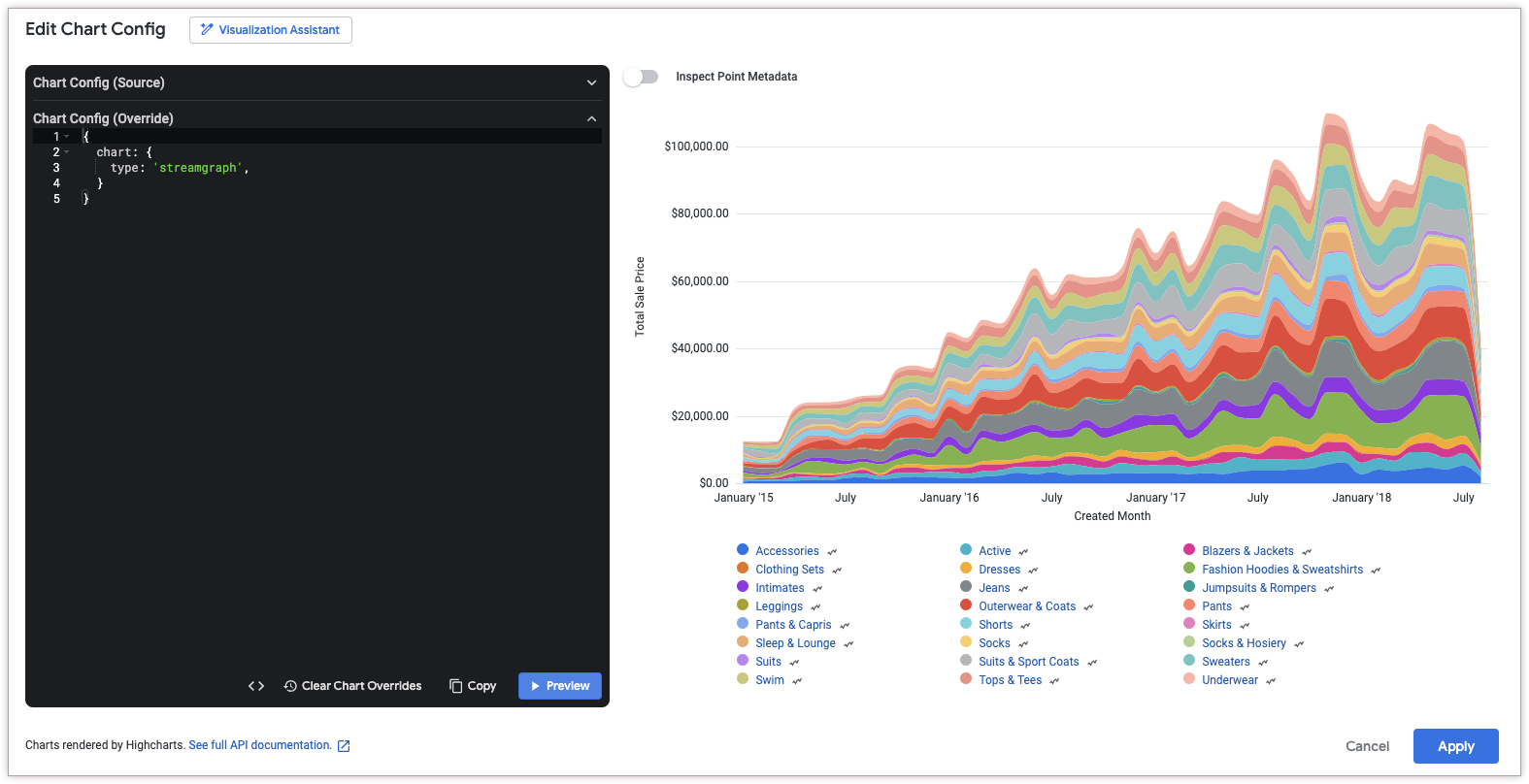
Para criar um gráfico de fluxo, comece com o seguinte snippet JSON:
{chart:{type:'streamgraph',}}
Como criar um gráfico de fluxo
Para criar um gráfico de fluxo, siga estas etapas:
Visualize um gráfico de área em uma Análise detalhada ou edite um gráfico de área em um visual ou painel.
Para este exemplo, recomendamos começar com um gráfico de área com duas dimensões e uma medida. Uma dimensão precisa ser girada. O gráfico inicial pode ser parecido com este exemplo:
Abra o menu Editar na visualização.
Na guia Gráfico, clique no botão Editar configuração do gráfico. O Looker mostra a caixa de diálogo Edit Chart Config.
Selecione a seção Configuração do gráfico (substituir) e insira o JSON do HighCharts na seção Como escrever o snippet JSON desta página.
Para que o Looker formate seu JSON corretamente, clique em <> (Format code).
Para testar as mudanças, clique em Visualizar.
Para aplicar as mudanças, clique em Aplicar. A visualização será mostrada usando os valores JSON personalizados.
Depois de personalizar a visualização, você pode salvá-la.
[[["Fácil de entender","easyToUnderstand","thumb-up"],["Meu problema foi resolvido","solvedMyProblem","thumb-up"],["Outro","otherUp","thumb-up"]],[["Difícil de entender","hardToUnderstand","thumb-down"],["Informações incorretas ou exemplo de código","incorrectInformationOrSampleCode","thumb-down"],["Não contém as informações/amostras de que eu preciso","missingTheInformationSamplesINeed","thumb-down"],["Problema na tradução","translationIssue","thumb-down"],["Outro","otherDown","thumb-down"]],["Última atualização 2025-08-25 UTC."],[],[],null,["# Creating a streamgraph chart with the Chart Config Editor\n\n| **Note:** Starting in Looker 24.8, the Chart Config Editor supports the creation of streamgraph charts.\n\nA streamgraph chart is a type of stacked area chart that is useful for displaying compound volume across different categories or over time.\n\nUsing the [Chart Config Editor](/looker/docs/chart-config-editor), you can create streamgraph charts by starting from an [area chart](/looker/docs/area-options) in Looker. Streamgraph charts require two dimensions and one measure.\n\nFor example, the following streamgraph chart shows the **Total Sale Price** over several different **Category** values, plotted over **Order Created Month**. Categories are stacked on top of one another to show how much each category contributes to the total, as well as how the total changes over time.\n\nPrerequisites\n-------------\n\nTo access the Chart Config Editor, you must have the [`can_override_vis_config` permission](/looker/docs/admin-panel-users-roles#can_override_vis_config).\n\n### Writing the JSON snippet\n\nTo create a streamgraph chart, start from the following JSON snippet: \n\n {\n chart: {\n type: 'streamgraph',\n }\n }\n\n### Creating a streamgraph chart\n\nTo create a streamgraph chart, follow these steps:\n\n1. View an [area chart](/looker/docs/area-options) in an Explore, or edit an area chart in a Look or dashboard.\n\n For this example, we recommend starting from an area chart with two dimensions and one measure. One dimension should be pivoted. Your starting chart might look something like this example:\n\n2. Open the **Edit** menu in the visualization.\n\n3. In the **Plot** tab, click the **Edit Chart Config** button. Looker displays the **Edit Chart Config** dialog.\n\n4. Select the **Chart Config (Override)** section, and enter the HighCharts JSON from the [Writing the JSON snippet](#json) section of this page.\n\n5. To let Looker properly format your JSON, click **\\\u003c\\\u003e (Format code)**.\n\n6. To test your changes, click **Preview**.\n\n7. To apply your changes, click **Apply**. The visualization will be displayed using the custom JSON values.\n\nOnce you've customized your visualization, you can save it."]]