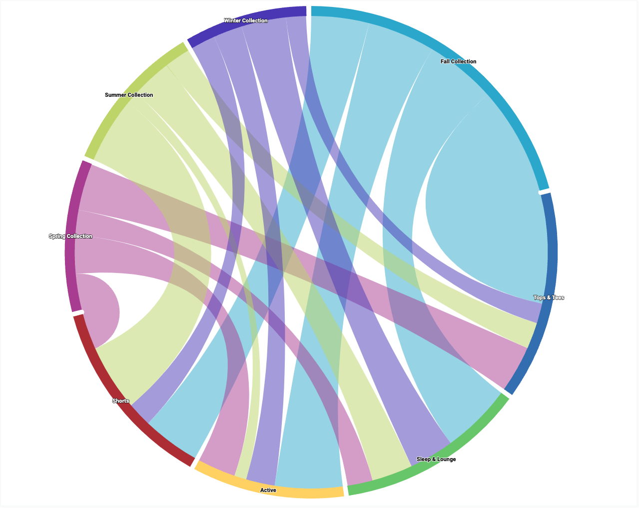
Um diagrama de dependência é semelhante a um diagrama de Sankey, mas mostra o fluxo entre estados em um círculo, em vez de uma direção linear. No Looker, cada valor de dimensão é representado como um estado, e o tamanho do fluxo é determinado por um valor de medida numérica.
Usando o Editor de configuração de gráficos, é possível criar gráficos de roda de dependência começando com um gráfico de colunas no Looker.
Os gráficos de roda de dependência exigem pelo menos duas dimensões e exatamente uma medição.
Por exemplo, é possível criar um gráfico de dependência que mostre os valores da métrica Contagem de itens do pedido em vários valores da dimensão Coleção sazonal, que fluem para os valores da dimensão Categoria. Cada valor de dimensão é representado por um arco codificado por cores na parte externa do círculo. A largura de uma linha que conecta dois arcos corresponde aos valores da métrica Contagem de itens do pedido para esse par de dimensões. Quanto maior o valor, mais larga será a linha.
Pré-requisitos
Para acessar o Editor de configuração de gráficos, você precisa ter a permissão can_override_vis_config.
Escrever o snippet JSON
Para criar um gráfico de roda de dependências, comece com o seguinte snippet JSON:
{
  chart: {
    type: 'dependencywheel'
  }
}
Como criar um gráfico de roda de dependências
Para criar um gráfico de roda de dependências, siga estas etapas:
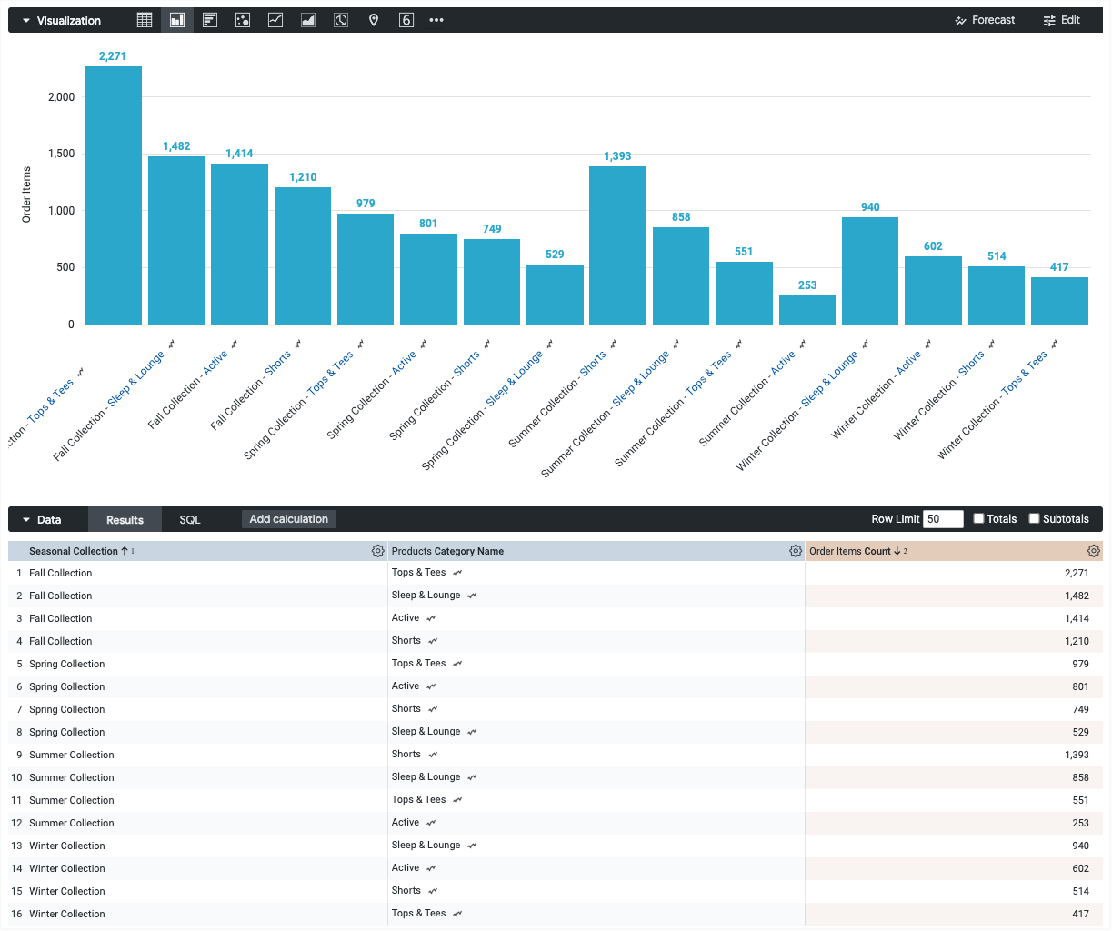
Ver um gráfico de colunas em uma Análise ou editar um gráfico de colunas em um Look ou painel.
Comece com um gráfico de colunas com pelo menos duas dimensões e exatamente uma métrica. Seu gráfico inicial pode ser parecido com este exemplo:
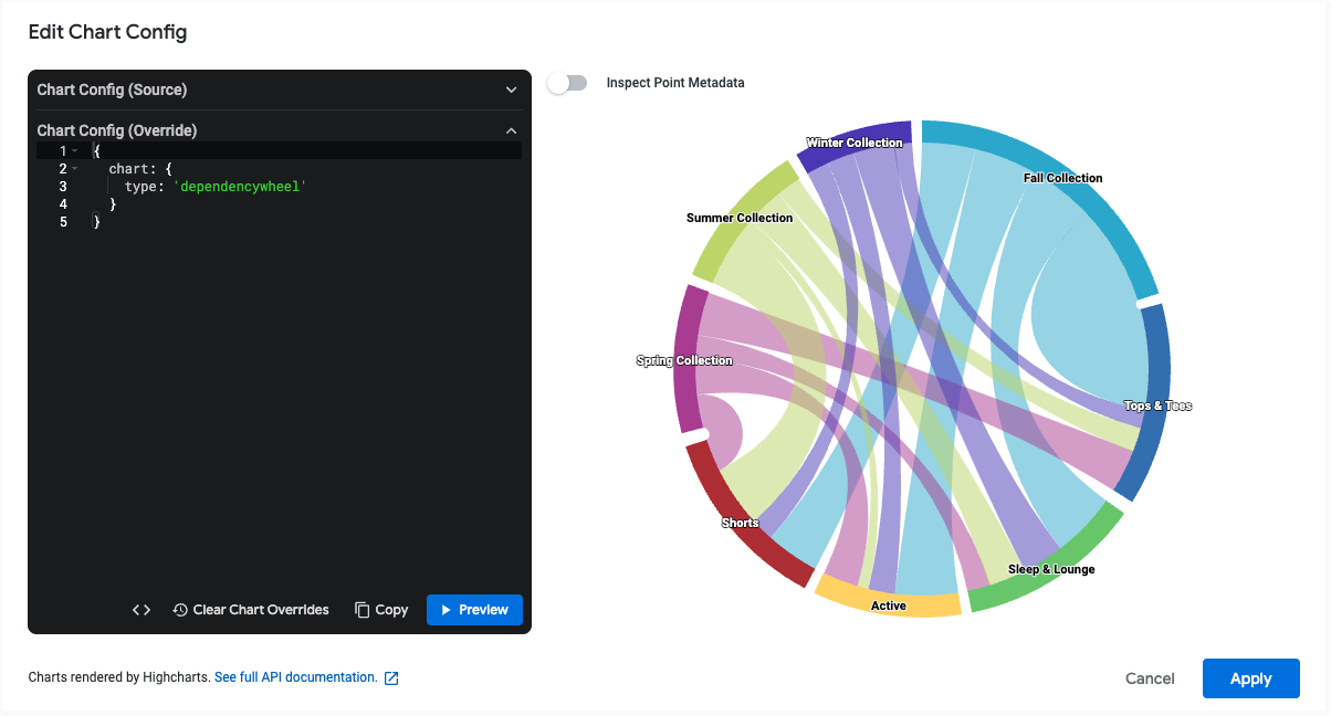
Abra o menu Editar na visualização.
Na guia Gráfico, clique no botão Editar configuração do gráfico. O Looker mostra a caixa de diálogo Editar configuração do gráfico.
Selecione a seção Configuração do gráfico (substituição) e insira o JSON do HighCharts da seção Como escrever o snippet JSON desta página.
Para que o Looker formate corretamente seu JSON, clique em <> (Formatar código).
Para testar as mudanças, clique em Visualizar.
Para aplicar as mudanças, clique em Aplicar. A visualização será mostrada usando os valores JSON personalizados.
Depois de personalizar a visualização, você pode salvá-la.
Limitações e requisitos
Ao usar gráficos de roda de dependência, lembre-se das seguintes limitações e requisitos:
- Os gráficos de roda de dependência exigem pelo menos duas dimensões e exatamente uma medição.
- Os gráficos de roda de dependência podem mostrar no máximo 50 linhas de dados.
- Os gráficos de dependência em forma de roda não são compatíveis com dimensões dinâmicas.