多重环形图非常适合直观呈现多个组成部分的比例值。每个序列的值都表示为所有序列的总值的百分比。
如需为查询创建圆环多重图,请点击可视化图表标签页上的省略号 (...),然后选择圆环多重图。
构建多个环形图
环形多重图表可基于包含以下任一内容的查询构建:
使用至少一个指标和至少一个透视
如果构建的多层环图至少包含一个衡量指标和一个数据透视,但不包含未透视的维度,则该图表会呈现,但各个多层环图没有标签。向查询中添加非透视维度可为每个单独的环形图提供标签。以下示例展示了一个圆环多重图,其中包含一个衡量指标、一个透视以及一个未透视的维度及其数据表:
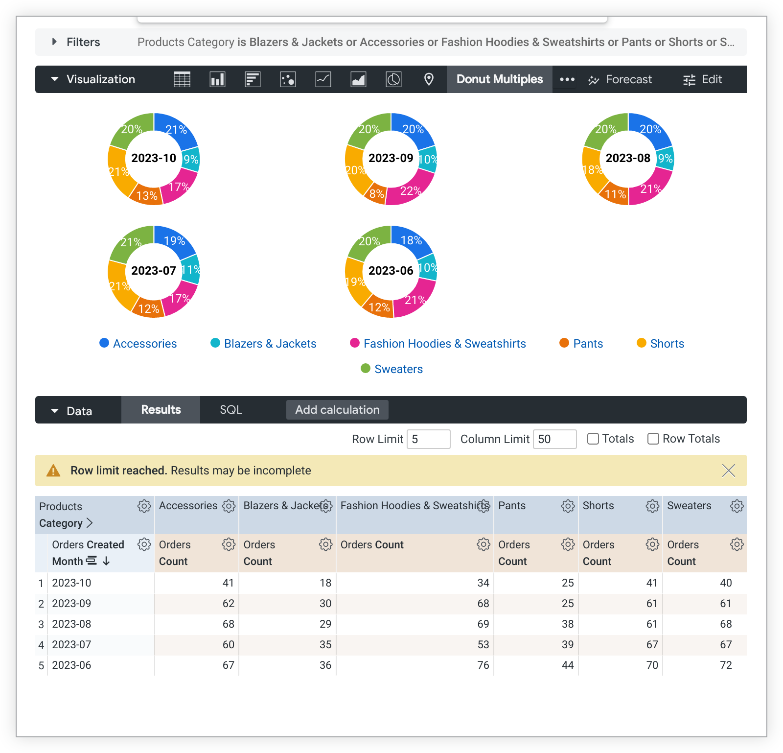
添加其他透视或指标会为每个甜甜圈图添加其他切片。
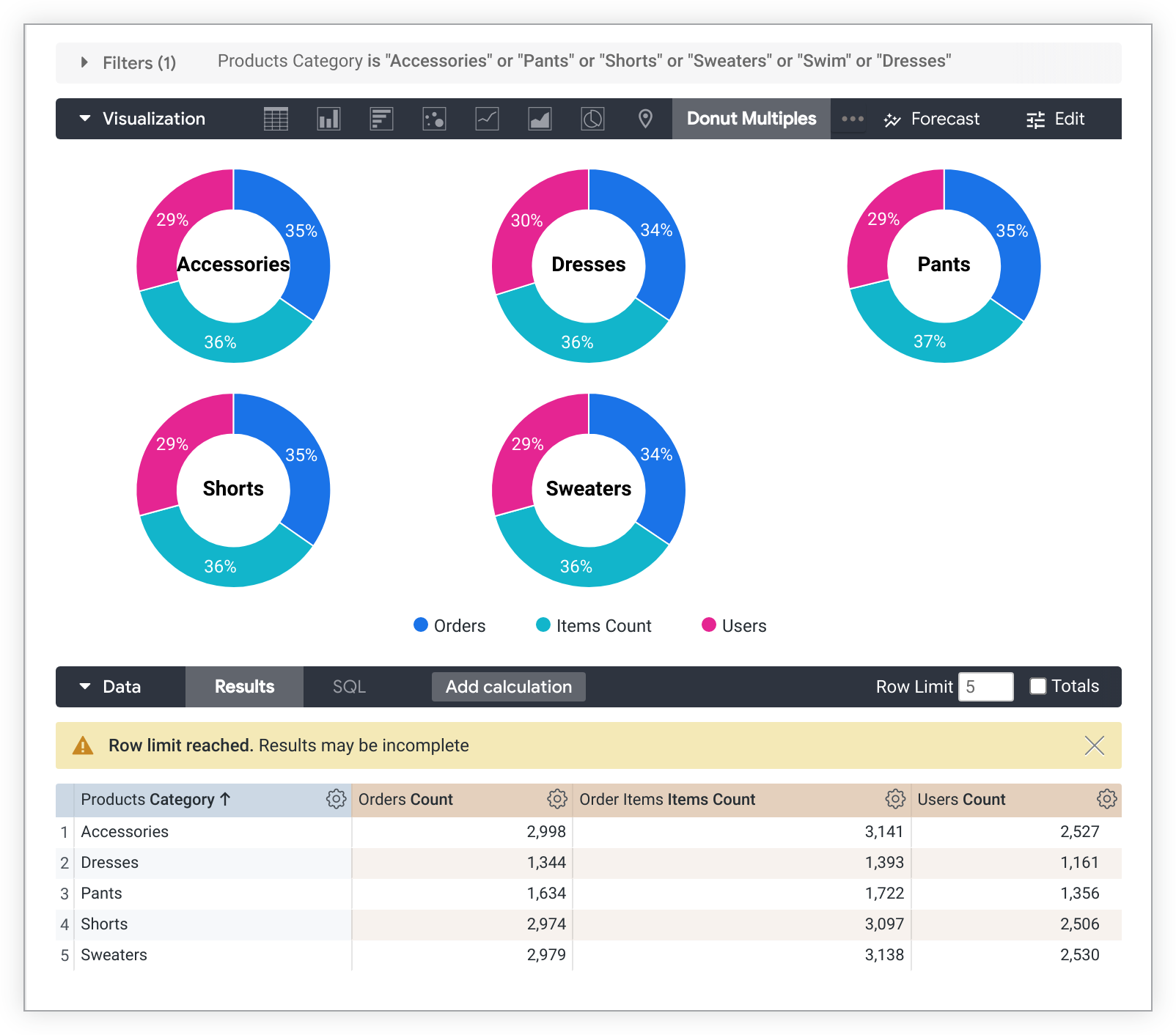
使用一个维度、多个衡量指标,但不使用数据透视
如需构建包含多个衡量指标且不含透视的多重环形图,每个衡量指标将成为每个图表上的一个切片,而维度将为每个单独的图表添加标签。可视化图表中只能显示一个维度。以下是此类图表及其数据表的示例:
自定义多个环形图
如需自定义图表,请点击可视化图表标签页右上角的修改。
如果某个选项与您选择的其他设置相冲突,则该选项可能会灰显或隐藏。
图表菜单选项
值标签
您可以切换图表中每个数据点的值标签的显示状态。
序列标签大小
您可以更改显示在每个环形图中间的标签的字体大小。
每行的图表数量
您可以定义甜甜圈多重图表中单行显示的甜甜圈的最大数量。默认值为 3。
隐藏图例
您可以切换图表上序列图例的显示状态。只有在有多个序列时,此选项才可用(饼图除外)。
系列菜单选项
“序列”菜单用于控制图表显示每个数据序列的方式。
颜色
您可以在颜色部分中定义图表的调色板。
集合
借助集合,您可以创建主题一致且效果出色的可视化图表和信息中心。Looker 的所有内置颜色集合都显示在颜色集合文档页面上。Looker 管理员还可以为您的组织创建自定义颜色集合。
您可以从集合下拉菜单中选择颜色集合。调色板部分将更新为所选颜色集合中的调色板。
调色板
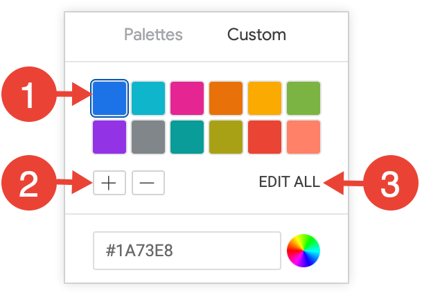
选择颜色集合后,您可以点击调色板本身,从该集合中选择其他调色板,也可以自定义调色板。系统会打开调色板选择器,并显示集合中的所有调色板。
系统会按顺序为每个序列分配颜色。对于分类调色板,调色板中的第一种颜色会分配给第一个序列,依此类推。对于顺序或发散调色板,调色板左端的颜色会分配给第一个序列,而每个剩余序列的颜色会向调色板的右侧移动。如果查询返回的数据序列数量多于列出的颜色数量,系统会从调色板的开头开始重复使用颜色,首先是每种颜色的浅色版本,然后是每种颜色的深色版本。
创建自定义调色板
如需创建自定义调色板,请在调色板选择器中选择自定义标签页。您可以通过多种方式修改调色板:
- 点击现有颜色之一即可进行修改。
- 点击 + 或 - 按钮,将颜色添加到调色板末尾或移除所选颜色。
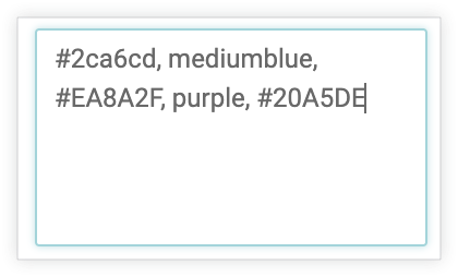
- 点击菜单右下角的全部修改,即可使用以英文逗号分隔的颜色值列表。
如需更改所选颜色或同时修改所有颜色,请在选择器底部的颜色值框中输入十六进制字符串(例如 #2ca6cd)或 CSS 颜色名称(例如 mediumblue)。
如需调出颜色选择器以选择颜色,请点击颜色值框右侧的色轮。相应颜色的十六进制值会显示在颜色值框中。
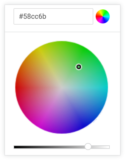
如果您点击全部修改,颜色值框会填充您选择或自定义的调色板的十六进制代码。复制并粘贴此列表是将自定义调色板从一个图表复制到另一个图表的最佳方式。
反转颜色
您可以反转调色板上使用的颜色。对于分类调色板,此属性会将调色板中的最后一个颜色应用于第一个序列,将调色板中的倒数第二个颜色应用于第二个序列,依此类推。对于顺序或发散调色板,此设置会将调色板最右端的颜色应用于第一个序列,并向左移动调色板以应用于其余序列。
自定义
您可以通过多种方式自定义图表中的每个序列:
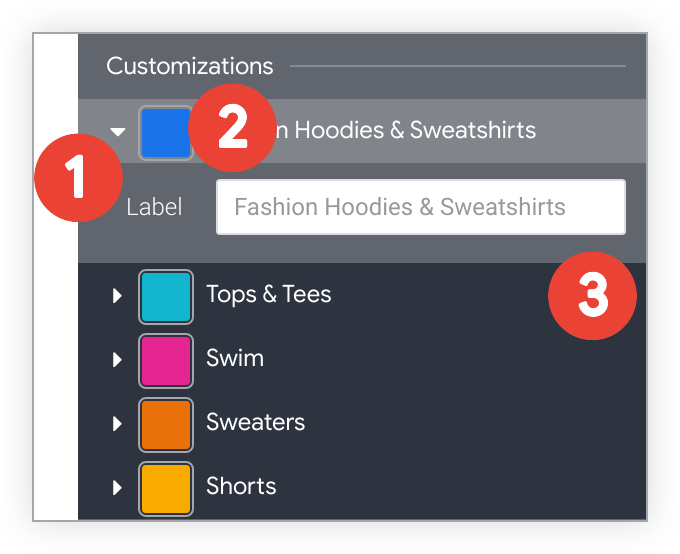
- 点击序列旁边的箭头可展开其选项。
- 点击色样,为相应序列选择自定义颜色。此属性会替换 颜色选项定义的调色板。
- 根据需要输入自定义系列标签。这会影响图表图例和提示。