This documentation page describes how to use Gemini assistance to generate JSON formatting options from text-based prompts to accelerate the customization of Looker visualizations. Customizing visualizations with the Visualization Assistant is a Gemini in Looker feature that is available in Looker (original) and Looker (Google Cloud core) instances.
The Visualization Assistant is available for visualizations that use the HighCharts API, which includes most Cartesian charts, such as the column chart, bar chart, and line chart, among others.
Gemini in Looker is a product in the Gemini for Google Cloud portfolio that provides generative AI-powered assistance to help you analyze and gain valuable insights from your data.
Learn how and when Gemini for Google Cloud uses your data.
This page is intended for users who are exploring data in a Looker instance.
Before you begin
To create visualizations with Gemini assistance, note the following requirements:
- Gemini in Looker must be enabled for your Looker instance:
- For Looker (original), the instance must be running Looker 25.2 or later, and the instance must be enabled for Gemini in Looker in the Admin settings. For detailed enablement instructions, see the Admin settings — Gemini in Looker documentation page.
- For Looker (Google Cloud core) the instance must be enabled for Gemini in Looker in the Google Cloud console. For detailed enablement instructions, see the Administer Gemini on your Looker (Google Cloud core) instance documentation page.
- You must be assigned a Looker role that contains the
can_override_vis_configpermission. - You must be assigned the Looker Gemini role.
Using the Visualization Assistant
To customize a visualization with the Visualization Assistant, follow these steps:
- View a supported visualization in an Explore, or edit a visualization in a Look or dashboard.
- Open the Edit menu in the visualization.
- Click pen_spark Visualization Assistant to open the prompt menu.
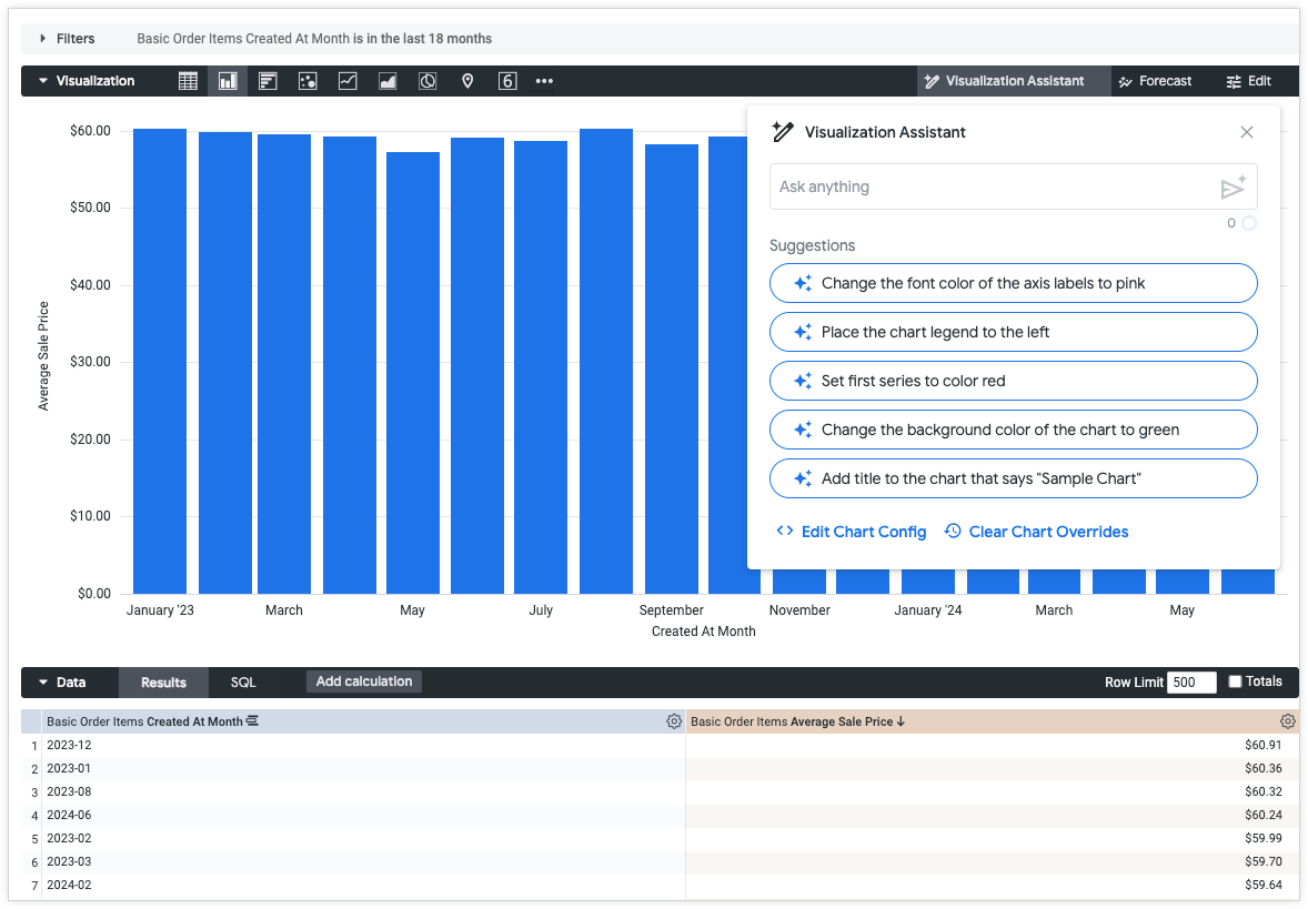
Within the pen_spark Visualization Assistant prompt menu, you can do the following:
- Type out a plain text prompt of changes for the visualization in the Ask anything field. To send send_spark your prompt, press return (Mac) or Enter (PC).
- Apply generated Suggestions to the visualization.
- Open the Edit Chart Config to manually write and edit JSON formatting options.
- Clear Chart Overrides to clear all custom changes applied to the visualization. You will be prompted to Confirm removing all changes before proceeding. If you cleared the changes by accident it is possible to retrieve them by navigating back in your browser history.
Once the prompt has run a preview window will open with the options to:
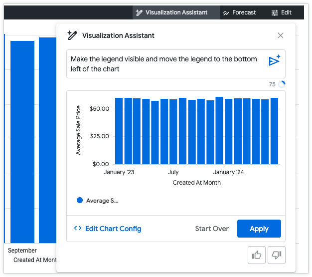
- Manually write and edit the generated JSON formatting options: Click Edit Chart Config to open the chart configuration editor. Click Visualization Assistant to return to the prompt menu.
- Start a new prompt: Click Start Over to begin a new prompt from the pen_spark Visualization Assistant menu. All unapplied changes will be lost.
- Apply the previewed changes to the visualization: Click Apply. If changes are made in the Chart Config menu, this option will change to Revalidate and Apply.
- Provide feedback about the helpfulness of the prompt response: Select thumb_up to indicate that the prompt response was helpful, or select thumb_down to indicate that the response was not what was expected.
An Invalid JSON detected error message will appear if you try to preview code containing invalid JSON. You can clean up invalid JSON using the Autofix code edit_fix_auto option at the bottom of the Chart Config pane.
Creating successful prompts
Writing successful prompts can take practice. Try some of the following suggestions to write prompts that successfully accomplish your goal.
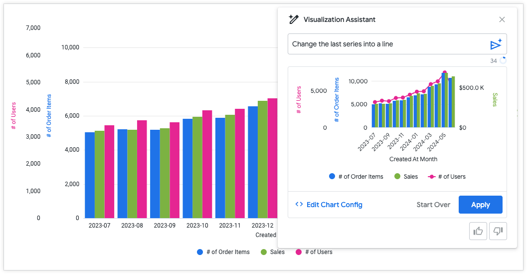
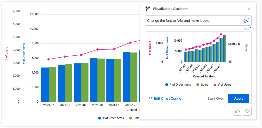
Break prompts into multiple parts
Prompts are more successful when they focus on one change at a time. For example, if you want to change both the font family and the type of visualization, it's better to make these separate prompts. Once you approve of the generated changes apply them and then begin writing the next prompt.
Prompt: Change the last series into a line
Prompt: Change the font to Arial and make it bold
Try writing a prompt multiple ways
If you're not seeing the results that you expect from your prompt, try rewording the prompt. When you apply conditional formatting, try making your prompt as unambiguous as possible. Setting specific value ranges and providing hex codes can create a more successful output. See the following examples:
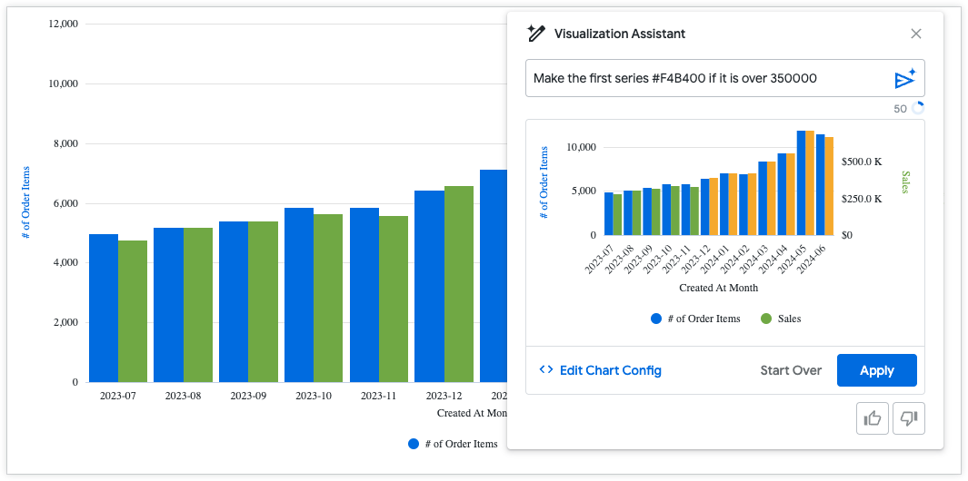
Good prompt: Make the first series #F4B400 if it is over 350000
Poor prompt: Highlight the top values in yellow
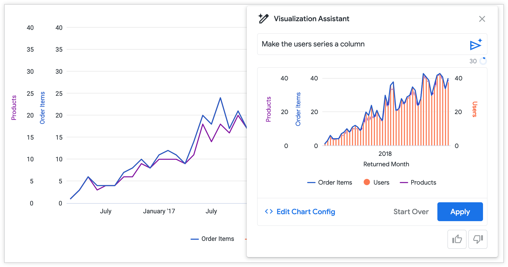
If you have multiple series in a visualization, try referring to the series by name rather than by its position in the chart.
Prompt: Make the middle series a column
Better prompt: Make the users series a column
Use prompts as a starting point
Particularly complex customizations may require making edits directly to the JSON. Try using the Visualization Assistant prompts to create templates and patterns for complex customizations, and then use the Edit Chart Config to manually write and edit JSON formatting options. Visit the Customizing visualizations using the Chart Config Editor documentation for more on using HighCharts JSON.
Sample prompts
Try the following sample prompts to get ideas on how the Visualization Assistant can help you get started customizing your visualizations:
- "Make this chart a column chart"
- "Add data labels to the chart"
- "Set the chart margin as 100px"
- "Set the line color as Red"
- "Set the chart background color as pink"
- "Set the line series marker shape as triangle"
Provide feedback
You can provide feedback for the visualization preview in the Visualization Assistant prompt menu. If the generated preview looks correct, click the thumb_up thumbs-up icon. If the generated preview looks incorrect or isn't what you expected, click the thumb_down thumbs-down icon.