A Venn diagram shows the overlap between two or more attributes in a dataset.
Using the Chart Config Editor, you can create Venn diagrams by starting from a column chart in Looker. You must include at least two type: yesno dimensions and one dimension with type: string or type: number to create a Venn diagram.
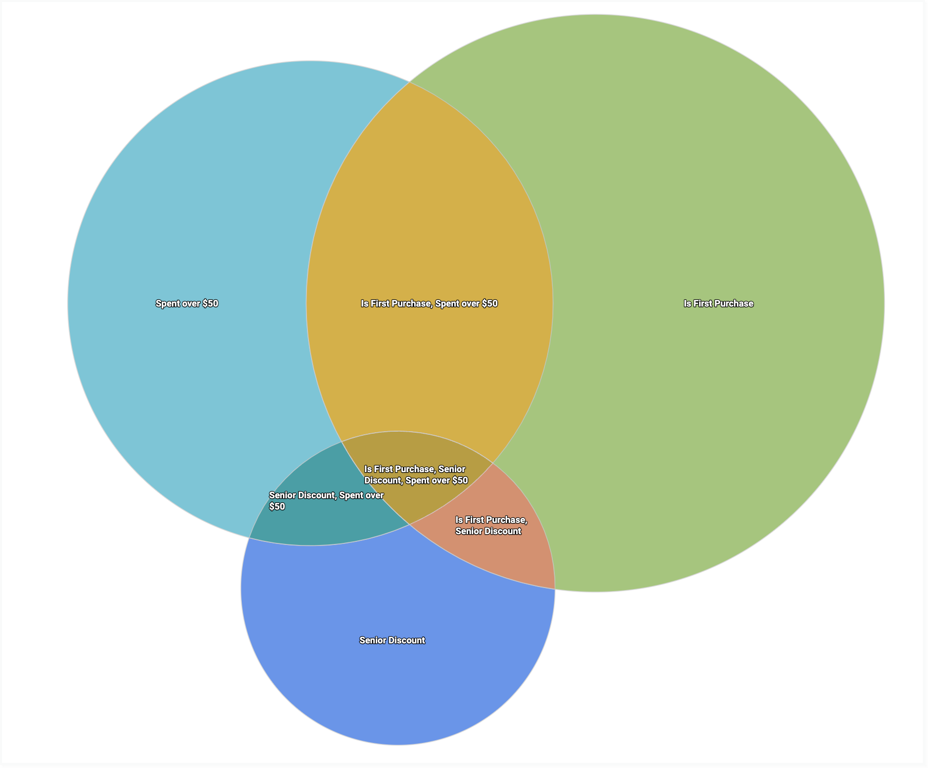
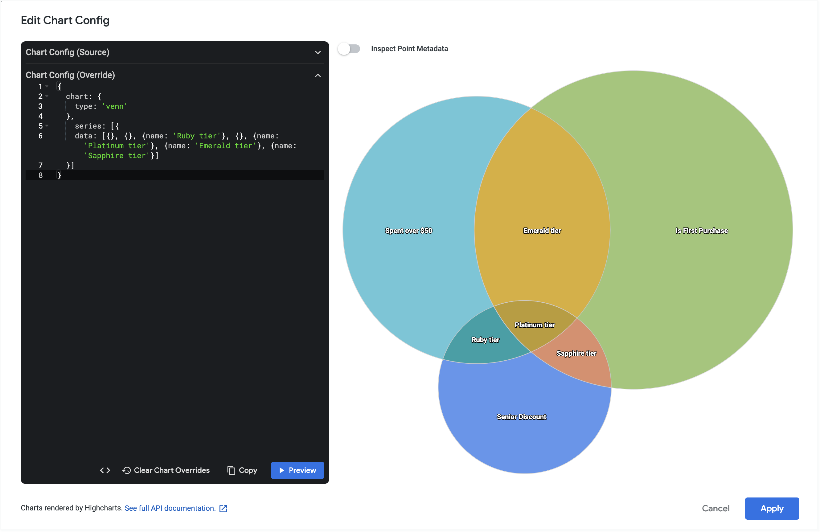
For example, you can create a Venn diagram that shows the overlap between orders that were a user's first purchase, orders that had a senior discount applied, and orders of $50 or more.
Prerequisites
To access the Chart Config Editor, you must have the can_override_vis_config permission.
Writing the JSON snippet
To create a Venn diagram, start from the following JSON snippet:
{
  chart: {
    type: 'venn',
  }
}
Creating a Venn diagram
To create a Venn diagram, follow these steps:
View a column chart in an Explore, or edit a column chart in a Look or dashboard.
Start from a column chart with at least three dimensions. Include one dimension of
type: stringortype: number. Include at least two dimensions oftype: yesno.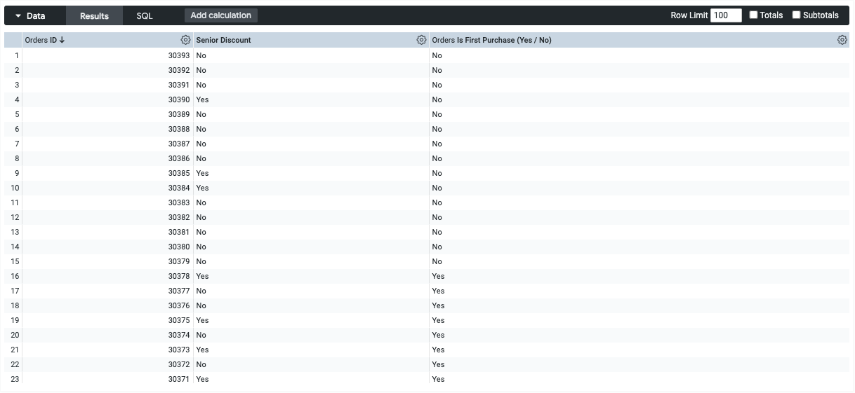
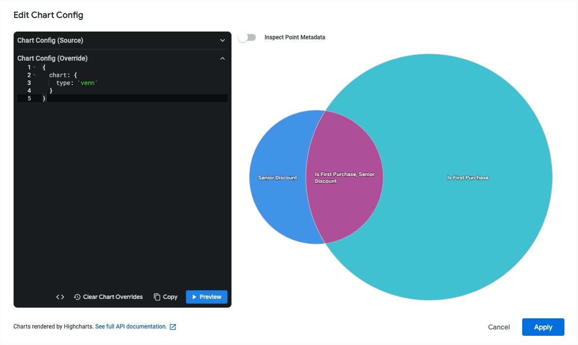
In the visualization, open the Edit menu.
In the Plot tab, click the Edit Chart Config button. Looker displays the Edit Chart Config dialog.
Select the Chart Config (Override) section, and enter the HighCharts JSON snippet from the Writing the JSON snippet section of this page.
To let Looker properly format your JSON, click <> (Format code).
To test your changes, click Preview.
To apply your changes, click Apply. The visualization will be displayed using the custom JSON values.
Once you've customized your visualization, you can save it.
Adding more conditions
To add more circles to the Venn diagram, add more type: yesno dimensions to the data table. You can create a custom dimension if you need this condition only for the Venn diagram. Write your custom dimensions as a boolean condition, like in this example:
${orders.total_amount} > 50
Changing the overlap label values
By default, the label for any overlapping regions in the Venn diagram will be a comma-separated concatenation of the region labels. For example, the overlap between the regions "Spent Over $50", "Is First Purchase", and "Senior Discount" would be "Spent Over $50, Is First Purchase, Senior Discount".
To customize these labels, edit the series.data.name attributes using the Chart Config Editor. To determine which attribute corresponds to which region, it can be helpful to enumerate all of the regions first.
For example, consider a Venn diagram with three circles. This means that there are seven regions in total.
You can use the following JSON snippet to find out which label corresponds to each number:
{
  chart: {
    type: 'venn'
  },
    series: [{
    data: [{ name: '1'}, {name: '2'}, {name: '3'}, {name: '4'}, {name: '5'}, {name: '6'}, {name: '7'}]
  }]
}
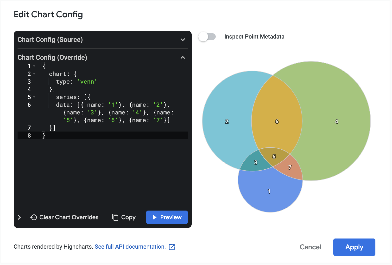
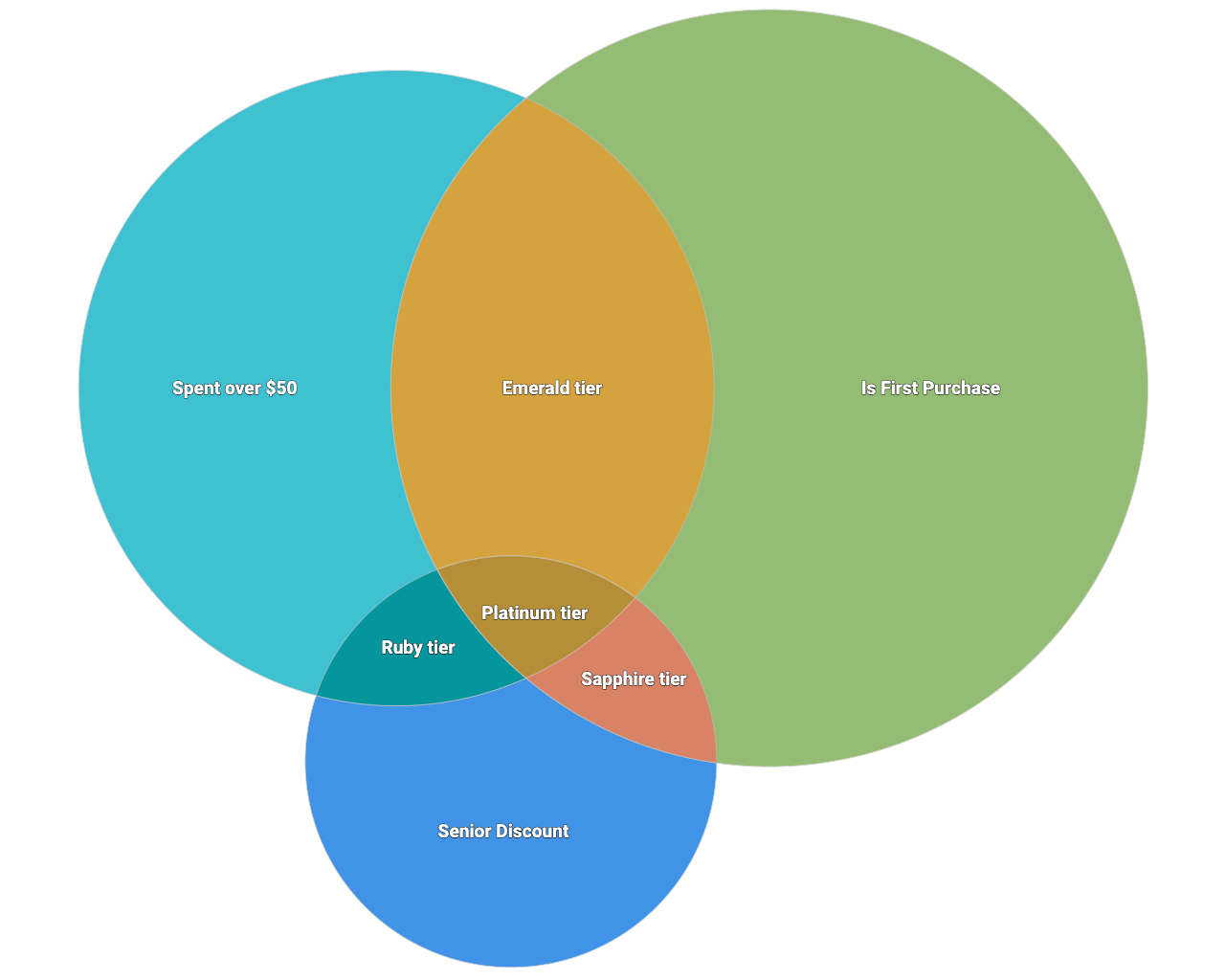
Then, you can edit the name attribute for any region whose name you want to change. To let the label remain as default, remove the name attribute but leave the brackets intact. In this example, the overlapping regions (3, 5, 6, 7) are relabeled, and the outer circles (1, 2, 4) keep their default label.
{
  chart: {
    type: 'venn'
  },
    series: [{
    data: [{}, {}, {name: 'Ruby tier'}, {}, {name: 'Platinum tier'}, {name: 'Emerald tier'}, {name: 'Sapphire tier'}]
  }]
}
Changing the label font size
To change the font size of the labels on the Venn diagram, edit the dataLabels.style.fontSize attributes using the Chart Config Editor.
To expand on the previous example, the following example sets the font size of each of the labels to 24 point.
{
  chart: {
    type: 'venn',

  },
  series: [{
    data: [{
        dataLabels: {
          style: {
            fontSize: 24
          }
        }
      }, {
        dataLabels: {
          style: {
            fontSize: 24
          }
        }
      }, {
        name: 'Ruby tier',
        dataLabels: {
          style: {
            fontSize: 24
          }
        }
      }, {
        dataLabels: {
          style: {
            fontSize: 24
          }
        }
      }, {
        name: 'Platinum tier',
        dataLabels: {
          style: {
            fontSize: 24
          }
        }
      },
      {
        name: 'Emerald tier',
        dataLabels: {
          style: {
            fontSize: 24
          }
        }
      },
      {
        name: 'Sapphire tier',
        dataLabels: {
          style: {
            fontSize: 24
          }
        }
      }
    ]
  }]
}