Successful implementation of conversational product filtering relies on well-thought-out user experience design.
Visual display elements
The placement and appearance of the conversational filter significantly impact its effectiveness.
Vertical versus horizontal layout
These are some considerations as to whether to design a vertical or horizontal layout:
Recommendation: Prioritize a horizontally-oriented, vertically compact design. This minimizes the risk of pushing product results below the fold.
Reasoning: If the filter is displayed horizontally across the top, it can push product results down the page, which increases the cost of the feature by reducing immediate product visibility. Additionally, minimizing blank space between elements can add prime space on the web page for showing additional product tiles.
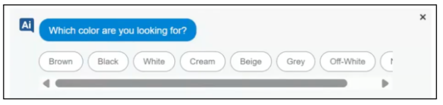
Handle long attributes
If multiple-choice options are long (such as brand names), don't wrap them to new lines as this adds height to the elements. Instead, allow them to extend horizontally off the page and enable side-scrolling.
Here is an example of a horizontal scroll implementation:
Optimal placement
Consider placing the conversational filter after 3-5 rows of products. This approach prevents the conversational element from displacing the initial list of products.
A key takeaway for this placement is that the conversation filtering bar should be as vertically compact as possible. When the conversational product filtering feature is positioned prominently, it can shift product displays further down the page, out of immediate view. This can be a drawback, as shoppers see fewer products. Therefore, the products that are visible must be as relevant as possible.
Side (vertical) versus top (horizontal): Consider placing the conversational filter after 3-5 rows of products. This approach prevents the conversational element from displacing the initial list of products.
Strong consideration: If conversational product filtering becomes your main method for narrowing product selections, consider fully minimizing or replacing your manual filter bar. This can let you add another column of product items.
Desktop and mobile
While desktop implementations have proven successful, results on mobile have been less consistent and have shown lower overall performance gains. The limited screen size on mobile requires a more creative and deliberate approach to placement.
Recommendation: Prioritize desktop implementations over mobile, at first. The larger screen size on desktop allows for greater flexibility in creative designs. The smaller screen on mobile forces developers to prioritize certain elements.
Avoid: Chat window interfaces. Don't implement the conversational filter as a chat window. This takes users away from the main web interface and can disrupt the intended web checkout flow design that developers typically spend considerable time optimizing.
Additional mobile considerations
Mobile web and apps should also be treated independently when it comes to testing. Mobile app testing is inherently difficult to conduct, but offers greater flexibility. Mobile web is often quicker to test, but comes with different tradeoffs for various mobile web browsers.
User interaction with filters
This section describes how to configure conversational product filtering. Replacing static, hard-coded filter elements with dynamic conversational filtering to liberate screen space for more targeted products is recommended. All applied filters, regardless of their origin, can globally update the product grid.
Subsequent conversational questions adapt to the complete set of applied filters, which offers both multiple-choice options.
Unified global filters
Shoppers can interact with both conversational filters and any remaining filter elements applied. Your frontend implementation must be able to handle this scenario.
Unified global filters have these characteristics:
- Global application: When a user makes a selection from any filter element on the page, whether it is a conversational product filter or static filter element, the product grid must update to show results with all global filters applied.
- Intelligent follow-up: The next conversational question the user sees should be relevant based on the complete set of applied filters applies, regardless of which element the user selects. For example, if a shopper selects a
colorfilter from the conversational element and asizefilter from the classic filter element, the subsequent conversational question should not ask the shopper what size they want.
Filter types
Conversational product filtering enables the option to use both multiple choice selections on the site.
Multiple choice
Vertex AI Search for commerce can present up to 20 multiple-choice options, based on the value names in the product catalog. Options appear in a sorted list of the most relevant choices. Long options, such as long brand names, help ensure that users can side scroll rather than wrap to new lines, which maintains vertical compactness.
Replace hard-coded elements
Many commerce search site developers have prebuilt, manual category filter components in their web interface that are intended for top revenue-generating queries. These filter components are typically expensive, time-consuming to produce, and not very interactive with the user.
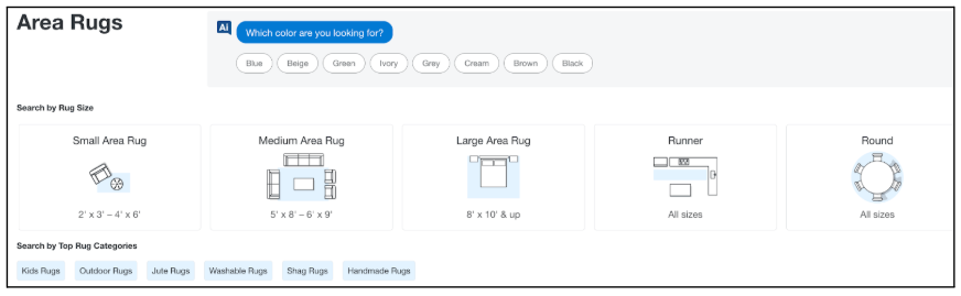 Figure 2. Example of hard-coded element display.
- Recommendation: The core idea behind conversational filtering lets you quickly deploy dynamic experiences like these across all your products, not just for the few top queries that the visual elements were designed for. Therefore, identify and remove elements that conversational filtering is designed to replace. Avoid having two competing sets of filter elements that perform similar functions. This liberates space on the screen to show more targeted products.
Ideas for experimentation
Some ideas for experimentation are:
- Placement between product rows: Insert the component partway down the page, after three to five rows of products. This approach prevents the conversational element from significantly displacing the initial product displays.
- Fly-out or pop-up: Use a button that triggers a dialog or fly-out menu containing the filter questions. This can be integrated with existing filter pop-ups, or a fly-out can be a separate element.
- Sticky bar: A persistent bar on the screen presents the questions and options. This sits in front of the products rather than pushing them down.
- Testing considerations: When testing mobile and desktop, ensure that these experiments are conducted independently. The shopping behaviors for each device vary greatly, and the visual components that work on one device might not translate to the other.
Data ingestion and quality
The Vertex AI model's intelligence is built on user interaction data. The onboarding process uses a two-phased approach to data ingestion.
Phase 1: Initial start with historical events
The model can be trained on historical event data. Historical event data is initially ingested into the Google environment, which allows the model to recognize even new projects with no live interaction data.
Phase 2: Transition to live query data
After the capability is live and starts to collect historically captured data, Vertex AI uses the live query data stream to refine the serving model. The live query data is generally of higher quality than historically captured event data as historical events can sometimes miss key information. This makes live query data more effective for ongoing optimization.