Stay organized with collections
Save and categorize content based on your preferences.
Looker visualization options let you customize your visualization, including adding reference lines. The reference line options are static value, median, average (mean), maximum, minimum, and range, which can be selected in the Edit Visualization settings.
But what if you want to use vertical reference lines in a graph? For example, what if you want to visualize the various stages of a product launch on specific dates against the orders that were placed during that period?
The solution
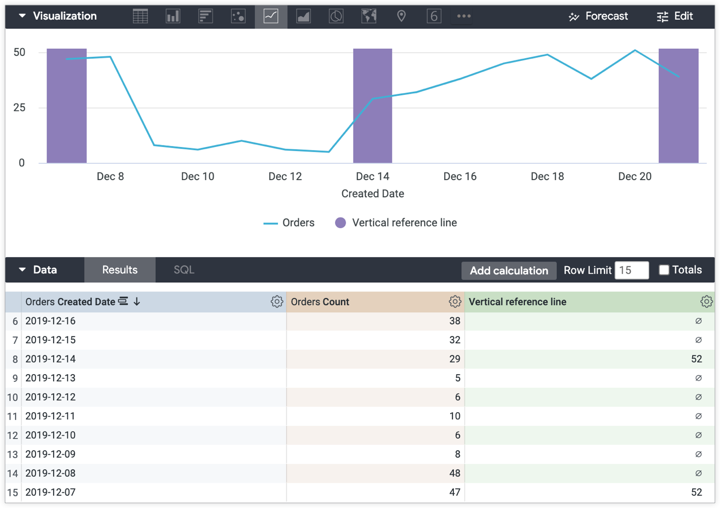
Using table calculations, you can create vertical bars that you can reference in graphs. The vertical lines will appear like those in the following example.
The following example is based on an Explore with Orders Count grouped by Orders Created Date.
To create a vertical reference line:
Create a table calculation that references the data points in the visualization that you want to highlight with vertical reference lines. This example of a use case uses the following expression to create vertical reference lines to mark stages in the product launch dates using the Orders Created Date:
if(
to_string(${orders.created_date}) = "2019-12-21" OR
to_string(${orders.created_date}) = "2019-12-14" OR
to_string(${orders.created_date}) = "2019-12-07"
,
max(${orders.count})+1, null
)
Next, apply the following sections in the visualization Edit menu:
In the Series menu, set the visualization Type for the table calculation to Column.
In the Plot menu, make sure Series Positioning is not set to Stacked Percentage.
The resulting visualization displays the line representing the number of orders placed over time, and the vertical bars produced by the Vertical reference line table calculation mark the launch stages of the product over time — beginning, middle, and end:
[[["Easy to understand","easyToUnderstand","thumb-up"],["Solved my problem","solvedMyProblem","thumb-up"],["Other","otherUp","thumb-up"]],[["Hard to understand","hardToUnderstand","thumb-down"],["Incorrect information or sample code","incorrectInformationOrSampleCode","thumb-down"],["Missing the information/samples I need","missingTheInformationSamplesINeed","thumb-down"],["Other","otherDown","thumb-down"]],["Last updated 2025-07-22 UTC."],[],[],null,["# How to create vertical reference lines\n\n| **Tip:** Starting in Looker 24.0, you can use the [Chart Config Editor](/looker/docs/chart-config-editor#add_vertical_reference_bands) to create more robust vertical reference lines and bands.\n\n\nLooker visualization options let you customize your visualization, including [adding reference lines](/looker/docs/best-practices/how-to-create-reference-lines-with-visualization-editor). The reference line options are static value, median, average (mean), maximum, minimum, and range, which can be selected in the **Edit Visualization** settings.\n\n\nBut what if you want to use vertical reference lines in a graph? For example, what if you want to visualize the various stages of a product launch on specific dates against the orders that were placed during that period?\n\nThe solution\n------------\n\n\nUsing [table calculations](/looker/docs/table-calculations), you can create vertical bars that you can reference in graphs. The vertical lines will appear like those in the following example.\n\n\nThe following example is based on an Explore with **Orders Count** grouped by **Orders Created Date**.\n\n\nTo create a vertical reference line:\n\n1. [Create a table calculation](/looker/docs/table-calculations#creating_table_calculations) that references the data points in the visualization that you want to highlight with vertical reference lines. This example of a use case uses the following expression to create vertical reference lines to mark stages in the product launch dates using the **Orders Created Date** :\n\n \u003cbr /\u003e\n\n ```\n if(\n to_string(${orders.created_date}) = \"2019-12-21\" OR\n to_string(${orders.created_date}) = \"2019-12-14\" OR\n to_string(${orders.created_date}) = \"2019-12-07\"\n ,\n max(${orders.count})+1, null\n )\n \n ```\n2. Next, apply the following sections in the visualization **Edit** menu:\n\n \u003cbr /\u003e\n\n - In the [**Series** menu](/looker/docs/line-options#series_menu_options), set the visualization **Type** for the table calculation to **Column**.\n - In the [**X** menu](/looker/docs/line-options#x_menu_options), change **Scale Type** to **Ordinal**.\n - In the [**Plot** menu](/looker/docs/line-options#plot_menu_options), make sure **Series Positioning** is *not* set to **Stacked Percentage**.\n\n\nThe resulting visualization displays the line representing the number of orders placed over time, and the vertical bars produced by the **Vertical reference line** table calculation mark the launch stages of the product over time --- beginning, middle, and end:"]]